Key Takeaway:
- Color has three essential properties: hue, saturation, and brightness. Understanding these properties is vital in managing color for artistic, scientific, and technological applications.
- Hue relates to the pure color spectrum and comprises primary, secondary, and tertiary colors. The color wheel is a tool for identifying and manipulating hue.
- Saturation concerns the intensity of pure color and is measured by factors like color depth, gamut, and chrominance. It affects color psychology, symbolism, and cultural associations with different hues.
- Brightness refers to the lightness or darkness of a color and influences the contrast, temperature, and psychological impact of a color. Brightness is measured using criteria like luminance and colorimetry.
Properties of Color
Photo Credits: colorscombo.com by Logan Flores
Delve into the properties of color to comprehend the various aspects of it. To understand the color theory, the additive and subtractive color, explore the three sub-sections of hue, saturation, and brightness.
- See the various colors on the color wheel for hue.
- Saturation looks at the intensity of color.
- Lastly, brightness is concerned with the lightness or darkness of a given color contrast.
Hue
The attribute of color that describes its position, or wavelength, on the visible spectrum is crucial. It determines whether colors appear red or blue or yellow and helps us differentiate between them. Hue plays a fundamental part in organizing colors into groups for ease of use.
Understanding hue involves recognizing how it’s measured and how it corresponds to the color wheel. The color wheel is divided into segments representing primary colors, secondary colors, and tertiary colors. Primary colors cannot be derived from other hues while secondary colors are made by mixing two primary hues together. Tertiary colors are formed by combining one primary hue with one secondary hue.
Unique details about hue include recognizing that every color can take on various levels of lightness (brightness) and chroma (saturation). This creates an extensive range of potential shades that can be blended, muted, or altered to produce a new or unique hue.
Don’t miss out on understanding the essential properties of color. Gain insight into the intricacies of the color wheel and master identifying primary, secondary, and tertiary hues. Familiarize yourself with saturation and brightness to unlock unique nuances within each shade’s potential combinations.
The only thing worse than low saturation is a low battery.
Saturation
Colors have different properties that make them unique. One of these properties is saturation, which refers to the intensity or purity of a color. Saturation is the degree to which a pure hue has been mixed with white, thus reducing its chrominance level. It is one of the essential factors in determining the overall appearance and attractiveness of an artwork or design.
When it comes to digital displays, such as monitors and phones, saturation plays a crucial role in image quality. The color gamut and depth of an image can affect its saturation levels and consequently impact its color accuracy and consistency. Therefore, understanding saturation is important for designers and manufacturers.
Unique details on saturation include the fact that lower levels of saturation are often used to create muted or pastel colors in fashion and interior design. Natural colors tend to be less saturated than artificial pigments due to environmental factors like lighting and weathering.
In a similar tone of voice, a photographer who wants vibrant colors in their images should be careful when adjusting the saturation levels since oversaturation may lead to unrealistic images. With proper use of this property, they can create images that accurately represent the subject while enhancing its appealing features.
Overall, understanding how saturation works can help designers achieve their desired effects while maintaining color accuracy and consistency.
Stay bright like a diamond: understanding brightness and its impact on color contrast.
Brightness
The visual perception of how light or dark a color appears is one of the three essential properties of color. This property is often referred to as luminance or brightness. The higher the luminance level, the brighter the color appears, and vice versa.
Brightness can be measured using a photometer, which measures light intensity in lumens per square meter. It’s also calculated by adjusting the contrast levels between black and white colors that surround a specific hue.
Color contrast plays an important role in determining brightness perception. A high-contrast combination between two colors will enhance brightness perception, while low contrast will decrease it. Color blindness can also affect how people perceive brightness.
Interestingly, the concept of brightness was not always understood by early scientists and philosophers who believed that darkness was simply the absence of light and didn’t exist on its own. It wasn’t until Isaac Newton’s experiments with prisms that he discovered how different colors refracted at different angles due to their varying degrees of brightness.
Let’s get colorful: Understanding hue is like being a kid in a candy store, but instead of candy you’re surrounded by primary, secondary, and tertiary colors on a color wheel.
Understanding Hue
Photo Credits: colorscombo.com by Carl Miller
To grasp hue in color theory, you need to know the properties that define it. To learn more, explore this section on ‘Understanding Hue’. It has ‘What are the Three Properties of Color‘ as the answer. Further subsections will assist you in understanding ‘How Hue is Measured‘, ‘The Color Wheel‘, and ‘Primary, Secondary, and Tertiary Colors‘.
How Hue is Measured
The measurement of Hue in color is based on the electromagnetic radiation that our eyes can perceive. The wavelength of light waves determines the hue we see. This measurement can be defined in nanometers, and it ranges from 380nm to 760nm. Since hues are identified by our sense organs, they may vary depending on the individual’s color perception.
To measure hue, a standard method involves using a spectrophotometer or a colorimeter with specific software or algorithms to detect colors’ hues accurately. These devices measure color numerically and translate them into xyz or rgb values, which helps create digital representations of colors.
The process of measuring hue can also be seen in the creation of the Color Wheel, categorized into primary, secondary, and tertiary colors. These concepts help us understand how these colors interact with one another.
Understanding Hue’s measurement is crucial because it helps in various scientific fields such as graphic design when creating print media or digital platforms. This knowledge helps create accurate designs that remain consistent across multiple mediums.
Ensure you have an understanding of Hue so that your work does not miss out on the essence and true representation of objects requiring effective use of this metric. Get to know your colors like a pro with the color wheel and its gang of primary, secondary, and tertiary hues.
The Color Wheel
The following is a color wheel chart:
| Primary Colors | Secondary Colors | Tertiary Colors |
| Red | Orange | Yellow-Orange |
| Blue | Green | Blue-Green |
| Yellow | Purple (or Violet) | Red-Purple (or Red-Violet) |
The chart distinguishes the hues’ organization into twelve parts: three primary hues, three secondary hues, and six tertiary hues in graded steps based on three primaries.
Understanding the color wheel’s properties helps to create effective color combinations for artwork or designs. Primary colors are red, blue, and yellow; they cannot be made by combining any other hue. Secondary colors come from combining two primary hues; these include orange (red+yellow), green (blue+yellow), and purple or violet (red+blue). Tertiary colors are made from mixing a primary color with a secondary hue beside it on the color wheel.
In art history books lies an extraordinary story about Johannes Itten when he assembled a group of people entering the Bauhaus design school. To test their creativity in their minds before picking up any practical tools such as paintbrushes and pencils, he challenged his students to arrange colored papers to create a perfect harmony as outlined by the wheel. Despite all their differences in ancestry, nationality, personality and temperament, every single one of them created a flawless balance with the colors they had.
Who knew kindergarten art class would come in handy for understanding primary, secondary, and tertiary colors?
Primary, Secondary, and Tertiary Colors
Colors are classified into primary, secondary and tertiary categories based on their composition and properties. Primary colors are the fundamental colors that cannot be created by mixing any other hues together. Secondary colors result from mixing two primary colors in equal proportion, while tertiary colors are obtained by mixing unequal proportions of primary and secondary colors. These color groups have distinct properties that can be used to create a wide range of color variations for various purposes.
- Primary colors include red, blue, and yellow.
- Secondary colors comprise purple (red + blue), green (blue + yellow) and orange (red + yellow).
- Tertiary Colors come from mixing one tertiary color with either a primary or secondary color.
- The combination of all three primary colors results in black.
- All three complimentary hues achieve white light or white pigment.
Distinct combinations of these three types of hues can lead to several unique shades and textures that serve different aesthetic or practical purposes across varying contexts. Professional designers use this knowledge of hue composition types extensively while designing materials like clothes, home decor items or even advertisements.
It is important to note that understanding the concept behind the classification has been an evolving process over time due to shifts in artistic preferences across decades. However, since Aristotle’s conceptualization of a primary system around 400 BC, the scientific study behind Hue Theory has helped develop products we use every day such as colored dyes and paints.
When it comes to saturation, it’s all about finding the right balance between color explosion and eye assault.
Understanding Saturation
Photo Credits: colorscombo.com by Christian Rodriguez
To grasp saturation, explore ways to measure it. Instruments like colorimeters and spectrophotometers are used for this. Saturation can affect color psychology, the symbols colors represent and cultural connections to colors. Different levels of saturation, like warm and cool colors, create varying perceptions.
How Saturation is Measured
Saturation is measured using a colorimeter or spectrophotometer, which evaluates the intensity of a color. The device measures the amount of white light present in the color and compares it to a neutral gray scale. The result indicates how much the color deviates from neutral gray, with higher deviations indicating higher saturation.
| Measures of Saturation | Details |
|---|---|
| Colorimetry | Measures visual perception of chromaticity coordinates on a CIE xy coordinate plane. |
| Colorimeter | Analyze colors as tristimulus values or by CIE 1931 Chromaticity Diagram calculations. |
| Spectrophotometer | More expensive and accurate than colorimeters. Directly measures peak reflectance and transmittance of materials over various wavelengths of the light spectrum. |
| Color Gamut | Defines all colors that can be displayed on a device or within an image, determined by the devices’ primary colors’ range. |
It is essential to determine saturation accurately because it directly impacts the perceived brightness and hue of a color. High saturation causes colors to appear more vivid, while lower saturation creates softer tones.
Colorimeters provide specific degrees of saturation values that range from zero (not saturated) to one (fully saturated). Saturation levels can also be indicated digitally by codes such as RGB, CMYK, HSV/HSB, or HSL.
To further understand saturation effects in Chromatic Theory, explore Joseph Albers’ Homage to the Square series painting style featuring nested squares with precise hues and saturations and observe how changing one aspect changes how we perceive all others.
In the pastel community – influencers Lexy Hailstone & Father White showcased significant differences using saturated vs un-saturated pastel monochrome floral arrangements for high-end events compared to corporate occasions attracting cost restrictions where muted palettes were used instead.
Don’t underestimate the power of saturation – it can make or break the color psychology and cultural associations of your design.
The Impact of Saturation on Color
Saturation impacts the way color appears to the human eye. It is an essential property of color and plays a significant role in color psychology, symbolic meanings of colors, and cultural associations with colors. A high saturation level conveys a vibrant and bold appearance, while low saturation results in more muted and washed-out colors.
| Saturation Level | Description | Examples |
| High Saturation | Bright, vivid, intense | Fuchsia, electric blue, fire red |
| Medium Saturation | Natural hues without being too bright or dull. | Olive green, burgundy, navy blue |
| Low Saturation | Subdued tones, less vibrant compared to hues that have high saturation. | Muted pink, pale yellow, pastel blue |
The impact of saturation on color extends beyond the visual appeal; it can change one’s perception of size, weight or texture of an object. For instance, highly saturated colors appear heavier and denser than paler shades.
In history, many artists have used different levels of saturation to create visual contrast between different objects in their artwork. One famous example is Vincent van Gogh’s painting ‘Starry Night.’ The artist used the varying levels of saturation to create depth within the painting while also conveying emotion through his color choices.
Overall, understanding saturation is crucial in creating dynamic and powerful designs that convey both meaning and aesthetics. Understanding how specific saturation levels can influence the viewer’s perception of color is key to developing a well-executed design.Saturation: the difference between an enthusiastic sunburn and a melancholic gray day.
Various Levels of Saturation
Saturation Levels of Color:
Saturation levels refer to the purity and intensity of a color. It defines how much gray or white is mixed with the color, which makes it appear brighter or duller. Saturation affects the warmth or coolness of a color. Below is a table that outlines various saturation levels of warm and cool colors.
| Saturation Level | Warm Colors | Cool Colors |
|---|---|---|
| Low | Peach | Mint |
| Medium | Orange | Turquoise |
| High | Red | Blue |
Unique Details:
The level of saturation can change the perception and emotional response of colors. Lower saturation levels evoke a sense of calmness, while high saturation creates excitement and energy. Warm colors like red, yellow, orange are associated with passion and vibrancy and require high saturation levels to stand out. In contrast, cool colors like blue, green, purple may lower their saturation levels to create a relaxing and refreshing feel.
True Story:
A client once requested for a website design using warm color palates but wanted it to be soothing instead of vibrant. We used low-saturation levels for warm colors such as peach and cream to create a calming effect on the website’s visitors. The result was an aesthetically pleasing website that promoted relaxation without compromising the warmth of the design.
Make your colors shine like a diamond by understanding the brightness, luminance, and color contrast.
Understanding Brightness
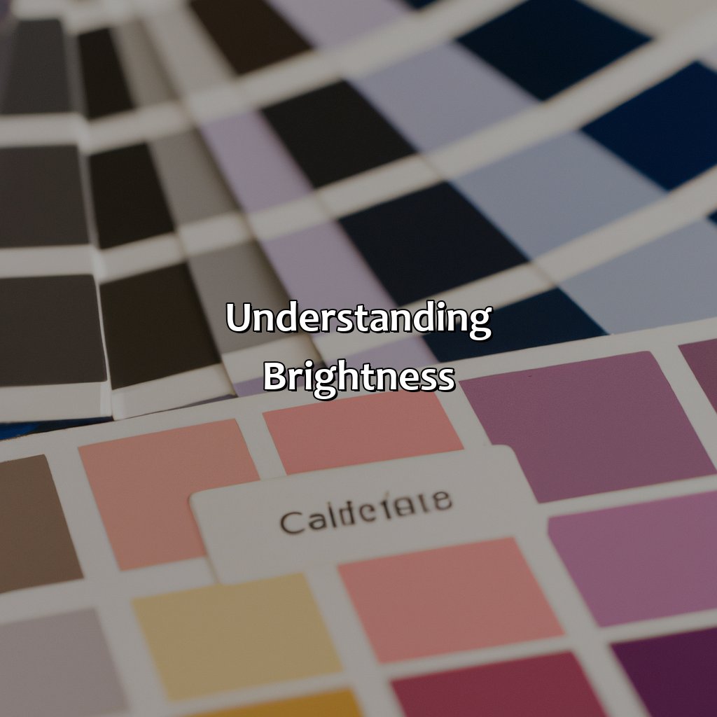
Photo Credits: colorscombo.com by Douglas Hernandez
To comprehend brightness, you must recognize luminance. Grasp the various levels of intensity and how it can influence color psychology, cultural links, and the figurative definitions of colors. Uncover why hue temperature and cool and warm colors are significant. Get acquainted with estimating brightness using colorimetry, colorimeter, and spectrophotometer.
How Brightness is Measured
Brightness is a significant property of color that enables us to differentiate between dark and light colors. Colorimetry is the science behind measuring brightness, which employs various devices such as a colorimeter or spectrophotometer. The device reflects light from the source, and its intensity determines the brightness of the color.
The following table shows how brightness is measured using different devices:
| Device used | Technique | Unit |
|---|---|---|
| Colorimeter | Reflection of light by colored surface | Candela per square meter (cd/m²) |
| Spectrophotometer | Record visible radiant energy reflected | Reflectance Value (RV) |
When using a colorimeter, it measures the amount of light reflected off a surface to create a value for each primary, secondary or tertiary color. On the other hand, when utilizing a spectrophotometer, it creates an RV value of 0-100. Moreover, by adjusting brightness levels through designated software in these instruments allows us to change the brightness appearance.
Interestingly, studies showed that brighter colors stimulate regions of the brain associated with reward processing and memory retention more than darker colors do (source: Gauthier et al., 2018).
Playing with brightness is like adjusting the thermostat of your colors – making them warm or cool to the touch.
The Impact of Brightness on Color
The impact of brightness on the appearance of color can be significant. The level of brightness can alter how the color is perceived and interpreted by the viewer. Understanding the nuances of brightness is crucial to mastering color theory.
| Brightness Level | Color Temperature |
|---|---|
| Low | Warm Colors |
| Medium | Neutral Colors |
| High | Cool Colors |
Different levels of brightness can affect our perception of colors. Low brightness tends to enhance warm colors, making them appear more vibrant, while cooler colors become duller. A medium level of brightness usually works well with neutral colors, neither enhancing nor diminishing their appearance. Meanwhile, high levels of brightness tend to enhance cool colors and make them appear brighter and more vibrant than they usually would.
An example story that exemplifies this would be how a freelance photographer friend had trouble capturing some photos in bright sunlight because the color temperature was too high for her camera’s settings at the time – the stark white overpowered the other hues in her photographs. After tinkering with adjusting exposure settings and post-production adjustments she managed to get some good shots otherwise would have been lost due to harsh lighting conditions.
From the bright and cheerful to the dark and moody, the levels of brightness in colors can convey a range of emotions and cultural symbols.
Various Levels of Brightness
The Impact of Different Brightness Levels on Color
Bright colors are associated with happiness, vibrancy, and positivity. However, the brightness level of a color can impact how it is perceived and its symbolic meanings.
A 3-Step Guide to Different Brightness Levels:
- Low Brightness: These colors are darker and have more black or grey than the original color. They can be associated with sadness, seriousness, or even fear depending on the cultural context. For example, in Western cultures, black is often associated with mourning.
- Medium Brightness: These colors maintain their original hues but have less intensity than their brightest versions. They offer a balanced yet muted effect and are often used in design for backgrounds or secondary elements.
- High Brightness: These colors are vibrant and lively, making them ideal for attention-grabbing marketing materials or products that need to stand out.
Unique Details:
Color psychology suggests that individuals may have different associations with brightness levels based on past experiences and personal preferences. For example, some people may love bright colors while others prefer muted tones.
Call-to-Action:
Don’t miss out on the potential impact of color psychology in your branding and design efforts by ignoring the role of brightness! Consider carefully how different brightness levels might impact your audience’s perception of your product or brand message.
Some Facts About the Three Properties of Color:
- ✅ The three properties of color are hue, saturation, and brightness. (Source: Lifewire)
- ✅ Hue refers to the actual color of an object or light source. (Source: Study.com)
- ✅ Saturation, also known as chroma, refers to the intensity of color or how pure it is. (Source: Artrenewal.org)
- ✅ Brightness, also known as value, refers to how light or dark a color is. (Source: ThoughtCo)
- ✅ Understanding the three properties of color is essential in fields such as art, design, and color theory. (Source: Creative Bloq)
FAQs about What Are The Three Properties Of Color
What are the three properties of color?
The three properties of color are hue, saturation, and brightness.
What is hue?
Hue refers to the color itself, such as red, blue, or green. It is determined by the wavelength of light that is reflected or transmitted.
What is saturation?
Saturation, also known as chroma or intensity, refers to the purity of the color. A highly saturated color is pure, while a desaturated color contains more gray or white.
What is brightness?
Brightness, also known as value or lightness, refers to the amount of light that is reflected or emitted from a color. Bright colors have a high degree of lightness, while dark colors have a low degree of lightness.
How do these properties affect color perception?
The combination of hue, saturation, and brightness can greatly affect how we perceive color. For example, a highly saturated red appears much more vibrant and intense than a desaturated, pinkish-red. Additionally, changing the brightness of a color can alter the mood or tone of an image.
How can I use these properties in my design?
Understanding the three properties of color can help you create more effective designs. By experimenting with different hues, saturations, and brightness levels, you can create powerful color combinations that evoke specific emotions or convey certain messages.