Key Takeaway:
- Sage is a greenish-gray color that resembles the leaves of the herb sage. It is a subtle and natural color that evokes a sense of calmness and tranquility.
- The characteristics of sage include its hue, saturation, tones, shades, and color combinations. The hue and saturation of sage can be used in creating the sage green color palette or sage green color scheme, while the tones and shades can be used in different combinations to create sage paint color, light sage color, dark sage color, and other sage green color combinations.
- The color psychology of sage is associated with calming, soothing, and natural emotions. Sage is also symbolically linked to wisdom, spirituality, healing, purification, and protection.
- The popular uses of sage color include fashion and beauty, interior design, and branding and marketing. Different color combinations can be used effectively with sage, and tips for designing with sage include using pale or muted shades of sage to create a calming effect.
- There are various other shades of green, such as light gray green, grayish green, and blue gray green, that can be used in combination with sage. The sage color palette and sage green color combinations can be used in designing effective color schemes.
- Effective sage color usage involves understanding the color’s characteristics, psychology, and symbolism, and applying it appropriately in different contexts. Sage is an important color in design and culture, and can be used to create subtle and natural effects that evoke a sense of tranquility and calmness.
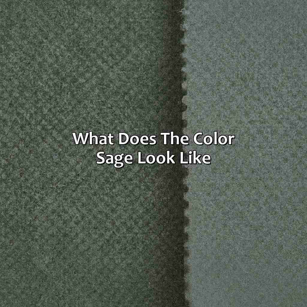
What is the color sage?
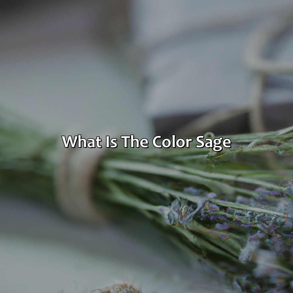
Photo Credits: colorscombo.com by Christopher Sanchez
Sage color is a muted green-gray with a slight hint of blue. It resembles the color of sage leaves, and is often used in interior design. This subtle color evokes a sense of tranquility and calmness in a space. Its versatility makes it a popular choice among designers. The subtle yet elegant shade can be paired with various other colors, such as beige, yellow, and brown, to bring out its warmth and earthiness.
The color is often used in bedrooms and living rooms, as it promotes relaxation. Its popularity has led to the creation of various shades and variations, such as lighter or darker versions of the original shade. Sage color is a timeless classic that continues to trend in modern design.
Characteristics of the color sage
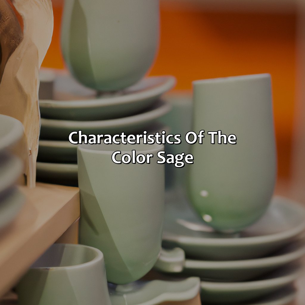
Photo Credits: colorscombo.com by Arthur Brown
To comprehend sage color’s characteristics, explore its hue, saturation, tones, shades and combos. Achieve sage green palette and schemes by changing hue and saturation. Sage paint color, pale and gray-green colors, varying shades of muted green, light and dark sage colors can be obtained by adjusting tones and shades. Numerous combos can be created by pairing sage color with others.
Hue and saturation
The sage green color is characterized by its unique hue and saturation. Its hue is a pale, greyish-green that exudes an earthy, natural feel to it. In terms of saturation, the sage green color is a muted tone that is not too bright or too dull but falls somewhere in between. When combined with white, it creates a light and airy appearance to spaces.
The sage green color palette can be grouped as monochromatic or analogous. Monochromatic colors are colors that share the same hue but have different tones or shades, while analogous colors are colors that sit next to each other on a 12-color wheel and create harmonious color schemes when combined.
Unique details about the sage green color palette include its versatility in creating both warm and cool environments depending on the colors it is paired with. For instance, combining it with warm reds and oranges brings out its earthy nature while mixing it with light blues can soften its appearance.
In ancient times, sage was used for medicinal purposes due to its cleansing properties which are still valued today in many cultures worldwide indicating the importance of this color in their practices.
The use of the sage green color scheme has become popular in interior design trends because of its calming effect when taking inspiration from nature. It’s also contrasted well with rustic materials such as wood accents providing an ideal balance between modernity and tradition.
Overall, understanding the hue and saturation variations of the sage green color palette can lead you towards designing stunning visuals suitable for every aspect ranging from fashion to branding.
Sage paint color: because sometimes you want your walls to be as calming as your herbal tea.
Tones and shades
Sage color comes in various tones and shades. The different intensities and variations of sage green are achieved by adding black or white to the original color, resulting in darker or lighter hues respectively. Additionally, mixing sage with other colors can create unique muted green shades like dusty green, pale green, gray green, blue-green, and more.
These subtle differences can significantly impact the mood and atmosphere of a design. Darker shades of sage evoke a sense of sophistication and elegance while lighter shades create a serene and tranquil ambiance. Sage blends perfectly with other natural shades to form calming earthy palettes.
One unique aspect is that this type of green also has an almost-gray quality depending on the intensity chosen. This blend results in several interesting colors such as bluish-green, greenish-gray, green-brown shade, olive green/moss green/fern green/sage moss color/sage thyme color – indirect muddy hues sometimes referred to as ‘dusty’ sages.
According to Elle Decor magazine, “Sage Paint Color is trending”. The article reported that people have been searching for the perfect shade of gray-ish light sage paint for their walls online. This trend reveals how the rise in popularity of organic-inspired interior décor aims for comfort within our homes through periods of isolation—making way for outdoorsy scenic-inspired elements suitable for all-year comfort inside living spaces.
Mix sage green with other colors like cream and beige for a soothing palette, or pair it with bold hues like navy and maroon for a daring design statement.
Color combinations
Sage color combinations are a crucial aspect of any design project. The right combination can create an elegant and sophisticated look.
- Sage green color combinations can be combined with white to elevate the freshness and naturalness of any design.
- For a more dramatic effect, sage green color code CMYK can also be paired with dark blue or dark purple.
- Sage green hex color is perfect for pairing with cream or beige for a warm and neutral look.
- Sage green RGB color can be matched with both warm and cool colors like pink, yellow, orange, or blue for a balanced feel.
- Using sage green color combos in floral prints adds drama while still maintaining an organic feel, especially when teamed up with shades of peach, rust, gold, reds or blues.
- Another popular choice is to pair sage green hues with bold geometric shapes to balance out the softness of the hue while still keeping the design understated.
Unique details about sage color combinations that have not been covered already include:
- To highlight lighter shades of sage Green In UX – Pair them with darker browns to make it pop!
- Using sage in combination with wood & earthy textures are stunningly elegant.
- When you combine this soft hue along with Metallic Gold or Silver Accents can give your overall designs an impressive touch.
True history shares that Sage is often associated with rebirth and growth in multiple cultures worldwide; thus, it’s used extensively in nature-themed designs across different domains such as fashion House branding, Where they infuse organic visual elements in their projects while being mindful of minimalism. It has even found usage among luxury hotels and restaurants looking to offer an upscale environment.
Sage may calm your nerves, but it won’t fix your problems – still, it’s a great color to have around.
Color psychology of sage
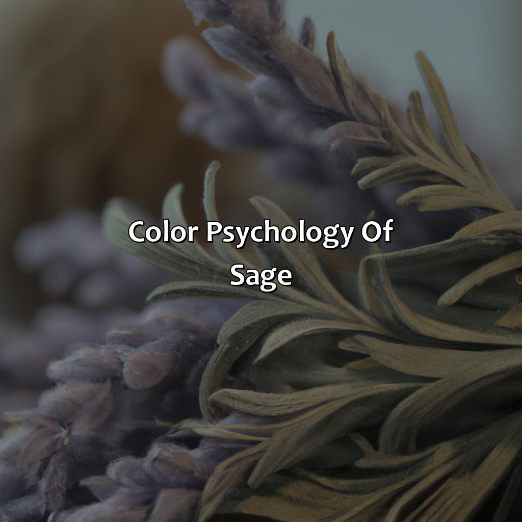
Photo Credits: colorscombo.com by Timothy Robinson
To comprehend the psychology of sage, explore its emotions and symbolism. Sage evokes feelings such as calming, tranquil, and subtle. It also symbolizes wisdom, healing, and spirituality. This section on the color psychology of sage reveals the profound symbolism and emotions linked to the soothing hue.
Emotions associated with sage
The color sage is known to evoke a sense of calmness and tranquility, making it an ideal hue for creating soothing environments. Its subtle and natural appearance makes it an airy and scenic tone that can be used effectively in various designs. The mild and herbal nature of this color gives a refreshing touch to the surroundings while also providing a fragrance-like feel due to its aromatic properties.
Sage color is associated with emotions such as calmness, peace, harmony, balance, and relaxation. Its calming effect makes it perfect for creating serene spaces that promote emotional healing and stress reduction. The soothing and tranquil properties of sage make it ideal for bedrooms, meditation rooms, or spas.
Unique details about the sage color are that it is believed to be a color that promotes mental clarity and intuition. It possesses transformative qualities that help in bringing positive changes in life. Associating this hue with nature brings out the inherent qualities of growth, abundance, freshness, energy, and peace.
A true story that supports these claims involves the interior designer who used Sage colored drapes in her client’s bedroom as they wanted their space to feel like a retreat from their busy lives. After completing the room’s makeover with sage accents and tones throughout the decor palette, the client noticeably felt more at ease in their environment- reporting improved mental clarity when meditating on his bed before sleeping after incorporating new color into his bedroom aesthetics.
Be like sage – wise, spiritual and full of healing properties that purify and protect.
Symbolism of sage
The color sage has significant symbolism related to wisdom, spirituality, healing, purification, and protection. It represents the balance between emotions and logic and is associated with intuition and awareness.
In culture, sage has been traditionally used for its holistic properties in many forms of healing practices such as aromatherapy, feng shui, and meditation. The color itself is believed to promote clarity of thought and a sense of calmness.
Moreover, in the psychology of color theory, sage can inspire trustworthiness, fidelity, and faithfulness. Being a muted tone of green, it encourages feelings of growth and renewal while also evoking a feeling of groundedness. It signifies abundance through frugality by influencing individuals to choose quality over quantity.
An interesting fact about sage’s symbolism is that Native Americans have long believed it possesses cleansing properties that purify negative energies from spaces or environments when it’s burned as incense.
Overall, incorporating the color sage into design elements can help create a sense of balance while promoting spiritual connections. Its historical significance has made it an enduring favorite across different industries such as fashion and interior design.
Sage color: perfect for when you want to look like you’re effortlessly stylish and environmentally conscious at the same time.
Popular uses of sage color
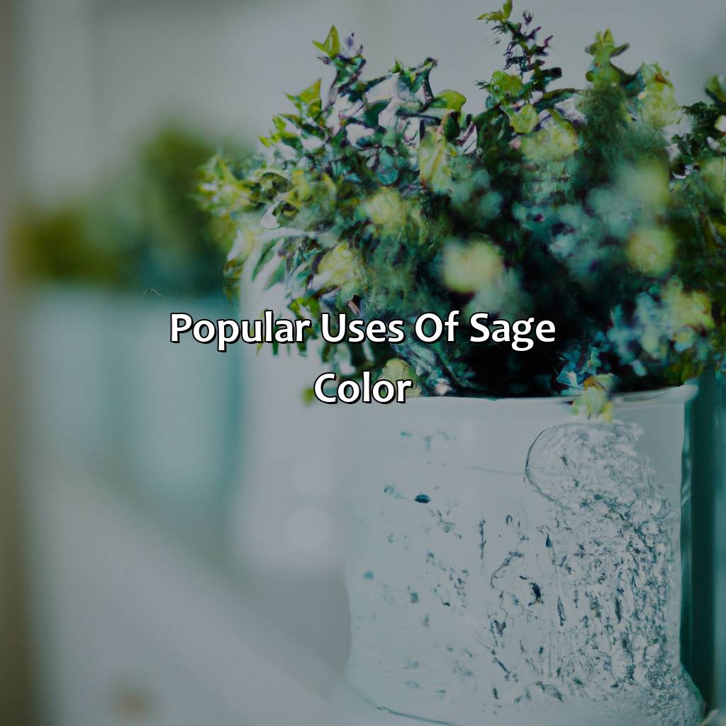
Photo Credits: colorscombo.com by Dylan Martinez
To delve into the widespread use of the hue sage in fashion and beauty, interior design, branding, and marketing, we’ll check out three sub-sections:
- Fashion and Beauty: Here, we’ll see how different shades of sage green are used for walls, bedrooms, and kitchens.
- Interior Design: Here, we’ll look at the various color schemes and combinations involving sage greens, such as muted, subtle, and pastel shades.
- Branding and Marketing: We’ll discover how the sage color palette and psychology are employed to form brand identity and advertise products and services.
Fashion and beauty
The Role of Sage Color in the World of Fashion and Beauty
Sage green is a delicate, muted shade that has become increasingly popular in fashion and beauty in recent years. This color is known for its calming qualities that can be used to create a calming ambiance in clothing and makeup products. It can also be used to soften bold or bright colors, making it ideal as a complementary color.
Sage green is suitable for a wide range of applications, including sage green wall color, sage green bedroom color, sage green kitchen color, and more. Its versatility makes it the perfect choice for various design projects that require a soothing yet eye-catching hue. The unique pairing of sage mint color or sage olive color with other shades can give rise to dynamic contrasts.
One unique characteristic of this shade is its ability to adapt to different skin tones. For instance, the soft and delicate sage dusty rose color looks beautiful on warmer skin tones while cooler skin tones radiate with liveliness in clothing adorning the evergreenish tinge of sage mint or olive colors.
Interestingly, Sage Green has been popular since ancient times among royal families who used this exquisite shade as their signature home decor and wardrobe token – bedding, dining ware or even tapestries depicting royalty showcases its versatility across civilizations.
If sage green walls could talk, they would whisper ‘elegance and serenity’.
Interior design
Sage green is a soothing color that brings a sense of calmness and relaxation to any interior. It is often used as an accent color to complement other natural colors, like beiges, browns, and shades of the sky and sea. Sage green wall color can make your space look fresh and inviting.
Sage green color scheme can be created by pairing sage with complementary hues like muted blues or soft grays. A muted sage green color scheme can create a subtle yet sophisticated look in any room. Similarly, sage pastel color can create an airy and light atmosphere, perfect for bedrooms and bathrooms.
To make your interior design stand out using sage green, you could try subtle sage green color combinations with pops of brighter greens or natural wood tones. Sage seafoam color combination can add a touch of nature to your space while creating a serene ambiance. Green pastel color paired with deeper greens or even black accents could work well in a modern living room or kitchen design. You could also experiment with metallic finishes like gold or brass for an elegant twist on your sage green decor.
It is worth mentioning that studies have shown green to be one of the most relaxing colors for our eyes, which makes it perfect for creating spaces we want to unwind in after a long day at work. According to research published in the Journal of Environmental Psychology, people who worked in offices with plants experienced less stress than those who worked in environments without foliage.
Branding with sage color is like having a wise old friend by your side, conveying trust and stability with a refreshing burst of green.
Branding and marketing
In the realm of branding and marketing, sage color is used to signify a luxurious, timeless appeal. The soft and muted tone creates a sense of calmness and elegance, which helps to establish trust and credibility in the brand. The use of sage green color palette in creating logos, packaging materials, or advertisements conveys an efficient and practical message with a touch of sophistication.
Moreover, the sage color psychology suggests that it represents growth, balance, and harmony. Companies that promote eco-friendly products often use this color because of its strong association with nature. Sage color branding is also popular in wellness industries such as spas or yoga studios since it infuses tranquility into the atmosphere.
In terms of unique details, sage can evoke feelings of peace, restoration, and ultimately support mental clarity. Along with its soothing attributes that bring a sense of calmness to consumers’ eyesight. Additionally, sage as a communicating element leverages sensibility into design.
Interestingly enough it was once believed that the sage plant held healing properties which has now become symbolic at many resorts as this notion becomes more mainstream across multiple mental health industries-creating influential business approaches toward relaxation services including day spas and summer camps for youth residential facilities promoting “new beginnings”.
Therefore businesses might select colors based on careful consideration regarding what their brands represent.; overall ensuring they align with their ideal customer demographic holistically.
You thought green was just green, but sage has more variations than a Kardashian’s love life.
Variations of sage color
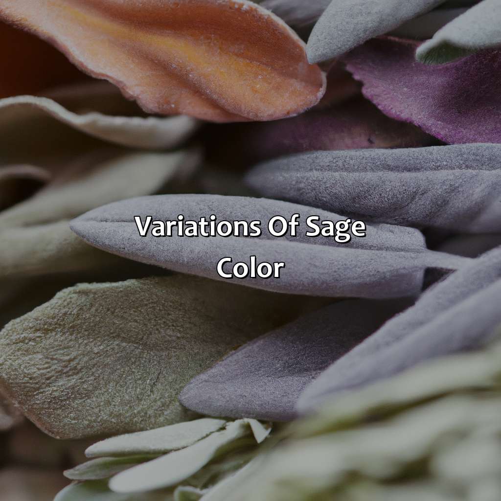
Photo Credits: colorscombo.com by Vincent Walker
Explore variations in sage color! We’ve got the right solution with our sub-sections. ‘Other shades of green’ covers colors like light gray green, grayish green and blue-gray green. Widen your knowledge on sage color palette, scheme, combinations and more with ‘Green color palettes’. Dive in!
Other shades of green
Green color has numerous shades that vary from one another. Apart from sage, some varying shades include light gray green, grayish green, and blue-gray-green color. These shades have a unique blend of various hues of green with a slight hint of either gray or blue undertones to create their identity. Light gray green is a subtle shade of green mixed with small amounts of gray and white, giving it a muted and delicate look. Grayish green is darker than light gray-green but lighter than the standard olive-green shade. Blue-gray-green, on the other hand, adds more blue to the mix to give it an overall cool tone.
These other shades of green come in handy when one wants to establish a color palette for their designs; they provide diversity in color harmony that can be appropriate for various design elements like graphics, print media, and digital platforms.
Pro Tip: When using these shades alongside sage color tones for design projects, consider complementing them with brighter or bolder colors or adding metallic effects to create an element of luxury or sophistication in your design scheme. If using sage green in your color palette, just remember: green with envy is good, green with mold not so much.
Green color palettes
Green Hues for Unique Combinations
Explore the versatility of sage green color palette. This shade of green is perfect for adding an earthy tone to any design project.
- Sage color scheme can be paired successfully with neutral colors, such as beige and gray, to create a subtle effect.
- Sage color combinations with other shades of green work great to add depth to any design or artwork.
- Sage green color combinations also pair well with natural colors like brown, arctic white, and blue-gray.
- Adding metallic accents to sage green tones creates a chic and modern look for branding projects.
- For bold designs, sage green can be mixed with bright yellows or pinks for additional contrast.
- Exploring different patterns and textures while using sage green in interior design produces a cozy atmosphere.
Sage has unique details that make it stand out among other shades of green. Utilizing this complex hue in any design allows you to add depth and character to an artwork or a brand identity. There are multiple ways to incorporate sage into your brand; explore the many possibilities of this unexpected shade!
Don’t miss out on exploring the beauty of sage color palette! Merge contemporary elegance with organic nature by incorporating these wonderful blends into your next project.
Designing with sage color: the difference between chic and looking like a pot leaf.
How to use sage color effectively
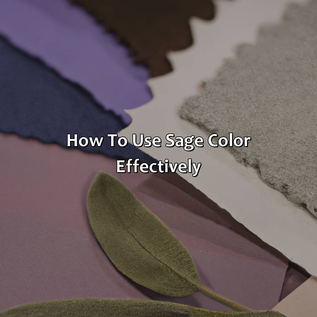
Photo Credits: colorscombo.com by Terry Perez
Gain mastery of sage color usage in designs! Get tips and tricks for designing with sage. Learn about color combinations such as CMYK and hex color representation. Discover sage-colored paint ideas.
Find out how to use muted and pale sage green shades in designs.
Different color combinations
Sage color combinations offer a wide range of possibilities for designers and artists. Matching sage green with other hues can create a harmonious and stylish appearance.
- Sage green pairs well with neutral colors such as white, beige, and light gray to make a subtle and elegant look.
- It can achieve a bold look by pairing it with deep blue or darker shades of green.
- Lasty, sage green goes well with earthy colors like burnt orange and mustard yellow to create calming and peaceful vibes.
To effectively use sage color combinations, consider the different ways to express the shade through its variations. Sage green color code CMYK (15 0 27 0) creates a cool gray-green tone ideal for print designs. Meanwhile, sage green hex color (#BCB88A) produces a soft, muted tone suitable for web design projects. Sage green RGB color (188 184 138) offers an excellent blend of red light and blue for creating depth in artwork.
Pro Tip: When choosing complementary colors to pair with sage green in design projects, it is best to stick with tonal shades that have similar undertones for an aesthetically appealing look.
Designing with sage is like painting with sophistication – use it effectively for a touch of calming elegance.
Tips for designing with sage
Designing with sage color can be effective with careful consideration of various elements. Effective usage of muted sage green color involves selecting the right hues, tones, and shades, along with an understanding of color psychology and combinations. Additionally, using sage colored paint in combination with other colors can create a harmonious palette.
When designing with sage color, it is important to consider the context and purpose of the design. For example, combining pale sage green with natural elements like wood or stone can create an earthy and calming atmosphere in a room. On the other hand, brighter green hues paired with contrasting colors can create a playful and energetic vibe.
To further maximize its impact in a design scheme, sage green can be used as an accent color in branding and marketing materials. Additionally, incorporating different textures such as velvet or linen when designing clothing or furniture pieces adds depth to the design.
Pro Tip: When using sage green in interior design, try to use it as an accent rather than a dominant color in large surfaces like walls or furniture.
Some Facts About What Sage Color Looks Like:
- ✅ Sage color is a grayish-green color that resembles the dried leaves of the sage plant. (Source: My Modern Met)
- ✅ Sage color has become increasingly popular in home décor and fashion in recent years. (Source: Apartment Therapy)
- ✅ Sage color can evoke feelings of calmness, tranquility, and balance when used in design. (Source: Decor Aid)
- ✅ Sage color is often used as a neutral color in design and can be paired with a range of other colors. (Source: The Spruce)
- ✅ Sage color is a versatile color that can be used in a variety of design styles, from bohemian to modern. (Source: HGTV)
FAQs about What Does The Color Sage Look Like
What does the color sage look like?
Sage is a grayish-green color that resembles the leaves of the sage plant. It is a muted, earthy tone that is often used in home decor and fashion.
Is sage a warm or cool color?
Sage is considered a cool color because it has more green than yellow tones in it. It can give a space a calming and soothing effect.
What colors go well with sage?
Sage pairs well with other earthy tones like beige, ivory, and taupe. It also looks beautiful with brighter accent colors like coral, mustard yellow, and navy blue.
What is the history behind the color sage?
The color sage gets its name from the herb of the same name, which is used in cooking and herbal remedies. The herb has a grayish-green color that resembles the color of sage as we know it today.
What emotions does the color sage evoke?
Sage is associated with feelings of tranquility, calmness, and relaxation. It can create a peaceful and serene atmosphere in a room.
How can I incorporate sage into my wardrobe?
Sage is a versatile color that can be worn in many ways. It looks great as a neutral paired with denim or black, or as a pop of color against white or cream. You can also find sage-colored accessories like scarves, hats, and shoes to add a touch of the color to your outfit.