Key Takeaway:
- Black and white create the color gray: Mixing black and white produces different shades of gray that can be used in a range of design applications, from minimalist art to home decor.
- Gray is an achromatic color: Gray falls within the achromatic spectrum of colors and is considered a neutral color that has no hue or saturation.
- Gray has cultural significance and symbolism: In color psychology, different shades of gray can evoke various emotions and have cultural significance in different parts of the world.
Understanding Colors
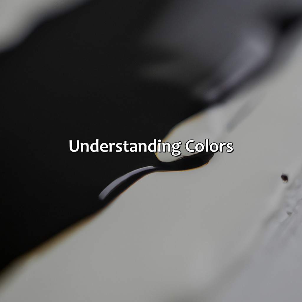
Photo Credits: colorscombo.com by Dennis Wilson
Grasping colors? Dive deeper! Check out hue, saturation, value, color models, and Pantone. Learn about Additive vs. Subtractive Colors, like RGB, CMYK. Or examine Primary Colors vs. Secondary Colors. Also, the color wheel and color palette help explain it all.
Additive vs. Subtractive Colors
Colors come in two varieties – additive and subtractive. Additive colors combine to form new colors, while subtractive colors remove wavelengths of light to create the final color. RGB is an example of additive color, while CMYK is an example of subtractive coloring.
| Additive Colors | Subtractive Colors |
| Use Red, Green and Blue light to form a new color. | Use Cyan, Magenta, Yellow and Black ink to block certain colored light. |
| Commonly used in technology such as screens and displays. | Commonly used for printing documents or artwork. |
It is important to note that computers use RGB colors, but when you print something from a computer it uses CMYK. Understanding these differences can help ensure your printed materials look the way they should.
These colors are also important when designing websites, logos and other visual branding materials. Additive color choices will impact how your design looks on screens while subtractive impacts what colors can be printed.
The history of these two types of color goes back centuries – with many different thinkers and designers exploring what new shades could be formed through experimentation. Today’s technology means that we have access to hundreds if not thousands more options for creating vibrant, striking visuals.
Primary colors are like the popular kids on the color wheel, while secondary colors are their slightly less cool sidekicks in the color palette.
Primary Colors vs. Secondary Colors
In the world of colors, it is essential to understand the distinction between primary and secondary tones. These hues play an integral role in color theory, which guides artists and designers in creating an aesthetically pleasing color wheel and color palette.
| Primary Colors | Secondary Colors |
| Red | Purple (Red + Blue) |
| Yellow | Green (Yellow + Blue) |
| Blue | Orange (Yellow + Red) |
These primary colors are the basis for all other colors, while secondary shades are created by mixing two primary hues. It’s crucial to note that primary colors cannot be created by blending other tones.
Understanding these variations will help you mix colors correctly and achieve desired results in your design project. Additionally, it can also aid you in selecting a harmonious color palette for your artwork or design project.
For instance, Secondary colors can be valuable when used sparingly to add variety or emphasize specific elements on your creation.
By mastering the differences between primary and secondary colors, you’ll increase your understanding of how hues interact with each other, making you a better artist or designer.
Don’t miss out on this fundamental aspect of color theory; understanding Primary and Secondary Colors can significantly impact how successful your design projects become.
Mixing black and white creates a timeless color scheme that’s both monochromatic and achromatic – perfect for when you want to look sophisticated without trying too hard.
What Happens When You Mix Black and White?

Photo Credits: colorscombo.com by Willie Davis
Let’s explore the mixing of black and white. We’ll look at:
- Complementary colors
- Monochromatic
- Achromatic
- Grayscale
We’ll explain the science behind gray. We’ll study its different shades and values too. Plus, we’ll learn about dichromatic, chromatic, tertiary, and neutral colors that make up the science behind gray.
Explanation of the Color Gray
Gray is a unique color that results when black and white come together. It is a varying balance of the two, leading to different shades of gray. The complexity of gray arises from its Value, which varies based on the amount of black or white added. The Value range starts from pure black (Value=0) and ranges up to pure white (Value=100). Different types of Gray, such as cool or warm gray, have specific values that designers can use for various applications.
Gray can evoke different psychological responses in people depending on its shade or value. For instance, darker grays may elicit feelings of masculine energy and sophistication while lighter shades calm the mind. In design, using gray provides a great background for other colors to stand out and create contrast. A pro tip for using gray in design is to pay close attention to the shade’s subtle differences as it can elevate the overall product’s aesthetic appeal.
Get ready for a scientific journey into the world of gray, where dichromatic and chromatic theories collide to form the perfect neutral color palette.
The Science Behind Gray
Gray is a neutral chromatic color that results from mixing black and white pigments or light. When black and white are mixed, the reflected light intensity decreases, resulting in a more muted color. This process is known as achromatic color mixing, which contrasts with additive or subtractive methods. In contrast to dichromatic primary colors such as red, green, and blue or secondary chromatic colors like purple, orange and green; gray is an achromatic tertiary color.
Gray is formed through a combination of black and white – but it’s not always an equal amount of both! The balance can vary depending on the desired tone or shade of gray needed for the design. A cool gray can be obtained by adding more blue tones to the mix, while warm grays incorporate hints of brown or yellow. As tints or shades are added to the base gray hue, variations in saturation and value help create depth within a single color.
One fascinating characteristic of gray is that it has no true hue but appears different depending on its surrounding colors because human eyes compare colors relative to one another rather than in isolation. This makes subtle shifts between shades critical when using grays in designs such as logos, illustrations, apparel design or typography.
Did you know? Gray was first documented as a formalized color term in English language usage circa 700 AD – making it one of the earliest recorded instances of any modern European language using a specific named color!
Gray: the only color that can go from cool to warm and still be considered neutral.
Shades of Gray
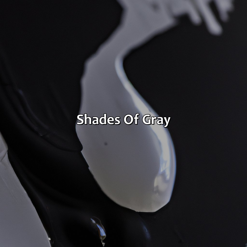
Photo Credits: colorscombo.com by Timothy Gonzalez
To know the subtleties of gray hues, explore the “Shades of Gray” section. Here, you can learn the differences between cool and warm gray. Also, discover how tints and shades of gray can be made by blending colors.
Cool Gray vs. Warm Gray
Gray is a versatile color that can add depth and sophistication to any design. One aspect that designers consider when choosing a shade of gray is whether it should be cool or warm. Cool grays tend to have blue or green undertones, while warm grays have yellow or brown undertones.
| Cool Gray | Warm Gray |
|---|---|
| 50C | 50W |
| #8C92AC | #9B9686 |
| Blue-Green Undertones | Yellow-Brown Undertones |
Cool grays are often used in modern and minimalist designs, as they convey a sense of sleekness and clarity. On the other hand, warm grays can lend a cozy and inviting feel to a design. Designers often choose warm grays for more traditional or rustic styles.
It’s important to note that cool and warm gray shades can also vary within themselves. For example, some cool grays may lean more toward green than blue, while others may have a slight purple undertone.
In fact, there are hundreds of different shades of gray, each with its own unique personality and effect on the viewer. With this in mind, it’s crucial for designers to carefully consider which shade of gray will best complement their specific design needs.
A designer once shared how she chose a cool gray shade for a client’s branding because it aligned with their brand values of innovation and modernity. The chosen shade conveyed professionalism while also standing out among competitors who used warmer colors like reds and oranges.
Mixing tints and shades of gray is like creating a grayscale rainbow – except with less unicorns and more black and white.
Tints and Shades of Gray
Tints and shades of gray refer to the variations that exist in the color gray. These variations are created by mixing colors, adding or subtracting black or white to a base color. The different tints and shades of grey can add depth and texture to design while also evoking emotional responses.
The following table shows the Name and Color Code of some popular gray shades:
| Name | Color Code |
|---|---|
| Cool Gray 1 | #D9D9D9 |
| Cool Gray 5 | #B3B3B3 |
| Cool Gray 10 | #999999 |
| Warm Gray 1 | #E6E2DA |
| Warm Gray 5 | #CCC6BF |
| Warm Gray 10 | #B3ADA7 |
Gray tints can be achieved using any primary color with varying amounts of white added. Similarly, gray shades involve adding different portions of black to a base color. For example, this table shows the hex codes for cool gray and warm gray tints and shades.
While cool grays tend to convey a more modern feel, the warm grays evoke feelings of comfort and coziness. Experimentation with these variations can lead designers to unique combinations that will make a visually appealing palette for their projects.
Historically, early human civilizations used charcoal dust as their sole means of creating shades of gray for art purposes such as cave paintings as it often complemented red ochre pigments found on rocky surfaces where they conducted painting activities.
Gray areas in design can create a subtle and sophisticated look, or a moody and dramatic atmosphere depending on the contrast and texture used.
Applications of Gray in Design

Photo Credits: colorscombo.com by Terry Scott
To use gray in your designs successfully, it’s important to grasp its meanings in color psychology, cultural symbolism, and art history. We’ll look at the different ways gray is used in design – from art to fashion and branding. Read on to discover the psychological and cultural importance of gray, plus tips on how to use it in your designs.
Color Psychology of Gray
Gray is a unique color in terms of color psychology and cultural significance. It conveys neutrality, balance, professionalism, and sophistication. Symbolically, it represents practicality, conservatism, and stability. Gray is often used in a variety of designs as it balances the contrasting colors with its lightness or darkness.
In design and branding, gray is often used to connote responsibility while being less harsh than black. Its connotation with honesty makes it an excellent choice for use in logos and materials in professional settings. Additionally, gray is commonly found as a backdrop behind brighter colors to increase their contrast.
It’s worth noting that cultural contexts can influence the interpretation of gray. For example, in some parts of Asian cultures, gray represents mourning or misfortune as it’s often associated with ash or dust. In the western world, however, gray is more likely to represent formality and elegance.
A leading car manufacturer wanted to reinvent its brand image by updating their logo. The previous logo consisted of blue letters on white background while the new one had all black letters on a muted gray background. The rebranding company intended for the new logo design to match the company’s target audience – mature professionals who preferred elegant simplicity over bright colors. After analyzing the success rate of this change along with client feedback they realized that most users appreciated this sophistication conveyed by using gray color in combination with black fonts.
Gray: the ultimate versatile color that can make any design look cool, modern, and chic – just like a minimalist art piece or a high-end fashion outfit.
How to Incorporate Gray in Design
Incorporating shades of gray is crucial in design as it creates a sense of sophistication and elegance. One can include gray in their design by pairing it with warmer tones, making it the dominant color, or using it to create contrast. To achieve balance, consider minimalistic design principles that highlight the importance of white space and contrast.
Gray is an essential color across various industries, such as minimalist art, op art, fashion, home decor, branding and art history. Embrace this versatile shade to enhance any design aesthetic and create a cohesive look that resonates with your brand.
Five Facts About What Color Black and White Make:
- ✅ The combination of black and white creates a grayscale, or monochrome, effect. (Source: Lifewire)
- ✅ Mixing black and white in equal parts creates shades of gray, while adding more black creates darker shades, and adding more white creates lighter shades. (Source: Color-Meanings.com)
- ✅ When printed, black and white images can create a high level of contrast, making them ideal for certain types of designs and photography. (Source: Digital Trends)
- ✅ Black and white are often used together to create a timeless and classic look in fashion and home decor. (Source: The Spruce)
- ✅ The psychological impact of black and white can vary, with black symbolizing power and authority, while white can represent purity and innocence. (Source: Psychology Today)
FAQs about What Color Does Black And White Make
What color does black and white make?
Black and white make gray.
Is gray the only color black and white make?
Yes, gray is the only color black and white make when mixed together.
Can you change the shade of gray produced by black and white?
Yes, the shade of gray produced can be changed by altering the amount of black and white used in the mixture.
What happens if you mix black and white with other colors?
If you mix black and white with other colors, the resulting color will become tinted or shaded depending on the quantity of black or white added.
Can you make other colors by mixing black and white with additional colors?
Yes, by mixing black and white with other colors, you can create an array of tones and shades, but not entirely new colors.
Is gray a neutral color?
Yes, gray is a neutral color as it lies between black and white, which are both considered neutral colors as well.