Key Takeaways:
- Pink and blue make purple: When mixed together, pink and blue pigments create various shades of purple depending on the proportions used. This is due to color theory and the blending of primary colors to create secondary colors.
- Understanding tints and shades: Mixing pink and blue can create different shades of purple by adjusting the amount of white or black added to the mixture. This technique is used in color theory for artists and designers.
- Applications of pink and blue mixtures: The versatile color of purple created by pink and blue is used in various fields such as art, design, advertising, marketing, fashion, and interior design. The color combination is associated with creativity, luxury, and sophistication.
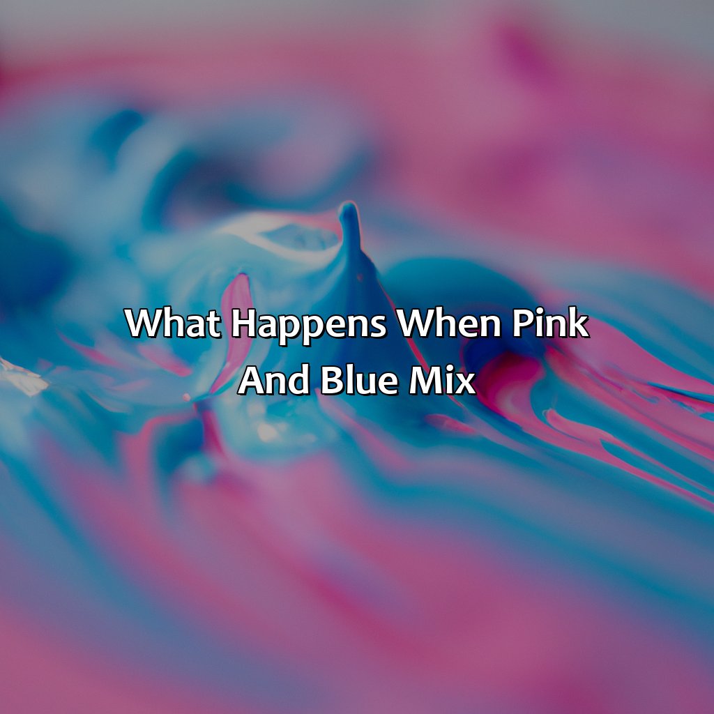
What Happens When Pink and Blue Mix
Photo Credits: colorscombo.com by Lawrence Williams
When pink and blue combine, they create the color purple. This is due to color mixing, which is a fundamental principle of color theory. The combination of different colors can result in an entirely new hue. Pink is a lighter shade of red, while blue is a primary color. When pink and blue come together, they mix to form the secondary color, purple.
Color combination is an essential aspect of design and art. By understanding how colors interact with one another, one can create beautiful and harmonious compositions. The combination of pink and blue is a popular color scheme, commonly used in branding, fashion, and home decor. It’s crucial to consider the psychology of colors when creating a color palette, as different hues can evoke various emotions.
It’s worth noting that not all color combinations are aesthetically appealing. While there are many different color combinations to choose from, some may not work well together. It’s essential to consider factors such as saturation and tone when combining colors. By experimenting with different color palettes, one can create unique and impactful designs.
In addition to its aesthetic significance, the history of color mixing is also fascinating. The study of color theory dates back to the 18th century when scientists and artists began to experiment with pigments and color combinations. Over time, color theory has evolved, and today it plays a crucial role in various fields, including art, design, and marketing.
The Science of Color Mixing
To learn about color science, look at the sub-sections: Primary Colors and Secondary Colors. Plus, Mixing Pink and Blue Pigments. Artists and designers need to know how colors work together. Mastering color theory is key.
Primary Colors and Secondary Colors
Mixing colors has always fascinated us – the way two or more colors come together to create something new is exciting. Speaking of color-mixing, every color can be identified as a blend of primary colors in different proportions, and these primary colors are the crux. Mixing two primary colors results in a secondary color that’s unique and has its own identity.
- Primary Colors – Colors that cannot be created by mixing other colors. These colors can only be obtained from natural sources or pigments. There are three primary hues, namely Red, Yellow, and Blue.
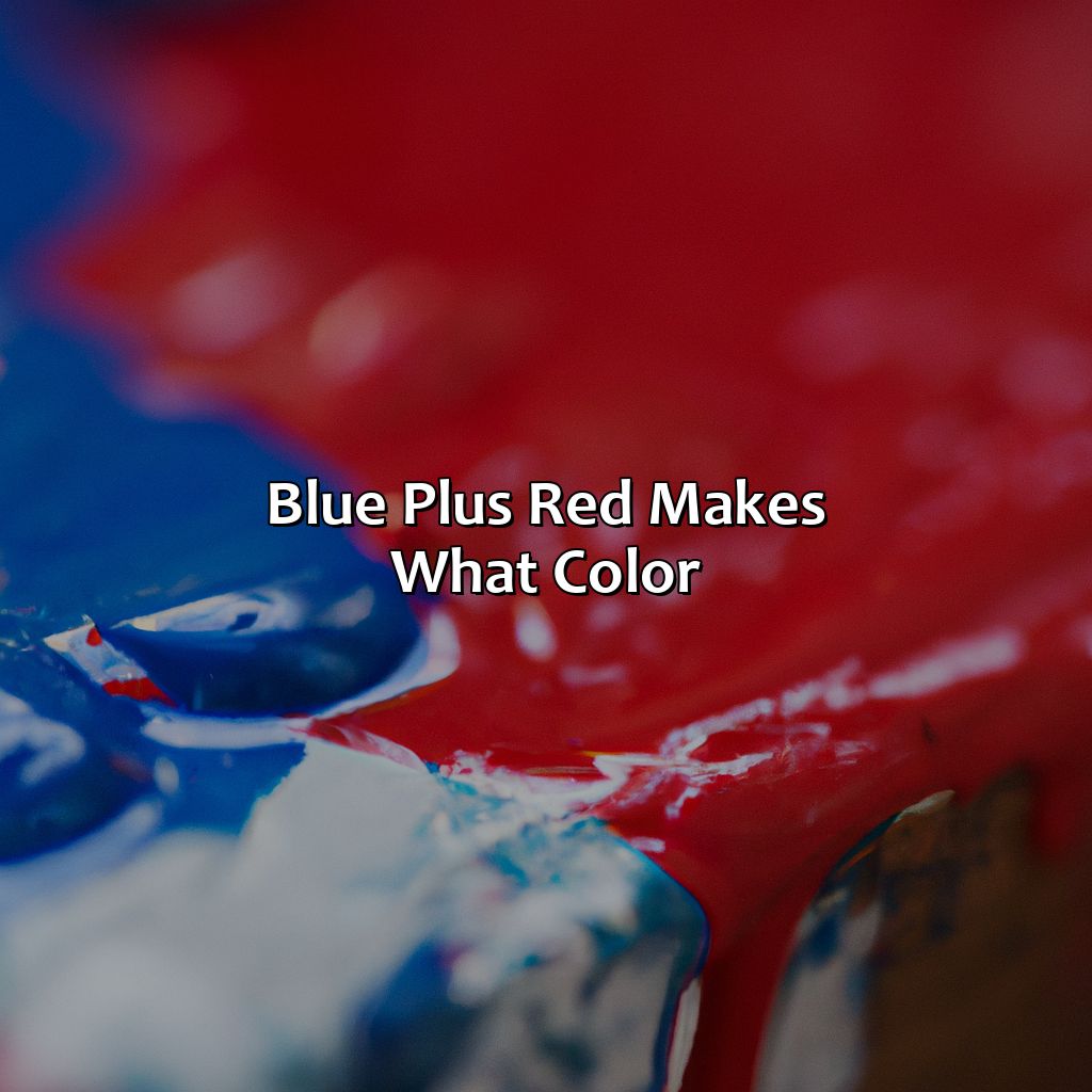
- Secondary Colors – When two primary hues are mixed evenly in equal amounts, they produce a secondary hue that’s unique and distinct. There are three secondary hues: Green (Yellow + Blue), Orange (Red + Yellow), and Purple (Blue + Red).
- Tertiary Colors – When one primary color mixes with small amounts of another primary or another secondary shade, it produces tertiary shades like Magenta (Red + Purple) and Teal (Blue + Green).
Understanding the fundamental difference between primaries and secondaries is critical for any artist or designer looking to blend shades to make their perfect pigment.
Pro Tip: The rule of thumb when blending primaries into secondaries is to start with bits of one hue at a time until the desired shade is achieved.
Why choose between pink and blue when you can mix them into a dreamy shade of lavender? It’s like getting two colors for the price of one!
Mixing Pink and Blue Pigments
Below is an example of how Pink and Blue paint colors mix together to create different shades of purple:
| Pink | Blue | Mixed Result |
|---|---|---|
| Light Pink | Light Blue | Lavender (light purple) |
| Medium Pink | Cerulean Blue | Bright Purple |
| Dark Pink | Ultramarine Blue | Deep Purple |
The final result may vary depending on several factors, including the amount of paint used, the tone, and type of colors mixed. Tints and shades can also affect the final outcome. In addition, certain paints may possess pigments that react differently when combined with others.
In art and design, pink and blue mixtures can be utilized creatively for backgrounds or accents in a piece. They are also commonly used in advertising and marketing to convey softness or sophistication. In fashion, designers combine pink and blue hues for playful springtime patterns or sophisticated evening gowns.
Interestingly, pink was once considered a masculine color while blue was associated with femininity until it switched around in the mid-20th century.
A true fact about color mixing is that it employs two methods: additive mixing (mixing light) and subtractive mixing (mixing pigments).
Mixing pink and blue creates the perfect harmony of shades, producing beautiful gradient colors from pastel violets to deep purples.
Results of Mixing Pink and Blue
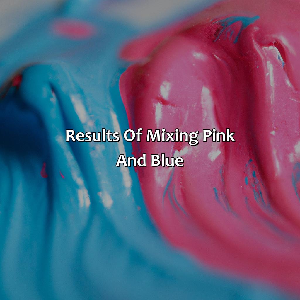
Photo Credits: colorscombo.com by Arthur Green
To grasp how pink and blue combine to make purple, take a look at the outcomes of mixing them with our guide on color blending. Discover how to create various tints of purple by utilizing color blending techniques and how to put them into a color scheme or palette. Delve deeper into color theory by understanding tints and shades. Also, learn how things such as color correction and grading software can influence the ultimate color result.
Producing Shades of Purple
Combining pink and blue pigments produces beautiful shades of purple, which can be used in various applications. Color blending is an art in itself, and creating the right color scheme requires a keen eye for color harmony. The shade of purple produced depends on the amount of each color added. By simply adding more blue to the mix results in a deeper shade of purple. Understanding tints and shades are crucial when creating different hues and shades of a color.
Creating unique shades of purple involves experimenting with several factors, including lighting conditions, transparency of each color, and how much pigment is used. Depending on these factors, the resulting hue can vary from a subtle lavender hue to a deeper indigo tone.
An interesting aspect in producing shades of purple through mixing pink and blue is how it can be utilized in different industries like art and fashion design. Artists can use this knowledge to create beautiful artwork with various tones and contrasts using combinations of colors for their designs. Similarly, fashion designers also incorporate these shades into their clothing collections by creating unique prints that exhibit modernity while maintaining traditional elegance.
The combination of pink and blue demonstrates how versatile colors can be when blended correctly to produce unique results. It is essential to have a clear vision when working with colors as every slight variation affects the final outcome.
According to Science Daily, “Purple combines stability (blue) with energy (red), giving it qualities such as creativity, wisdom, dignity, grandeur.” Hence many logos have been designed using this color scheme because it gives off an essence of royalty and sophistication – the perfect representation for brands looking to depict quality products or services they offer.
Overall, pink & blue mixes from natural pigments showcase the numerous possibilities that exist when blending colors – providing flexibility across multiple fields like art, design or marketing! Get ready to become a color connoisseur as we dive into the world of tints and shades in color theory.
Understanding Tints and Shades
Understanding the Differences between Tints and Shades
Tints and shades are two essential components of color theory, which every designer should grasp to create the perfect color palette. Tints refer to a hue mixed with white, while shades indicate adding black pigments to a hue. The outcome creates various levels of lightness or darkness, which describes the property of colors we refer to as value. A lower value indicates that we have more pigments, making it darker, whereas a higher value means there is more white, creating a lighter shade.
The most significant difference between tints and shades is their contrast level in terms of brightness and saturation. In the case of tints, the hues become brightened and produce a pastel-like appearance that’s softer on the eyes than pure hues. On the other hand, shades add depth to designs by providing dimmed versions of pure hues that are used frequently in shadowy elements. Designers use these properties when dealing with backgrounds, foregrounds or subtle highlights to convey mood and make design elements distinct.
To ensure that you can use tints and shades effectively in your artwork or design projects, it’s crucial to understand how they relate to one another concerning hue values. This knowledge will help you mix any desired hue from scratch by not only experimenting with combining primary colors but also by getting familiar with manipulating lightness or darkness for variations using either tint or shade depending on what suits best.
Color correction can be a real mood changer, just like finding out your crush likes pink and blue mixed together.
Factors Affecting the Final Color
The color that results from mixing pink and blue can be affected by various factors. These could include the amount of pigment in each color, the type of pigments used, and the lighting conditions under which the mixing takes place.
The following table shows the Factors Affecting Color:
| Factors Affecting Color | Description |
|---|---|
| Pigment Concentration | More of one color than the other will result in different shades of purple. |
| Lighting Conditions | The same mixture may appear different under different lighting conditions. |
| Type of Pigment | Different types of pigments have varying hues and saturation levels which affect the final color produced. |
| Color Correction & Grading Software | A software can be used to enhance/ correct colors in a digital image or video for accuracy or aesthetic purposes. |
| Color Accuracy & Calibration | Factors such as screen calibration, ambient light, and monitor quality, etc., should be taken into account for accurate representation of colors. |
Colors could also be corrected or graded using specialized software. This approach helps to edit out any shortcomings resulting from inadequate lighting conditions or differences in pigmentation between dyes. Without this capability, there is no guarantee that people looking at a television show or motion picture would view it with consistent colors across all their devices.
It’s important to note that tints and shades comprise a vast spectrum beyond mixing just pink and blue. For instance, while testing paint samples on walls or clothing fabrics before committing is advised to achieve the desired outcome.
In 2017, a photo of a dress went viral online and baffled many as to what color it actually was. It was later determined that due to differences in lighting conditions, many saw the dress differently. This story highlights how important factors such as light and viewing environment are when it comes to perceiving colors accurately.
From gendered clothing to psychological association, pink and blue mixtures have infiltrated every aspect of our lives, proving to be a versatile and captivating color combination.
Applications of Pink and Blue Mixtures
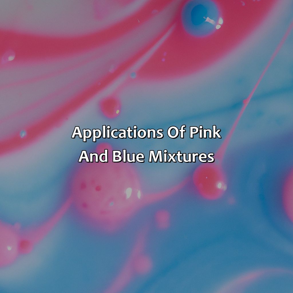
Photo Credits: colorscombo.com by Ronald Jones
To comprehend the use of pink and blue combos in various arenas, such as color psychology, color symbolism, color association, color energy, color meaning, color trends, and more, check out this section on Applications of Pink and Blue Mixtures.
In this section, we’ll investigate the importance of this color in:
- Art and design
- Advertising and promotion
- Fashion and clothing
Each subsection will include the essential terms like color symbolism, color trends, color psychology in marketing, and more.
In Art and Design
The use of color in design plays an integral role in creating visually pleasing art. Mixing different colors together can enhance the visual appeal and evoke certain emotions in the viewer.
When it comes to pink and blue mixtures, their versatility makes them perfect for abstract art. By combining them in varying shades, designers can create unique color harmonies that draw the attention of the audience.
Below is an illustration of how mixing pink and blue pigments results in different shades of purple:
| Pink | Blue | Color Result |
|---|---|---|
| High concentration | Low concentration | Dark Purple |
| Low concentration | High concentration | Light Purple |
| Equal Concentration | Equal Concentration | Medium Purple |
Factors such as lighting, surface texture, and proportions can affect the final shade produced. Therefore, taking note of these factors is essential when mixing pink and blue or any other colors.
In summary, mixing pink and blue pigments offers significant opportunities for designers looking to create aesthetic color harmony in art. For example, carefully selecting shades of purple produced by their mixture creates a beautiful visual balance that appeals to the viewers’ senses.
In the world of advertising and marketing, the right mix of pink and blue can evoke emotions of trust, calmness, and creativity among consumers.
In Advertising and Marketing
Pink and Blue Mixture in the World of Advertising and Marketing
Pink and blue colors have their significance in advertising and marketing.
- Brands use pink to evoke femininity, romance, and sweetness in products related to women or girls.
- Blue is commonly used in ads that promote trust, loyalty, and security. It also symbolizes authority.
- The color combination of pink and blue can be used to represent balance, harmony, and gender equality.
- Pink and blue mixtures can be applied in health-related products as they are known to promote calmness, relaxation, and healing.
- Color psychology in marketing suggests that using pink and blue together can trigger an emotional response of happiness or contentment among consumers.
- Care must also be taken while targeting customers from different cultures as color symbolism varies across cultures. Pink may signify purity or death in some cultures while blue represents evil or bad luck in others.
There are unique details about the use of these colors which make them a popular choice for branding.
Pink & Blue are frequently used for promoting both masculinity & femininity through symbolic design.
In history, the color revolution began with Eugene Delacroix’s famous painting titled “Liberty Leading the People” (1830). This led Edouard Manet to produce his own unique mix by combining cobalt blue & rose hues that became one of his signature styles.
Looking to make a bold statement? Try combining pink and blue in your fashion choices for a trendy and eye-catching look that’s sure to turn heads.
In Fashion and Clothing
Pink and blue mixtures have a significant impact on the fashion industry, with several designers and brands using these colors to create stunning designs. The combination of pink and blue has always been a popular choice among clothing brands for their versatility and their ability to create unique color combinations.
In fashion and clothing, pink and blue blends are used to produce shades such as lavenders, lilacs, mauves, and violets. These colors are often incorporated into clothing in various forms like prints, solid fabrics or accessories. Pink is considered a feminine color while blue is perceived as a masculine color. Blending these two colors can create gender-neutral colors that appeal to both genders.
Color in branding is crucial in the fashion world as it plays an essential role in the brand’s identity. Choosing appealing color combinations can influence consumer perception of a brand’s personality and values. Companies use different colors in their logos, packaging or advertising materials to attract people’s attention. Color trends change regularly; hence it is essential to stay updated with market trends.
The makeup industry also uses pink and blue mixtures extensively. Makeup artists blend different shades of pink and blue eyeshadows or lipsticks to produce striking looks that enhance their client’s facial features; furthermore, nail polish companies blend pinks and blues to come up with colorful tints perfect for suitable personalities.
In a true story about color combinations: A reputable high-end handbag brand experimented by introducing playful pastel-colored handbags made possible through the combination of pink & blue pigments creating numerous lavender hues combined with other secondary colors proved instrumental in increasing sales among younger more adventurous clientele whilst retaining existing customers’ loyalty through signature luxe leather product lines boasting rare statement-making pieces- perfect for bold consumers seeking attention-grabbing accessories!
Five Facts About What Color Does Pink and Blue Make:
- ✅ Mixing pink and blue creates the color purple. (Source: Color Meanings)
- ✅ The shade of purple obtained depends on the amounts of pink and blue used and their respective hues. (Source: Color Combos)
- ✅ Pink and blue are both considered tertiary colors, meaning they are made by mixing a primary color with a secondary color. (Source: Creative Bloq)
- ✅ The color purple is associated with royalty, luxury, and power. (Source: Bourn Creative)
- ✅ Purple is also often used in branding and marketing to convey sophistication, creativity, and innovation. (Source: CoSchedule)
FAQs about What Color Does Pink And Blue Make
What color does pink and blue make?
Pink and blue combinations create a new color known as purple. When used in equal parts, pink and blue provide a perfect balance that results in a light or medium shade of purple.
What are some variations of pink and blue color mixes?
When different amounts of pink and blue are used, the resulting shades can range from pale, soft hues to vibrant, bold colors. For example, adding more pink than blue produces a lighter shade of purple, while increasing the amount of blue results in a deeper, darker shade.
Can other colors be used with Pink and Blue?
Absolutely! Pink and blue are often combined with white, grey, and black to create a variety of different color palettes. They can also be mixed with other bright colors like yellow, green, or orange for a fun and playful look.
How can I use pink and blue color schemes in my home decor?
Pink and blue color schemes can be used in a variety of home decor styles from traditional to modern. Consider using a light shade of blue on the walls and a pop of pink in the accessories to create a fresh, inviting look.
What are some popular brands that use pink and blue in their logos?
Many well-known brands use pink and blue combinations in their logos, for example, T-Mobile, Twitter, and Barbie, to name a few. These colors are often seen as playful, energetic, and youthful.
Are there cultural associations with the colors pink and blue?
Yes, in western cultures, the color pink is often associated with femininity, while blue is associated with masculinity. However, in other cultures, these color associations may be different or even non-existent. It’s important to consider the cultural context when using these colors.