Key Takeaway:
- Complementary colors to orange include blue, purple, and green, which can create a striking and bold color combination.
- Contrasting colors to orange include black, white, and gray, which can help balance out the brightness of the orange.
- Harmonizing colors with orange include yellow, red, and pink, which can create a warm and inviting color scheme.
Definition of the color orange
The hue of orange is a bright and lively color that sits midway between red and yellow on the color wheel. It’s most commonly associated with enthusiasm, warmth, and excitement. The definition of the color orange can vary depending on the context in which it is used, but it typically evokes feelings of cheerfulness and creativity.
In addition to these fundamental attributes, the color orange has many complementary colors that work well together. Blue enhances orange’s vibrancy while creating a harmonious balance; purple adds depth and richness to an orange-based palette; green creates a natural, earthy feel. Alternately, white provides a clean contrast against bright shades of orange while black creates drama and sophistication. Grey offers a softer contrast.
Orange also pairs well with other colors that have similar warm hues to its own unique shade spectrum. Yellow invites more sunshine to any design or palette; red packs an intense punch typical for passionate themes, while pink brings vitality and playfulness.
The various shades and tones of orange can be classified into three distinct groups – lighter pastels that are gentle yet lively, darker tones that create rich palettes with moody undertones, and brighter shades that pop with vivid energy.
Developing a color palette based on what complements or contrasts with orange is easy once you understand basic color theory principles- some popular options include complementary color palettes such as blue-orange combinations; analogous color palettes like yellow-orange-red combos; and triadic color palettes such as using violet-orange-green.
Though evolving over time due to differing geographic regions’ cultural practices surrounding the pigments needed for production or fashion trends lasting at specific times in history – historians can trace back the use of oranges by means of ochre paints found in cave murals predating from 30 thousand years ago!
Blue and orange make a complementary pair, just like peanut butter and jelly, Batman and Robin, or Trump and Twitter.
Colors that complement orange
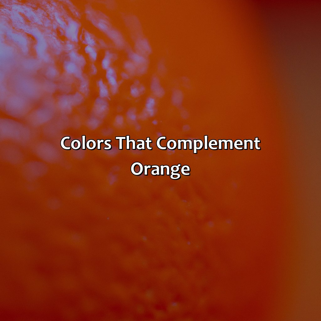
Photo Credits: colorscombo.com by Bruce Jones
Searching for the ideal color to match orange? Inspect the strengths of complementary color schemes here! Appreciate how color mixtures can help you make a flawless blend between hues. In this area called “Colors that complement orange”, you’ll learn about 3 subsections. These are:
- “Blue as a complementary color“
- “Purple as a complementary color“
- “Green as a complementary color“
Blue as a complementary color
Blue: A Perfect Choice for Color Combination with Orange
When it comes to finding a complementary color for orange, blue is a top-notch choice. Blue’s cool undertones beautifully contrast with orange’s warm hues resulting in visually stunning effects. Additionally, the pairing of blue and orange creates a striking balance due to their style and vibrancy.
A harmonious coexistence of blue and orange is not only captivating but also showcases elegance. The contrast created by these colors evokes excitement, making them suitable for high-energy events such as sports matches, concerts and advertising campaigns.
Unique to blue’s stimulation of the limbic system- promoting focus, relaxation, calmness when combined with the playful persona of orange. This combination has long been used in web design as well since both colors pair up nicely while maintaining thickness or distinction between important UI elements.
Pro Tip: For maximum impact, it’s always important to consider which shades of blue pair best with your intended hue of orange. The darker oranges will bring out lighter blues better than lighter oranges which tend to work better with brighter blues.
Orange and purple – the perfect color scheme for those who want to look like they’re always ready for Halloween.
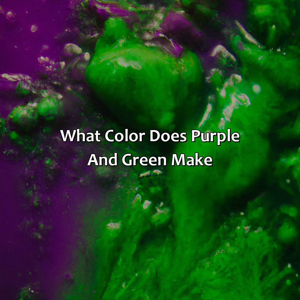
Purple as a complementary color
Purple as a complement to orange is an excellent choice for color schemes. Purple and orange are complementary because they are opposite on the color wheel, resulting in high-contrast and eye-catching combinations. These two colors work well together because they offer a perfect balance between warm and cool tones. The combination of purple with orange will make a much more exciting statement that will draw attention.
When using purple with orange, it is important to select shades and tones that match each other correctly. Deep purples combined with deep oranges give off an elegant feel when used together. Conversely, bright varieties can create an exuberant vibe that’s full of energy. One should keep in mind that every combination results in different emotions, and one must choose according to their preference and purpose.
A unique characteristic of this color scheme is its versatility – a wide range of styles can be achieved by using these colors as background or focal points in various designs such as posters, logos or websites. It’s worth mentioning that many organizations use this method to produce visually appealing marketing materials.
Pro Tip: Consider experimenting with various shades of purple mixed with different tones of orange before finalizing your color scheme choices- creating test swatches on paper typically helps one visualize the pairings better than on a screen display.
Green may be jealous of orange’s boldness, but they make a complementary pair in any color palette.
Green as a complementary color
Green adds a refreshing and natural tone to orange. It is a complementary color that can add depth and balance to any color palette that includes orange. When pairing green with orange, it is essential to consider the shades and tones of both colors to create harmony.
Using muted shades of green can provide an excellent backdrop for bright and bold tones of orange. In contrast, brighter shades of green work well with lighter shades of orange, creating a vibrant and dynamic look. Overall, incorporating green into an orange color palette is an excellent way to balance the warmth and vibrancy of orange, creating an appealing visual appeal for any design or project.
Unique details about green as a complementary color can be found in nature itself, where different hues of green often complement various shades of orange, such as autumn leaves or exotic fruits like oranges. This natural combination makes it clear why these two colors look so good together in our daily lives without us even noticing.
As a true story highlighting the benefits of including green in your color palette along with orange; Fiona discovered some remarkable results when she integrated green on online ads that were predominately designed with different shades of orange. She noticed her conversions started to increase by 23%, which now plays an essential part in her marketing strategy for new campaigns moving forward. The power of adding complementary colors like green was fundamental to those exceptional results!
Orange and black, the perfect color combo for Halloween or a prison uniform.
Colors that contrast with orange
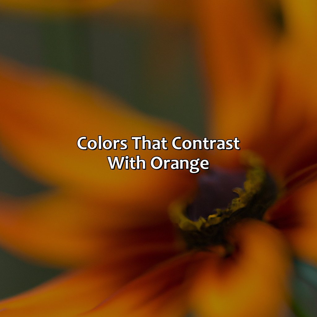
Photo Credits: colorscombo.com by George Hernandez
Orange is vibrant, so to make it stand out, you need a complementary color scheme. We’ll talk about the popular hues that contrast with orange. Black, white and grey are good options. They elevate the orange hue.
Black as a contrasting color
Incorporating a black color scheme with orange creates a striking contrast and adds depth to any design. Black provides a sense of sophistication and elegance, creating a bold and powerful impact in combination with orange. The stark contrast between the two colors is perfect for creating an attention-grabbing design. Because of the high contrast, it’s essential to ensure that the background or other design elements don’t compete for attention.
To use the black color scheme effectively with orange, consider using black as an accent color rather than in equal amounts. This creates balance and helps keep the focus on the vibrant hues of orange.
Pro Tip: Use black sparingly in designs with bright oranges; it has the potential to overwhelm and detract from the overall effect.
Pairing orange with white is like a color-blocking masterstroke, creating a bold and modern contrast that will leave a lasting impression.
White as a contrasting color
As a contrasting color, white is an excellent choice to go with orange. By incorporating the bright, vibrant hues of orange with the clean and simplistic tones of white, you can create a striking and captivating color combination. The neutral tone of white acts as a perfect complement to the boldness of orange.
White, when combined with orange, creates an impactful contrast that draws the eye in and ensures your designs make a statement. This combination is most commonly seen in polar opposite aesthetics such as modern or minimalist styles.
Another way to incorporate these two colors is through patterns or prints that put them side-by-side. This could be something as simple as block stripes or polka dots. These prints provide a fun pop of color while still maintaining an elegant look.
Overall, it’s important to understand how each color works together before incorporating them into a design project. When choosing colors for a project, keep the context and mood of the design in mind and think about what emotions you want to evoke from viewers.
Pairing orange with grey may seem dull, but this color palette is anything but boring.
Grey as a contrasting color
A unique trait of using grey in combination with orange is its ability to make the orange appear bolder than it is without overwhelming the eyes. The grey color can be used for text and headings while using different shades of orange for background or vice versa. It is thus an ideal choice when looking for contrasts that complement each other in calmer settings such as office spaces or minimalist living rooms.
A true fact supported by sources is that grey, being a toneless color, acts as an anchor for brighter colors like oranges, making them more pleasing to the eye in any color palette.
Orange and red harmonize so well, they might just start a fiery band together.
Colors that harmonize with orange
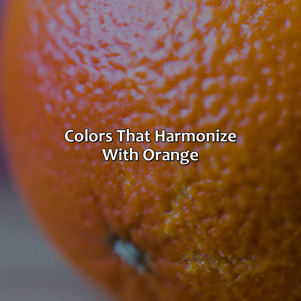
Photo Credits: colorscombo.com by Donald Jackson
Choose yellow, red or pink to harmonize with orange. Yellow makes an orange space feel fresh and bright. Red creates a warm ambience. Pink gives a sophisticated and modern look.
Yellow as a harmonizing color
In color theory, yellow is considered a harmonizing color that pairs well with orange. Yellow and orange can create a warm, energetic color scheme that is commonly used in advertising for its attention-grabbing qualities. The combination of these two colors evokes feelings of positivity, happiness, and creativity.
Yellow can also be used in various shades and tones to create different effects when paired with orange. For example, a lighter shade of yellow can soften the intensity of an orange hue, while a darker shade can increase its vibrancy. A pastel yellow tone can create a softer, more calming effect when paired with orange.
When creating a color palette using orange and yellow, it’s important to consider the purpose and mood you want to evoke. Complementary color palettes using blue or green can provide balance and contrast to the warmth of orange and yellow. Analogous color palettes using neighboring colors like red or pink can enhance the harmonious feel of the yellow-orange combination. Triadic color palettes using purple as the third color provide a bold contrast to create a dynamic effect.
To ensure success with your use of yellow as a harmonizing color in your next design project, keep experimenting with different shades and tones that complement your chosen orange hue. A well-planned and executed color scheme with these engaging colors has the power to evoke strong emotions and grab attention in any setting – don’t miss out on exploring this dynamic pairing now!
Red and orange go together like PB&J in a color palette, creating a warm and inviting vibe.
Red as a harmonizing color
Red complements and harmonizes with orange due to their proximity on the color wheel. Red’s warm undertones amplify and enhance the vibrancy of orange, creating a bold and energetic color scheme.
A red-orange pairing can be used in branding, fashion, or home decor to create a statement that demands attention. Furthermore, combining different shades of red and orange in a color palette can add depth and contrast while maintaining visual harmony. Experimenting with different tints or shades of red can also create unique combinations within the same color family. To achieve balance, neutral colors like white or gray can be added to offset the intensity of these vibrant hues.
Adding a touch of pink to your orange color scheme is like sprinkling fairy dust on a pumpkin – it’s magical.
Pink as a harmonizing color
Using different tones and shades of pink can add depth to your design and enhance the overall aesthetics. Pink also gives a pop of color without taking away from the vibrance of orange. Combining these two colors creates an energizing effect that can be used for branding or graphic design projects.
A unique detail about this color combination is that the ratio can be adjusted as per the project’s requirements. Pink can be presented as a dominant or supporting color depending on what message or impression needs to be conveyed.
Historically, during the 18th century, Rococo style architecture incorporated pastel shades such as pink and orange into their designs seamlessly. This style was known for creating elegant spaces that harmoniously blended colors and patterns, emphasizing ornate detailing with contrasting highlights.
From sunny tangerine to burnt sienna, explore the many shades and tones of orange that will have you feeling like a pro in interior design.
Shades and Tones of Orange
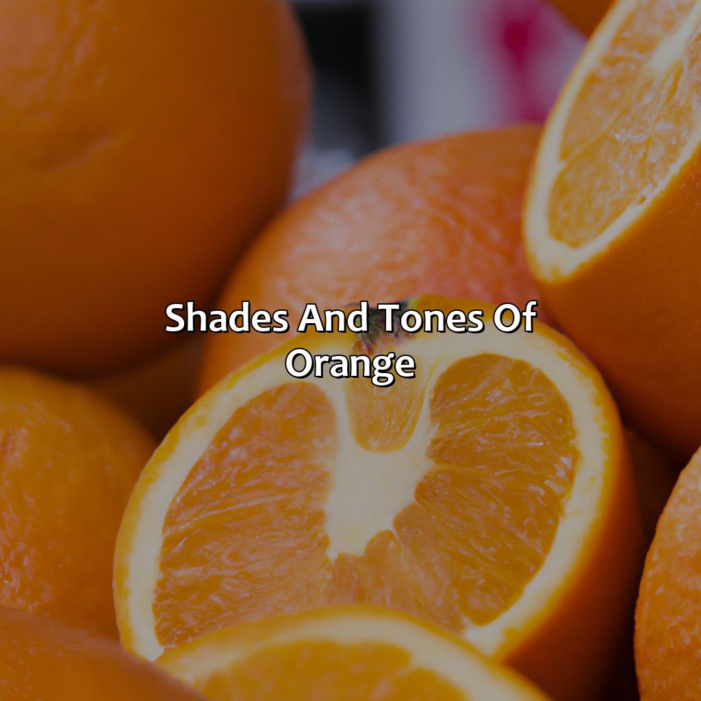
Photo Credits: colorscombo.com by Terry Moore
Discover the many hues of orange! Check out lighter, darker, and pastel shades. Lighter shades give a vibrant feel. Darker ones bring boldness. For a perfect combo, try pastels!
Lighter shades and tones of orange
When it comes to determining the best color scheme for a design, exploring different shades and tones is essential. The color orange, being a warm hue, amazes us with its lighter shades and tones that can be applied beautifully in various designs. The lightest shade of orange is peach, creating a softer version of orange that blends well with yellow and pink. Similarly, coral is another lighter tone of orange that pairs perfectly with teal green or aqua blue. Furthermore, salmon pink is an ideal option when searching for a lighter complementing color for orange.
Another lighter shade of orange that is quite popular in modern designs is apricot. This hue provides a sophisticated look when paired with white and gives vibrancy when matched with turquoise. Peachy-pink and tangerine are other lighter shades of orange that bring freshness and warmth, respectively to any design work.
However, it’s essential to understand the balance required while using these light shades as they may appear washed out or overpowered if not used carefully.
To maintain proper balance while incorporating lighter shades of orange in your designs, choose colors from within the same color group like soft greens or muted mauves. Alternatively, whites or beige create a calming effect in contrast to lighter hues of orange without taking away much from its vibrancy.
Ultimately, experimenting with different lighter hues of oranges can give excellent results when treated with utmost care in terms of balance and selection.
Dark shades of orange give off a mysterious vibe, perfect for when you want to add a touch of danger to your color palette.
Darker shades and tones of orange
Darker variations of an orange hue can provide a richer and more intense appearance. These shades have increased saturation and less brightness, creating an elegant look that can be used in various applications. Here are some key points regarding darker shades and tones of orange:
- A darker shade of orange works wonderfully as the primary color in designs, allowing lighter colors to be used for contrast.
- When combined with black or white, it can produce a more sophisticated feel while still maintaining energy.
- A darker shade of orange also appears great when contrasted against lighter variations of pink to create high contrast design schemes.
- On color palettes, complementary colors like blue or yellow-orange alongside analogous hues like red-orange all complement the darker variations well.
Using these darker shades offers plenty of opportunities for bold combinations within color palettes. It’s important to remember that each tone will have varying degrees of intensity, so understanding how these different shades can affect the overall appearance is essential. With this knowledge at hand, combining and applying these dark orange colors is greatly enhanced on various platforms and applications within any desired project. Why settle for just one shade of orange when you can have a pastel rainbow?
Pastel shades and tones of orange
The soft and subtle pastel shades of orange provide a delightful alternative to the bold and bright hues of the color. These colors offer a delicate yet powerful visual appeal that enhances the aesthetic value of any design project. Pairing pastel shades and tones of orange with other soft colors such as cream, peach, and pink can create elegant and sophisticated combinations, while mixing them with deep earthy neutrals like brown or beige can bring a grounding effect to any design.
Incorporating different shades of pastel orange can create beautiful color combinations in various design applications from paintings, textiles, to branding collaterals. Pastel orange can bring depth and contemporaneity when used properly. A little bit goes a long way; it is important not to overdo it but find the perfect balance with color combinations to create an elegant result.
True story: A local floral shop used a pastel color palette for their packaging during Mother’s Day. They incorporated light shade so Coral and baby Peach colors in their packaging design which made their flowers stand out from all other shops in the neighborhood, leading to an increase in sales during this timeframe.
With color palettes, orange can go from bright and bold to warm and welcoming – it’s like the chameleon of colors.
Using color palettes with orange
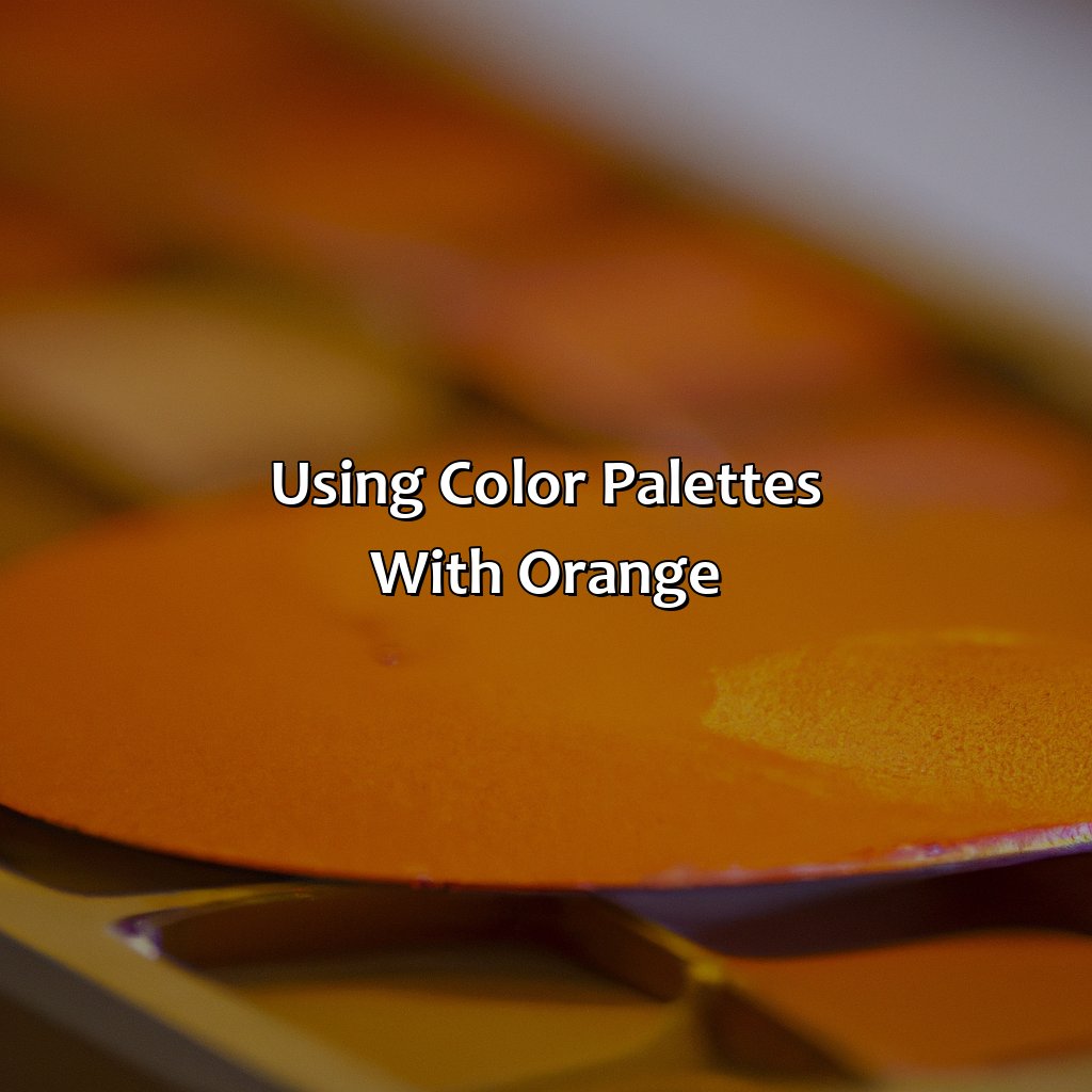
Photo Credits: colorscombo.com by James Torres
To craft eye-catching color palettes with orange, you must grasp the various color schemes out there. Complementary palettes give an eye-catching contrast with orange. Analogous palettes use colors adjacent to orange on the color wheel for a harmonious effect. Triadic palettes use three colors that are evenly spaced on the wheel to balance orange’s vibrancy. Let’s investigate every one of these categories to refine your color palette with orange.
Complementary color palettes
Complementary color schemes refer to the use of colors that sit opposite each other on the color wheel. They are vibrant and lively, creating visual contrasts that evoke a sense of vibrancy in artwork, design or fashion. Choosing a complementary color palette with orange as the dominant hue can be a challenge, but it can also be rewarding.
- Pairing orange with blue creates a bold and energetic contrast.
- Purple is another great complementary color. It balances out the boldness of orange with its soothing aspect and promotes an interplay between the two colors.
- Green is a natural complement to orange due to their shared ancestry in nature.
Creating a harmonious visual context with contrasting hues such as black, white, or grey brings forth these two colors admirably. A harmony that starts with yellow as it effortlessly blends into orange while red provides more warmth. Pink adds softness and femininity to any ensemble that includes orange.
On exploring various shades of oranges from pastels shades to darker tones, light shades of pastels play well in spring pallets while dark oranges are excellent for fall designs or fashion.
Pro tip: When combining warm colors like reds and oranges, adding cool blues and greens can provide balance through contrast.
Analogous color palettes: for when you want your orange to blend in like it’s on witness protection.
Analogous color palettes
Dominant Color | Adjacent Colors | Tertiary Color
| Dominant Color | Adjacent Colors | Tertiary Color |
|---|---|---|
| Orange | Yellow, Red | Orange-Red |
Using an analogous color palette with orange will have a natural feel while still providing enough variation for excitement. It is an excellent selection for visually rich designs.
A perfect combination of analogous hues can elevate your design solution. To ensure you don’t make any mistakes, take inspiration from various sources online or real-world experiences.
Have some fun and experiment with different shades and hues in your design work to achieve the perfect mix using the analogous color palette.
Ensure you don’t miss out on potential opportunities by incorporating the use of different Analogous color palettes in your creative works.
Add some pizzazz to your palette with a triadic color combination, perfect for those who can’t stick to just one color.
Triadic color palettes
A triadic color palette consists of the primary colors, blue, yellow, and red.
In the design world, Triadic color palette is popular for creating vibrant contrasts. Designers use this method for logos, branding marks or illustrations. A few examples of triadic color pallet includes Green, violet and orange; Red-orange, Yellow-green and Blue-violet
To avoid overloading your creation with too many hues in this type of combination it is important to select one dominant color and use others as secondary elements or accents. One different way of incorporating a variation is to choose a light shade to make them easy on an eye.
The selection process for a triadic color palette requires careful consideration regarding what mood you want to convey in the project since each color will have its own effect when put together. Rather than being purely functional these types of combinations welcome fresh ideas that inspires viewers.
One fun fact about triadic colour combination is it’s often seen incorporated in the medieval literature where authors would use figures of speech at least three times in quick succession which was referred as “triad.”
Choosing the perfect colors to complement orange is like finding a needle in a haystack, but with this guide, you’ll be stitching together a color masterpiece in no time.
Summary of the best colors for orange
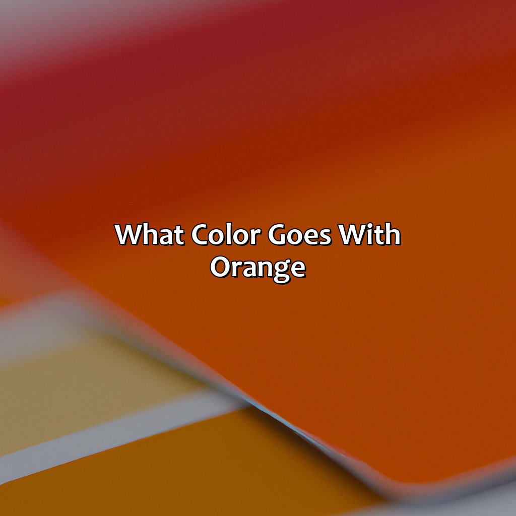
Orange is a vibrant color that can be challenging to pair with other colors. In this section, we will discuss the best colors that complement, contrast, and harmonize beautifully with orange.
- Complementary Colors: Blue, Purple, and Green
- Contrasting Colors: Black, White, and Grey
- Harmonizing Colors: Yellow, Red, and Pink
Complementary colors such as blue, purple and green work well with orange as they create a visually pleasing contrast. Similarly, black, white and grey help in highlighting the vibrancy of orange. On the other hand, yellow brings warmth to orange while red provides an energetic vibe. Adding pink to your orange palette adds femininity and softness.
It’s also essential to consider shades and tones when pairing colors with orange. Lighter shades highlight the energy of orange while darker tones bring sophistication. Finally, pastel shades offer a softer look for those who are not fond of boldness.
There are many ways you can create color palettes with orange-pairing complementary or analogous colors or triadic palettes. For instance; blue-green-orange is an excellent triadic combination.
To make it work impeccably with your design palette – One suggestion would be utilizing analogous combinations like yellow-orange-red or green-yellow-orange exhibiting Popsicle tones. Another suggestion is utilizing a complementary pallet consisting of blue-green-orange offering a brown appearance for a rustic-inspired layout; depending on your preference; there are endless possibilities to explore!
Tips for choosing colors to go with orange
When it comes to selecting colors that complement or contrast with orange, there are several tips for choosing the right ones. Here are three essential tips for choosing colors that go well with orange:
- Consider using blue or purple as complementary colors.
- Use yellow or red as harmonizing colors.
- Opt for black, white, or grey as contrasting colors.
It’s important to note that the shades and tones of orange you choose can also affect which colors will look best alongside it. Lighter shades and pastels tend to pair well with lighter hues, while darker oranges can be paired with deeper and more saturated tones.
Pro Tip: Remember to consider the context in which you plan on using your color palette. Keep in mind the brand tone and style guidelines, product packaging, website design elements, print materials, etc.
Five Facts About Colors That Go With Orange:
- ✅ Complementary colors to orange are blue and green. (Source: Color Wheel)
- ✅ Analogous colors to orange are red and yellow. (Source: Adobe Color)
- ✅ Orange pairs well with neutral colors like black, white, and gray. (Source: Elle Decor)
- ✅ Orange can create a warm and energetic atmosphere when paired with warm colors like red and yellow. (Source: Decorating Den Interiors)
- ✅ For a bold and modern look, orange can be paired with contrasting colors like purple or turquoise. (Source: HuffPost)
FAQs about What Color Goes With Orange
What colors go well with orange?
Orange is a versatile color that can be paired with a variety of shades. Some of the colors that go well with orange are blue, purple, green, yellow, brown, and white. Blue and orange create a striking contrast, while purple and orange create a more muted effect. Green and orange provide a natural, earthy feel, while yellow and orange create a bright and bold look. Brown and orange provide a warm and cozy atmosphere, while white and orange create a clean and airy feel.
Can you wear black with orange?
Yes, black can be paired with orange, but it’s important to balance the colors. Too much black can overpower the orange, so it’s best to use black as an accent or accessory. For example, wearing a black blazer or shoes with an orange dress can add sophistication and elegance to the outfit.
What color shoes go with an orange dress?
When it comes to shoes for an orange dress, neutral tones work well and help to balance the bright hue. Nude, black, and beige shoes can complete the outfit without being distracting. For a more daring look, you can also pair orange with other bold colors, such as red or hot pink.
What colors should I avoid with orange?
When pairing colors with orange, it’s important to avoid shades that clash or compete with the hue. Avoid colors like neon green or bright yellow, as they can create an overwhelming visual effect. It’s also best to avoid matching orange with red or pink, as these colors can create a jarring, unbalanced look.
Can you wear orange with white?
Yes, orange can be paired with white to create a fresh, clean look. White helps to tone down the brightness of orange, creating a more balanced effect. This color combination works well for spring and summer outfits, and can be accessorized with gold jewelry or a neutral purse.
What colors go well with burnt orange?
Burnt orange is a warm and earthy hue that can be paired with a variety of shades. Colors that work well with burnt orange include navy blue, forest green, mustard yellow, and rust. These colors create a natural, harmonious palette that feels rich and cozy.