Key takeaways:
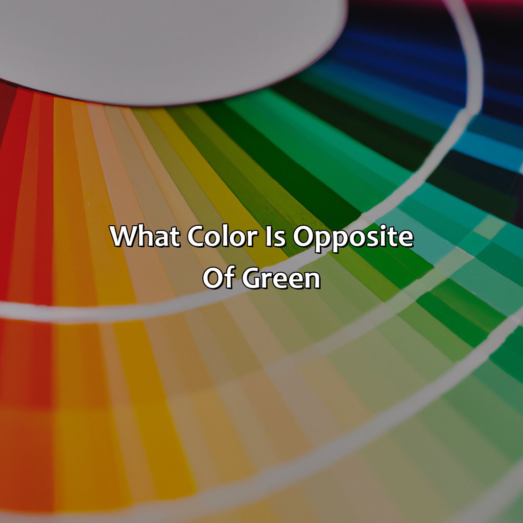
- The opposite color of green is red: This is because of their position on the color wheel, where they are located across from each other. Using red and green together in design can create visual contrast and balance in a color palette.
- Complementary colors are important in color schemes: understanding complementary colors can help in creating harmonious color palettes in design. By pairing complementary colors, you can create visual interest and balance in your design.
- Color has significance in many areas: From art and design, to fashion and branding, to psychology and culture. Understanding the meanings and associations of different colors can help in creating effective and impactful designs.
Understanding Color Theory
Photo Credits: colorscombo.com by Wayne Martin
To comprehend color theory and its rules, investigate the “Understanding Color Theory” section. Focus on:
- The color wheel
- Mixing colors
- Warm and cool shades
- Earthy and lively hues
- Pastel colors
Uncover how primary and secondary colors combine to generate balance and harmony utilizing theories of color mixing and color history.
Primary Colors
Colors that cannot be created by mixing other colors, namely red, blue, and yellow, are known as primary colors. Basic principles of the color wheel theory and color history deem these three hues fundamental because all other colors can be created by mixing them in different proportions. In addition to pigment-based primary colors, there are also light-based primary colors used in digital design – red, green, and blue.
The concept of primary colors is intertwined with color theory which can be traced back to Greek philosopher Aristotle. Modern-day color wheels were developed in the 18th century based on this theory stating that all visible colors are derived from a combination of three primary hues.
Did you know that Sir Isaac Newton was the first to create a circular diagram reflecting the relationships between different hues? This evolution of the color wheel theory laid the foundation for academic teaching on the subject in art schools.
Are you utilizing primary colors effectively? Don’t miss out on learning how to use complementary colors to enhance your designs and visuals further.
Mixing Secondary Colors
Mixing secondary colors is like creating a harmonious symphony – each color must play its part in achieving the perfect balance.
Secondary Colors
Secondary hues are created through the color mixing process of primary colors. These hues include combinations such as orange, purple, and green. Color balance and harmony theory suggest that secondary colors play a vital role in creating visually appealing designs.
- Orange is made by mixing yellow with red
- Purple is made by mixing blue with red
- Green is made by mixing blue with yellow
- Secondary hues often create complementary colors when paired with a primary hue they were not created from.
- In color theory, secondary hues are often used to balance out the overall composition of a piece of art or design.
- The use of secondary hues can create a more dynamic and visually interesting piece when combined with other colors on the color wheel.
Secondary colors help designers achieve color balance, enhance contrast, and create interest. These tones are versatile attributes that play an essential role in interior design, fashion design, graphic design, and art. These tones can evoke a range of moods depending on how they are used.
It’s interesting to note that the concept of secondary colors dates back centuries to ancient Greek philosophers who contemplated color perception. Through time-tested methods for color theory research, secondary colors have become an integral part of modern-day artistry.
Opposites attract, especially in color theory where complementary colors create visual contrast and harmonious color palettes.
Opposite Color
Photo Credits: colorscombo.com by Bradley Adams
To create a perfect color palette, you must grasp the Opposite Color Theory. This theory is also called Complementary Colors. Here, you will learn two sections: the color wheel theory, color mixing, and color harmony theory. Moreover, you’ll study the Red-Green and Blue-Yellow Opposites. This will enable you to easily create a perfect color palette.
How to Find Complementary Colors
To determine the Opposite Color (Complementary Color), you need to find the color on the opposite side of the color wheel theory. To achieve color balance and harmonize your composition, understanding color mixing with compliments is necessary.
Here’s a 6-step guide on how to identify complementary colors for your projects:
- Start by choosing your primary color
- Locate your primary hue/color and identify its place on the color wheel
- The color across from it is its complement/opposite
- To check if it matches, mix them together & access their tone/lightness balance
- You can add secondary colors to further emphasize moods/themes
- Refine the selection by adjusting tone, saturation and value.
It’s worth noting that different applications may require using different proportions of opposing colors to achieve harmony even with followed step guides.
Color theory plays a crucial role in visual art compositions where pairing colors complementarily creates depth, emphasis and other messages that could be transmitted.
Naturally, interior design requires appropriate combinations of complementary colors for creating an aesthetic space aligned with the owner’s preferences while also contributing to a calm ambiance.
Fashion designers use opposites’ pairing because they stimulate excitement through contrast: you might notice this being used often in runway designs or fashion magazines.
According to experts’ research at Tokyo University, looking at complementary color pairs enhances brain activity related to visual process ability (Shibata et al., 2003).
Why settle for red or green when you can have them both? Discover the magic of complementary colors on the color wheel.
Red-Green Opposites
Opposite of green on the color wheel is red. Red and green are known as complementary colors, as they are located opposite to each other in the color wheel. This makes them highly suitable for contrast purposes, particularly in visual arts, interior design, and fashion design. In terms of visual perception, red has a longer wavelength than green; hence these colors create the strongest contrast when placed together.
Red-Green Opposites exhibit an interesting relationship that makes them perfect for applications requiring high-contrast visuals. They complement each other by making their respective colors appear more vibrant when combined or side-by-side. Moreover, the brain interprets these contrasting hues simultaneously to maximize their difference and make the image stand out.
In addition to its use in aesthetics and design, the starkness and contrast between red-green pairs have found diverse applications across several domains such as aviation safety lights, video editing software interfaces among others.
A true fact about these pairings – The most common type of color blindness worldwide is a condition where individuals have difficulty distinguishing between reds and greens. It affects approximately 8% of males and 0.5% of females of Northern European descent (source: Colour Blind Awareness).
Blue and Yellow may make Green on the color wheel, but as Complementary Colors, they’re more of a ‘opposites attract’ situation.
Blue-Yellow Opposites
Blue-Yellow Complementary Colors are vital in color theory. The colors which complement each other and create a striking visual effect are of great interest to designers, visual artists, and fashion designers.
A typical color wheel shows Blue as primary and Yellow as secondary colors alongside other shades. These two colors are complementary to each other, creating a perfect contrast when placed together.
The following table demonstrates the blue and yellow hues along with their hex codes –
| Color | Hex Code |
|---|---|
| Blue | #0000FF |
| Navy | #000080 |
| Sky | #87CEEB |
| Teal | #008080 |
| Yellow | #FFFF00 |
| Gold | #FFD700 |
In addition to designing print media and digital platforms, blue-yellow complements rule interior designs and maintain balance in the space where the room’s paint tone is either blue or yellow.
When we mix two different lengths of waves on the spectrum, we get green light that is created by mixing blue (shorter length) and yellow (longer length). It’s what people perceive when looking at specific combinations that excite these “green” retinal cells.
A study published in ‘Color Research & Application’ stated that among all peripheral hues from the spectrum, blue and yellow always form unique colors due to their fundamental properties. Complementary colors aren’t just for pleasing aesthetics, they’re also a foolproof way to avoid looking color blind.
Applications of Complementary Colors
Photo Credits: colorscombo.com by Austin Scott
Investigate the many ways complementary colors can be used! Start with ‘What color is opposite of green‘. Visual Arts, Interior Design and Fashion Design are the 3 subsections you will be exposed to. Each subsection will delve into color history, color psychology and color symbolism which all influence color selection.
Visual Arts
The use of complementary colors plays a crucial role in creating color contrast within visual arts. Artists have been using color wheel theory to create a balanced composition since the history of art. Color science proves that using complementary colors enhances the visual experience of the artwork.
A painter can choose two opposite colors from the color wheel to create dynamic tension and overall harmony, which gives a lively effect to the viewer’s eyes. Conversely, if two adjacent hues are used in an artwork, it makes it bland and somewhat non-thrilling. Hence, understanding complementary colors is essential for creating impactful art.
An accurate selection of complementing hues can make paintings much more expressive and distinct, bringing attention to various objects or forms within a piece of art. This resonates with the works of Vincent Van Gogh as we can see his bold primary colors complimented by their opposite colors in his paintings.
Color contrast gave birth to various movements and styles within art history; an example is Op art where contrasting hues played a significant role in creating dazzling moments for viewers.
Moreover, this technique is widely used nowadays in contemporary collaborations with artists; Examples include Alex Eagle x Phoebe Bridgers’ album cover where the use of red-orange letters with dark blues spread conveyed warmth and comfort.
Source: ArtGo Blog
Transform your living space with the power of color psychology and symbolism, no renovation required.
Interior Design
The role of color in interior design cannot be overstated. A keen understanding of color psychology in interior design and color symbolism in art can help create spaces that evoke the desired emotions and moods. The complementary color scheme is one way to bring balance to a room, using colors that are opposite on the color wheel for visual interest.
Incorporating complementary colors into an interior design scheme can create a dynamic and vibrant space. By using contrasting tones, designers can achieve a range of effects from energizing to calming, depending on the specific colors selected. For example, pairing blue and orange together creates a sense of warmth while green and red offer a fresh contrast.
When choosing complementary colors for an interior design project, it’s important to consider both the tone and intensity of each hue as well as how it interacts with other elements in the space such as lighting or furniture.
One designer shared their experience using complementary colors in a project where they chose yellow and purple as the dominant hues. They found that this combination created a regal and luxurious atmosphere that perfectly reflected their client’s taste.
In summary, understanding how to use complementary colors is an essential aspect of creating successful interior designs. By incorporating these principles into your work, you can create spaces that feel harmonious, inviting, and balanced all at once.
Why wear black when you can wear a rainbow of cultural and religious symbolism in your fashion design?
Fashion Design
Color plays a significant role in Fashion Design, which has created a new paradigm for fashion enthusiasts. Color in fashion is essential as it represents the individual personality and sets the mood for an event or occasion. The right choice of colors can define the success of any design project.
Color symbolism in different cultures and religions adds another layer to color theory. For example, white is considered a symbol of purity and innocence in Western culture. However, it’s also recognized as a mourning color in some Asian countries. Likewise, red is believed to be auspicious in Hinduism but associated with danger and anger in Western culture.
In contemporary fashion design, designers have experimented with vibrant hues and eye-catching patterns to make their designs unique. Each year fashion trends incorporate new tones that quickly catch on among enthusiasts.
Interesting fact: Coco Chanel’s use of black sheath dress marked a revolutionary change by breaking societal norms regarding wearing black only at funerals. Black was no longer limited to grieving!
Five Facts About the Color Opposite of Green:
- ✅ The color opposite of green on the color wheel is magenta. (Source: Color Matters)
- ✅ Magenta is a combination of blue and pink and is known as a primary subtractive color. (Source: Encyclopedia Britannica)
- ✅ When red and green are mixed in equal amounts, the result is a shade of brown called olive drab, not the opposite of green. (Source: Live Science)
- ✅ Magenta has historically been used in color printing and is one of the four colors used in CMYK printing. (Source: Adobe)
- ✅ The opposite of a color on the color wheel is called its complementary color and can create contrast and vibrancy in design. (Source: Canva)
FAQs about What Color Is Opposite Of Green
What color is opposite of green?
The color opposite of green is red.
Why is red opposite of green?
Red is opposite of green on the color wheel because they are complementary colors.
What are complementary colors?
Complementary colors are those that are opposite of each other on the color wheel and when combined, they create neutral colors.
What are some other examples of complementary colors?
Some other examples of complementary colors are blue and orange, yellow and purple, and pink and green.
How can I use complementary colors in my designs?
You can use complementary colors to create contrast and make certain elements stand out in your designs.
What emotions are associated with the color red?
The color red is often associated with passion, energy, love, and excitement.
