Key Takeaway:
- Burgundy is a rich and versatile color that can vary from deep purple-red to reddish-brown shades, and can have undertones of blue, violet, or brown. Other names for burgundy include oxblood, claret, maroon, and wine red.
- To create burgundy color, mix equal parts of red and blue with a small amount of black or brown. Adjusting the color tone can result in variations like reddish burgundy or brownish burgundy.
- Burgundy is commonly used in fashion, home decor, and graphic design to create a sophisticated and elegant look. It pairs well with neutral colors like black, white, and beige, as well as complementary colors like teal and gold, and analogous colors like pink and purple.
- To maintain the burgundy color in clothing, follow the care instructions on the label and avoid exposing it to direct sunlight or harsh chemicals. For hair and home decor, choose products with color-preserving formulas and minimize exposure to heat and moisture.
What is Burgundy?
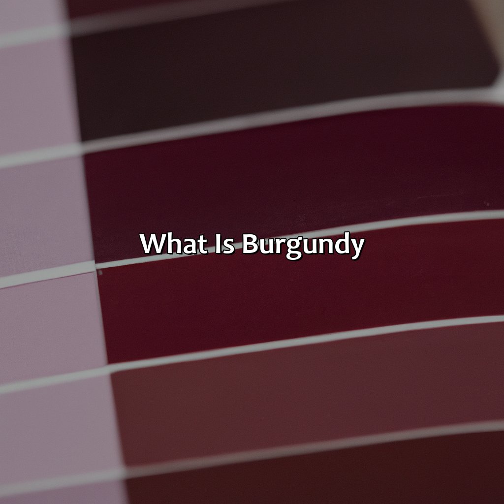
Photo Credits: colorscombo.com by Terry Lee
Burgundy is a deep dark red color similar to that of burgundy wine. It is a shade of red which is often described as having purple tones. This color is also known as bordeaux, garnet, deep purple-red, ruby red, and merlot. Its deep maroon shade has a rich and warm feel to it, and it is often associated with luxury, elegance, and sophistication. It is a popular color in fashion, home decor and weddings. Shades of burgundy include oxblood, mulberry, berry, aubergine, plum, eggplant, currant, claret, magenta, and fuchsia. Its many variations include muted burgundy, pale burgundy, light burgundy, creamy burgundy, antique burgundy, and glossy burgundy.
Burgundy has a timeless appeal and is a popular choice for formal occasions. Don’t miss out on incorporating burgundy into your wardrobe or home decor for a touch of sophistication and elegance.
Creating Burgundy Color
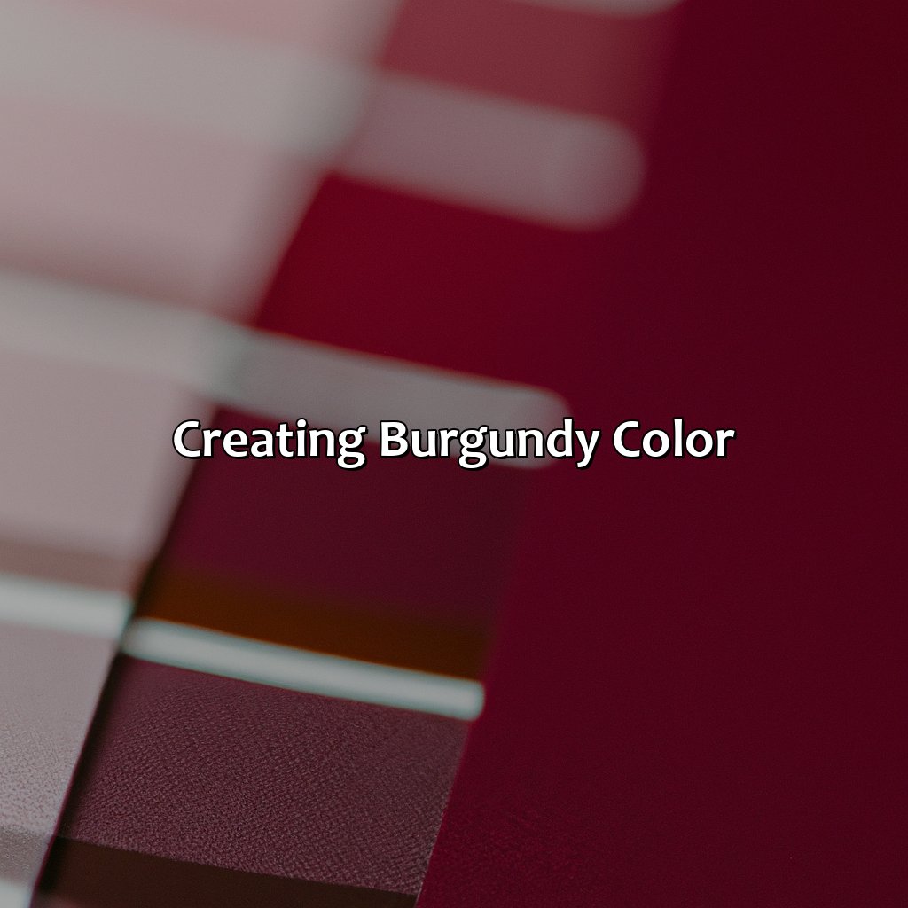
Photo Credits: colorscombo.com by Douglas Nelson
To make burgundy shades, you must know what colors create it. Master the skill of mixing colors and adjusting tones. This section will show you how. Learn how to make that perfect burgundy shade!
Mixing Colors
When creating the rich hue of burgundy, mixing colors is a crucial step. This involves combining different pigments to achieve the desired shade of wine-like color.
To create burgundy, follow these three steps when mixing colors:
- Start by mixing a deep red color with purple.
- Add a small amount of black pigment to darken the mixture and deepen the hue to resemble burgundy.
- Finally, add a touch of brown pigment to enhance the color tone.
Unique details about mixing colors for burgundy include using shades like crimson or maroon as the base rather than just plain red. It is essential to utilize high-quality paint or dye and mix in small increments while constantly checking on the color.
A true history behind mixing colors for burgundy lies within its application in fabric production throughout Europe. In medieval times, dyes were typically made from natural elements such as tree bark or plants. Burgundy was created by combining oak tree bark and lichen found in specific regions in France and Italy which allowed them to produce exquisite fabrics in beautiful shades of this color.
Fine-tune your burgundy hue like a pro by mastering the art of color tone adjustment.
Adjusting Color Tone
Adjusting the Tone of Burgundy Color
To perfect the exact shade of burgundy color, adjusting the tone is necessary. It involves slight enhancements or reductions in various elements to create a unique look.
Here’s a six-step guide to successfully adjust the tone of burgundy color:
- Start with a base color: A dark red or purple can be used as a base.
- Add Blue: Mixing blue and red will bring out the dark, cooler side of burgundy.
- Reduce saturation: By reducing saturation, you can obtain shades that range from deep wine to dusty rose.
- Increase yellow makeup: More yellow pigments will add warmth and brightness to the color.
- Lighten or darken hues: A slight adjustment in lightness/darkness can create a distinct hue.
- Experiment with tints: Adding small amounts of white or black will make your burgundy look lighter or darker respectively.
While adjusting the tone, it’s essential not to overdo any step to ensure desired outcomes.
Unique Variations for Adjusting Burgundy Tones
A mix of brown and crimson colors creates brick house reddish-brown for an unorthodox variation in darker tones than traditional Burgundies. One can also try adding golden tones to uplift brighter aspects in decor.
Don’t settle for stock purples/roses/blues! Adjusting it to perfection depends on deliberate experimentation that requires patience and creativity.
Take Time To Get Optimum Results
Burgundy has always been one of fashion’s dependable colors, so keeping things fresh demands some ingenuity while still maintaining its aesthetic value. Pay attention to all variations and make adjustments accordingly until achieving satisfactory results.
For Originality Purposes, take time; don’t fall back by using identical shades- realize every specific mixture alters everything about this beautiful hue – perfect balance is essential.
Try different approaches till satisfaction while utilizing adjustable variables like lighting intensity in some cases will make various burgundy finishes look different, even experienced interior decorators note these slight nuances.
From haute couture to home decor to digital designs, burgundy is the color that never goes out of style.
Common Uses of Burgundy

Photo Credits: colorscombo.com by Ronald Mitchell
Uncover the amazing uses of burgundy in fashion, home decor, and graphic design! We’ll look at its versatility and examine how it can be used in different applications. Check out our sub-sections to learn more. Here, we’ll introduce you to the ways burgundy works in fashion, home decor, and graphic design.
Fashion
To incorporate burgundy into your wardrobe, you can choose clothes in this color such as jackets, pants, skirts, dresses or accessories like bags, shoes or scarves. Burgundy also pairs well with other colors like gray, black, white or even pastel shades.
In addition to personal style choices, the fashion industry often incorporates burgundy into runway collections each year. Designers may showcase this color in different textures such as suede or velvet to add a touch of sophistication.
For those who want to stay on trend with burgundy but prefer subtlety over boldness, they could try incorporating small details of the color into their outfits such as lingerie or socks.
Overall, adding burgundy to your fashion choices can elevate your look effortlessly while maintaining a timeless aesthetic.
Add a touch of class to your home decor with a splash of deep, rich burgundy – just don’t spill your wine on the sofa.
Home Decor
When it comes to home decor, burgundy color adds a touch of elegance and warmth. It can be used as an accent or dominate the entire room.
Burgundy can be incorporated in curtains, pillow covers, rugs, and even furniture pieces like sofas or armchairs. A variation of burgundy with a brown undertone can give a vintage look while pairing burgundy with neutral colors like beige or white can create a sophisticated appearance.
To enhance the vibrancy of burgundy in home decor, consider using natural light and adding accessories in complementary colors such as green or gold. Make sure to balance the color scheme and avoid overusing burgundy to prevent an overwhelming effect.
Experimenting with textures and patterns like velvet or stripes can add depth to the space. Additionally, incorporating metallic accents like silver or gold for fixtures can complement the richness of burgundy and elevate the overall aesthetic.
Incorporating burgundy into home decor creates a bold statement that never goes out of style.
Graphic designers love burgundy because it’s the perfect shade for creating a stylish and sophisticated look.
Graphic Design
Burgundy is a popular color in Graphic Design due to its elegant and sophisticated appearance. It’s often used for branding elements like logos, typography, and graphic assets. Burgundy can be used as a primary or secondary color, depending on the overall design scheme. In fact, when paired with neutral colors like black, white or gray it’ll add a timeless touch to any design project.
To achieve the perfect hue of Burgundy in graphic design, one must start by mixing two or more colors. Usually, by blending red, blue and purple pigments result in the perfect burgundy color. However, designers need to ensure that they adjust the tonality of burgundy according to specific projects’ requirements.
One unique approach to use burgundy in graphic design is by adding it as a background color for text-based designs or posters for creating contrast between letters and the background. One can also design creative layouts using pictorial graphics with attention-grabbing burgundy accents and applying gradients with subtle variations that add depth to digital illustrations.
For better results while using Burgundy in graphic design combining fashionable shades like black and white with this versatile color works great too. This unison of colors creates an upbeat classic look when paired together giving designs an elegant touch while maintaining visual coherence throughout different applications.
Don’t be so bourgeois, there’s more to life than just plain burgundy – try the dark, reddish, and brownish varieties.
Variations of Burgundy
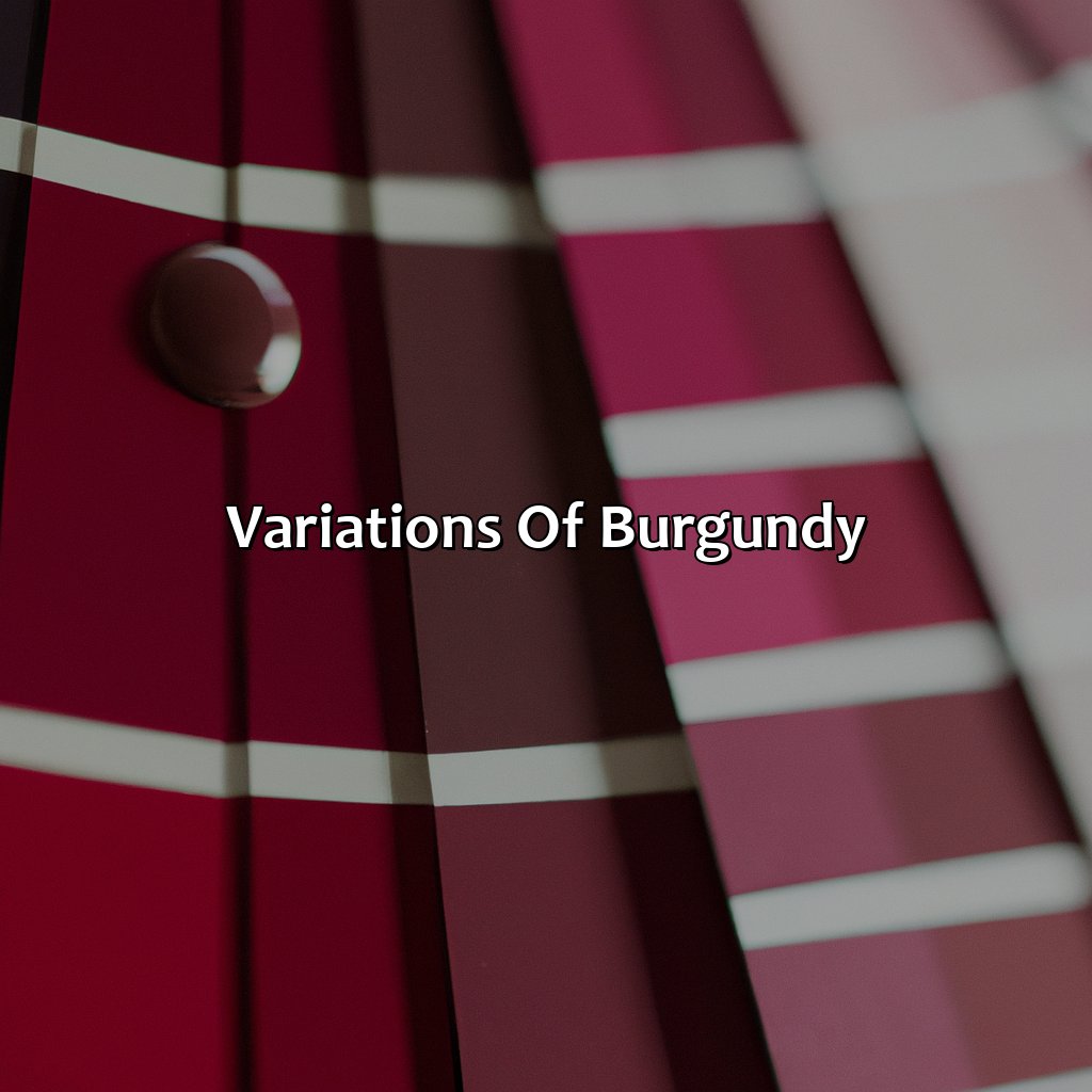
Photo Credits: colorscombo.com by David Hall
Wanna discover the wonderful world of burgundy? From dark to reddish, and brownish! Comprehend the range of colors in each shade. Analyze the nuances to comprehend the distinct characteristics of each. Let’s explore the shades of dark burgundy, reddish burgundy, and brownish burgundy. We’ll gain a better understanding of each!
Dark Burgundy
The color known as “Dark Burgundy” is a deeper, more intense shade of burgundy. It is created by adding black or navy blue to the base burgundy color, resulting in a rich and bold hue. Dark burgundy carries a sense of sophistication and elegance and can be used in various design applications.
In fashion, dark burgundy is commonly used for more formal occasions such as evening gowns or men’s suit jackets. It pairs well with neutral colors like black, white, and gray. In contrast, it also matches beautifully with brighter jewel tones like emerald green or sapphire blue.
In home decor, dark burgundy can add depth to a room when used in accents like throw pillows or curtains. It works exceedingly well with natural materials like wood and leather and adds warmth to any space.
For graphic design, dark burgundy is an excellent alternative to black for text on printed materials such as business cards or brochures. It’s darker than regular burgundy but still elegant enough to make an impression.
To maintain dark burgundy color over time, it’s essential to wash clothing items separately in cold water without bleach. For hair dye, use sulfate-free shampoo along with regular upkeep from a professional hairstylist. In home decor items such as furniture or rugs vacuum regularly and spot treat any spills or stains promptly.
Overall, the rich beauty of dark burgundy makes it versatile for many design applications ranging from fashion to home decor while still retaining its sense of sophistication and elegance.
“Reddish Burgundy – for when you want to look like a vampire, but not a scary one.”
Reddish Burgundy
Burgundy in reddish tone is a rich, deep shade of red with hints of brown that resemble the color of wine made from Burgundy grapes. To create this hue, red and brown colors are mixed in different ratios to achieve the desired depth. The more brown added to the mixture, the darker and warmer the resulting color becomes.
Reddish Burgundy is often preferred over dark burgundy because it adds vibrancy and liveliness to designs that dark burgundy cannot offer. It is a versatile color that can be adapted easily for fashion, home decor or graphic design purposes.
To achieve reddish burgundy, combining muted shades of pink and orange can help create an appealing shade that makes your creation stand out while not straying too far from its Burgundy roots.
Famous French winemakers revolutionized the process of creating wines in Burgundy during World War II by inventing new techniques like separating individual berry colors for enhanced taste. This innovation led to many successful vintages and paved the way for numerous artistic interpretations using wine shades like reddish-burgundy in fashion and design around the world today.
Why settle for plain old red when you can have a brownish burgundy that screams ‘I’m classy but also a little bit unpredictable’?
Brownish Burgundy
This shade of burgundy has a slightly brown tint to it, creating a warmer and earthier tone. Brownish burgundy can be achieved by adding small amounts of yellow or orange to the original burgundy mixture. This variation is commonly used in home decor and fashion, providing a subtle yet sophisticated look. It pairs well with neutral colors such as beige, cream, and gray.
In fashion, brownish burgundy is popular for autumn and winter outfits, lending its cozy warmth to sweaters, scarves, and coats. In home decor, this color adds depth and richness to any room when used on walls or accents like pillows or curtains. Brownish burgundy also looks stunning in graphic design for branding projects or marketing materials.
Unlike other burgundy shades that are more striking, brownish burgundy is a muted and understated option that balances beautifully with darker tones like black or navy. Its natural hue also harmonizes well with analogous colors such as rust or terracotta.
Historically, brownish burgundy was used in art during the Baroque period by artists like Rubens who favored rich colors inspired by luxurious fabrics seen in Venetian paintings. Today, this nuanced shade continues to evoke opulence and elegance across various fields from fashion to interiors.
Pair burgundy with neutral shades for a chic and timeless look, or go bold with complementary colors like green and blue for a show-stopping ensemble.
Pairing Burgundy with Other Colors
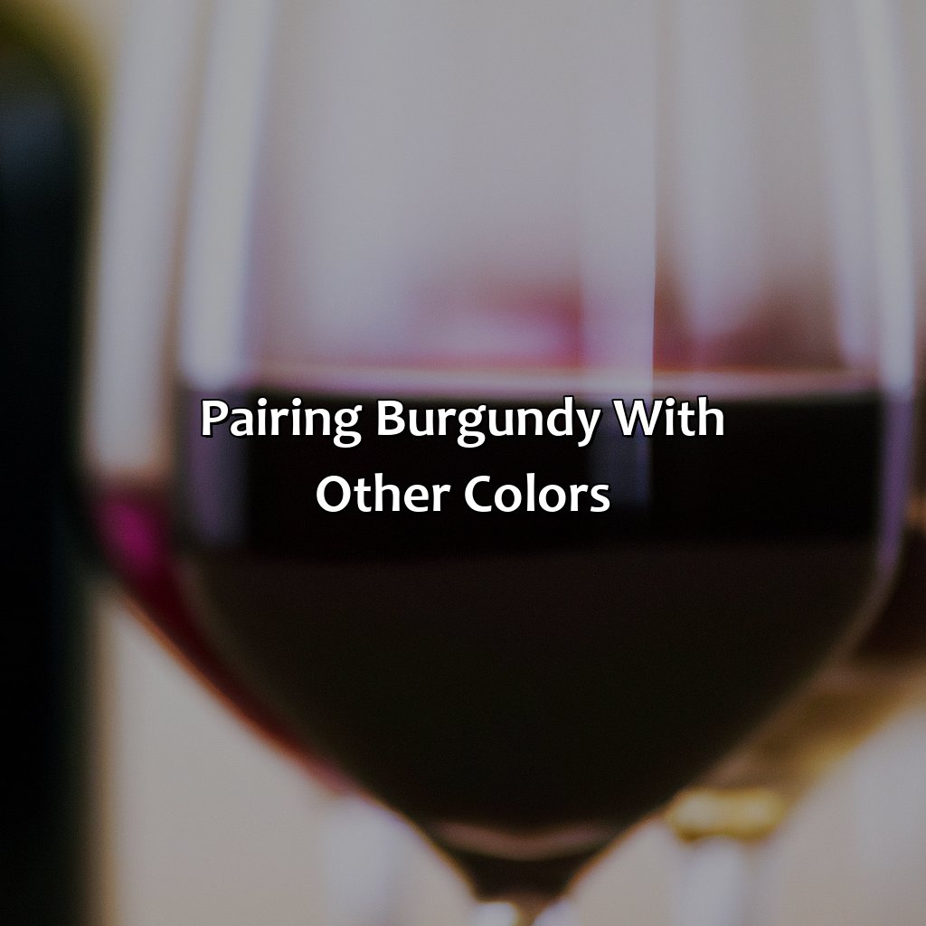
Photo Credits: colorscombo.com by Richard Flores
For an amazing effect, pair burgundy with neutrals, complements, or analogous colors. Neutrals emphasize the vibrancy of burgundy. Complements create a powerful contrast. Analogous colors make a subtle, balanced look.
Neutral Colors
Neutral colors are the perfect companions of burgundy as they balance its boldness and allow it to stand out. These hues include shades like white, cream, gray, and black. Adding these neutral tones to any burgundy outfit, décor setup or graphic design piece can give an elegant and sophisticated look. For instance, pairing a burgundy dress with nude heels creates a chic outfit that is perfect for formal events.
To create a monochromatic color scheme using neutral colors with burgundy gives an illusion of warmth and depth. To achieve this look, combine different shades of gray ranging from light silver to charcoal with burgundy accents in bedding or home decor items.
On the other hand, adding pops of gold or metallic shades on metal frames or lamp bases ties in well with neutral colors when decorating with burgundy. This complements the rich hue as mirrors or picture frames offer an unexpected contrast against the wall.
As regards fashion accessories like shoes, purses and scarves – having them in neutral colors helps tone down any overly bold clothes within your wardrobe that may not match your plan for the day. It is also essential to remember that using too many neutral colors can dull out burgundy’s deep redness.
A fashion blogger who goes by the name Olivia Palermo once paired her embroidered dark-wine coat with cream-colored clothes underneath this winter season- A perfect example of using neutrals with Burgundy.
Adding a pop of complementary color to burgundy is like a cherry on top of a Sundae, it just makes it that much better.
Complementary Colors
- Complementary colors for Burgundy include greenish-yellow, chartreuse yellow, and bright yellow.
- These combinations create a vibrant visual effect but should be used with care.
- It is recommended to use complementary colors sparingly in design as overuse could produce an unharmonious effect and exhaust the viewer’s eyes.
Unique details concerning Complementary Colors have been uncovered through experimentation from designers and artists. It has been found that using true complementary colors against a neutral background can produce an interesting depth of field.
A scientific study by a group of researchers at Yale University discovered that the brain activity caused by viewing complementary colors simultaneously triggers intense reactions associated with pleasure.
Analogous colors to burgundy are like the siblings you want to invite to the party—they blend in perfectly and make the whole group look better.
Analogous Colors
Analogous colors refer to the set of colors that are adjacent to each other on the color wheel. These hues have a visual similarity due to their close proximity, which makes them harmonious when used together. Understanding analogous colors allows for subtle yet impactful color compositions for any design or art project.
- Analogous combinations work well for creating a unified and serene feeling in art and design.
- These pairs often include a primary hue, secondary hue, and tertiary hue.
- For instance, red-orange, orange, and yellow-orange can create a warm-toned analogous combo.
Analogous colors also allow artists to play with the tonality of one main color in different shades.
Design projects require the use of well-paired analogous colors as it evokes unity and creates balance in layouts bringing an appealing cohesiveness. Incorporating an analogous scheme with natural color progression can uniquely represent emotions or convey mood.
Once, while designing packaging orders for a soap company, I applied varying tones of green that belong to the analogous family complementing each other which resulted in an exceptional outcome for their branding package.
Keep your burgundy looking fresh by avoiding bleach, excessive heat, and your clumsy roommate’s red wine spills.
Maintaining Burgundy Color
Photo Credits: colorscombo.com by Noah Hall
Keep burgundy hues vibrant? We got you! Explore this section for solutions. Clothing, Hair, and Home Decor sub-sections have tips for maintaining that rich color. Long-lasting and bright – check it out!
Clothing
Dressing up in burgundy clothing is a chic way to elevate one’s outfit. The reddish-brown hue of burgundy creates an air of sophistication and understated glamour. Mixing and matching different textures of fabric such as velvet, silk, or leather can create an interesting visual contrast that amplifies the richness of the color.
When picking a single item like a dress or blazer, using the exact shade variation can make any outfit look well put together. Pairing burgundy with monochromatic colors like black, gray, or white will highlight the rich hue of the garment.
To add more dimension to an outfit, pair burgundy clothing with complementary colors such as pale pink or light blue for a feminine touch. Another option is pairing it with analogous warm hues like deep oranges or eggplant for a more bold statement.
It’s crucial to care for this color carefully to prevent premature fading or staining. Washing clothes in cold water and hand washing only with gentle detergents is recommended. Also, avoid direct sunlight while drying clothes to prevent color fading.
The fashion industry has adored the Burgundy color so much that it has become part of many designer labels’ collections across various seasons. (Reference: https://www.marieclaire.co.uk/fashion/burgundy-style-27441)
When it comes to burgundy hair, red isn’t the only option – but it’s definitely the fun one.
Hair
Achieving and maintaining burgundy hair color requires careful attention and diligence. It is important to choose a shade that complements your skin tone and natural hair color. Achieve the perfect hue by mixing semi-permanent dyes. Burgundy hair typically fades faster than other colors, so regular touch-ups with a conditioning treatment are necessary to maintain its vibrancy. A boar bristle brush or wide-toothed comb can help reduce fading and protect strands from breakage. Keep locks hydrated with a sulfate-free shampoo and conditioner, avoiding hot tools when possible. Trust a professional stylist for major color changes or maintenance to prevent damage and promote healthy hair growth.
Decorating with burgundy is like adding a touch of elegant brooding to your home, perfect for setting the mood or hiding a murder weapon.
Home Decor
One can incorporate burgundy color into home decor to create a bold and luxurious look. It can be used on walls, furniture or accessories to add warmth and depth. A modern finish can be achieved by pairing it with metallic colors, while traditional feels can be achieved by pairing burgundy with rustic wood finishes. Using natural lighting helps to bring out the richness of color in burgundy home decor.
5 Facts About What Color Makes Burgundy:
- ✅ Burgundy is a deep shade of red that typically has a purple hue.
- ✅ Burgundy can be created by mixing red and blue, or red and purple.
- ✅ Burgundy is often associated with luxury and sophistication.
- ✅ Burgundy is a popular color choice for clothing, particularly during the fall and winter seasons.
- ✅ Burgundy is commonly used in home decor, especially in accent pieces like throw pillows and curtains.
FAQs about What Color Makes Burgundy
What color makes burgundy?
Burgundy is a deep, dark red color that can be achieved by mixing red and purple or red and blue. Typically, a darker shade of red is used as the base color and then mixed with a touch of blue or purple until the desired burgundy hue is achieved.
Can you make burgundy with just red paint?
No, it is difficult to achieve the rich tones of burgundy with just red paint. However, mixing red with other colors like blue or purple can help achieve the desired burgundy hue.
What other colors pair well with burgundy?
Burgundy pairs well with neutral colors such as white, black, beige, and gray. Other colors that complement burgundy include mustard, forest green, and navy blue.
What is the difference between maroon and burgundy?
Maroon is a shade of brownish-red, while burgundy is a darker shade of red with a hint of purple or blue. Maroon is considered a warm color, while burgundy is a cool color.
Can you mix burgundy with other colors to create new shades?
Yes, mixing burgundy with other colors can create new shades. For instance, mixing burgundy with white can create a lighter shade of pink, while mixing burgundy with yellow can create a rich shade of orange.
Is burgundy considered a trendy color?
Yes, burgundy is a timeless color that never goes out of style. It is often used in fall and winter fashion trends because of its rich and luxurious feel.