Key Takeaway:
- Complementary colors for blue include shades of gray, pale pink and blush, soft greens and aqua, warm yellows and oranges, and rich purples and burgundy. These colors can be used to create various blue color schemes and combinations, such as pastel blue color combinations and jewel-toned color combinations.
- Choosing colors for different purposes, such as home decor, fashion and accessories, and graphic design and branding, requires considering the color temperature, using the color wheel, and starting with a base color. Neutral colors for blue, cool color combinations with blue, and earthy color combinations with blue are some of the options for creating a harmonious color palette with blue.
- When working with navy blue, it is important to consider its level of darkness and choose complementary colors accordingly. Combining navy blue with warm, earthy colors like mustard or red-orange can create a bold and impactful look.
Colors that complement blue
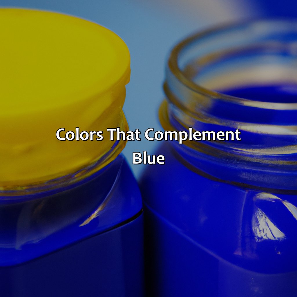
Photo Credits: colorscombo.com by Thomas Hall
Looking for colors to match blue? Check out these hues! Gray, greens, aqua, yellows and oranges, pink and blush, purples and burgundy – all of these colors complement blue. Try a few out and find the perfect combination!
Shades of gray
Gray is a versatile and sophisticated color that can complement blue perfectly. In a blue and gray color scheme, the different shades of gray can create contrast and depth, making the blue stand out even more. Gray hues range from light to dark, cool to warm, and neutral to bold.
For instance, light grays like silver or dove gray can bring a delicate touch to a blue outfit or décor. On the other hand, dark grays like charcoal or slate can add drama and intensity to the same ensemble. Additionally, cool grays with blue undertones can harmonize seamlessly with navy or indigo blues, while warm grays with yellow or brown undertones can pair well with lighter blues.
Unique details about gray hues include darker shades like pewter or platinum that bring a metallic vibe to any blue design. Alternatively, soft greiges (gray-beige) or taupe tones add warmth and earthiness to any blue room.
Incorporating a blue and gray color scheme in designing your home decor, fashion styles, graphics design and branding would elevate their elegance – one wouldn’t want to miss giving off an appealing look.
Don’t miss out on creating an elegant aesthetic by incorporating the right combination of blue and gray in your design choices. Add a touch of pink to your muted blues for a color scheme that’s both sweet and sophisticated.
Pale pink and blush
Complementing the muted blue color combinations, pale pink and blush hues create an elegant and sophisticated blue and pink color scheme. The softness of pastel blue color combinations highlights the warmth of pink, making it suitable for a variety of purposes.
When incorporating pale pink and blush with blue, it’s best to stick to minimalist aesthetics. This can be achieved by using pale pinks in conjunction with softer blues such as powder blue or baby blue shades. Adding subtle touches of gray as well can help bring out both colors in a subtle yet refined way.
To achieve the right balance between these colors, one can experiment with different shades and tints until they find a harmonious blend. Moreover, adding light green accents to this color pairing can provide additional depth while avoiding overpowering either hue.
Pro Tip: When styling or designing around this combination of colors, try not to add too many additional colors so that the muted scheme remains intact.
Pairing blue with green is like mixing vodka with Gatorade – unexpected but surprisingly refreshing.
Soft greens and aqua
This color scheme pairs perfectly with blue hues. Soft greens and aqua are calming, soothing, and convey a sense of peace and stability. These colors are incredibly versatile and pair well with various shades of blue.
Using a blue and green color scheme provides an earthy feel that is perfect for natural-themed designs. For a bold look, designers can opt for the blue and chartreuse color scheme as it creates high contrast between complementary colors. On the other hand, the blue and teal color scheme works well in beach-themed projects or designs where a more relaxed atmosphere is desired.
The subtle use of the blue and mint green color scheme adds freshness to any design while conveying a calm energy. Additionally, for a timeless look, the combination of blue with sage green can never go wrong as it communicates trustworthiness.
Lastly, using blue with yellow-green is perfect for creating vibrant designs full of energy. This pairing is bright yet grounded as yellow-green adds warmth to the cool hues of blue.
To create an effective design using this color scheme, designers may choose to use shades that have similar levels of intensity or play around with different hues from each category. Using tones that are too bright or too muted may create visual noise rather than achieving harmonic balance.
Add some zest to your blue color scheme with warm yellows and oranges, creating an earthy yet vibrant palette that’s sure to make a tangerine dream come true.
Warm yellows and oranges
Warm Tones That Complement Blue
Yellow and orange hues are ideal to offset blue, creating a warm and inviting feeling. The blue and yellow color scheme is perfect for homes, as they evoke the feeling of the sun shining over water. Meanwhile, the blue and orange color scheme offsets well in fashion accessories, particularly in summer clothing collections. Tangerine shades are also becoming increasingly more popular in fashion, providing an earthy feeling to the combination.
Combining these colors can be tricky, but using earthy colors for blue walls in make-up designs or home decors can provide a sense of cohesiveness. For instance, one could use deep oranges to pick up exterior brickwork or yellow tones to bring out interior woodwork.
A true story about this color combination involves a client who wanted their logo design to feature a sunset over a seaside town- with blue for the sea and sky- blended seamlessly into yellow-orange gradients for warmth at twilight. This personalized branding demanded specific use of tones and specific shades for both constant variances like print jobs or digital media campaigns.
Add a touch of royalty to your blue color scheme with rich purples and burgundy – because who says blue and purple can’t rule together?
Rich purples and burgundy
Purple and Burgundy Shades in Harmony with Blue
Blue is a classic color that pairs beautifully with rich purples and burgundy tones. The combination of these colors creates a striking contrast that is both elegant and eye-catching, making them a popular choice for home décor, fashion, and graphic design.
When creating a blue and purple color scheme, jewel tones such as amethyst, sapphire, and emerald work well together. For a softer look, lavender and lilac shades complement powder blue hues. Another popular option is pairing deep maroon or burgundy shades with navy or dark blue.
To achieve an appealing result with these complementary shades, consider the color temperature of each hue. Tonally warm purples pair well with navy or royal blues while tonally cool purples combine harmoniously with baby or pastel blues.
Using the color wheel can also help you to create visually balanced designs. Typically, complementary schemes involve picking colors directly opposite on the wheel e.g., coral oranges are opposite blue-greens like teal especially if using multiple tones in each hue.
So whether you’re using purple’s many shades to bring out every design element of blue or opting for intense hues in home décor accents or accessories- just remember to take inspiration from nature while keeping it simple.
Don’t miss out on your next wardrobe staple by trying out unique combinations like blue and peach color scheme as well as beige tone for more neutral effects. To improve outcomes further embrace uncommon favorites among designers today such as forest green/emerald green which perfectly compliment any shade of blue – but one thing is certain: these harmonious combinations will always make your look stand out.
Whether you prefer light or dark shades, blue offers endless color combinations that can complement neutrals, warm tones, cool tones, or even jewel tones.
Choosing colors for different purposes
Photo Credits: colorscombo.com by Gregory Nelson
Are you unsure of which colors to choose for different purposes? ‘Choosing Colors for Different Purposes’ with ‘What Colors Go With Blue’ has your back! We’ll discuss various aspects such as home decor, fashion, and graphic design.
You’ll find plenty of solutions for light blue combos, dark blue combos, blue and gold, blue and silver, neutral colors, warm colors, cool colors and secondary colors for blue. Plus more!
Home décor
Enhancing your living space can be an exciting project, and colors play a pivotal role in the process of home décor. One must mix and match various hues with blue to create a cohesive and visually appealing environment. In the world of home décor, unique color combinations can elicit feelings of comfort, luxury, and modernity.
The selection of colors for the walls, curtains, furniture pieces, and accessories is crucial to achieving the desired outcome. An excellent starting point can be deciding on a base color theme that complements blue and then branching out to additional accent shades. For instance, one may select shades such as pale pink and blush to pair with light blue or soft greens and aqua tones to combine with dark blue hues.
To achieve an elegant atmosphere while decorating with diverse hues, there are essential principles one must apply when selecting colors. By using contrasting pastel shades of yellow or bright orange to define the interior design concept is ideal for the bold approach homeowners prefer.
One afternoon while shopping at the local boutique store in Paris, Sophie stumbled across a beautiful piece of abstract art featuring rich purples and burgundy tones blended into the night sky with different blue shades accented on it. From that artwork illustration at her apartment in Provence inspired her to incorporate these colors into all aspects of her home decor aesthetic.
Add a pop of pale pink to your blue outfit and you’ll look like cotton candy, but in a good way.
Fashion and accessories
Color coordination in fashion and accessories is an essential aspect of styling. The right combinations of colors can enhance any outfit or accessory, making them stand out in the crowd. When pairing blue with other colors, one must keep in mind the basic rules of color harmony and balance.
For fashion and accessories, choosing colors that complement blue depends on personal style and specific occasion. For example, neutrals such as white, black, gray, beige or brown are timeless choices for creating a classic look. Meanwhile, bolder shades of reds or pinks offer eye-catching contrasts when paired with blue clothing or accessories.
To create a contemporary look while staying true to the season’s trends, complementary hues of coral or peach can be paired with blues. While cool tones like greens and purples present fresh options for an outfit showcasing blue elements.
Experimenting with different textures and fabric weights also offers new possibilities when selecting colors that complement blue. Leather accessories could provide texture to outfits that fuse together colors from different families on a single piece.
Color outside the lines and experiment with bold hues to make your branding pop.
Graphic design and branding
In the realm of visual communication, graphic design and branding are essential components. A key aspect of effective graphic design and branding is determining the appropriate color scheme to represent a brand or message. Color theory plays an integral role in selecting the right shades, tones, and hues that evoke emotions, represent values, and convey meaning.
Understanding the psychology behind color is crucial in establishing a brand’s identity. A well-integrated color palette can create an excellent first impression and cultivate strong feelings towards a brand. Elements like logos, packaging, web design, advertisements, signage must complement one another with a consistent color scheme that resonates with their intended audience.
When working with colors for graphic design or branding purposes, it is crucial to consider not just personal preference but also cultural contexts. For instance, shades of red symbolize good fortune in Chinese culture; purple represents royalty in many Western cultures. Integrating regional preferences when conveying messages using colors ultimately leads to greater cultural relevance.
Pro Tip: Using contrasting colors can help make graphics stand out while maintaining consistency within your overall palette. Combining colors with blue is an art, but don’t worry, you don’t need to be Picasso with these easy tips.
Tips for combining colors with blue
Photo Credits: colorscombo.com by Peter Green
Mast’ring the art of combining blue colors? Here’s your guide! We’re offering you tips on triadic, analogous, and tetradic schemes. Plus, bold, monochromatic, neutral, warm, cool, earthy, jewel tones, and bright combinations. For the perfect color scheme, we’ll show you three sub-sections: base color, temperature, and color wheel.
Start with a base color
Begin by selecting a primary or base color to go with blue. The color you choose will depend on the overall look and feel you want to achieve. Neutral colors like white, gray, or black give a sleek finish, while pastel shades add softness.
When choosing a complementary color, consider the tone of your base color. For example, if you have chosen navy blue, try pairing it with ivory or beige; if your preference is baby blue, consider using blush pink. Opt for shades that contrast well with blue so they pop.
To create an aesthetically pleasing design, use the 60-30-10 rule when combining colors: 60% should be your base coat (blue), 30% supporting shade (gray or beige), and the remaining 10% in accent hues (blush pink or gold).
Pro Tip: Experiment with different combinations until you find one that suits your taste. Mix and match muted tones with vibrant shades for a stand-out effect.
Who knew colors could have a temperature? It’s like they have their own little weather forecast going on.
Consider the color temperature
When selecting colors to complement blue, it is essential to consider the color temperature. Warm colors such as orange, yellow, and red can create a cozy feeling and enhance blue’s vibrancy. In contrast, cool colors like green and purple can provide a calming effect when paired with blue.
The color temperature refers to the hue’s warmth or coolness represented by its position on the color wheel. Warmer tones are found in hues such as red, orange, yellow, while cooler hues include blue-green and purples.
To add depth and harmony to your color scheme involving blue, consider pairing it with contrasting warm hues for high-contrast designs. This strategy works particularly well in fashion accessories like scarves or handbags.
It is interesting to note that varying temperatures of blues exist as well. For instance, muted blues lend themselves well when mixed with warm neutrals like beige or cream for a casual atmosphere and clean look. Palettes including rich deep blues combined with bright oranges work nicely when creating modern graphic design materials.
Understanding color temperature is an essential aspect of creating balanced and visually appealing design spaces. The right use of this skill also comes into play when branding products which often require combinations of an enterprise’s distinct shades together.
Spin the color wheel and let it decide the fate of your blue color pairing.
Use the color wheel
Understanding color theory is key to effectively using the color wheel. Color schemes like complementary, analogous, and triadic can aid in selecting colors that harmonize well with each other.
Here’s a 5-Step Guide on how to use the color wheel:
- Start by selecting a base color from the wheel.
- Decide on a color scheme that fits your intention.
- Complementary colors are placed directly across from each other; these add contrast to any base color.
- Analogous colors are located next to each other on the wheel and work harmoniously with each other.
- To create depth and interest, choose three colors that are equidistant apart from one another from the wheel.
It’s essential to keep in mind that color temperature plays a significant role in determining how well different hues will coexist. Warm colors like reds, oranges, and yellows usually pair nicely with cool blues, while greens work as effective connecting points for both warm and cool-toned folks.
Taking into account specific objectives is vital when choosing complementary colors to blue for various purposes:
- For home decor: Mint green or coral shades perform admirably when paired with light blue walls.
- For Fashion & Accessories: A deep navy dress pairs beautifully with earthy tones such as rust or olive green shoes.
- For Graphic Design & Branding: Using contrasting shades of orange alongside blue can draw attention to crucial parts of your content.
Unique details about using the color wheel include considering opacities, textures, patterns, etc., which should blend with their chosen hues’ tone and saturation.
The history of utilizing the color wheel for aesthetics dates back centuries but was formally introduced by Sir Isaac Newton in 1666; since then, it has been widely used by artists and designers worldwide as a go-to tool for designing aesthetically pleasing visual material.
5 Facts About Colors That Go With Blue:
- ✅ Blue is a versatile color that pairs well with a variety of other colors, such as white, gray, yellow, green, and pink. (Source: The Spruce)
- ✅ Pairing blue with its complementary color, orange, can create a bold and striking contrast. (Source: HGTV)
- ✅ Blue and beige or tan create a calming and soothing color palette, perfect for a relaxing space. (Source: Elle Decor)
- ✅ Navy blue pairs well with metallic accents, such as gold or brass, for a sophisticated and elegant look. (Source: House Beautiful)
- ✅ For a fresh and vibrant look, pair shades of blue with bright and bold colors, such as coral, turquoise, and chartreuse. (Source: Real Simple)
FAQs about What Colors Go With Blue
What colors go with blue for clothing?
Some colors that go well with blue for clothing include white, beige, black, gray, pink, and green.
What colors go with blue for home décor?
Some colors that go well with blue for home décor include white, cream, yellow, gray, and green.
What colors go with navy blue?
Some colors that go well with navy blue include white, beige, gray, pink, and red.
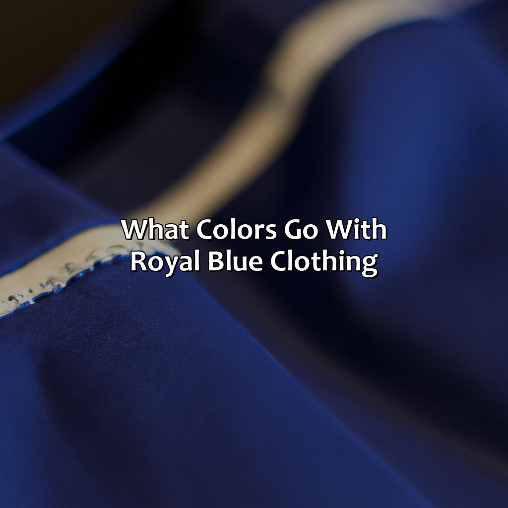
What colors go with royal blue?
Some colors that go well with royal blue include yellow, pink, green, coral, and silver.
What colors go with light blue?
Some colors that go well with light blue include pink, yellow, green, gray, and brown.
What are some color combinations to avoid with blue?
You may want to avoid pairing blue with orange or brown, as they may clash and create an unpleasant color palette. Also, you may want to avoid combining light blue with pastel colors, as they may appear too soft and delicate.