Key Takeaway:
- Spot color is a term used in the printing industry to describe a specific ink color that is printed separately from the standard 4-color printing process. This results in higher color accuracy and more vibrant colors than can be achieved through process printing alone.
- Spot colors are typically chosen from a standardized color palette, such as the Pantone Matching System, and can be printed using a variety of printing techniques. Spot color printing is particularly useful for corporate branding and print quality enhancement.
- Selecting and implementing spot colors requires careful consideration of factors such as color value, color harmony, and printing workflow. Proper preparation, such as color correction and registration marks, is also crucial for achieving accurate and high-quality prints.
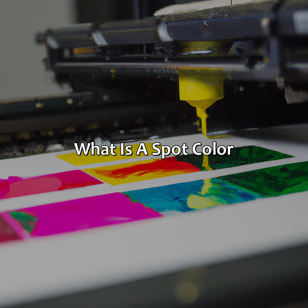
Definition of Spot Color
Photo Credits: colorscombo.com by Edward Gonzalez
To understand spot color printing with ink, Pantone, and CMYK, two subsections may help.
- Explanation of Color Models will give you an understanding of the color models & spaces used in printing.
- Differences between Spot Color & Process Color will help differentiate their usage & how it impacts color reproduction in digital printing.
Explanation of Color Models
Color Models: Understanding Color Spaces and Systems
Different color systems and spaces are used in graphic design, printing, and digital media for representing colors. They define the range of colors that can be reproduced or displayed on various devices. Commonly used color models include RGB (Red, Green, Blue), CMYK (Cyan, Magenta, Yellow, Key/Black), HSB (Hue, Saturation, Brightness), and Lab (Lightness, a/b values).
| Color Model/System | Description | Usage |
|---|---|---|
| RGB | An additive model where colored light is projected on a black background to form colors. Used in digital displays. | Web graphics, mobile apps, TVs. |
| CMYK | A subtractive model where ink is applied to paper in different combinations to create colors. Used in print process. | Newspapers, magazines, packaging. |
| HSB | A cylindrical color space based on three attributes: hue (color family), saturation (intensity), and brightness/value (lightness/darkness). | Selecting colors for user interfaces or data visualization. |
| Lab Color Space | A standardized color space defined by the International Commission on Illumination (CIE) that approximates human visual perception of color. It uses three axes – L* for lightness/darkness values; a* for red/green axis; b* for yellow/blue axis. | Used for color adjustments and accurate color matching in printing and textile industry. |
When working with spot colors, Pantone Matching System (PMS) is commonly used. PMS is a universally recognized set of ink colors with unique identification numbers to ensure consistency across different mediums.
To get the best possible output from spot colors, it’s important to choose the right color system depending on the medium where it will be reproduced. Understanding and using color models/systems effectively can help designers achieve consistent outcomes across digital or print projects while keeping in mind different technical requirements.
Don’t miss out on delivering professional and visually appealing content by neglecting Color Models/Systems understanding meticulously.
“Spot color is to printing what a single note is to a symphony, while process color is more like a full orchestra – both have their strengths, but it all depends on the end goal.”
Differences between Spot Color and Process Color
When it comes to color in printing, there are two main types: Spot Color and Process Color. These are vastly different methods of achieving accurate color reproduction and can be useful for various purposes.
| Spot Color | Process Color |
|---|---|
| Uses ink mixed according to a specific formula to match desired colors. | Uses the CMYK (Cyan, Magenta, Yellow, Black) color model to replicate colors. |
| Ideal for jobs requiring fewer colors or precise matches for specific brand or pantone shades. | Ideal for full-color digital printing projects with complex images and gradients that require multiple hues. |
| Requires a separate plate or screen for each ink and requires manual setup. | Uses automated technology and computerized color separation techniques to generate the final result. |
| Higher cost per print due to manual production processes and ink mixing requirements. | Lower cost per print because the process is digitally generated through automation; however, large projects typically require higher initial costs due to equipment needs. |
It’s worth noting that by utilizing both methods in unison it can lead to unprecedented quality enhancement no matter how intricate your design may appear.
Spot Color has largely been implemented by companies who have chosen their signature shades. However, it is now possible for many smaller businesses as well since digital printing technology allows precise color reproduction that was once limited solely to offset printing processes.
The history of spot color dates back more than a century when the process was developed as an alternative method of reproducing photographs. The first documented usage came from Fredrick Ives in 1881, utilizing four different colored filters, each exposed for a portion of the photographic plate. This led to an improved color process that allowed for more nuanced hues and rapid advances in printing technology.
Spot color: Because brand identity doesn’t have to be black and white.
Uses of Spot Color
Photo Credits: colorscombo.com by Peter Brown
To get the hang of spot color in corporate branding designs and enhance print quality, explore the subsections of this section. “Uses of Spot Color” has two subs: Corporate Branding and Print Quality Enhancement. Corporate Branding looks at color theory, psychology, saturation, gamuts and schemes in design. Print Quality Enhancement spotlights print technology, materials, equipment and professional printing to improve quality.
Corporate Branding
Color plays a crucial role in corporate branding. Choosing the right color scheme for a brand is a crucial aspect of design, as it communicates a message and creates an emotional connection with the audience. Color psychology and theory are essential in selecting Spot Colors to enhance brand identity and recognition.
The use of spot colors allows designers to achieve colors that cannot be produced using process printing techniques. The limited number of spot colors can offer excellent color saturation when compared with the vast range of hues and values offered by CMYK process printing. As such, brands turn to spot-colors to keep their print collateral consistent across different printers, substrates, materials, or locations while maintaining optimal color gamut and harmony within their designs.
A well-designed corporate brand should have standardized colors that communicate the company’s vision and value proposition effectively. This consistency also helps create trust among customers who associate these colors with quality products or services. Spot Colors can enhance this consistency while ensuring that logos, fonts, images, and other branded elements remain recognizable across all mediums – from business cards to billboards.
For example, if your company’s logo uses Pantone 485C Red Colour on white backgrounds specifically because it emits energy and excitement emotions. You will want to ensure that this exact shade of red is used every time your logo appears in print by specifying the specific spot color inkjet cartridge in marketing materials such as brochures or packaging labels.
Trust me, with spot color and professional printing equipment, your print quality will be so good you’ll want to frame your documents.
Print Quality Enhancement
Text: Print Enhancement through Specialized Coloring
Specialized coloring in print technology is a hallmark of professional printing that enhances print quality.
| Benefits of Spot Color: |
| Bright Colors |
| Precise Tints |
| Sharp Contrast |
| Consistent Branding |
Spot-color usage is pivotal in creating precise outlook on printed materials like; catalogs, packaging or highlight corporate branding. This process is uniquely different from other color models and usually produces more vivid and striking hues to improve the print media through optimized coloring.
Print enhancement is achieved when printing equipment, printing material, and spot colors are tailored to meet various client specifications. A regular exchange with the client can provide more relevant recommendations for special requirements to be met.
For instance, there was a project where vibrant branding colors were requested during design time but could not be delivered using process color due to client programming error specification. Our team had advised consulting with print experts beforehand so as not to limit desired color options later on in the design stage (which most times will ultimately lead to unnecessary expenses for our clients).
Choosing the right spot color is like picking the perfect shade of lipstick – it can make or break your entire look.
Selection and Implementation of Spot Color

Photo Credits: colorscombo.com by Jose Nguyen
To use spot colors well for a project, you need to know the color proof, correction, and grading system.
Utilize the color wheel to pick colors that work well together. Also, measure color values for accurate color control.
This section will cover two parts: choosing spot colors and getting them ready for print. Choosing spot colors includes color temperature, harmony, and measurement. Preparing spot colors for printing entails different types and methods.
Choosing a Spot Color
Selecting an Appropriate Spot Color is crucial for achieving high-quality print. Considering color temperature, value, harmony and measurement is necessary for the choosing process. Additionally, reviewing ICC Profiles and Hexachrome options can help determine color accuracy. The L*a*b* method may also be used to ensure color consistency. Ensure that the chosen spot color aligns with brand identity and that it will be readily available during the printing process to avoid any delays or errors. Failure to consider these details may result in inconsistency between design and print, leading to dissatisfaction for both clients and customers.
Preparing spot colors for print? Better get your tonality right or your lithographic printing will be a hot mess.
Preparing Spot Colors for Print
| Process | Description |
|---|---|
| Tonality | Determines the amount and contrast of colors in an image. |
| Heatset Printing | Utilizes heat drying ink for quick drying results. |
| Spot Varnish | Gives a textured finish to specific areas of a printed design. |
To achieve a high-quality standard print, other processes involve overprinting, register marks and stochastic screening. Additional methods include uv printing, dye-sublimation printing, flexographic printing and thermography printing.
It is important to note that eco-friendly printing practices should be taken into consideration during spot color preparation. This includes waterless printing and risograph printing methods.
Suggested techniques involve providing adequate training to staff involved in the process. Collaborating with experienced printers throughout every stage is also catastrophic since subsequent procedures like selecting press color should be executed precisely. Finally, ensuring that unique software such as Adobe Photoshop or Illustrator are utilized efficiently will add aggrandizement detail in reproducing any color hue correctly.
From inkjet printing to spectrophotometers, these examples showcase how spot color can elevate printing materials to a whole new level.
Spot Color Examples
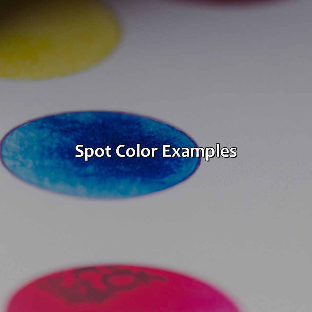
Photo Credits: colorscombo.com by Logan Harris
Spot Color Examples:
Spot color is a printing technique that uses pre-mixed solid inks to produce specific colors. Here are some examples of spot colors used in printing materials:
| Color Name | Color Code | Print Technology |
|---|---|---|
| Pantone 485C | #FF0000 | Inkjet Printing |
| Pantone 871C | #827567 | Offset Printing |
| Hexachrome Magenta | #FF0090 | Large Format Printing |
Interestingly, before the invention of spectrophotometer, printers used to match colors by eye. Pantone Matching System (PMS), introduced in the 1960s, allowed printers to match spot colors accurately.
Overall, spot colors offer a unique and precise way to produce specific colors in printing materials using the latest printing technology like inkjet printing.
Some Facts About Spot Color:
- ✅ Spot color is a printing technique that uses premixed ink colors instead of combining process colors (Cyan, Magenta, Yellow, and Black) to achieve a specific shade. (Source: PrintingForLess)
- ✅ Spot color is often used in print materials that require a specific hue, consistent color quality, or metallic and neon colors. (Source: MOO)
- ✅ Spot color is the preferred method for printing logos, graphic designs, and package labels because of its accurate color reproduction. (Source: FASTSIGNS)
- ✅ The Pantone Matching System (PMS) is a color standard used in the spot color printing process, allowing for precise color matching across different printing materials and techniques. (Source: Pantone)
- ✅ Spot color is gradually being replaced by digital printing methods, which offer more cost-effective and flexible color options, especially for small batch printing. (Source: Print On Demand World)
FAQs about What Is A Spot Color
What is a spot color?
A spot color is a specific color formulated using ink or paint. It is used for offset printing and other applications where solid, consistent colors are required.
What is the difference between spot colors and process colors?
Spot colors are custom colors mixed to achieve a specific hue, while process colors are created by printing tiny dots of four primary colors (cyan, magenta, yellow, and black) to create the illusion of different colors.
How many colors can be created using spot colors?
The number of colors that can be created using spot colors is virtually limitless, as custom colors can be created to match any specific shade or hue.
What is the Pantone Matching System (PMS)?
The Pantone Matching System is a standardized system used for identifying and matching spot colors. Each color is assigned a specific number to ensure consistency across different printing processes and substrates.
What are some applications of spot colors?
Spot colors are commonly used in branding and logo design, as well as in printing materials such as business cards, brochures, and packaging.
Can spot colors be used in digital printing?
Yes, spot colors can also be used in digital printing, although the process and materials may differ from those used in offset printing.