Key Takeaway:
- Green’s complementary color is red: Color theory teaches that every color has an opposite or complementary color. In the case of green, its complementary color is red. When placed next to each other, they create a visual contrast that is pleasing to the eye and can add harmony to a design.
- Using the color wheel to determine complementary colors: The color wheel is a tool that designers use to determine color relationships. It consists of primary and secondary colors, warm and cool colors, and neutral colors. By identifying where green is on the color wheel, one can determine its complementary color, which is opposite on the wheel.
- Incorporating green’s complementary color in design: Designers can use green’s complementary color to create balanced and aesthetically pleasing color schemes. Different color schemes include complementary, analogous, triadic, split-complementary, and tetradic schemes. By incorporating green’s complementary color in design, it can create a sense of balance and contrast that can enhance the ambiance and lighting of a space.
Green’s Complementary Color: Understanding the Concept
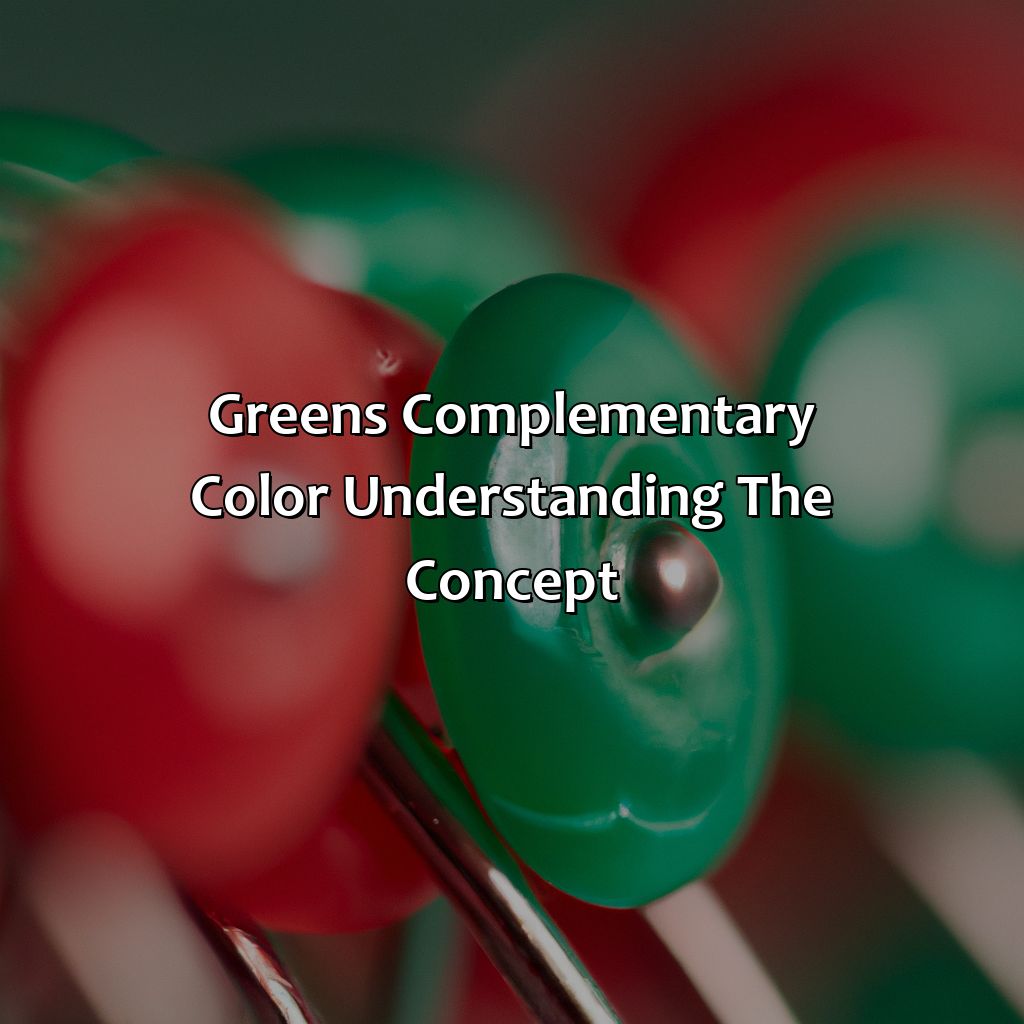
Photo Credits: colorscombo.com by Sean Walker
Green’s Complementary Color: Exploring Color Theory and Visual Perception
Color theory plays a significant role in various fields, including graphic design, fashion, and visual arts. One of the most essential concepts in color theory is the complementary color. Complementary colors are opposite hues that create a sense of harmony and contrast when used together.
In color theory, green’s complementary color is magenta. When green and magenta are used together, they create a visually striking contrast that can make designs and artworks more dynamic and interesting. Visual perception plays a crucial role in the effectiveness of this color combination, as the human eye can perceive these colors simultaneously without adjusting its focus.
To achieve balance and harmony in design, it’s vital to understand how complementary colors work together. In addition to selecting the right colors, it’s also important to consider the level of contrast between them. High contrast can be a powerful tool in design, but it should also be balanced with elements of similarity to create a cohesive and effective composition.
To create stunning designs using green’s complementary color, consider using it sparingly as an accent color, as too much can overwhelm the senses. Additionally, pay attention to the overall color scheme, and choose complementary colors that work well with the primary colors to create a harmonious design. By experimenting with different combinations, you can discover the power of complementary colors and elevate your design to new heights.
The Color Wheel and How it Works

Photo Credits: colorscombo.com by Jack White
It is essential to understand the color wheel to comprehend the various aspects of colors. Learn about primary and secondary colors that emerge from it. Also, familiarize yourself with complementary colors and how they interact with warm, cool, and neutral colors. Get more information on how the color wheel works. Solve any queries you have.
Primary Colors and Secondary Colors
Primary Colors: These are the fundamental colors that cannot be obtained by mixing other colors. They include red, blue, and yellow.
Secondary Colors: These colors are obtained by mixing two primary colors together. The three secondary colors are green (yellow and blue), orange (red and yellow), and purple (red and blue).
Understanding primary and secondary colors is crucial in designing color schemes that work coherently in creating a balanced visual impact. By knowing how these two sets of colors function, designers can better mix them to create various shades, tints, and hues.
Knowing the difference between primary and secondary colors is important in choosing pairs of complementary or contrasting colors. Such knowledge provides valuable insight into optimizing image contrast that leads to a more pleasing effect on eyes.
Are you curious about how to use the incredible effects of the primary & secondary color combination? We highly recommend proceeding towards discovering more exciting findings!
Complementary colors: separating the warm and cool from the meh.
Complementary Colors and How They Work
Complementary colors are a pair of colors that are opposite to each other on the color wheel. They create striking contrasts when placed together, making each color pop. Warm colors, which include reds, yellows and oranges have cool complements like blues and greens. Similarly, cool colors like greens and blues have warm complements including yellows and oranges. Neutral colors like black, white, gray and beige can be paired with any hue as they lack dominant undertones. When using complementary colors in design, color schemes like monochromatic or analogous can be used to ensure a consistent look and feel.
Identifying Green’s complementary color is like finding a needle in a rainbow-colored haystack filled with reds, pinks, corals, magentas, burgundies, and every other shade under the sun.
Green’s Complementary Color: Identifying the Colors
Photo Credits: colorscombo.com by Nathan Gonzalez
To discover green’s complementary color and come up with new color schemes, try this solution. It has two sub-sections:
- ‘Finding the Complementary Color of Green‘
- ‘Examples of Green’s Complementary Color in Design and Art‘
Use the color wheel to find green’s opposite color. This is its complementary match. Understanding color schemes in design and art can give you ideas for beautiful and harmonious color combos.
Finding the Complementary Color of Green
Green’s Opposite Color: Unearthing the Missing Hue
Discovering the opposite color of green is essential to designing an eye-catching color scheme that evokes emotions. The complementary color turns out to be a crucial element as it adds contrast, balancing the overall design.
- Begin by finding green on the color wheel.
- Locate the hue directly across from green; this hue is known as its complementary color and is often referred to as its opposite color.
- The direct opposite of green falls within the red spectrum, which can range from pink hues to deep crimson tones.
- Different shades of these colors can be used with different shades of green to build stunning designs.
Incorporating contrasting colors defers between creating balance and producing tension in a design. Mixing neutrals with bright or bold complementary colors always seems like a winning strategy for creativity.
To create a harmonious feel, you can pair varying shades of muted greens with reds or even pastel pinks and blushes – achieving a stylish yet understated effect.
As if reading our minds, Mother Nature uses contrasts to emphasize specific aspects, notice how plants in nature use their complementary colors to attract pollinators? Well-designed graphics generally follow suit.
Looking for some real-life examples? Nike’s logo features both grayish blue (“Cool Gray”) and orange (“Max Orange”), two hues that are starkly different in the grand scale of things but beautifully complement each other.
Green’s complementary color is not just for design and art, it’s also perfect for a monochromatic makeup look that will leave your friends green with envy.
Examples of Green’s Complementary Color in Design and Art
Green’s Complementary Color can be seen in various design fields, including interior design, fashion, art, makeup, and more. The complementary color of green is opposite on the color wheel, which includes red. This pairing creates a striking contrast that can be used to create balance and harmony in a design. Moreover, Green’s Complementary Color is often used in color-blocking and monochromatic schemes to add depth and dimension.
Examples of Green’s Complementary Color in Design and Art include:
- Red accent walls with green furniture pieces or decor items
- A green dress paired with red heels or accessories
- A landscape painting featuring green trees against a red sunset sky
- Makeup looks featuring green eyeshadow paired with a red lip
- An abstract art piece featuring splashes of green and red hues
In addition to complementary schemes, designers also utilize analogous schemes (using colors next to each other on the wheel), triadic schemes (using three evenly spaced colors on the wheel), split-complementary schemes (using one color paired with two adjacent colors to its complement), or tetradic schemes (using four colors arranged into two complementary pairs) that incorporate Green’s Complementary Color.
Unique details about Green’s Complementary Color include its versatility as an accent or dominant hue in designs. Additionally, it can evoke emotions such as tranquility when used alongside blue tones or create energy when paired with warmer hues like orange.
According to Pantone, the global authority on color trends, ‘Greenery‘ was named 2017’s Color of the Year for its refreshing and revitalizing effect.
Green and its complement – the perfect aesthetic duo for creating balanced and contrasting color schemes in design.
Using Green’s Complementary Color in Design
Photo Credits: colorscombo.com by Billy Garcia
Create an eye-catching design with a balanced and contrasting look by using green’s complementary color. Know about various color schemes such as complementary, analogous, triadic, split-complementary, and tetradic colors. Mix green with its complementary color. This will create a pleasing balance and contrast in your design. Don’t forget to factor in visual perception, lighting, and ambiance.
Color Schemes and How They Work
Understanding Color Scheme: Matching Colors that Work Well Together
Color schemes refer to the combination of colors that work well together. These are carefully selected and applied in different fields such as design, fashion, art, and more. One example is by using complementary colors.
Complementary colors involve pairing two opposite hues on the color wheel. This creates a highly contrasting yet balanced effect. Other types of color schemes include analogous colors (colors next to each other on the wheel), triadic colors (a combination of three hues spaced evenly apart), split-complementary colors (a mix of one hue plus two adjacent hues to its complementary color) and tetradic colors (two pairs of complementary hues).
When creating a design or artwork, choosing a color scheme is essential in conveying a message or mood effectively. The right pairing can create harmony or excitement while an incorrect choice may lead to confusion or chaos.
Choosing an ideal cool complement for green requires identifying the color opposite it on the wheel, which results in red. Alternatively, if using a warm complement, yellow would be selected.
To make your designs stand out and have depth, incorporating green’s complementary color is an excellent way to achieve balance and contrast. Don’t miss this opportunity to enhance your creative projects dynamically!
Adding green’s complementary color to your design creates a visual dance of balance and contrast, setting the perfect ambiance for any space.
Using Green’s Complementary Color to Create Balance and Contrast
Creating Harmony and Contrast with Green’s Complementary Colors
Incorporating green’s complementary color into design work can be beneficial in creating a balance and contrast. By understanding the visual perception, lighting, and ambiance, designers can form an appropriate color scheme. The right combination of colors can lead to aesthetic harmony.
Using Green’s Opposite Color for Balance
To strike a balance between different hues, using green’s opposite color on the color wheel works wonders. For instance, if there is an overuse of green in the design, its complementary color (red) could be introduced to level out the dominance of this hue. This practice establishes a vibrant contrast within the same location.
Complementary Colors’ Role in Providing Contrast
The use of colors isn’t only limited to making the design look more balanced; it also helps create excellent contrast. Using contrasting hues helps draw viewers’ attention to particular areas in the design or artwork. By experimenting with different combinations based on 3-4 color schemes that go well together, designers can create harmonious designs while playing with contrasts.
Achieving Balance and Contrast through Creative Intention
Designers should seek ways to obtain maximum benefits from using complementing colors by considering details such as visual perception, various lighting conditions, etc., culminating into engaging compositions for end users across any industry.
One compelling fact remains: clothing chains like H&M & Forever21 use green paired with its complementary red accent constantly throughout their branding efforts.
Five Facts About Green’s Complementary Color:
- ✅ Green’s complementary color is red.
- ✅ Complementary colors are opposite each other on the color wheel, and together they create contrast and balance in art and design.
- ✅ Complementary colors are used in color theory to create dynamic, eye-catching combinations in visual art.
- ✅ Green and red are also complementary colors in the RGB color model used for digital displays.
- ✅ Green and red are often used together around the holiday season, especially in Christmas decorations.
FAQs about What Is Green’S Complementary Color
What is green’s complementary color?
Green’s complementary color is red. This means that when you mix the two colors together, they cancel each other out and create a neutral gray or brown color.
Why is it important to know green’s complementary color?
Understanding complementary colors helps you create balance and harmony in your design or artwork. By using green and red together, you can create a visually striking color combination that can evoke different emotions and moods in your audience.
Can green have more than one complementary color?
No, each color has only one direct complementary color. However, green may have other colors that can create interesting color harmonies, such as yellow or purple.
Does the shade of green affect its complementary color?
Yes, the shade of green can affect its complementary color. For example, a yellowish green may have a complementary color closer to violet than red.
Can I use complementary colors in my wardrobe?
Absolutely! Complementary colors can create bold and stylish outfits. Green and red, when paired correctly, can create a daring and festive look.
Should I always use green and red together?
No, it’s not necessary to always use green and red together. In fact, you can create beautiful color combinations using a variety of complementary colors, such as blue and orange, or purple and yellow.