Key Takeaway:
- Understanding PMS color: PMS color, also known as the Pantone matching system, is a color matching system used in print and graphic design to ensure color accuracy and consistency. This system is important for branding, advertising, and corporate identity.
- Benefits of using PMS color: Using PMS color allows for color accuracy, saturation, and opacity in print and digital media. It also helps with color selection, harmony, and coordination, as well as staying up-to-date with color trends and symbolism.
- PMS color in branding and design: PMS color plays a crucial role in branding and design, as it helps to establish a consistent and recognizable identity for a company or product. It is important to understand the differences between PMS and CMYK color, and to choose the right color system for the project.
Understanding PMS Color
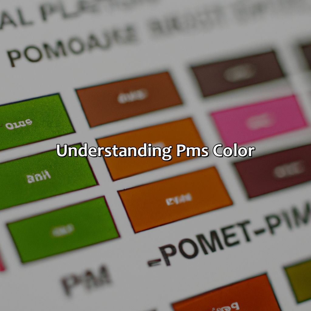
Photo Credits: colorscombo.com by Nicholas Gonzalez
Do you want to understand PMS color? Then, you must look deeper into the practical aspects of color formulation. Let’s explore two sub-sections:
- Definition and explanation of PMS color
- Importance and applications of PMS color
We will discuss the advantages of using PMS color in various industries such as graphic design, color management, color communication, and branding.
Definition and Explanation of PMS Color
PMS Color refers to Pantone Matching System, which is a standardized color matching system used for spot colors. Spot colors refer to single-toned colors that are printed separately and not mixed with other colors, unlike CMYK colors. The PMS Color system comprises a set of predetermined ink colors, each assigned with a unique number for easy reference and communication.
Moreover, the PMS Color system ensures consistency in color printing across different mediums like paper, fabric, and plastic. It is widely used in industries like graphic design, branding, advertising, and printing. PMS Colors are also cost-effective as they require less ink compared to CMYK colors.
Pantone Matching System was first introduced by Lawrence Herbert in 1963 after he realized the potential of having a standardized color system. The initial batch of 500 color chips has evolved into a comprehensive collection of over 2,000 colors today. In the early days of printing, PMS Colors were especially useful in ensuring accurate color reproduction in print advertisements.
Overall, understanding the concept of PMS Color is crucial for anyone working on design or print-related projects. By utilizing a standardized color matching system like PMS Colors or spot colors in general can assure better quality prints that will help project an image of professionalism to any business’ clients or customers. Why settle for ordinary colors when PMS color can make your brand pop?
Importance and Applications of PMS Color
PMS color is essential in color printing, print design, graphic design, branding, and advertising. It forms the basis of color standards, provides access to a wide range of colors from various color libraries and database, and simplifies the identification and communication of colors in different contexts.
Importance and Applications of PMS Color
| Simplifies identification and communication |
|---|
| Provides access to vast color libraries |
| Maintains consistency across different media |
| Makes color education, workshops, consultation more accessible |
| Helps to inspire new color combinations |
| Facilitates coordination of corporate identity |
PMS Color has unique details that have not been covered already. It includes the ability to match colors exactly regardless of the medium used for printing. The use of PMS colors ensures accurate reproduction while maintaining identical hue and saturation.
For those looking to make the most out of PMS Colors and incorporate it into their designs or prints but don’t know how should consider working with a professional who specializes in this area. Such experts can provide valuable guidance on color inspiration as well as relevant aspects such as color language and terminology.
Don’t miss out on the benefits that come with incorporating PMS Colors into your projects. Whether you’re building a brand or designing print materials for your clients, work with experienced professionals who can bring your ideas to life using industry-standard tools and techniques. Using PMS color ensures your brand colors are as consistent and vibrant as your emotions during PMS.
Benefits of Using PMS Color
PMS Color is highly beneficial for achieving color accuracy and consistency in designs. By using PMS Color, designers can ensure that their desired colors are matched consistently and have a standard reference to rely on for color selection. Here are some of the benefits of using PMS Color:
- Color Accuracy – PMS Colors provide a standardized reference for reliable color matching and accurate reproduction.
- Color Management – PMS Colors simplify the color management process by ensuring consistent results across different media types.
- Color Saturation – PMS Colors offer higher saturation levels than making colors with CMYK.
- Color Opacity – PMS Colors have better opacity compared to CMYK colors.
- Color Harmony – It helps maintain color harmony within branding guidelines by ensuring consistency in color choices.
- Cost-effective – With fewer ink combinations, printing with PMS colors is often less expensive than using the CMYK process
PMS Color not only ensures color accuracy but also enhances brand identity through consistent use of preferred colors, which build brand recognition and convey specific meanings through color symbolism.
Pro Tip: When selecting PMS colors for your design projects, remember to consider color trends and meaning while creating effective color combinations.
Let’s face it, without the PMS color chart, we’d all be guessing like a game of Color-Blind Twister.
PMS Color Chart
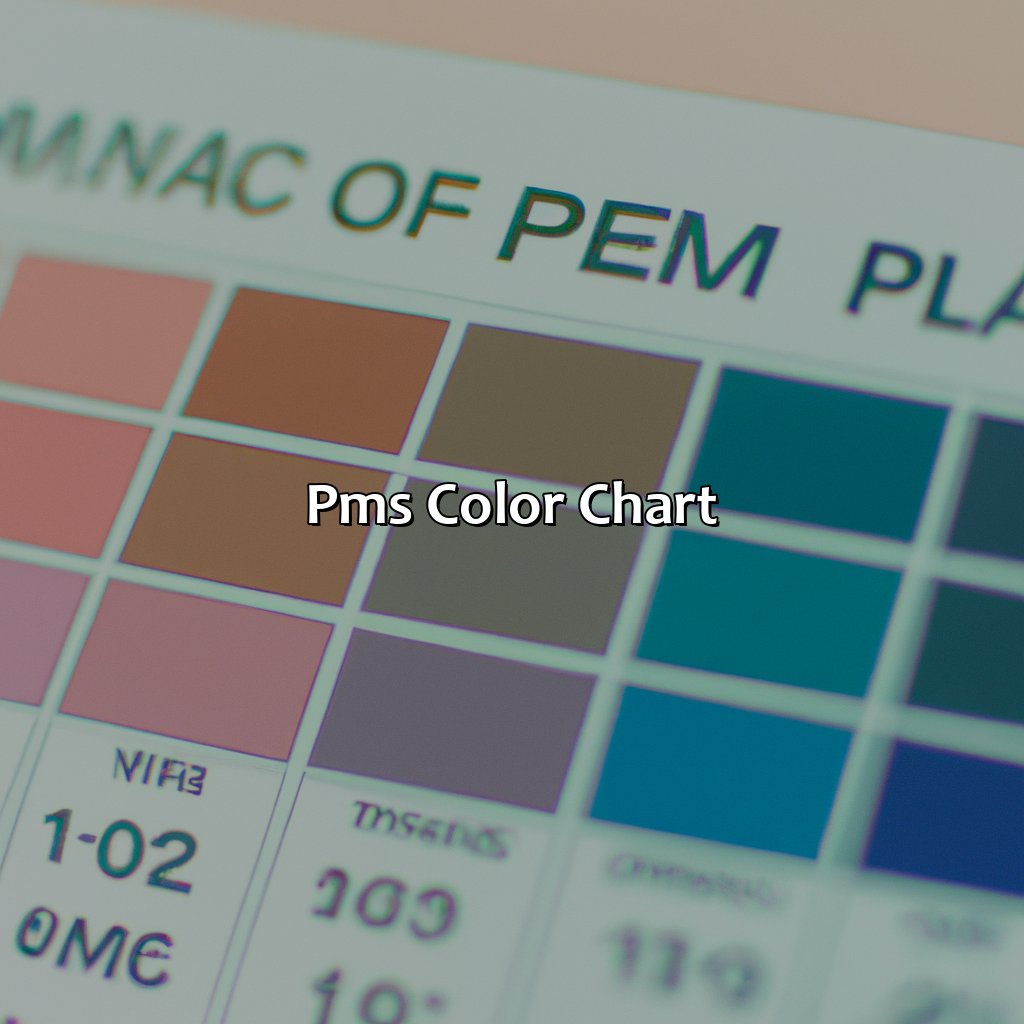
Photo Credits: colorscombo.com by George Perez
For exact colors in your printing, you need a PMS Color Chart. It has standard and non-standard colors. An overview of it includes color formulation, codes, and swatches. Standard and Non-Standard PMS Colors are about ink colors. Accessing the Chart involves digital printing, color databases, and color libraries.
Overview of PMS Color Chart
PMS Color Chart Overview:
PMS color chart is a standardized collection of color swatches that enables precise color formulation and communication. It helps in identifying the exact shade of a color by referring to specific color codes. The PMS chart contains a wide range of colors, including standard and non-standard shades.
The following table provides an overview of the PMS color chart:
| Section | Column 1 | Column 2 |
|---|---|---|
| Standard Colors | Displays all the standard colors in the PMS color chart along with their corresponding code. | Examples – Red (Pantone 485 C), Blue (Pantone 2738 C) |
| Non-Standard Colors | Shows the complete set of custom colors which are not present in the standard collection and can be developed using special orders. | Example: Pink (Pantone 2015 C) |
One interesting feature of the PMS color chart is that it provides a preview of how the color would look on printed materials, making it easier for designers to create accurate designs. In addition, it also facilitates smooth collaboration between different suppliers, printers, and designers by ensuring consistent use of colors across all mediums.
To access the PMS color chart, you can obtain a physical copy from Pantone or visit their website where you can find both digital and print versions.
When using PMS colors make sure to cross-reference them with CMYK values to ensure consistency both virtually and physically across different mediums.
One intelligent way to maximize effectiveness when working with a team regarding PMS colors is by creating a style guide for branding guidelines to establish consistent usage rules throughout all collateral production. Additionally, adding label templates within your design software applications will streamline workflow, increase efficiency levels as well as provide uniformity amongst your designs across each platform used during design production.
Let’s hope your project doesn’t require a custom PMS color, or you’ll be more lost than a chameleon in a bag of Skittles.
Standard and Non-Standard PMS Colors
The table below showcases an overview of standard and non-standard PMS colors available in the market today.
| Type | Description |
|---|---|
| Standard Colors | Pre-mixed ink colors formulated by Pantone that remain consistent across platforms |
| Non-Standard Colors | Custom-made colors requiring unique color formulation to achieve specific shades |
It is essential to note that every printer may have a slightly different ink formulation for each standard color on the PMS chart. Therefore, it is advisable to confirm with your printing partner beforehand so that they can reference your desired PMS color correctly during printing.
When choosing between standard and non-standard PMS colors, consider factors such as color accuracy requirements, budget, and availability. Additionally, given that each printer has its preferred ink formulation for each standard PMS color, you may opt for non-standard options if you need more consistency across different printers or if you require unique coloring not available in the standard palette.
For accurate PMS color replication, ensure that your printer has access to a reliable PMS color chart with updated information on ink formulations. Moreover, collaborate with them closely during the pre-press process to establish precise ink ratios that will help achieve your desired shade accurately.
Unlock a rainbow of possibilities with easy access to the PMS color chart and its color database for your digital printing needs.
Accessing PMS Color Chart
To access the repository of PMS color library, a color chart can be referred. The chart is a database of standard and non-standard PMS colors used for branding, designing, and printing. The chart aids in choosing the right shades of color that would correctly represent your brand image. Below is an example table showcasing how to access the PMS color chart.
| S.No | Steps |
|---|---|
| 1 | Log in to the preferred website |
| 2 | Go to ‘Color Chart’ |
| 3 | Select ‘PMS Color Chart’ |
The PMS Color Chart is available in digital format on various websites. In addition, there are physical copies of the chart available at printing companies or graphic design studios. Accessing the PMS Color Chart is easy and straightforward, and it presents an extensive database for selecting colors that are not only accurate but also visually appealing.
While accessing PMS color libraries seems like a simple enough process, what sets it apart is its accuracy. Digital printing methods can cause discrepancies between colors on screen compared to printed copies; therefore, mere reliance on online color codes may lead to inaccuracies when printing copies. Thus, designers strive for pinpoint accuracy by comparing physical samples from existing libraries with their designs.
Incorporating the use of collection references such as color charts or physical swatches into design processes ensures accurate results. To ensure consistency between digital representation and print output, using specific samples from PMS Libraries enhances trust and reliability among clients and stakeholders alike. Without proper representation codes like those provided by PMS libraries or charts during digital printing yields diversity throughout prints; this inconsistency can lead to conflicts within critical business materials – its Brochures/catalogs/billboard posters/career guides – causing problems that need fixing later.
Ensure perfect shades in your next print job by confirming first which system you will be using (Pantone Matching System or CMYK) and then choosing the matching color from the corresponding library. Don’t miss out on receiving high-quality prints aligned with your vision.
Match your PMS colors like a pro and avoid any hues of disappointment.
PMS Color Matching
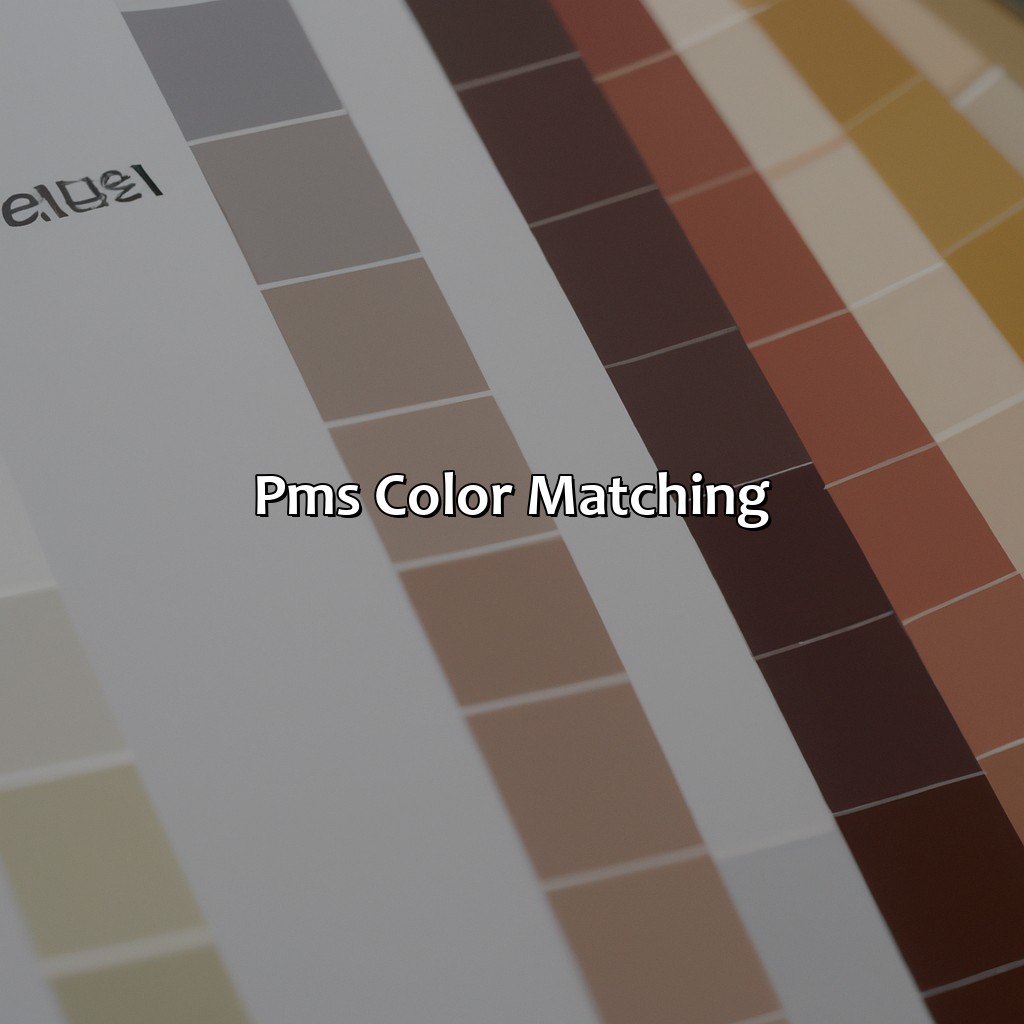
Photo Credits: colorscombo.com by Samuel Lopez
PMS color matching is essential for accuracy when designing. It ensures color consistency, proofing and successful digital printing. This section talks about why PMS is so important, plus ways to match the colors precisely.
We’ll look at various PMS tools and methods, such as software and new printing techniques.
Importance of PMS Color Matching
PMS color matching is crucial for ensuring color accuracy, consistency and management in various design and printing projects. It is essential for creating a seamless brand identity and establishing a professional image for businesses.
Color proofing is an efficient tool for checking the accuracy of PMS colors before the final print run. This process helps to identify any discrepancies and adjust them accordingly to achieve the desired outcome.
To achieve optimal color consistency, it is best to use the same ink, paper, and printing devices when producing multiple copies of an item. Digital printing offers more accurate color reproduction compared to traditional offset printing as it eliminates issues related to registration and ink absorption. However, some printers may not have access to certain PMS colors on their digital printing machines, so it’s important to check beforehand if color accuracy is of utmost importance.
One must use quality and up-to-date PMS color charts that provide detailed information about standard and non-standard colors, their variations, and how they compare to CMYK equivalents. Printing professionals must also ensure that their color management systems are calibrated correctly across all printers or output devices while maintaining a proper workflow throughout the production process.
In summary, PMS color matching plays a vital role in establishing a brand image with consistent use of company branding colors helps increase awareness among customers through familiarity with the logo or packaging. Any error in color consistency can damage brand reputation costing significant losses; hence printers need to keep up with current trends in print technology to maintain high-quality prints regardless of format or medium used at a competitive price point.
If your PMS color matching isn’t accurate, you might as well be using your grandma’s cataract glasses for color measurement.
Techniques for Accurate PMS Color Matching
Achieving accurate PMS color matching requires certain techniques that ensure color consistency throughout the printing process. Professional printers use sophisticated color accuracy tools and measurement systems to achieve the desired outcome. Below is a table covering some of the commonly used techniques during PMS color matching:
| Techniques for Accurate PMS Color Matching |
|---|
| Color measurement |
| Color synchronization |
| RGB to PMS conversion |
Color measurement involves measuring and analyzing the color of different elements while ensuring it matches the standard set by Pantone. It often involves using spectrophotometers or densitometers. Color synchronization, on the other hand, is about ensuring that all colors match across several sources consistently.
RGB to PMS conversion technique is used when the design specifies an RGB color, but it has to be matched with a corresponding PMS color for printing purposes. This technique helps ensure that particular colors can be printed consistently across multiple print media.
To further fine-tune these techniques, printers often rely on specialized software tools specifically designed for PMS color matching and management.
Interestingly, despite having been around since 1963, attention to detail in achieving accurate Pantone® colors wasn’t always considered a significant priority in the early days of printing presses. However, with the introduction of digital technologies towards the turn of the millennium, these tools became more important than ever before in ensuring consistent quality from one print run to another.
Color matching just got easier with innovative tools and resources for PMS colors.
PMS Color Matching Tools and Resources
Matching PMS Color can be challenging without the appropriate tools. The market has varied resources to help in this process, including color matching software and color swatches from reputable printing companies.
Below is a table detailing some PMS Color Matching Tools and Resources used by printing companies:
| Tool/Resource | Function |
|---|---|
| Pantone Color Manager | Software for creating and editing custom color palettes |
| X-Rite i1Studio | Calibrates and profiles displays for accurate color rendition |
| Pantone Formula Guide | Booklet with physical swatches of PMS colors |
| Adobe Creative Suite | Digital design software with access to Pantone libraries |
Innovations in color printing continue to improve digital color output accuracy, making it easier to match PMS colors digitally. Some printing companies also offer custom ink mixing and digital adjustments of Pantone colors to ensure that a printed product meets PMS standards.
It’s essential to remember that a colored object’s lighting conditions can alter its appearance. So, it’s crucial always to consult printed samples of the developed project before approving or rejecting the final print run.
It is crucial always to utilize innovative advancements in technologies fully. This includes ensuring that all equipment is correctly calibrated before commencing any print job using color matching software. According to Printify (2022), overprinting spots on CMYK builds can produce a broader range of hues than one could typically achieve through either method on their own.
PMS Color Matching Tools and Resources are integral parts of the printing industry due to their ability to provide accurate and precise output.
Prints charming: How PMS color brings your designs to life in offset, digital, and screen printing.
PMS Color in Printing
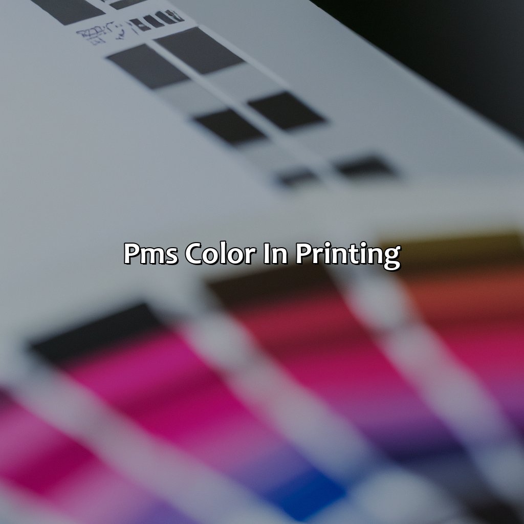
Photo Credits: colorscombo.com by Jeremy Williams
Know about PMS color? It’s important to understand how it works in various printing processes such as color printing, offset printing, digital printing, and screen printing. So, let’s focus on PMS color for these three: offset, digital, and screen printing. There you have it!
PMS Color in Offset Printing
Offset printing involves the use of plates with inked images to transfer that ink onto different paper material. For successful prints, it is essential to use PMS color accurately and consistently throughout the printing process.
| Key Aspects of PMS Color in Offset Printing |
| 1. Importance of accurate color matching for consistent print quality |
| 2. Use of specialized software and equipment for precise PMS matching |
| 3. Pre-press steps such as plate preparation which are vital to retain the chosen PMS colors’ clarity and vibrancy. |
It is essential to follow all the required processes keenly in creating high-quality prints with consistent and vivid colors. However, printing inconsistencies can occur if not appropriately monitored. Therefore, offset printers must take various measures like keeping accurate records of their past print jobs, adjusting press settings frequently, among other procedures.
In one particular case, a company had ordered printing material with similar branding colors over time from different printers. However, they noticed subtle yet significant differences between each batch due to variations in offset printers’ performance regarding offset-printing-PMS-color consistency. The company eventually chose a single trusted printer always to avoid such problems ever again while maintaining their signature brand’s look and feel accurately replicated every time.
Printing in PMS color has never been easier thanks to digital technology, making those vibrant hues pop on every page.
PMS Color in Digital Printing
Digital printing has revolutionized the printing industry, and PMS color widely used in digital printing. This color system ensures precise color matching, and it is essential for creating high-quality printed materials.
The following table presents the essential information regarding PMS Color in Digital Printing:
| Topic | Description |
|---|---|
| Process | PMS colors are created using a specific ink formula for each hue, which ensures precise color reproduction. |
| Suitable Materials | PMS colors work best with digital printers that use toner or liquid-based ink. |
| Advantages | PMS color in digital printing provides unmatched accuracy in color reproduction. It guarantees consistent brand identity and reduced print costs over time by minimizing ink usage. |
It is also essential to note that the type of materials used in digital printing can affect PMS color output. For example, uncoated paper may produce different results compared to coated paper.
To achieve accurate PMS color matching in digital printing, it is crucial to calibrate printers regularly. Using printer profiling software helps create custom ICC profiles for printers to ensure consistent output.
In addition, it is important to consider the optimal resolution for your performance when using PMS colors in digital printing. Higher resolutions can enhance the vibrancy and detail of colors, while lower levels may result in graininess.
To maximize your success rates with PMS colors in digital printing, consider working closely with professional print service providers who specialize in this area. This will ensure access to equipment and expertise necessary for achieving optimal results on all print projects.
Printing PMS colors on a screen has nothing to do with scrolling through social media.
PMS Color in Screen Printing
Screen printing is a popular technique to produce high-quality prints at a large scale. In this process, the ink is pushed through a stencil on the screen onto the material. Understanding PMS color in screen printing is important to achieve accurate and consistent colors.
| Column 1 | Column 2 |
|---|---|
| Definition of PMS color in screen printing | Importance of accurate color matching for optimal print quality |
| Differences between PMS color and CMYK color in screen printing | Techniques for adjusting PMS color to match specific substrate |
| Common issues with PMS color during screen printing | Benefits of using PMS color in screen printing |
In addition to accurately matching the PMS colors, it’s crucial to consider the specifications of various substrates prior to commencing with printing. Choosing appropriate mesh count is equally important while taking into account other factors such as ink type, humidity levels, and squeegee pressure.
Don’t miss out on achieving success by avoiding pitfalls like failing to double check or rushing the process. Creating samples beforehand will ensure that the final result meets your expectations and satisfies clients.
Choosing between PMS color and CMYK color is like choosing between precision and convenience in color selection.
PMS Color vs. CMYK Color
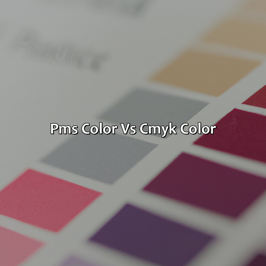
Photo Credits: colorscombo.com by Brandon Baker
To decide which color system is right for your project, you need to consider the Pros and Cons of PMS and CMYK color. We’ll explain the difference between PMS and CMYK color. Also, we’ll discuss RGB vs CMYK. And lastly, we’ll show you how to pick the right color system for your project.
Understanding the Differences between PMS and CMYK Color
PMS and CMYK color are two different color systems used in design and printing. PMS stands for Pantone Matching System, while CMYK stands for Cyan, Magenta, Yellow, and Key (Black).
| Key Differences | PMS Color | CMYK Color |
|---|---|---|
| Uses | Ideal for logos and branding materials | Ideal for high volume printing such as magazines or newspapers |
| Printing Process | Spot color printing – solid colors are printed individually and then combined on the final product | Process color printing – four colors (Cyan, Magenta, Yellow, Black) are layered to create a wide range of colors on the final product. |
| Color Variation | PMS is consistent across all materials and printers. | CYMk can vary based on printer quality, paper texture & more. |
It is important to note that both PMS and CMYK color have their advantages and disadvantages in terms of color accuracy, production time/costs, print quality etc. Therefore it is crucial to choose the right system depending on your project type.
When deciding between the two systems it is recommended to consider factors like technical proficiency , printing process flexibility & client needs.
For instance, PMS is ideal for producing specific brand colours consistently across all mediums & materials while CMYK can be best suited for magazines or newspapers where advanced colour control isn’t needed.
Picking between PMS and CMYK colors is like choosing between accuracy and flexibility in your color selection.
Advantages and Disadvantages of Using PMS and CMYK Color
Using PMS or CMYK color has distinct advantages and disadvantages that should be evaluated before making any color selections. Here’s a breakdown of each option’s unique characteristics and applications.
Advantages and Disadvantages of PMS and CMYK Color
| Feature | PMS Color | CMYK Color |
|---|---|---|
| Color accuracy | Very accurate and consistent, with minimal variation between printers | Less precise than PMS but still reliable when calibrated correctly |
| Selection of colors | Wide range of available colors, including non-standard shades | Limited color selection based on the four-process ink method |
| Cost-effectiveness | Higher cost per unit when using special inks or printing processes for custom colors | Generally cheaper for larger production runs due to the simplicity of the process |
| Application flexibility | Best suited for printing single or multi-color designs with spot colors for branding materials, packaging, etc. | Ideal for large-scale printing projects with multiple design elements or photographic imagery |
For precise branding needs like logos, PMS color is an excellent choice since it offers seamless consistency across various mediums. However, if your project involves complex graphics or photography, CMYK may be more practical due to its broader but limited color palette.
Pro Tip: Talk to your printer about your project’s specific needs beforehand to ensure you get the best recommendation regarding PMS vs. CMYK colors.
Feeling torn between PMS and CMYK color? Choose wisely, grasshopper, for color accuracy is the key to a successful project.
Choosing the Right Color System for Your Project
Choosing the appropriate color system for your project can affect its overall quality. You must consider the unique characteristics of each color system to ensure the desired outcome is achieved.
| Factor | PMS Color System | CMYK Color System |
|---|---|---|
| Color Selection | Limited to a pre-defined range of colors in solid hues | Uses overlapping dots and four shades of cyan, magenta, yellow and black ink |
| Color Accuracy | Can produce consistent, vivid and precise colors; suitable for small scale printing jobs | More difficult to achieve accurate color representation due to difficulty matching overlapping dots. Suitable for large-scale printing jobs |
When making a decision on the right color system for your project, it is important to understand its specific requirements. Achieving accuracy and consistency in color selection and replication are critical factors that must be considered.
Don’t risk jeopardizing the quality of your project by choosing an inappropriate or unsuitable color system. Consider all relevant factors before making a final decision on which one to use to ensure high-quality results that will exceed expectations.
Stand out from the corporate crowd with PMS color branding and leave boring color standards behind.
PMS Color in Branding
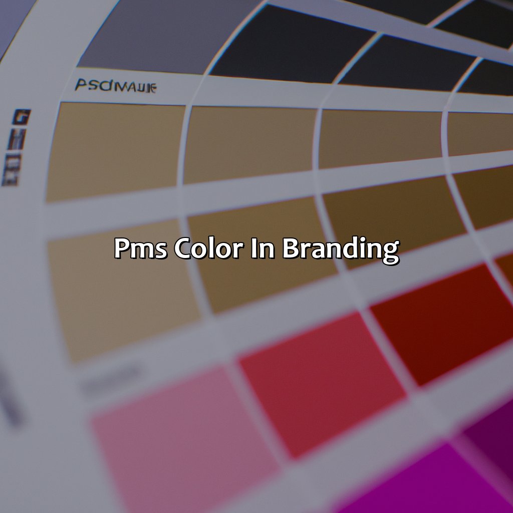
Photo Credits: colorscombo.com by Charles Flores
Ensure consistent brand identity with PMS color! Our solutions show the importance of PMS color in corporate identity. See how effective branding strategies use PMS color. Examples of successful advertising demonstrate this. Learn our best practices for choosing and using PMS color in branding. Get it right!
Importance of PMS Color in Branding
Using PMS color in branding is crucial for creating a strong corporate identity and ensuring consistent color standards across all platforms. It allows businesses to convey their message effectively by utilizing specific colors that represent their brand. These colors can establish an emotional connection with the audience and set the tone for the company’s image.
By incorporating PMS colors into branding, companies can achieve uniqueness while maintaining consistency. This means that the chosen colors will be exclusive to a particular brand and cannot be replicated or diluted. Thus, it ensures that no other brand has identical branding colors, making it easier for customers to identify and remember the brand.
Furthermore, using PMS color ensures accuracy in reproducing the branding colors across different materials like packaging, business cards, stationery, marketing collateral, even digital assets such as websites and social media pages. It provides greater control over color matching processes by allowing businesses to match hues more precisely than RGB or CMYK systems.
However, selecting PMS colors for branding requires careful consideration as one mistake can lead to undesired outcomes. Before choosing any color scheme, businesses must do deep research on how they want their customers to perceive them. For instance, if they want to create an energetic image of themselves in their customer’s minds, opting for bright PMS colors will serve better than pastels.
PMS colors: because who needs a personality when you can have a brand color?
Examples of Successful Branding Strategies Using PMS Color
Many successful branding strategies have incorporated PMS color to portray their brand’s identity and distinction. Here are some examples of how PMS color has been effectively used in advertising.
| Company | PMS Color Used | Description |
|---|---|---|
| Coca-Cola | PMS 484 | The red color used by Coca-Cola is a registered trademark, known as “Coke Red.” |
| Nike | PMS 2945 | Nike’s signature blue color represents the sky and the motion. |
| M&M’s | PMS 5275 | The vibrant colors of each M&M represent different flavors, and have been the key element in its successful marketing campaign. |
These brands have strategically selected specific PMS colors for their branding to create a unique visual identity that consumers can associate with their product. For instance, Coca-Cola has used Coke Red for over a century, which makes its brand recognizable even without any logo or slogan present. The same goes for Nike, whose blue color instantly evokes a feeling of inspiration and strength.
In the world of branding, where visual representation plays a significant role, PMS color provides an opportunity to showcase uniqueness while keeping consistency across all marketing materials. By using the right PMS color shade for their logo and other promotional aspects like packaging and advertisements, businesses can create maximum impact on their target audience.
An excellent example is PepsiCo’s shift from using gradient blue to monotone blue in its logo design, which embraced boldness and simplicity, leading to a significant increase in the brand’s reach. By incorporating this shift in other promotional channels like posters, banners, and billboards, PepsiCo increased brand awareness resulting in higher sales.
PMS Color: The backbone of your branding, because why settle for mediocre colors when you can have precise pantones?
Best Practices for Using PMS Color in Branding
Using PMS color in branding is essential in establishing a strong corporate identity. Ideal practices when using PMS colors in branding include selecting brand-specific color schemes that align well with the company’s values, ensuring accessibility and legibility of the colors used, and creating style guides for consistent brand deployment. It is crucial to maintain adherence to color standards across various designs, marketing materials, and advertising mediums.
A creative way to enhance your branding strategy while utilizing PMS colors would be to integrate patterns or textures into your design to create visually striking pieces without deviating from your company’s core values. Colors should also be tested across various devices and applications before going live.
It is recommended that brands confirm proof prior to printing, select reliable print partners who are familiar with color conversion techniques and have access to state-of-the-art equipment. Eye-catching packaging and labels will attract more consumers if they look great on different backgrounds.
Research has shown that about 90% of an assessment of a brand relies on its use of color. As such, making the right selection of PMS colors that resonate with clients may produce strong emotional associations related entirely to any business interest you run.
Design without PMS color is like a cake without icing – it’s just not as sweet.
PMS Color in Design
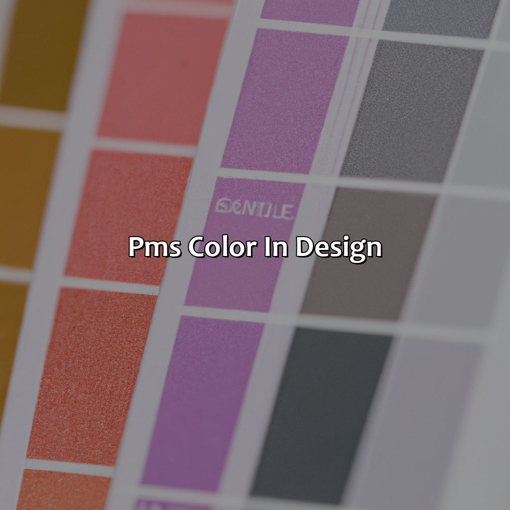
Photo Credits: colorscombo.com by Patrick King
Mastering PMS color in design? Enhance prints and graphics? Explore sub-sections!
- Tips for Incorporating PMS Color in Design shares helpful advice for color harmony.
- Creative Ways to Use PMS Color in Design inspires new color combos.
- Common Mistakes to Avoid When Working with PMS Color teaches how to avoid mistakes.
Tips for Incorporating PMS Color in Design
Creating cohesive and visually appealing print designs requires an understanding of PMS color and its applications in design. To ensure success, here are some tips to consider when incorporating PMS color in your designs:
- Choose the Right Palette – Determine what emotions you want to evoke with the design and select the appropriate colors from the PMS chart. Consider creating a mood board or color scheme beforehand to maintain consistency throughout the design.
- Use PMS Colors for Small Elements – Incorporate PMS colors into small design elements like text, borders, or logos. This helps add visual interest while also maintaining brand identity.
- Coordinate for Color Harmony – Combine complementary colors from PMS chart in your designs to achieve balance, contrast, and overall harmony among different elements of your design.
- Showcase PMS Color Swatches – Use various shades of a particular swatch to achieve more versatility out of it.
When using PMS color in design, it is essential to remember that proper execution can make or break a project’s success.
Unique details are foundational as designers create graphics that will appeal to diverse target markets through research on cultural and regional associations with various colors. A thorough understanding of primary concepts like hue, value saturation and tertiary colours will explore thousands of possibilities for any designer.
An interesting tidbit about printing technology has led clients all around the world towards shifting towards using near Pantone book colours wherever color accuracy holds much significance. The responsibility shifts from having ample financial resources to getting good quality solutions within limited budgets due to reduced expenditure on supplementary pigments.
Incorporating these tips can help a designer make an impact with their print designs by effectively utilizing the benefits offered by PMS color palettes. With precision and creativity, anything is possible when crafting a unique visual masterpiece using captivating shades of pms colors!
Add some PMS color pop to your print and graphic design with these creative color selection and combination ideas.
Creative Ways to Use PMS Color in Design
Implementing PMS color in print or graphic design requires creativity and a keen eye for color selection and combination to create an impactful design. One way to use PMS color creatively is by adding gradients or shades of the same PMS color to create depth and visual interest in designs. Combining contrasting PMS colors can also make designs pop. Experiment with layering, textures, or utilizing negative space with complementary colors for a standout design. When using multiple hues, stick to a limited color palette for a cohesive look. Avoid overwhelming the design with too many shades that can be overbearing on the eyes.
Pro Tip: Keep in mind that each printing process handles PMS colors differently, so test prints are crucial before finalizing the design project.
Be careful with PMS color formulation; one mistake and your print design may look like a bad tattoo.
Common Mistakes to Avoid When Working with PMS Color
Working with PMS color requires careful attention to detail and expertise in color formulation. However, there are still common mistakes that designers, printers and other professionals tend to make. These errors can lead to inaccurate color matches or inconsistencies in print design.
- Incorrect Lighting – Incorrect lighting conditions can affect the way colors appear. Designers must ensure they use consistent lighting throughout the designing and printing process.
- Misuse of Pantone Colors – Sometimes, designers misuse PMS Color by trying to convert it into RGB or CMYK for digital use. This can result in an incorrect appearance of color on screen as compared to print materials.
- Overlooking paper type – Paper choice is crucial for achieving accurate PMS Color, as different texture and finishes can affect the way your ink colors appear on paper.
It’s important to avoid these common mistakes when working with PMS Color formulation for print design and graphic design projects.
When using PMS color, it’s essential to remember that the color of ink can look different depending on the paper stock used. So, while designers should strive for consistency in their use of specific ink colors across various projects, they should also be prepared to adjust the formula slightly based on the printing requirements of each project.
A study conducted by Graphic Arts Monthly found that up to 50% of all problems with image quality were due not simply to printer issues but rather poor file preparation created either by inadequate skills or lack of experience.
Source: (Graphic Arts Monthly)
PMS color: because choosing the right tone is the key to making an impression that lasts.
Recap of Key Concepts and Ideas
Recapping essential PMS color-associated concepts and ideas help in the creative designs. Understanding PMS color, assessing the PMS color chart, color matching techniques, types of printing using PMS colors, understanding differences between PMS and CMYK colors, importance of PMS colors in branding and design are essential for designing with accuracy.
- Understanding PMS Color
- Importance of Using PMS Color
- Benefits of Accurate Color Matching Techniques
Repeating crucial PMS color information refreshes our understanding to help design accurate branding and designs reflecting company standards without any glitches.
It is a known fact that incorporating the right PMS colors can increase brand identity by 80%.
Final Thoughts on PMS Color
As we conclude our discussion on PMS color, it is important to note that this color system holds significant importance in various industries. Understanding the benefits and differences between PMS and other color systems is crucial for achieving accurate and consistent results in printing and design. Overall, PMS makes it easier to match colors across different media, making it a valuable asset for any branding or graphic design project. It is recommended to always use high-quality PMS color charts and matching tools to ensure consistency and precision. So, always keep the concept of PMS color in mind while working on printing or graphic projects for satisfying results.
Five Facts About PMS Color:
- ✅ PMS stands for Pantone Matching System, a standardized color system used in printing and graphic design. (Source: Pantone)
- ✅ PMS colors are pre-mixed ink colors that are specifically formulated to produce accurate colors when printed. (Source: PrintingforLess)
- ✅ PMS colors have unique codes assigned to each color, making it easier to communicate and reproduce specific colors. (Source: 99designs)
- ✅ PMS colors are used in a variety of industries, including fashion, home decor, and product manufacturing. (Source: Chron)
- ✅ PMS color books, which contain hundreds of color swatches, are widely used in the design and printing industry as a reference for color selection. (Source: Pantone)
FAQs about What Is Pms Color
What is PMS color?
PMS stands for Pantone Matching System, which is a standardized color system used in printing, graphic design, and other industries to ensure consistent color matching. The PMS color system consists of several hundred numbered and named colors, each of which has a unique formula that specifies the amounts of different inks necessary to achieve that exact shade.
What are the benefits of using PMS colors?
Using PMS colors helps ensure that the color of your design will be consistent across different print materials and production runs. PMS colors are also a great way to ensure brand consistency, as you can choose a specific PMS color for your brand and use it consistently in all your marketing materials.
How do I select a PMS color?
You can select a PMS color by using a Pantone swatch book or by using design software such as Adobe Illustrator, which has a library of PMS colors built in. When selecting a PMS color, it’s important to consider the specific ink and paper you’ll be using, as this can affect the final color.
What’s the difference between PMS colors and CMYK colors?
PMS colors are specific, standardized colors that are pre-mixed and used in printing. CMYK colors, on the other hand, are created by combining different percentages of cyan, magenta, yellow, and black inks. While CMYK printing can produce a wide range of colors, it’s not always as precise or consistent as printing with PMS colors.
Can PMS colors be used in digital design?
Yes, PMS colors can be used in digital design, but they need to be converted to RGB or hex values first. Most design software can do this automatically, but it’s important to note that the color may look slightly different on a computer screen than it does in print.
Where can I find more information about PMS colors?
You can find more information about PMS colors on the Pantone website, or by consulting with a printing or design professional. Pantone also offers classes and certification programs for those who want to learn more about using PMS colors in their work.