Key Takeaway:
- Sepia color is a warm, amber color with a brownish tint that resembles an aged, vintage look. It’s often used in photography, painting, and graphic design to evoke a sense of nostalgia or historic feel.
- Sepia color has a rich history dating back to the 19th century, when sepia photography was popular for its classic look. Today, sepia color is still popular for its timeless quality and enduring character.
- Sepia color has unique properties, including its warm tone, coppery hue, and weathered, grunge effect. Hue and saturation, lightfastness and fading, and opacity and transparency all play a role in the appearance of sepia color.
What is Sepia Color?
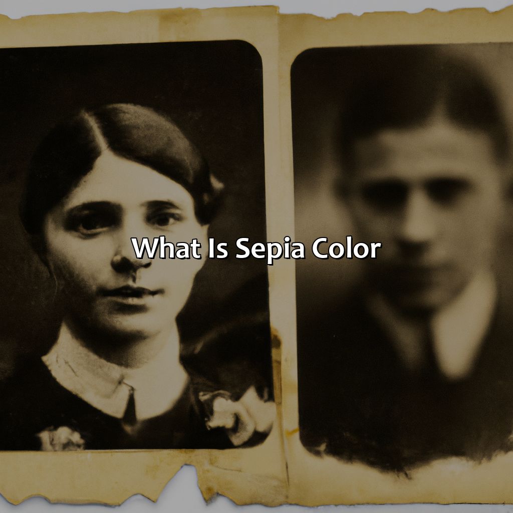
Photo Credits: colorscombo.com by Donald Hernandez
Sepia color refers to a warm brown hue used in photography to replicate the historic appearance of antique photographs. The color gives photographs a rich, timeless quality and is achieved with the use of sepia tone or sepia effect filters. These creative tools allow photographers to add a classic look to their images and evoke feelings of nostalgia and depth.
The sepia filter creates a beautiful vintage look to the images and adds a layer of warmth and beauty to them. Photographers can create a vintage mood to their images using the sepia filter or tone, making them perfect for old-fashioned shots. Don’t miss out on the opportunity to create stunning vintage photos with the sepia effect tools in your photography arsenal.
History of Sepia Color
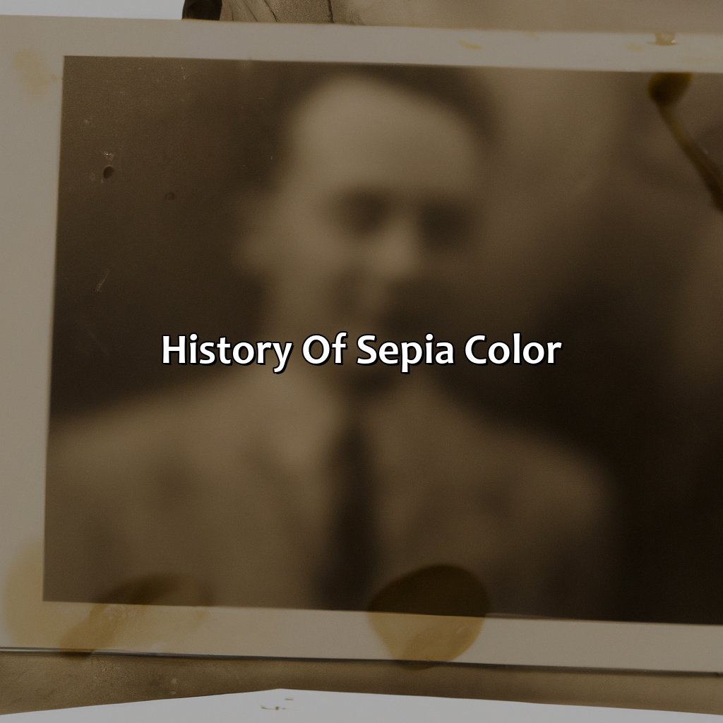
Photo Credits: colorscombo.com by Eric Carter
The beauty of sepia color is timeless, but what is the history behind this vintage effect? Sepia was originally used as a traditional method of developing photographs in the 19th century. Black and white prints were washed in a solution of sodium sulfide and then treated with sepia toner to make them last longer. Today, sepia is often used to give images an antique or aged look, with its distinctive brownish tint and yellowed hue.
When considering the historic look of sepia color, it’s important to note its connection to nostalgia. Many people associate the retro look of sepia with fond memories of the past, which is why it’s so often used in vintage-inspired designs. Despite its age, sepia remains a popular technique to this day, thanks to its ability to evoke a sense of nostalgia and longing for a bygone era.
One unique detail about sepia is that it can be used to give both photographs and artwork an aged look. This is due to its ability to provide a subtle, warm tint that softens sharp lines and makes images appear more organic. Whether you’re looking to give your artwork a historic feel or add a touch of old-timey charm to your photography, sepia is a versatile and effective choice.
For example, famed photographer Ansel Adams often used sepia to add depth and warmth to his landscape images, emphasizing the natural beauty of the surrounding environment. The use of sepia added an extra layer of artistry to his photographs, making them even more stunning and memorable. Sepia color continues to be a beloved and timeless choice for artists and photographers alike, thanks to its ability to evoke such powerful emotions and memories.
Properties of Sepia Color
Photo Credits: colorscombo.com by Kyle Jones
Explore the unique properties of sepia color! Its warm tones, amber hues, coppery looks and earthy, rusty vibes give it a grunge, distressed, and faded effect. Learn about its hue and saturation, lightfastness and fading, and opacity and transparency. Get a comprehensive understanding of sepia’s features!
Hue and Saturation
Sepia color has a unique hue and saturation that make it distinctive in its composition. The color is subdued and muted, creating a vintage effect that is revered in art and photography.
| Hue | Saturation |
|---|---|
| A reddish-brown tint | Low saturation, giving it a muted look |
This combination makes the sepia effect perfect for creating old-timey vibes in visual media. While sepia can affect different colors differently, its hue remains constant.
The sepia tone’s low saturation makes it difficult to blend with other colors, and the resulting color may become too dark. Additionally, over time, the color may fade due to light exposure or chemical reactions.
Pro Tip: When using sepia, consider its subtle nuances and carefully choose accompanying colors to ensure an impactful result.
Sepia color adds a vintage effect to any design, just like how aging and weathering add character to a good whiskey.
Lightfastness and Fading
The endurance of Sepia color against aging, weathering, and fading is a crucial aspect to retain its vintage effect. The time for which the hue keeps intact without losing its brightness is called “lightfastness.” It indicates quality and permanence, making it an ideal pigment for archival or museum-grade works. To achieve even greater stability, lightfastness rating systems are followed in different industries.
Sepia’s excellent lightfastness assures its longevity, making it one of the preferred pigments for historical and archival projects. As a result of this specific property, sepia-tinted photographs remained as striking as they were taken centuries ago. However, it is imperative to note that exposure to direct sunlight can cause fading over time. Additionally, professional-grade paints usually suggest using it in color mixes rather than using alone as they tend to be weaker than darker earthtones.
It is critical to ensure the maintenance of sepia-colored artworks by avoiding their display exposed to intense sunlight or humid climates. They should be stored in controlled environments away from direct sunlight when not being displayed publicly. Moreover, professional painters prefer mixing Sepia color with other earth pigment shades for obtaining the optimal outcome.
To protect the uniqueness of Sepia in artworks with prolonged quality assurance against weathering or aging effects call for proper education regarding protection techniques. Protect what truly matters—invest today in methods that maintain integrity forever!
Sepia color is like a chameleon, it can be both opaque and transparent depending on how it’s used.
Opacity and Transparency
When it comes to Sepia color, the properties of opacity and transparency are essential to take into account. Opacity refers to the degree to which a color will block light from passing through it, while transparency measures how easily light can pass through a given color. In Sepia, these qualities play an important role in determining how the color behaves in various applications.
Sepia’s opacity and transparency levels can be adjusted according to its intended use. In photography, for example, sepia toning requires a degree of translucence in order to achieve a soft and warm effect. In contrast, for graphic design purposes where boldness is required, opacity serves as an essential property. This dual nature of sepia allows it to be used across various media with varying effects.
In pre-modernist art scenes, artists utilized sepia ink and paint due to its excellent lightfastness (resistance to fading). Indeed, these artist materials afforded artists better control over their opaqueness or transparency depending on brush type and technique.
In today’s world, digital methods make it easier than ever before for creative professionals who want to produce sepia-toned images either within plug-ins or with online tools offering several filter variations based on shadows or saturation adjustments.
As the use of sepia may not naturally occur in our daily lives anymore – as it did during ancient times due limited of other colors- many people continue using this beautiful “old-world” hue when wanting that authentic vintage look -both traditional artist print makers and photographers maintain affection for its unique aesthetic today.
Sepia color adds a vintage and nostalgic feel to photography, art, painting, and graphic design projects.
Applications of Sepia Color
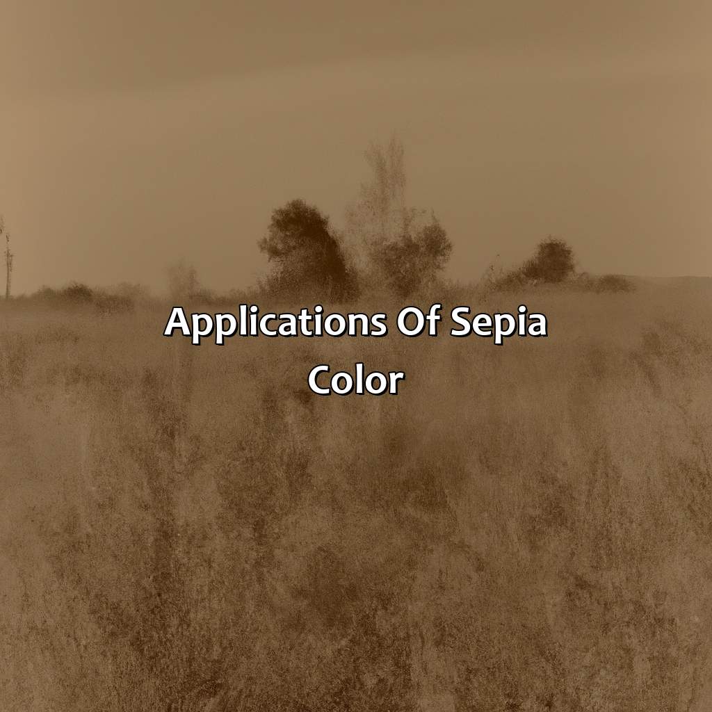
Photo Credits: colorscombo.com by Gerald Campbell
To grasp the many uses of sepia color in multiple areas, such as photography, art, painting, and graphic design, explore its special advantages. In photography, sepia color adds a vintage or antique effect with a yellowish or brownish tint. Art and painting benefit from the classic, timeless feel of sepia color. It creates an atmosphere of nostalgia and history in graphic design, with a warm rust and aged patina.
Photography
Sepia photography provides a vintage look to images, creating an old-timey or antique aesthetic. The brownish tint and yellowed hue offer a retro and nostalgic effect, providing a historic appearance.
To achieve sepia photography, one can use traditional techniques with sepia-toned paper or chemicals during the developing process. Alternatively, digital methods such as post-processing software can apply a sepia filter over the image.
Unique details include choosing appropriate lighting and composition for the desired result. Sepia photography is often used in historical reenactments or to portray archaic scenes in cinema or television.
Don’t miss out on the opportunity to add an aged look to your pictures with sepia color in photography. Incorporating this technique can enhance your images and evoke emotions of nostalgia and history in viewers.
Transform your art into a masterpiece with the classic and enduring quality of sepia, giving it an old-fashioned, past-era vibe that exudes an aged patina and antique feel.
Art and Painting
Artists and painters have long used Sepia color to achieve a classic effect and give their artwork a timeless look. It is also popular due to its enduring quality and traditional tone, which gives any piece an old-fashioned look. Sepia color brings out the past era vibe, giving artwork an aged patina or antique feel to it. It is a popular choice among artists who wish to create works that convey a sense of nostalgia or timelessness.
Sepia color has been used in paintings for centuries. Renaissance-era artists would mix ink with sepia sediment to create rich, warm tones in their drawings. Later on, sepia pigment was developed from the cuttlefish bone, and its popularity increased due to its weathered patina appearance.
Sepia color can be used in various ways in painting. It can be used as an overall wash or mixed with other colors to bring out different hues and shades. Artists also use it as an underpainting layer before adding additional layers of color on top.
In addition to painting, sepia color is also widely used in printing and graphic design due to its vintage appeal. Marketers often use sepia-toned photos for advertisements concerning retro fashion trends or antiques.
An interesting anecdote regarding the usage of Sepia colors is that renowned painter Vincent van Gogh preferred using earthy reds/browns like sepia because he believed that this palette captured emotions more effectively than brighter colors.
Overall, Sepia color has been around for a long time, yet it still holds tremendous significance in today’s art world. Its unique qualities allow artists and designers to imbue their work with classic touches while simultaneously conveying emotional depth through its warm tones.
Design like a time traveler with warm rust and nostalgic tones to create a heritage look and classic ambience.
Graphic Design
Graphic Designers often use Sepia color to create warm rust, vintage atmosphere, classic ambience, nostalgic tone, historic feel and heritage look in their designs. It adds a classic touch to the designs and evokes a sense of nostalgia. Graphic designers use Sepia color in various design elements such as backgrounds, overlays, textures, typography, and images.
For graphics that require an old-world charm and antique vibe, designers use an array of sepia shades between cream and brown. This gives an artistic palette commonly used for designing brochures or business cards meant to convey traditional values.
One unique approach is to add transparency with Sepia color so that it creates a see-through effect, giving the design varied depths and creating interest to the viewer’s eyes.
Several years ago, the famous social media platform Instagram created a filter named “Sepia,” which became incredibly popular among its users worldwide. Many photographers and graphic designers on platforms such as Behance.com have since followed suit by incorporating sepia shades into their professional projects.
Sepia color: where old-world charm meets modern technology in creating the perfect vintage aesthetic.
Creating and Using Sepia Color
Photo Credits: colorscombo.com by Bradley Clark
Want to give your designs a classic, vintage, or retro vibe? You need to learn the correct technique for creating and using sepia color. It can provide your work with old-fashioned charm, a bygone era atmosphere, aged character, historic style, and timeless beauty.
Traditional and digital methods both offer benefits, such as classic elegance, vintage glamour, retro sophistication, old-world charm, warm nostalgia, timeless style, and enduring character.
So, if you’re looking to add some old-fashioned style, vintage glamour, retro sophistication, old-world charm, warm nostalgia, timeless beauty, and enduring character to your designs, you’ll want to master the art of sepia color!
Traditional Methods
Traditional Sepia Color Creation Methods
Sepia color creation has a long history rooted in the traditional photographic and artistic methods of the past. The process involved exposing photographs or artwork to silver nitrate and washing them with sodium sulfide for a warm brownish tone.
Alternatively, some artists would use ink made from cuttlefish while photographers would use sepia toners after developing their prints. These old-fashioned charm techniques created an aged atmosphere, historic charm, and classic character that still evokes warm nostalgia even in modern times.
Notably, these methods were time-consuming and required skilled craftsmanship but ultimately provided enduring character to the end product. Today, digital processes have simplified the creation of sepia color, but many prefer traditional methods for their vintage charm or retro vibe. Don’t miss out on experiencing the timeless beauty of sepia color through these traditional methods.
Adding a touch of old-school charm to your digital designs with sepia color is like giving your website a monocle and top hat.
Digital Methods
The digital age has opened up newer, faster methods of creating Sepia Color. From a photograph to a painting, the same warm elegance can be achieved quickly using various graphic design tools. Retouching software and color correction apps have streamlined the process, and even mobile cameras today come equipped with sepia filters. In terms of graphic design, Adobe Photoshop and other such image-editing software allow one to adjust color balance, contrast, tint, etc., resulting in a traditional style with historic charm.
Sepia toning was once done purely by chemical means in dark rooms during the processing stage; now this can also be achieved in just a few clicks. One simply needs to convert an image to black-and-white before applying sepia effects digitally. With advances in technology, various other colors can also be added to create unique variations of sepia.
When using digital methods for achieving retro elegance, it is crucial not to overdo the effect or distort elements that need to remain part of the image’s logic. As always, subtlety is key when it comes to creating classic elegance without crossing into being kitsch.
A leading design agency recently used Sepia Color techniques as part of its branding campaign for a boutique hotel group that aims to evoke old-world charm and vintage elegance at their properties worldwide. The imagery created online has since become renowned within hospitality circles across the globe.
Sepia color combinations: for when you want your photos to look like they’ve been sitting in a coffee shop for 100 years.
Popular Sepia Color Combinations
Photo Credits: colorscombo.com by Anthony Allen
Sepia color is a popular choice for giving photos and designs a vintage, nostalgic look. Below are some popular combinations that work well with sepia tones:
- Amber hue
- Copper tone
- Earthy hue
- Rusty tone
- Weathered tone
- Grunge tone
- Distressed tone
- Faded tone
- Golden color
- Caramel shade
- Toasty hue
It’s important to choose a combination that complements the sepia tone and enhances the overall look and feel of the design. In addition to these popular combinations, there are endless possibilities for creating unique and personalized sepia color schemes.
It’s worth noting that sepia color is not just a design trend, but also has historical significance. Sepia was a commonly used photographic printing process in the 19th century and remained popular until the mid-20th century. Today, sepia tones are often used to replicate the look of old photographs and evoke a sense of nostalgia.
A true story that highlights the enduring appeal of sepia colors involves a young couple who were restoring an old family photo album. The album was filled with sepia-toned images, many of which were damaged and in need of repair. After spending countless hours carefully restoring each photo, the couple was amazed at how the sepia tones gave each image a timeless quality. The restored album became a cherished family heirloom, passed down through generations, and the sepia tones were a key factor in its enduring beauty.
Five Facts About Sepia Color:
- ✅ Sepia is a reddish-brown color that has been used in art since ancient times. (Source: The Conversation)
- ✅ The name “sepia” comes from the Greek word for the cuttlefish, which was used to make ink in ancient times. (Source: My Modern Met)
- ✅ Sepia is often associated with vintage and antique styles, and is commonly used in photography to create a nostalgic effect. (Source: Photography Life)
- ✅ Sepia was a popular color for early film and television to give a more “natural” appearance to skin tones and backgrounds. (Source: Smithsonian Magazine)
- ✅ Today, sepia is still used in various art forms, including painting, drawing, and graphic design. (Source: Artsy)
FAQs about What Is Sepia Color
What is sepia color?
Sepia color is a brownish-gray color with a reddish undertone that is often associated with old photographs or antique prints. It is named after the pigment derived from the ink sac of the common cuttlefish, Sepia officinalis.
What are the origins of the sepia color?
Sepia was initially used as a drawing pigment in ancient Greece and Rome. The ink made from the cuttlefish was commonly used in the Middle Ages and the Renaissance. Sepia was later used as a photographic toning agent in the late 19th and early 20th centuries, which is why we often associate it with old photographs.
What are some common uses of the sepia color?
Sepia color is used in various art forms, such as drawing, painting, and photography. It is often used to create a nostalgic, antique feeling or to add warmth to an image. Sepia is also commonly used in interior design, fashion, and graphic design.
What color is sepia similar to?
Sepia color is similar to a range of brownish-grey tones, including taupe, beige, and khaki. It is often compared to the color of old parchment paper or faded photographs.
Can you create sepia color on a computer?
Yes, you can create sepia color digitally using photo editing software or adjusting the color balance of an image. Most photo editing software has a sepia filter that you can apply to an image. This filter adds a yellow-brown tint to the image and alters the contrast to create the sepia effect.
What is the symbolism of the sepia color?
Sepia color is often associated with nostalgia, aging, and the passage of time. It is also considered to be a warm and comforting color that evokes a sense of stability and tradition. In some cultures, it is also associated with wisdom and maturity.