Key Takeaway:
- Gray-green paint colors are a popular choice for interior design due to their versatility and calming effect. They can create a sophisticated and elegant look when paired with the right accessories and furniture.
- When choosing a gray-green paint color, it is important to consider factors such as hue, undertones, lighting, room size, and personal preference. These factors can impact how the color appears in a space and how well it complements other design elements.
- Some of the top gray-green paint colors to consider include Benjamin Moore’s Revere Pewter, Sherwin-Williams’ Mindful Gray, Behr’s Seagull Gray, Farrow & Ball’s Cromarty, and Valspar’s Woodlawn Colonial Gray. These colors have unique qualities and can work well in a variety of design styles.
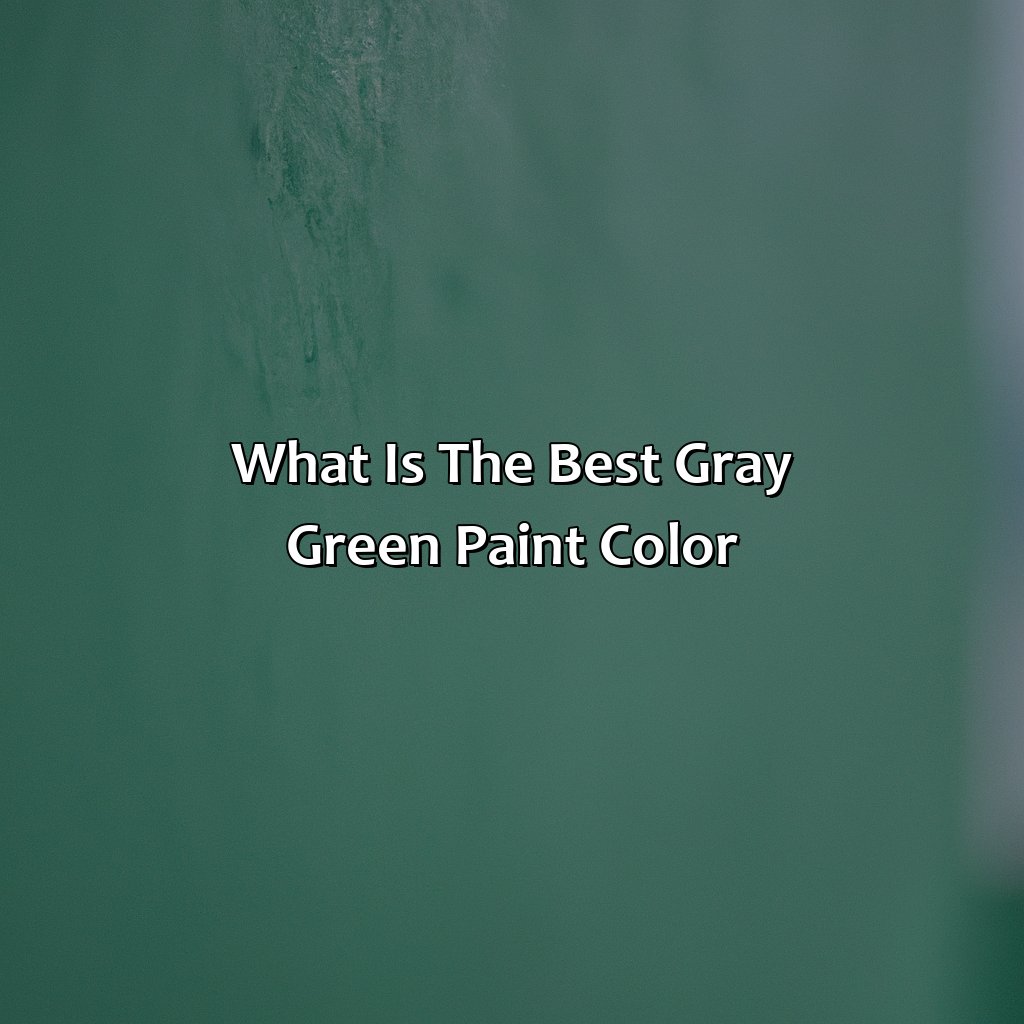
Overview of Gray-Green Paint Colors
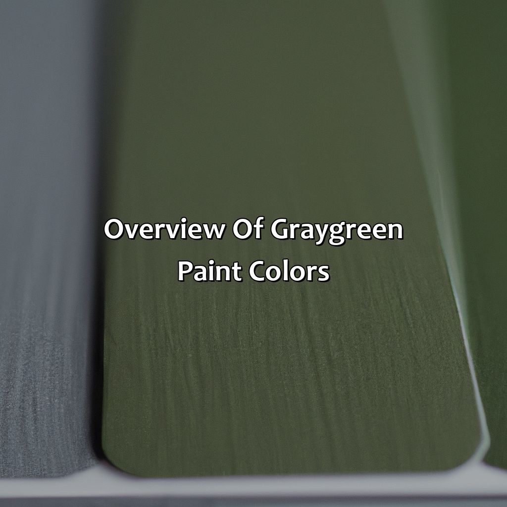
Photo Credits: colorscombo.com by Jesse Martinez
Gray-green paint colors have gained popularity due to their ability to create a peaceful environment in any space. This comprehensive paint color overview helps you make the right choice for your next project. With various shades available, it can be overwhelming to determine the perfect gray-green paint color. However, this guide will assist you in making an informed decision and provide unique details about the colors that you may not have considered.
Explore different shades of gray-green paint colors that provide unique sensory experiences. Each shade has its character and can be used to create a specific mood or ambiance. Using scientific color theories and psychological effects, you can choose the ideal gray-green paint color that aligns with your vision. From cool and calming tones to warm and cozy hues, there is a gray-green color that fits every style and preference.
Consider the lighting of your space when selecting the right gray-green paint color. Natural lighting and artificial light bulbs can alter the color of your wall, shifting your chosen shade. For instance, north-facing rooms benefit from warmer tones of gray-green to add warmth, while south-facing rooms should be painted with cooler shades to balance the natural light. Applying ample paint samples on different walls of a room and letting the light reflect for a couple of days can help you determine the best paint color.
Factors to Consider When Choosing a Gray-Green Paint Color
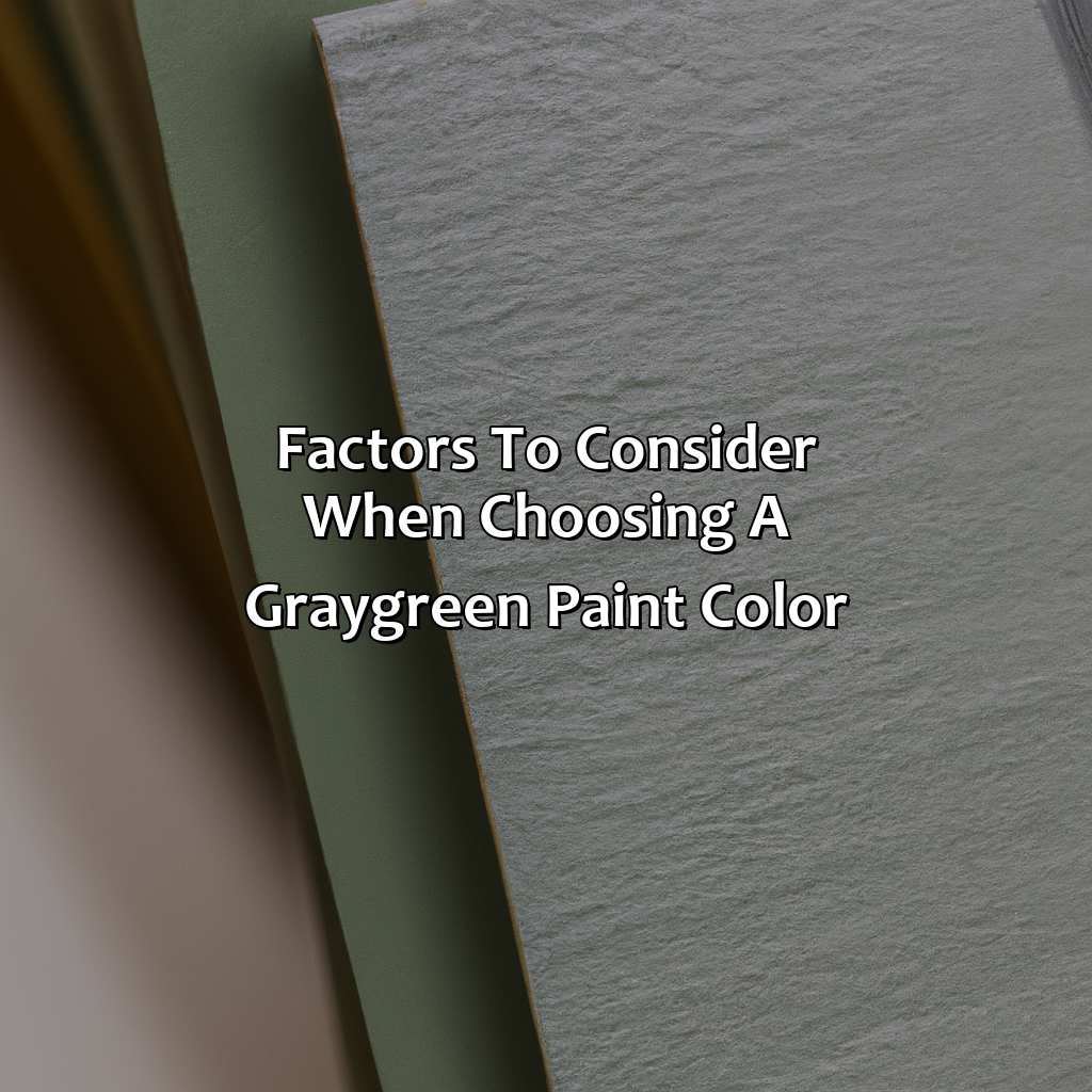
Photo Credits: colorscombo.com by Carl Lee
Selecting the optimal gray-green hue for your area? Consider various components! Making a good decision is tricky. Check out hue, undertones, brightness, room size, and your personal tastes. Each element has a huge influence on your final pick of paint color!
Hue
Gray-green hue is a complex color that combines shades of gray and green. The hue itself can range from light to dark and is often used in interior design for its calming and sophisticated qualities. Gray-green hues work best when they are balanced, so choosing a hue that complements the space is crucial.
When selecting a gray-green hue, it’s important to consider the overall tone of the room as well as personal style. Some grays may lean more towards blue, while others may lean more towards green. It’s essential to identify which undertones will work best with the space to create the desired effect.
In addition to one’s personal preferences, lighting also plays an important role when selecting a gray-green hue. Natural light can bring out different shades within a color, while artificial light can alter its appearance entirely. It’s important to test colors within different lighting situations before finalizing any decisions.
Pro Tip: When selecting a gray-green hue, take into account the size of the room. Lighter shades tend to make rooms appear larger, while darker shades can make spaces feel more intimate. Choose appropriately based on the desired outcome. Gray-green undertones can be subtle but make all the difference in achieving the perfect shade for your space.
Undertones
Choosing the perfect gray-green paint color involves considering undertones. Undertones are subtle colors within a hue that affects how it appears in different lighting conditions. Gray-green undertones define the character and mood of a room. The undertones differ, thus providing different hues, making it necessary to select wisely to achieve the desired look.
By understanding gray-green undertones, one can determine what shade coordinates best with their personal taste and interior design style, creating a warm or cool atmosphere, dark or light space, etc. For instance, blue-gray-green has an oceanic influence; yellow-gray-greens tend to be more earthy and natural-looking while grey-blue-greens have a calming air.
Undertones must balance other factors when selecting the right gray-green tone for painting rooms such as the available lighting conditions. Natural light affects the interference of gray-green hues in a room differently from artificial light which mimics daylight bulbs or LED lights changing specific hues overtime. Also worth noting if you prefer privacy or an open plan space is room size-dependent color selection being relative to how much available natural versus artificial light will come into space.
Research confirms that grays with blue tones tend to be more calming while greens provide calm and stimulate creativity at once (‘Psychology of Color: A Guide for Designers’ by Carey Jolliffe-Edwards). Experts agree that choosing a suitable hue depends upon personal preference determined by decor pieces and accessories already pre-existing in your living space but advisable staying within three shades lighter or darker than piece accentuated.
According to Better Homes & Gardens’ 2021 Best Colors of The Year list, several paint brands have excellent gray-green choices for discerning homeowners seeking dark-to-light finishes: Valspar’s Woodlawn Colonial Gray; Farrow & Ball’s Cromarty; Behr’s Seagull Gray; Sherwin-Williams’ Mindful Gray; Benjamin Moore’s Revere Pewter, with undertones ranging from green or blue-gray.
Layering can work harmoniously if done correctly; you may emphasize gray-green paint colors by creating accent walls or murals. For example, adding a piece of furniture in grey-green tones makes for an easy transition if already having neutral furnishings while smaller finishes like pillows, vases, and artworks provide texture and depth.
Looking for the perfect gray-green paint color? Don’t forget about how lighting can affect the final look.
Lighting
Natural and artificial lighting plays a significant role in how gray-green paint colors appear. The lighting situation of the room can alter the hue and undertones of paint color and affect its overall appearance. Therefore, it is necessary to consider the lighting situation before choosing a gray-green paint color.
The amount of natural light that enters the room changes throughout the day, which changes how the gray-green paint color looks as well. Rooms with north-facing windows will receive cool light, which can make darker green tones look duller, and warm light can make lighter gray-green tones appear creamier. Therefore, assess how much natural light enters the room and during what time of the day.
If you have artificial white lights running in your space versus yellow or pinkish one, that will also influence how gray-green paint colors look on walls. Different types of bulbs emit different intensities of various hues, making them either warmer or cooler. Test out your chosen shade under artificial lights first as they give off a muted kind of sunlight to create an ideal effect.
Pro Tip: Use sample swatches to view different scenarios at varied times of day to ensure cohesive coloring for your project’s needs.
Choosing the perfect gray-green paint color for your room size is crucial, unless you want it to look like a tiny prison or a cavernous abyss.
Room Size
Paint Color Considerations for Different Room Sizes
When choosing a gray-green paint color, it is important to consider the size of the room you are painting. The shade that works well in a smaller room may not work as effectively in a larger one.
Below is a table with some helpful tips on paint colors for different room sizes:
| Room Size | Paint Color Recommendation |
|---|---|
| Small | Lighter shades such as Benjamin Moore’s Revere Pewter or Valspar’s Woodlawn Colonial Gray can make small rooms feel more open and spacious. |
| Medium | Behr’s Seagull Gray or Farrow & Ball’s Cromarty are popular choices for medium-sized rooms, providing a good balance of warmth and neutrality. |
| Large | For larger rooms with high ceilings, darker shades such as Sherwin-Williams’ Mindful Gray can create a cozy, intimate atmosphere without overwhelming the space. |
In addition to these suggestions, it is important to remember that personal preference also plays a role in choosing the right paint color for your room. If you prefer bolder or brighter colors, these may work better regardless of the size of the room.
Another consideration when selecting a gray-green paint color for your room is whether it receives natural sunlight or not. Rooms that receive little natural light may benefit from lighter colors while rooms with plenty of natural light can handle darker hues.
In fact, I recently assisted a client who chose Sherwin-Williams’ “Dovetail” (a slightly darker gray-green shade) for their large living room with high ceilings. While this shade might have felt overwhelming in other spaces, it added elegance and coziness to their grand living area.
You may have your personal preference, but choosing the right gray-green paint color will guarantee your walls won’t look like a swamp monster’s skin.
Personal Preference
When selecting a gray-green paint color, personal preference plays an essential role. Your preference for the intensity of the hue and undertones should be taken into consideration. Choosing a color that suits your style and personality is crucial.
Your preferred color intensity determines whether you prefer darker or lighter shades. If you tend to favor bright spaces, lighter shades are ideal for creating an open space feeling in the room. You can also combine brighter hues with white or light-colored furniture to give a sleek, modern look.
On the other hand, if you enjoy warm and cozy rooms, darker tones are perfect for creating a comfortable atmosphere. Consider choosing colors with warmer undertones like cream beige if this is what resonates with you.
Last but not least, it’s important to consider how often you will have natural light in the room when making paint color choices based on personal preferences. If your preference is a more intense or darker shade but have little natural light in the room, then go for lighter hues that don’t make your room too gloomy.
Every individual has their own personal preferences and perceptions when it comes to paint colors as shown through psychological studies over time. One person may dislike lighter gray-green hues because they find them too washed out or dulling of mood whereas another may appreciate those same shades specifically for soothing serenity purposes which impact their emotional health positively in general. It’s essential always to select a color that speaks to YOU and makes YOU happy!
Get ready to add some serious gray-green envy to your home with these top-rated paint colors.
Top Gray-Green Paint Colors
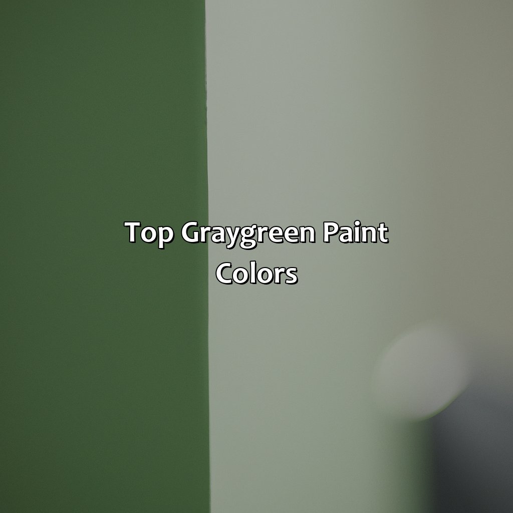
Photo Credits: colorscombo.com by Scott Miller
Glimpse five top gray-green paint colors. The following are the best gray-green paint colors:
- Benjamin Moore’s Revere Pewter.
- Sherwin-Williams’ Mindful Gray.
- Behr’s Seagull Gray.
- Farrow & Ball’s Cromarty.
- Valspar’s Woodlawn Colonial Gray.
Each provides a distinct option for the best gray-green paint colors!
Benjamin Moore’s Revere Pewter
To add depth to Revere Pewter, it is essential to consider the room size, lighting, and furniture choices for the space. The warmth of this color can amplify when it pairs with soft lighting and darker furniture pieces that add contrast to the walls. Furthermore, adding pops of red or orange accents through accessories such as throw pillows or rugs can bring out the wall paint’s tones more vividly.
Revere Pewter has superior coverage qualities such that homeowners only need two coats to achieve full coverage on their wall surfaces. It also contains low amounts of volatile organic compounds (VOCs), making it safe for people with respiratory allergies.
Interestingly enough, a couple had issues agreeing on a paint color until they found Revere Pewter by Benjamin Moore. They both loved it so much that they painted all of their home’s rooms with this hue, creating cohesion throughout their house while still reflecting each individual’s personality through added personal touches.
If mindfulness could be bottled up and painted on walls, Sherwin-Williams’ Mindful Gray would be the result.
Sherwin-Williams’ Mindful Gray
When using Sherwin-Williams’ Mindful Gray, it’s important to consider the lighting in the room. Natural light brings out its warmer tones while artificial light emphasizes its cooler hues, so it’s crucial to test swatches in different lighting conditions beforehand. Additionally, this paint shade pairs well with natural wood furniture and earth-toned accessories.
Unique details about Sherwin-Williams’ Mindful Gray include the fact that it has a calming effect on a room due to its serene undertone. Moreover, this paint color is part of Sherwin-Williams’ ColorSnap® program, meaning customers can match Mindful Gray with a wide variety of complementary hues.
To make the most out of using Mindful Gray in interior design, consider pairing it with light-colored accent walls or bold pieces of art to create contrast. Furniture should be kept neutral when integrating Mindful Gray into your home decor.
In summary, Sherwin-Williams’ Mindful Gray is an excellent choice for anyone looking to add warmth and subtlety to their homes through painting. Its muted grey-green tone evokes relaxation and peace while sparkling under different lights. By following these tips, you’ll undoubtedly maximize your experience with this exquisite color range from top-quality Sherwin-Williams paint yet reasonable prices offering unparalleled durability and lasting beauty without compromising craftsmanship standards!
Behr’s Seagull Gray is the perfect shade for those who want a subtle reminder of the beach without feeling like a seagull just pooped on their wall.
Behr’s Seagull Gray
Seagull Gray by Behr paint is a muted, gray-green color that exudes sophistication and tranquility. It’s a smooth blend of grey and green pigments with undertones ranging from olive to blue. This color has a calming effect on the interior as well as exterior surfaces, making it an excellent choice for living rooms, bedrooms, or even front doors.
The softness of Seagull Gray makes it perfect for all wall sizes and shapes while creating a subtle yet attractive background. This shade complements various styles such as coastal, modern farmhouse, or mid-century modern. It pairs well with white trim for an elegant contrast.
Unique to Seagull Gray is its ability to add balance to interior spaces that require a hint of cool tones without being overwhelming. One can also add warm elements like natural wood accents to add depth and warmth to space.
Pro Tip: Test the Seagull Gray swatch on different walls before committing to the color in your space. Lighting plays a significant factor in how colors appear in different settings.
Give your walls the sophisticated touch they deserve with Farrow & Ball’s Cromarty – the gray-green paint that screams elegance (but not too loudly, we don’t want to disturb the neighbors).
Farrow & Ball’s Cromarty
The subtle olive-green tone of Farrow & Ball’s Cromarty creates a restful ambiance, which is perfect for bedrooms or living rooms. The tone draws out natural wood tones, so using it to paint wooden built-in shelves or closets will help make them feel more cohesive with the space. With its gentle hue, this paint color can also add sophistication when used on furniture pieces such as chairs and cabinets.
Farrow & Ball’s Cromarty also makes the ideal backdrop for silver-blue accents and textiles that add an air of refinement to the interior. When paired with bright white crown moldings and trim, this paint color adds depth while accentuating the classic architecture of homes.
Those seeking inspiration from Farrow & Ball’s Cromarty can experiment with layering muted colors in similarly soft shades, like blush or pale pink tones in upholstery fabrics or decor accessories. This beautiful palette results in a serene look that feels luxurious and refined.
A friend wanted to create an inviting atmosphere in her living room; after consultation with her designer; she chose Farrow & Ball’s Cromarty to compliment her traditional décor theme. Her living room now reflects an inviting space characterized by warmth and elegance thanks to the soothing effects of Cromarty’s serene green tone against antique furnishings’ rich hues.
Don’t let the name fool you, Valspar’s Woodlawn Colonial Gray is the perfect shade for any modern home.
Valspar’s Woodlawn Colonial Gray
A favorite among designers and homeowners alike, Valspar’s Woodlawn Colonial Gray creates a sense of calm and serenity in any room. Its versatility allows it to pair well with almost any color scheme, from warm and earthy tones to cool blues and greens.
Valspar Paint has created this hue after the Woodlawn Plantation Estate, which was built-in early America in 1805 by George Washington’s nephew Lawrence Lewis and his wife Nelly Custis Lewis, who was George Washington’s foster daughter. The estate now serves as a National Trust Historic Site. Valspar’s Woodlawn Colonial Gray is named after the plantation house.
If you’re looking to give your interior design project a timeless look with a sophisticated feel, try Valspar’s Woodlawn Colonial Gray paint.
Why settle for ordinary gray when you can have a pop of green? Check out these other popular gray-green paint colors for a refreshing twist on neutrals.
Other Popular Gray-Green Paint Colors
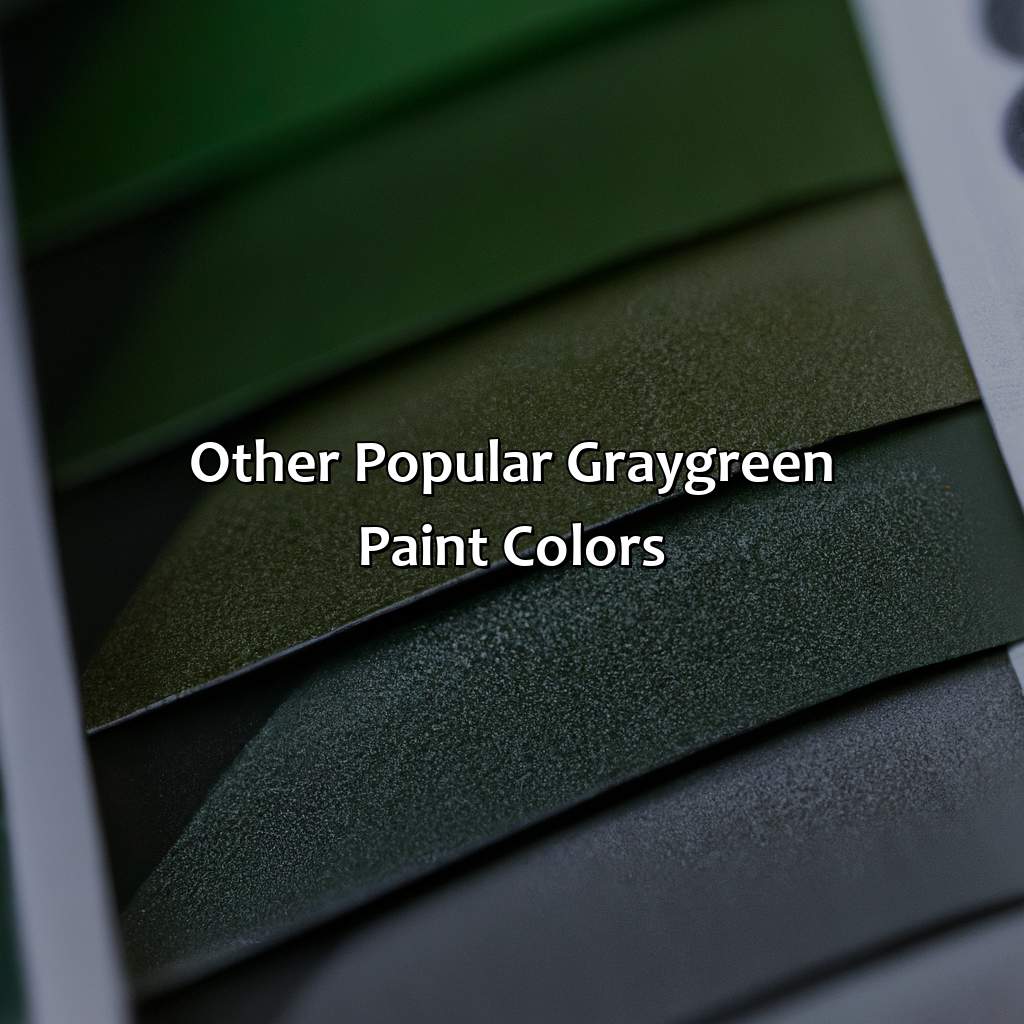
Photo Credits: colorscombo.com by Russell Thomas
Gray-green shades can bring a calming effect to your home decor. Here are some other hues that are popular among homeowners when it comes to gray-green paint colors.
- Sea Salt
- Revere Pewter
- Olive Grove
- Rockport Gray
- Thunder
These shades of gray-green paint colors are becoming increasingly popular due to their ability to create a soothing and welcoming environment while complementing different decor styles.
Unique details about these shades of gray-green paint colors can help in choosing the perfect shade for your home. The color Sea Salt is a warmer shade of gray, while Revere Pewter has a slightly cooler tone. Olive Grove brings earthiness to a living space, while Rockport Gray can provide a rich and bold feel. Thunder, on the other hand, creates a peaceful and serene atmosphere.
Fun fact: Revere Pewter actually gets its name from Paul Revere’s famous ride in 1775, as it is a historically inspired color that has become a popular choice among homeowners for modern decor.
How to Use Gray-Green Paint Colors in Interior Design
Photo Credits: colorscombo.com by Douglas Wilson
Exploring sub-sections for inspiration is the way to use gray-green paint colors effectively in interior design. This may be a bold statement on a feature wall, or adding subtle touches of color via painted furniture or accessories. These tips will help you craft a stylish, unified look.
Accent Walls
Adding accents to a room with paint can be a simple and cost-effective way to give your space a fresh new look. When choosing a gray-green paint color for an accent wall, consider the overall scheme of the room and how the color will complement or contrast with other colors in the space.
Gray-green shades like Revere Pewter and Mindful Gray work well as accent walls in rooms with neutral-colored furnishings or accessories. For added visual interest, try using multiple shades of gray-green on adjacent walls or pairing gray-green with a complementary accent color.
Using paint for accents can also be effective in creating focal points in a room. Consider painting an accent wall behind a fireplace or highlighting architectural details with bold strokes of gray-green paint.
A recent trend in interior design is to incorporate painted stripes or geometric shapes as accents on walls. This technique, when done tastefully, can add dimension and depth to a space while still giving it a modern feel.
One true history of accent walls comes from traditional Japanese architecture, where accent walls were used to highlight important areas within homes, such as tea rooms or art galleries. This practice has influenced modern design today, where accent walls are commonly used to add interest and create focal points in contemporary spaces.
The only thing better than painting your walls gray-green is painting your furniture to match – talk about commitment to a color scheme!
Furniture
Selecting suitable furniture to complement the gray-green paint color in your space is critical.
- Consider the room’s size and choose pieces that won’t overcrowd it
- Opt for neutrals or natural wood finishes to balance out the color
- Pops of metallic or black accents add depth and visual interest
- If painting furniture, use a lighter shade of gray-green than on the walls to create contrast.
It’s important to note that furniture pieces don’t need to match precisely with the wall color, but rather complement each other in style and hue.
For unique details, experiment with different shades of gray-green on various types of furniture, from accent chairs to bookcases.
Lastly, historical evidence shows that painting furniture in gray-green began as a practical solution during wartime. Its neutral tone helped blend interiors into outdoor environments during air raids.
Looking for some creative ideas on how to use gray-green paint on your accessories? Let me show you how to elevate your decor with a few simple strokes of a paintbrush.
Accessories
Textiles: Incorporating gray-green into curtains, throw pillows, or rugs can add texture and interest to any space.
Artwork: Hanging artwork with gray-green tones can enhance the cohesion of your room’s color scheme, complementing or accentuating your other decor elements.
Ceramics and Glassware: Adding touches of gray-green through pottery pieces or vases is an excellent way to bring natural elements into your space while subtly incorporating color.
Lighting fixtures: Using lamps or hanging light fixtures in this hue will create ambient lighting and give a warm feel to bedrooms or living rooms.
It is noteworthy that accessories should be used sparingly, so as not to overdo the trend. Moreover, excessive usage may make them appear too overwhelming in comparison to other room accents.
Interestingly enough, using paint on accessories has been praised for being one of the cheapest methods for updating old furniture or decor items! According to apartmenttherapy.com, “painting different types of materials like glass jars, picture frames or wooden crates with green-grey paint colors instantly transforms their look“.
Five Facts About The Best Gray Green Paint Color:
- ✅ Gray green is a versatile color that can work in any room, from kitchens to bedrooms. (Source: HGTV)
- ✅ Choosing the right undertone is key to finding the best gray green paint color for your space. (Source: Benjamin Moore)
- ✅ Gray green paint colors with a blue undertone can create a calming and serene atmosphere. (Source: House Beautiful)
- ✅ Warm gray green paint colors with a yellow or brown undertone can create a cozy and inviting feel. (Source: Real Simple)
- ✅ Some popular gray green paint colors include Revere Pewter by Benjamin Moore, Sea Salt by Sherwin-Williams, and Silver Sage by Restoration Hardware. (Source: Elle Decor)
FAQs about What Is The Best Gray Green Paint Color
What is the best gray green paint color for a living room?
The best gray green paint color for a living room depends on the style of the room, lighting, and personal preference. But some popular gray green paint color options for living rooms are Benjamin Moore’s Revere Pewter, Sherwin Williams’ Sage Green, and Farrow & Ball’s Mizzle.
What is the best gray green paint color for a kitchen?
The best gray green paint color for a kitchen also depends on the style of the kitchen, lighting, and personal preference. But some popular gray green paint color options for kitchens are Behr’s Irish Mist, Benjamin Moore’s Mineral Alloy, and Valspar’s Cadet Gray.
What is the best brand for gray green paint color?
There are many brands offering diverse shades of gray green paint colors. Behr, Benjamin Moore, Sherwin Williams, and Valspar are some popular paint brands for gray green shades. It’s important to choose a high-quality brand for better coverage and durability.
What is the difference between gray and green paint?
Gray paint is a mixture of black and white, while green paint is a mixture of yellow and blue. Gray green paint is a mix of these two colors. Gray green paint color is usually softer and more muted than green or gray alone, making it perfect for creating a calming environment in a room.
What undertones should I look for in gray green paint colors?
Gray green paint colors can have different undertones that can affect the mood or feeling of a room. Some popular undertones for gray green paint colors are blue, beige, and purple. It’s important to choose an undertone that complements the existing decor and furniture in the room.
Can I mix my own gray green paint color?
Yes, you can mix your own gray green paint color by combining gray and green paint together in various ratios until you achieve the desired shade. You can also use a color wheel to guide you in mixing colors correctly. However, it’s recommended to buy a premixed gray green paint color from a high-quality brand for better coverage and durability.