Key Takeaways:
- Taupe is a sophisticated and versatile color that is a combination of beige, brown, and gray. It is a neutral color that is often used in home decor, fashion, and accessories to create a calming and elegant atmosphere.
- The color taupe comes in different shades and variations, including taupe gray, muted colors, subtle colors, and natural colors. It is a timeless color that can be paired with other neutral colors or complemented with warm or cool colors for added contrast.
- To use taupe in fashion and interior design, it is important to consider color psychology and color theory. Taupe can be used to create different styles, such as rustic, minimalistic, or coastal, depending on the color palette and color scheme. When mixing with other colors or creating contrast, it is important to choose complementary warm or cool colors that enhance the taupe color.
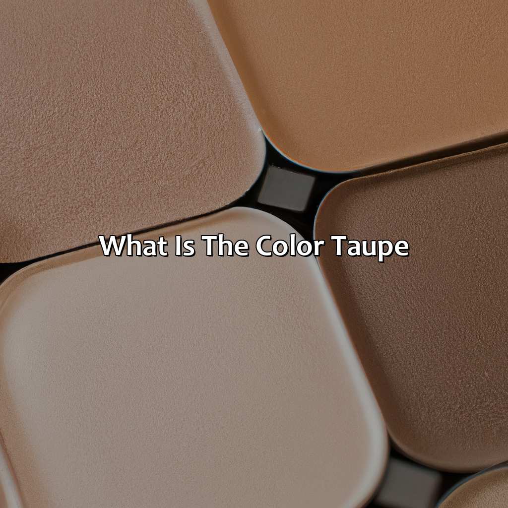
What is Taupe?
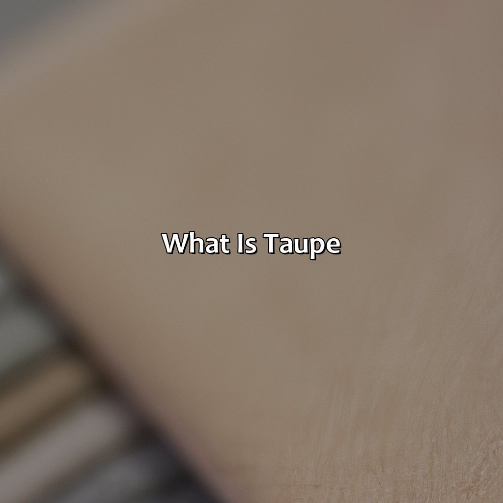
Photo Credits: colorscombo.com by Donald Jones
To comprehend the intricate hue of taupe, delve into its beginnings with browns and neutrals. Examine the definition and source of this color. Uncover how its composition of beige, brown and gray has changed over time. Also, contemplate how its earthy tones fit into the present-day color psychology and theory.
Definition of Taupe
Taupe, a versatile neutral color, is a combination of gray, brown and beige. It is often described as a warm gray or a cool brown and falls somewhere in the middle of the spectrum between these two colors. Taupe is characterized by its subtle nature and ability to blend seamlessly with other colors.
Many experts believe that taupe originated from France in the early 1900s when it was used to describe the natural hue of moleskin fabric. The word “taupe” itself comes from the French word for “mole”. In recent years, taupe has become increasingly popular in fashion and interior design due to its understated elegance.
Taupe color variations range from light shades such as taupe white to darker shades like dark taupe. It can also be distinguished by undertones including pink, green or yellow. Taupe can be compared to other neutral colors like beige, tan or gray, but it distinguishes itself by its unique blend of brown and gray tones.
In fashion, taupe is often praised for its versatility as well as its ability to complement most skin tones. It can be used in clothing such as coats, pants, and dresses. In interior design, taupe provides a classic backdrop for brighter pops of color without dominating or overpowering other elements in the room.
When using taupe in design or fashion contexts, consider pairing it with complementary colors such as teal or burgundy for added interest. To create contrast with taupe, pair it with crisp whites or bright oranges. Tones like deep reds can add warmth while hues like slate blues bring cool tones into the mix.
Taupe products can be found at many retailers both online and offline. For those interested in DIY projects involving taupe mixing lighter and darker shades creates texture while mixing different undertones adds depth.
Why settle for plain brown when you can have the sophisticated origins of taupe with its earthy, natural, and neutral tones?
Origins of Taupe
Taupe, a color that falls under the category of earth tones, has its roots in the French language. The word “taupe” in French means mole or talpa, which inspired both the name and color of taupe. In color theory, taupe is identified as one of the neutral colors, together with beige, ivory, and grey.
Historically taupe was used to dye fabric during the early 19th century in Europe. It gained popularity due to its muted yet sophisticated appearance. Throughout the years, designers experimented with the tone by adding hints of different pigments such as green or pink to create unique hues.
A fascinating characteristic of taupe is how it resembles natural coloring found in stones and soil pigments. Additionally, this resemblance allows for versatility when incorporated into various design schemes for both fashion and interior decorators.
A true fact about Taupe; According to the International Association of Color Consultants (IACC), Taupe’s popularity skyrocketed during the 1940s-1950s post-war period as it reminded people of hopefulness and new beginnings.
Taupe may seem like a bland color, but its versatile shades prove that it’s anything but beige.
Taupe Color Variations
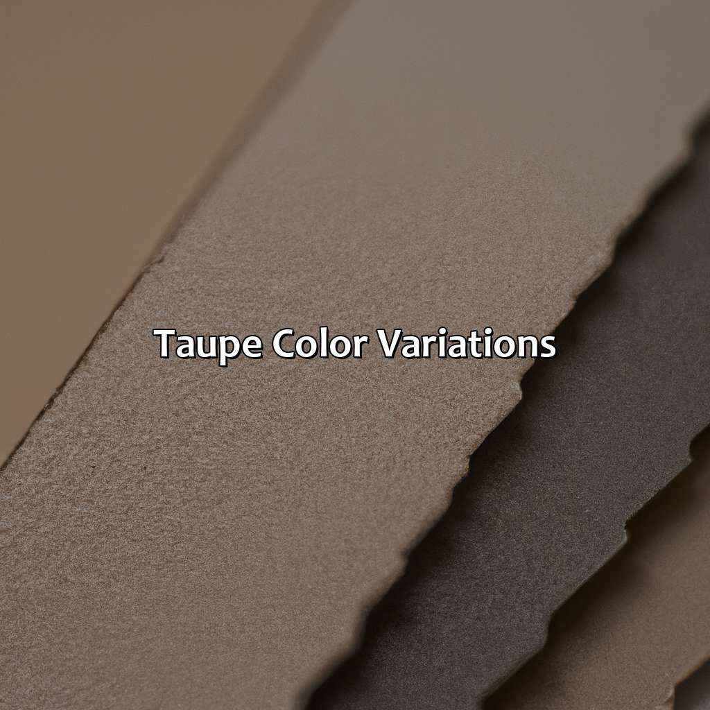
Photo Credits: colorscombo.com by Henry Robinson
We will be focusing on two sections to explore the timelessness of taupe and its variations. These include taupe gray, muted colors, subtle shades, sophisticated tones, natural hues, calming neutrals, understated colors, and elegant neutrals.
The first section will explore the shades of taupe. These are characterized by muted tones, sophisticated neutrals, earthy colors, and timeless neutrals. The second section will compare taupe to other colors. It will look at color matching, neutral color combinations, and color mixing.
Different Shades of Taupe
Taupe color ranges from muted tones to earthy colors that are considered sophisticated neutrals. Below is a comprehensive table showing different shades of taupe.
| Shade Name | Hex Code |
|---|---|
| Light Taupe | #B38B6D |
| Rosy Taupe | #905D5D |
| Dark Taupe | #483C32 |
| Warm Taupe | #97754C |
Each shade has its unique touch, making it a well-known and timeless neutral in fashion and interior design. Additionally, taupe color blends well with other colors, creating contrast for exceptional designs.
Furthermore, it is important to note that incorporating taupe in home interior creates a serene and calming atmosphere while adding elegance to the designs.
Don’t miss out on the opportunity to elevate your fashion or interior design by including the sophistication of taupe into your style choices. Taupe, the ultimate neutral color that can be mixed and matched with any shade, making other colors look like amateurs in the color game.
Comparing Taupe to Other Colors
Taupe in Comparison to Other Colors
Taupe can be compared to many other colors in terms of its undertone, hue, and saturation. The grayish-brown shade is often compared to beige, khaki, and gray due to its neutral color combination. However, when it comes to color matching and mixing, Taupe may lean more towards yellow or red depending on the specific shade.
The comparison table below demonstrates Taupe’s similarities and differences with other colors:
| Color | Undertone | Hue | Saturation |
|---|---|---|---|
| Taupe | Grayish-brown | Warm/cool tones | Muted |
| Beige | Yellow/gray undertones | Eggshell/tan hues (lighter than taupe) Browner hues (darker than taupe) |
N/A |
| Khaki | Greenish-brown | Olive to light brown hues | N/A |
Taupe: the perfect shade for when you want to be sophisticated without trying too hard.
The Use of Taupe
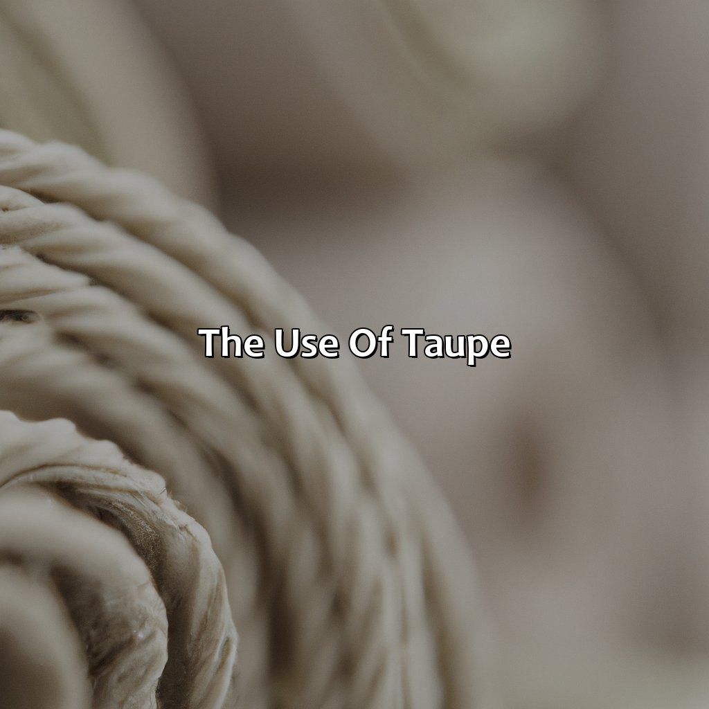
Photo Credits: colorscombo.com by Tyler Harris
To understand taupe’s use in interior design, fashion, and accessories, here are two sections:
-
In fashion, taupe is a chic shade which can work with vintage, bohemian, rustic, farmhouse, minimalistic, Scandinavian, Mediterranean, coastal, and tropical styles.
-
In interior design, it provides subdued elegance and versatility. It has been used in contemporary, classic, traditional, modern, transitional, rustic, coastal, desert, autumn, springtime, winter, and summertime themes.
In Fashion
Taupe has become a staple in fashion for its versatile and chic colors. From vintage to bohemian styles, taupe complements a wide variety of looks and can be worn in any season. Its neutral nature also makes it popular in rustic, farmhouse, minimalistic, Scandinavian, Mediterranean, coastal and tropical style settings.
In the fashion industry, Taupe is widely used due to its versatility to match with different styles and seasons. It’s a neutral color that complements vintage, bohemian styles and other contemporary fashion trends.
While taupe may seem like an unassuming color choice, it adds depth and sophistication to an outfit. It can be paired with bold colors for contrast or used as a foundation for monochromatic looks. Accessories in taupe like shoes or bags are great statement pieces to incorporate into outfits.
Don’t miss out on incorporating this timeless color into your wardrobe for its understated elegance and versatility.
Taupe: the color that can play chameleon in any interior design style, from classic to contemporary, with its versatile subtleness and understated elegance.
In Interior Design
In the world of interior design, taupe is a popular color choice for those seeking understated elegance. It falls under the category of neutral colors, which are versatile and can be incorporated into a wide variety of styles, including contemporary, classic, traditional, modern, and transitional.
Taupe’s subtle color psychology makes it an appealing choice for those who want to create a calm and soothing atmosphere in their home décor. Its versatility allows it to work well with other colors, including both warm and cool shades. It is also easy to pair with different textures and materials.
For those looking to achieve a rustic or coastal style, taupe pairs well with desert hues, making it an excellent choice for earthy tones. In contrast, taupe can also work well as a base color for springtime or summertime colors when paired with pastels or brights.
Historically, taupe has been used as a backdrop for bolder accent colors like reds and oranges. However, in recent years its popularity as a stand-alone color has continued to grow.
Overall, taupe’s versatility makes it an excellent choice for any season or style preference. Why settle for a beige existence when you can add some taupe-tastic contrast to your space?
Tips for Using Taupe
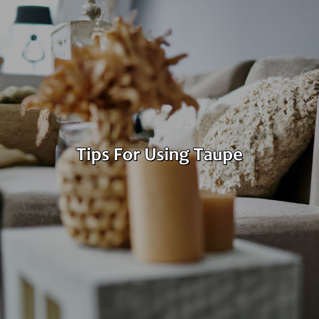
Photo Credits: colorscombo.com by Raymond Nguyen
For amazing visuals, use taupe as your foundation. This color has a strong impact on color psychology. To get the most out of it, pair it with complementary colors and experiment with contrast. Mastering color theory involves exploring these two sub-sections.
Pairing Taupe with Complementary Colors
Taupe is a versatile color that can be paired with complementary colors to create a harmonious balance. When it comes to pairing taupe with complementary colors, there are certain tips and tricks that one must keep in mind to understand the color theory and color psychology.
- Pairing taupe with warm colors like red, orange or pink can create a cozy and welcoming vibe whereas cool colors such as blue, green or purple can evoke serenity and calmness.
- Juxtaposing textures of different materials can add dimensionality to any space.
- Contrasting various hues of taupe further enhances the warmth of the color while giving it an understated elegance.
- Combining prints of different sizes is also an effective way of adding depth and character to any room.
Finally, layering different shades and textures of taupe against each other creates an invigorating effect.
When it comes to using taupe in fashion or interior design the possibilities are endless. Unique details such as pairing it with metallic accents for added glamour appeal or adding pops of vivid hues like fuchsia or turquoise can give a playful outlook to your design idea.
As per history goes, Comtesse de Castiglione was someone who famously wore drapes in both light gray-blue and taupe for her portraits in 1856. This marks the beginning of using light browns like taupe-portrait sessions that we still use today.
Mixing warm and cool colors with taupe is like creating a masterpiece using color theory and psychology.
Creating Contrast with Taupe
Pairing Taupe with Contrasting Colors to Create Visual Interest
Using taupe as a base color can provide opportunities for creating contrast and visual interest. Color theory and psychology suggest that warm colors like oranges and yellows tend to advance, while cool colors like blues and greens recede. Therefore, pairing taupe with warmer or brighter accent colors can create a sense of depth in a space.
In addition, contrasting textures and patterns can also help create visual interest when using taupe. Mixing smooth and rough materials or combining patterns such as stripes with floral prints can add dimension to the overall look.
It’s important to note that adding too many contrasting elements can overwhelm the space, so it’s essential to strike a balance between the base color and accent hues.
According to Sherwin-Williams’ 2021 Color Forecast, “Taupe has taken on more attitude over the last few years as it’s shifted closer toward gray. While still serving as a dependable neutral, taupe provides an updated foundation in which we’re now seeing people experiment with rich textures.”
Get your hands dirty with taupe by mixing it up with other colors for some DIY magic on a budget.
Where to Find Taupe
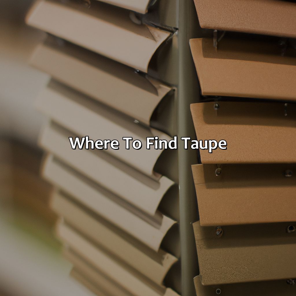
Photo Credits: colorscombo.com by Ralph Adams
Searching for the perfect taupe shade? Check out this section! Here you’ll find ‘Where to Find Taupe’ – a great resource to explore. Plus, discover the latest color trends for home decor and fashion. In addition, the sub-sections ‘Purchasing Taupe Products’ and ‘Mixing Taupe with Other Colors for DIY Projects’ offer tips on creating your own taupe with paint and color mixing.
Purchasing Taupe Products
Taupe products can be found in various stores and online marketplaces. To keep up with current color trends, many home decor and fashion retailers offer a range of taupe paint, furniture, and accessories.
When shopping for taupe products, it is important to consider different shades and variations to find the perfect match for your specific needs. Whether you’re looking for a warm or cool tone, you can find a wide variety of taupe products to create the perfect atmosphere in your home or wardrobe. Additionally, mixing taupe products with other colors can create unique DIY projects that reflect your personal style.
Mixing taupe with other colors is the perfect DIY project for those who love to experiment with home decor and create their own unique color combinations.
Mixing Taupe with Other Colors for DIY Projects
- Pairing Taupe with Pastel Shades: Soft hues of pastels such as light pink, mint, and lavender compliment taupe.
- Creating a Contrast: Bold colors like red, navy blue, or green create an exciting contrast against taupe.
- Neutralizing Other Vibrant Colors: When paired with brights or vivid hues, taupe can tone down other shades without being too overpowering
- Natural Shades: Choose medium brown tones to produce a natural feel in outdoor decors.
To add creativity in your home interior projects, mix taupe with vibrant and bold colors to ensure the development of an appealing and exceptional look that adds a personal touch without clashing colors. Color mixing can be intimidating; therefore, start small and experiment using cool patterns like stripes and chevrons to create artistic interest.
It has been found that many designers opt for “armenian pink” as their go-to companion color when pairing it up with taupe in home decor projects. (Source: Elle Decor)
Taupe: the perfect color for those who can’t decide between beige and grey.
Summary of Taupe Characteristics and Uses
Taupe is a sophisticated and elegant color that falls under the neutral color category, which consists of earthy and natural tones. This understated color has become quite popular in recent years, both in fashion and interior design. Taupe’s versatility makes it suitable for a wide variety of projects.
In terms of its characteristics, taupe can vary in different shades, from light to dark, with warm or cool undertones. It is often compared to beige or gray but has its unique identity. The color theory behind taupe associates it with calming effects, stability, and warmth.
Taupe is an excellent choice for fashion as it serves as a versatile color base that pairs well with many other colors and creates contrast when paired with bold hues. In interior design, taupe can be used on walls or furniture pieces to achieve a timeless and elegant look. Mixing different shades of taupe can help create depth and texture within the space.
For using taupe effectively, pairing it with complementary colors such as gold or navy blue adds character to the design project. Creating contrast by adding brighter accents like yellow or orange would provide an eye-catching effect. Taupe products are easily purchasable at most hardware or paint stores.
Fun Fact: “Taupe” comes from the French language; it originally meant the natural moleskin fabric that was beige-brown in color but eventually got associated with this particular shade over time.
Some Facts About the Color Taupe:
- ✅ Taupe is a brownish-grey color that originated in France in the early 1900s. (Source: Sensational Color)
- ✅ The name “taupe” comes from the French word for mole, as taupe-colored clothing was popular among French farmers in the 19th century. (Source: Apartment Therapy)
- ✅ Taupe is a versatile color that can be paired with both warm and cool colors, making it popular in interior design. (Source: Elle Decor)
- ✅ The color taupe can be found in many natural materials, such as stones, animal fur, and wood. (Source: MyDomaine)
- ✅ Despite being a neutral color, taupe can evoke feelings of warmth and coziness, making it a popular choice for fall and winter fashion. (Source: Harper’s Bazaar)
FAQs about What Is The Color Taupe
What is the color taupe?
Taupe is a subtle, brownish-gray color that falls between gray and brown on the color spectrum. It is a versatile color that can be used in a variety of design applications.
What colors make up taupe?
Taupe is typically created from a mixture of gray and brown, but the exact shade of taupe can vary depending on the specific amounts of these colors used in the mix. Some variations may have more of a purple or pink undertone.
Is taupe considered a neutral color?
Yes, taupe is often considered a neutral color due to its versatile and subtle nature. It can be paired with a wide range of other colors and can complement any design aesthetic.
What are some popular design uses for taupe?
Taupe can be used in a variety of design applications, including interior design, fashion, and graphic design. It is often used as a base color for walls, furniture, and décor, and can serve as a neutral backdrop for brighter accent colors.
What is the difference between taupe and beige?
While taupe and beige may look similar, taupe has a more distinct gray undertone, while beige tends to have a warmer, yellow undertone. Taupe is often considered a more sophisticated and complex color than beige.
Can taupe be used in both modern and traditional design styles?
Yes, taupe is a versatile color that can be used in both modern and traditional design styles. Its neutral nature allows it to complement a wide range of aesthetics and color schemes.