Key Takeaway:
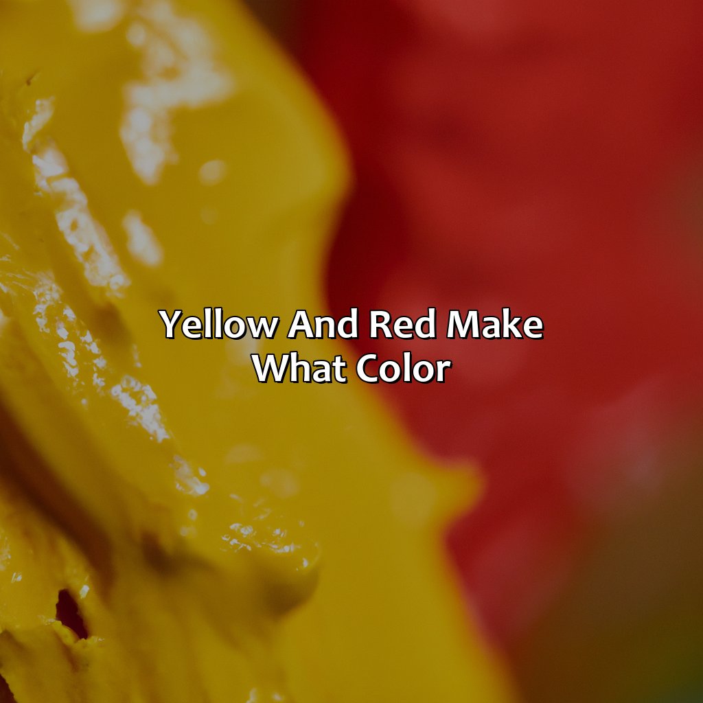
- Yellow and red make the color orange: When yellow and red are mixed together, they create the beautiful and vibrant color orange. This new color can vary in hue depending on the proportions of yellow and red used in the mixture.
- Understanding color mixing and theory: Familiarity with color theory and the color wheel is important in the process of mixing colors. Primary colors, secondary colors, and tertiary colors play a role in finding and creating the desired shades.
- The versatility of orange: Orange is a warm color and is commonly associated with excitement, enthusiasm, and happiness. It can be used in art, design, interior decor, fashion, branding and marketing, and product design. The different shades of orange, as well as its ability to pair well with other colors, allow for endless creative possibilities.
Mixing Yellow and Red
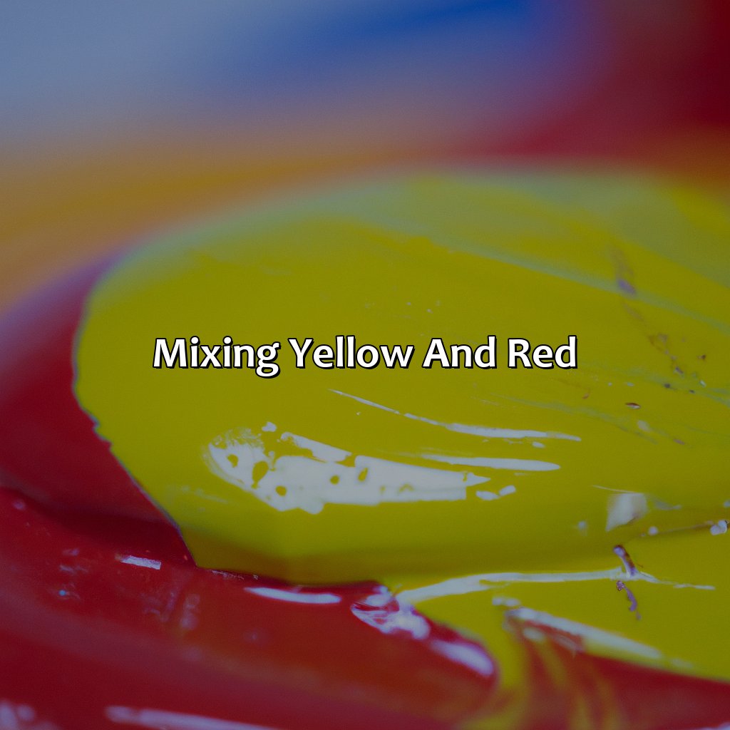
Photo Credits: colorscombo.com by Thomas Hill
Mixing yellow and red? To get a new color, you need to understand color theory and the color wheel. This wheel has primary, secondary, and tertiary colors. Primary colors are yellow, blue, and red. They’re foundational, so you can’t get them by mixing other pigments.
Color Theory and the Color Wheel
Understanding the Chromatic Palette and Hues
The science of color theory explores how colors interact and affect one another. The color wheel is a visual representation of this theory, with hues arranged in a circular format. Primary colors (red, yellow, blue) form the foundation of the wheel, with secondary colors (orange, green, purple) created by mixing two primary colors. Tertiary colors (yellow-orange, red-orange, red-purple, blue-purple, blue-green, yellow-green) then emerge from the combination of a primary and a secondary color. This chromatic palette offers endless possibilities for artists and designers to create visually striking compositions.
Why settle for just red, yellow, and blue when you can mix and match like a mad scientist?
Primary Colors
The fundamental colors in color theory are known as primary colors, which form the foundation for all other colors. Mixing these primary colors provides a spectrum of secondary and tertiary colors. In the world of pigment-based mixing, red, yellow and blue are the three primary colors used to create every other hue. However, in additive color theory, red, green and blue (RGB) are considered primary for mixing light-based colors.
Primary color sets aid artists when they mix pigments to achieve desired hues. Red is one of the essential primary colors with various shades ranging from maroon to scarlet. Yellow is another key primary color that mixes different shades from lemon yellow to goldenrod. Mixing yellow and red creates brilliant oranges with various shades like tangerine or peach.
Adding more or less amount of these base tones results in various hues between yellow and red on the color spectrum. These mixtures can range anywhere between warm oranges like butterscotch to cooler corals like salmon pink. The subtle difference can make a big impact on design and branding aesthetics.
Historically, it was Sir Isaac Newton who first discovered that white light broke down into its spectral components while adventuring into clear prisms in 1672. He then realized that seven distinct hues – violet, indigo, blue, green, yellow-orange-red were evident across the visible spectrum which laid the foundation for color mixing theories today.
Mixing yellow and red results in the warm and vibrant shade of orange, perfect for design and branding purposes.
What Color Does Yellow and Red Make?
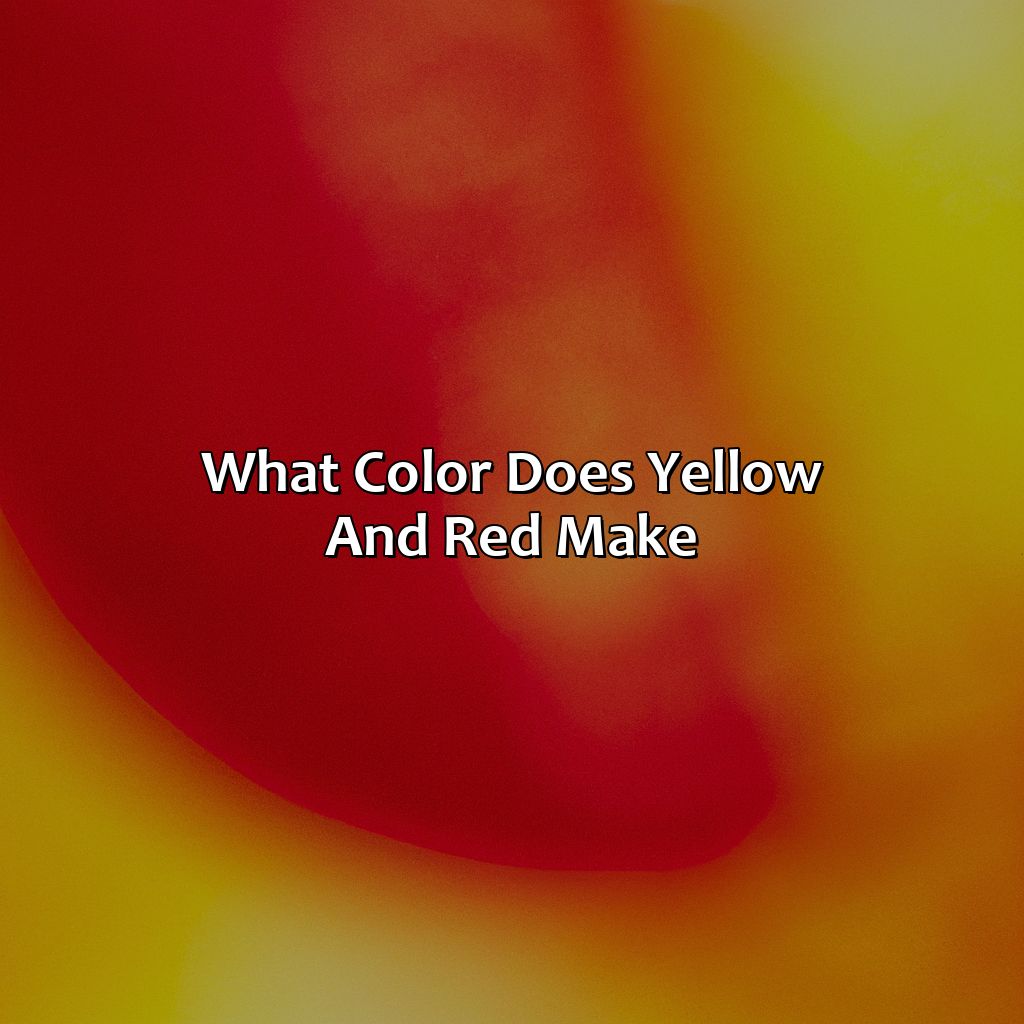
Photo Credits: colorscombo.com by Willie Moore
To comprehend what two colors make together, particularly yellow and red, you need to research the science of color mixing. With it, you can form a whole range of hues using primary, secondary, and tertiary colors.
Also, perceiving color is just as important as knowing how to mix them. Thus, it is valuable to study the science of color perception. The essential factors are complementary colors, warm, and cool colors.
Understanding Color Mixing
Understanding the Art of Mixing Colors
Color mixing involves combining hues to create new colors. By blending different pigments, artists can obtain secondary and tertiary colors that are not present in the color wheel. Secondary colors are formed by mixing two primary colors, while tertiary colors are the result of combining a primary color with a secondary color. Understanding how each hue interacts is crucial for creating harmonious color schemes.
To achieve desired results, it’s important to use quality pigments and control the amount of paint used. Too little paint can result in a weak mixture, while too much can make it hard to achieve the intended tone. A general rule of thumb is to mix light colors into darker ones gradually instead of adding large amounts all at once.
Ultimately, color mixing is an art form that relies on experimentation and creativity. To find what works best, consider using a color-mixing guide or simply experimenting with different combinations. With practice, anyone can master this skill and unlock the full potential of their artwork.
Why see the world in black and white when you can experience the full spectrum of color perception with the science behind warm and cool tones, complementary hues, and the color spectrum?
The Science of Color Perception
Color perception is the way in which our brain interprets different wavelengths of light. The color spectrum is divided into warm colors, such as red and yellow, and cool colors, like blue and green. Complementary colors are those that are opposite each other on the color wheel, and when combined create neutral tones.
The Science of Chromatic Interpretation delves into how our eyes detect different wavelengths of light and how we interpret them. Our eyes contain specific cells called cones, which help us perceive color. There are three types of cones; red, green, and blue, which work together to create a full spectrum of colors. This process is known as additive mixing.
Additionally, the science behind the psychological effects of color perception has been studied extensively. Warm colors like red and yellow are known for creating feelings of excitement and energy, while cool colors like blue can produce a calming effect.
It’s true that our perception of color has evolved over time due to various factors including culture, technology advancements, etc. However, with continued scientific research in this field – we can gain further insight into understanding the beauty of color perception.
Why settle for just one shade of orange when you can have a whole spectrum of tints and tones to play with?
Shades of Orange
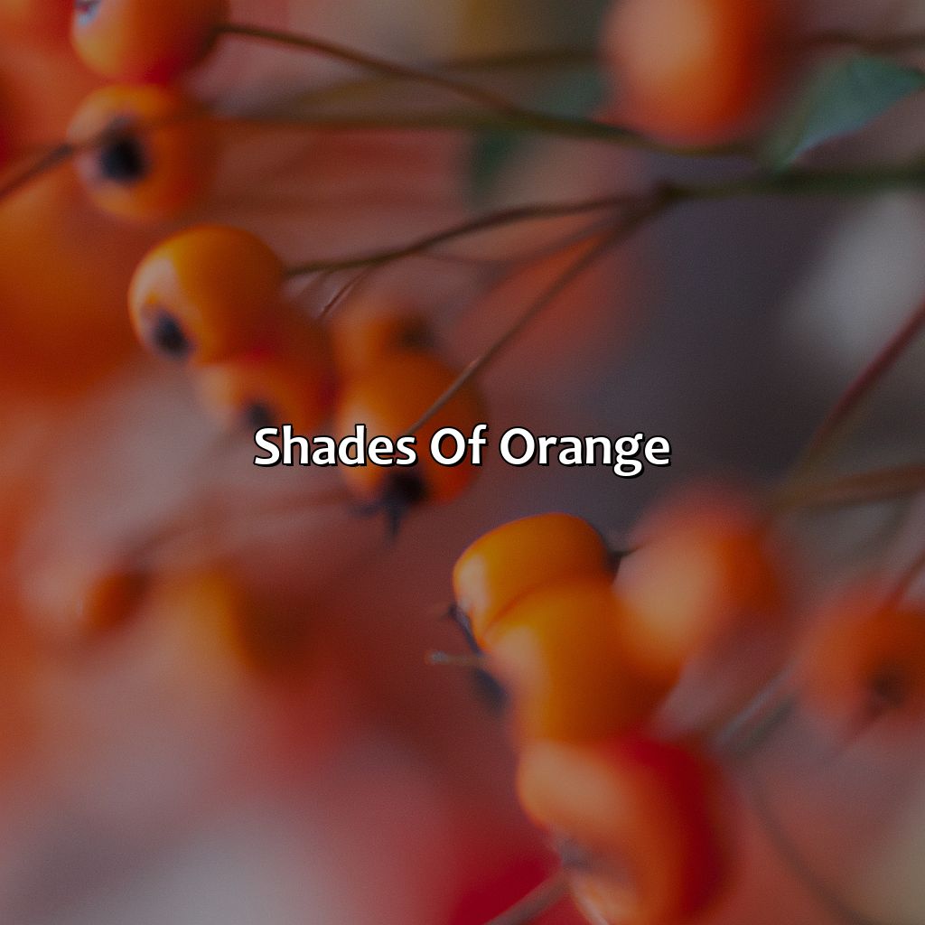
Photo Credits: colorscombo.com by Gregory Martinez
To get the full scope of oranges, check out the various hues like yellow-orange, red-orange, and yellow-green. Plus, blend yellow and red to get a variety of shades. These colors can add depth and interest to your palette. Explore how using the right accent colors can create contrast or harmony.
The Different Tones of Orange
Orange can be created by mixing yellow and red, but there are various tones of orange that can be achieved through different ratios of these colors. The Different Shades of Orange can add depth and complexity to designs or art, making it a popular color choice.
- Yellow-Orange: This tone has more yellow than red when mixing the two colors. It is seen in autumn leaves and sunsets.
- Red-Orange: This tone has more red than yellow when mixing the two colors. It’s often associated with citrus fruits like oranges and blood oranges.
- Yellow-Green: When adding more green to the mix, this creates a greenish-yellow shade of orange which is commonly used in branding and advertising.
- Tertiary Colors: By including additional colors such as blue or purple in the mix, one can create various unique shades of orange that have never been seen before.
These different shades of orange can evoke various emotions and have distinct meanings depending on their use. Brighter oranges tend to be associated with excitement and energy, while darker shades can indicate stability or sophistication. These nuances should be considered when choosing a shade of orange for your project.
Interestingly, ancient Egyptians were one civilization who placed great significance on the color orange due to its association with gold – a highly valued material during that time period.
Overall, The Many Shades of Orange demonstrate how color mixing allows for an endless spectrum of hues to choose from, spurring numerous artistic possibilities and highlighting how science influences our visual perception.
Mixing yellow and red may seem simple, but the endless possibilities of complementary, warm-cool, and accent colors prove the science of color mixing is not for the faint of heart.
Additional Colors Produced by Mixing Yellow and Red
Mixing yellow and red leads to the production of several other colors. Here are the colors you can expect to see:
- Secondary Colors: Yellow and red combine to form the secondary color orange, which is a warm hue on the color wheel.
- Tertiary Colors: Mixing orange with varying amounts of yellow or red leads to several different tertiary colors such as peach, tangerine, and coral.
- Complementary Scheme: When paired with blue, shades of orange produced by mixing yellow and red create a complementary color scheme that provides excellent color contrast.
Overall, Additional Colors Produced by Mixing Yellow and Red can be used effectively in design and branding, as accent colors or in a warm-cool scheme. You can use them to add pops of vibrant hues to your neutral color palettes for maximum impact. Color harmony can be created using these colors, especially when you mix them with other accent colors.
For instance, you can create highly contrasting images using tints or shades of Orange made from Yellow and Red. A friend once told me that she designed her house interior using various tones of peach which she produced from mixing Red and Yellow. It gave her space a warm feel and complemented her furniture exceptionally well.
Why settle for boring monochromatic designs when you can add a pop of fiery orange to your art, design, and branding choices?
Real-World Applications

Photo Credits: colorscombo.com by Jerry King
Orange is a color that can add vibrancy and energy to any design. It is often used in designs related to food, technology, and sports. Orange is also a good choice for call-to-action buttons and other UI elements. In the food industry, orange is often used to suggest freshness and tastiness. In tech, it conveys innovation and energy. In sports, it’s associated with excitement and enthusiasm.
Orange has a lot of symbolism and cultural importance associated with it. It is often linked to joy, warmth, courage, and enthusiasm. In some cultures, orange represents spirituality and enlightenment. On the other hand, it can also signify warning or danger in some contexts.
The color orange has also been found to have an impact on consumer behavior. It can stimulate appetite and encourage impulsive shopping. With its energizing effect, orange can also create a sense of urgency in consumers, encouraging them to act quickly.
Using Orange in Design and Branding
Using orange in design and branding is an excellent way to create excitement and draw attention to a product. The unique touch of orange has its advantages in interior decor, fashion, branding and marketing of products. Orange color trends are often used to cater to the millennial audience as they resonate with the youthful vibrance it brings. The use of this color is essential because it ignites emotion and sparks interest.
Color choices are a critical aspect of any product design – it reflects on the company’s ethos and values. For example, warm orange hues have been known to represent friendliness, enthusiasm, and happiness. By incorporating this tone into branding efforts or product designs can evoke these emotions in potential customers while guiding them towards purchase action.
Using complementary color schemes can improve the overall aesthetic appeal of design elements. Orange mixed with black or white can achieve such results, resulting in an eye-catching bold expression that stands out from typical gray designs.
Pro Tip: Consider your target audience when utilizing different colors in your branding strategy as it can significantly influence their perception of your brand.
Orange may be the color of enthusiasm and warmth, but it can also evoke feelings of caution and danger – just like my ex.
The Psychological Effects of Orange
The Impact of Orange on Human Perception
According to the psychology of color, orange is a particularly impactful hue due to its warmth and vibrancy. Its symbolism of energy, enthusiasm, and creativity is further amplified by its cultural significance in many parts of the world. When used in visual communication, orange can command attention and convey a sense of urgency or excitement.
Orange elicits emotions and behaviors that are often associated with sunshine and warmth. It produces an invigorating effect that motivates people to take action. Additionally, studies have shown that orange encourages social interaction and enhances appetite.
In terms of branding and marketing, incorporating orange can be a strategic move for companies looking to boost engagement or increase conversions. The energetic nature of this color draws attention to products or services while also creating positive associations with the brand.
True Story:
A popular juice bar chain successfully leveraged the power of orange in their branding strategy. By using bright hues of orange throughout their interior design, signage, and packaging, they were able to create a consistent visual language that evoked feelings of healthfulness, vitality, and freshness. As a result, customers were more likely to engage with the brand and return for future purchases.
Five Facts About Yellow and Red Making What Color:
- ✅ Yellow and red make orange when mixed together. (Source: Color Matters)
- ✅ The primary colors, yellow and red, can be mixed together to create secondary colors, such as orange, green, and purple. (Source: ThoughtCo)
- ✅ When yellow and red are mixed in equal parts, the resulting color is a shade of brown. (Source: Sensational Color)
- ✅ The color wheel is a helpful tool for understanding color combinations and relationships, including how yellow and red interact. (Source: Canva)
- ✅ The color orange can evoke feelings of warmth, happiness, and enthusiasm. (Source: Bourn Creative)
FAQs about Yellow And Red Make What Color
What color do you get when you mix yellow and red?
Answer: When you mix yellow and red, you get the color orange.
Can you mix any shades of yellow and red to get orange?
Answer: Yes, you can mix any shades of yellow and red to get orange, but the exact shade of orange may vary depending on the shades of yellow and red that you use.
Is there a scientific explanation for why yellow and red make orange?
Answer: Yes, there is a scientific explanation for this. Yellow and red are both primary colors that together make up the secondary color, orange. When mixed together, yellow and red reflect wavelengths of light that correspond to the color orange.
How can I mix yellow and red to get a lighter shade of orange?
Answer: To get a lighter shade of orange, you can mix more yellow than red. The more yellow you add, the lighter the shade of orange will be.
What happens when you mix orange and yellow together?
Answer: When you mix orange and yellow together, you get a lighter, more pastel shade of orange.
Can you make red from mixing orange and yellow?
Answer: No, mixing orange and yellow will not create the color red. Red is a primary color and cannot be created by mixing other colors together.