Key Takeaway:
- The combination of orange and green make the color brown: When you mix the primary colors of red and yellow together, it creates orange. When you mix the primary colors of yellow and blue together, it creates green. Mixing orange and green together into an equal proportion results in the creation of brown.
- Understanding color mixing is essential: To create any new color or hue, it is essential to understand the primary and secondary colors along with their combinations. This knowledge is fundamental in the field of art, design, and fashion.
- Complementary colors are useful in creating color harmony: Orange and green are complementary colors on the color wheel, which means they tend to look good together. This color combination creates a sense of balance and harmony, making it useful for branding, graphic design, and fashion.
Understanding Primary Colors
Photo Credits: colorscombo.com by Ryan Williams
Colors play a vital role in our lives and communication. Understanding primary colors is crucial to grasp the color theory.
Primary colors refer to any of a group of colors from which all other colors can be obtained by mixing. Mixing any two of these colors creates a secondary color. The three primary colors are red, blue, and yellow.
Knowing the primary colors is not enough; one must also understand their characteristics. Red is an emotionally intense color, blue is calming, and yellow stimulates intellectual curiosity. These colors have their unique psychological effects, bringing out different responses in people.
Pro Tip: Be mindful of color combinations when designing to communicate effectively. The right mix of primary colors can create a striking visual impact.
Color Mixing
Photo Credits: colorscombo.com by Bryan Gonzalez
To comprehend color mixing for your artwork, delve into this “Color Mixing” section. Focus on the topic “How are New Colors Made?”. Glean some color mixing tips and dive into an illuminating color experiment!
How are New Colors Made?
Mixing primary colors is a basic technique used in creating new colors. This process involves combining two or more primary colors to form secondary colors such as orange and green. The mixture’s color will depend on the amounts of each primary color used.
Secondary colors like orange and green are made when two primary colors are combined. For example, mixing yellow and red produces orange, while blue and yellow make green. These new hues add endless possibilities to the color palette.
To enhance your color mixing skills, try experimenting by combining different levels of each primary color to achieve an array of secondary hues. It’s essential to keep track of the amounts you use to reproduce it later.
Secondary colors can be created through mixing primary colors and are essential in understanding color theory.
Understanding Secondary Colors
Photo Credits: colorscombo.com by Eugene Flores
Secondary colors are a combination of two primary colors that, when mixed together, create a new hue. This understanding is crucial for artists, designers, and anyone interested in color theory.
The mixture of blue and yellow creates green, red and blue create violet, and yellow and red produce orange. These secondary colors can be further mixed with primary or other secondary colors to create a vast array of shades and tones for art and design.
Understanding how to mix secondary colors can also aid in creating complementary color schemes for visual projects. For example, green is a complementary color to red, and orange complements blue. These pairings can create balance and harmony in artwork and design.
It is a true fact that the human eye can perceive around 10 million colors, according to the National Center for Biotechnology Information. This vast range of color possibilities highlights the importance of understanding secondary colors in the world of art and design.
Mixing Orange and Green
Photo Credits: colorscombo.com by Eric Anderson
Create a unique hue by blending orange plus green! Check out the “Mixing Orange and Green” section in the “Orange and Green Make What Color” article. Discover the color you get when you mix orange and green. It’s an eye-catching combo!
Resulting Color of Orange and Green
The blend of orange and green produces a unique color that is neither too warm nor too cool. The resulting color takes on the perfect balance of both hues, offering an inviting and lively feel to any space or design.
This harmonious relationship between orange and green as complementary colors creates an unmistakable aesthetic appeal, most notably in nature-inspired designs. The combination offers a sense of balance and works well in home decor, fashion, and branding. When used appropriately, these colors can create beautiful color combinations that arise a range of emotions in people.
In psychological terms, this is often referred to as the color psychology theory which states that different shades can elicit specific emotions. Orange and green have long been known to evoke positive feelings within humans.
The following table shows some popular shades of orange and green and their resulting color:
| Orange | Green | Resulting Color |
|---|---|---|
| Light Orange | Dark Green | Olive |
| Dark Orange | Light Green | Chartreuse |
| Burnt Orange | Deep Sea Green | Rust |
As such, many companies use these energetic hues in their logo design or branding strategies to appeal to their audiences’ nostalgic desires for something familiar yet new.
To leverage the benefits of this versatile color pair, one needs to have a basic understanding of how complementary colors work together effectively while experimenting with different shades for optimal results when creating stunning color combinations. So, don’t miss out on exploring the world of complementary colors by practicing mixing them and experimenting with different textures and tones when incorporating them into designs. Get ready to spin the color wheel and dive into the basics of color theory!
Color Wheel and Color Theory
Photo Credits: colorscombo.com by Andrew Roberts
Dive into the Color Wheel and Color Theory section to understand the basics of color theory. Discover primary, secondary, and tertiary colors. Then, move on to Color Theory and Its Applications. Learn how to use color theory for coordinating, blocking, and more!
Understanding the Color Wheel
Knowing the intricacies of color selection and mixing is essential to comprehend how colors impact our lives visually.
The Color Wheel Chart is a tool that explains the theory of color relationships and combinations in detail. It displays all the colors in their purest forms and exhibits their relations with one another. The chart consists of three different types of color- Primary, Secondary, and Tertiary colors. Primary colors cannot be made; thus, they are present on the wheel as red, blue, and yellow blend into other colors to make secondary ones like orange, green, and purple. Tertiary colors are created by mixing primary with secondary colors.
| Color Relationship | Primary Colors | Secondary Colors | Tertiary Colors |
|---|---|---|---|
| Complimentary Colors | Red & Green | Purple & Yellow | Blue-Violet & Yellow-Green |
| Analogous Colors | Red-Orange & Orange-Yellow & Yellow-Green | Green-Blue & Blue-Violet & Violet-Red | |
| Triadic Colors | Red, Yellow,& Blue | Yellow, Purple,& Green |
The Color Wheel Theory guides its enthusiasts in efficiently picking suitable color schemes for uses via applying different typologies like complementary colors’ opposites harmony or analogous’ harmonious hues.
Studying this theory does not only assist artists and designers but also helps in understanding how individuals respond to various products’ color choices or branding strategies’ effectiveness.
Sir Isaac Newton invented the first-ever Color Wheel in 1666 when he refracted white light through Prism, uncovering that it divides into seven spectrums: red, orange, yellow, green, blue, indigo and violet (ROYGBIV). From that time onwards, many artists adopted his idea as a guidance tool.
Unlock the power of colors with this comprehensive color theory guide, perfect for artists, designers, and anyone interested in color coordination and blocking.
Color Theory and Its Applications
Color Theory Guide for Artists and Color Coordination Techniques
The idea behind color theory and its applications is to understand how colors work together to create harmony or contrast in a design or artwork. Artists and designers use the color wheel, color schemes, and concepts like complementary and analogous colors to enhance their creations. This guide will explore the basics of color theory for artists and cover different techniques for color coordination and blocking.
When it comes to creating an effective design or artwork, color choice can significantly impact mood, message, and overall appeal. The right combination of colors can evoke emotions, improve readability, or highlight specific content elements. Therefore, understanding contrasting warm hues like orange versus cool blues and greens plays a key role in crafting excellent designs.
Using color combinations with contrasting colors helps artists achieve maximum balance without overusing any particular hue. In contrast, similar colors such as yellow with orange cause jarring effects that mute one’s vibrancy. So getting to know the ins-and-outs of complementing hues is a crucial point in creating perfect designs.
Did you know? – Color psychology has vast implications regarding branding- having necessary knowledge about choosing good brand colors accordingly is beneficial in business growth!
Orange and green: the dynamic duo of complementary colors that never fail to make a statement.
Complementary Colors
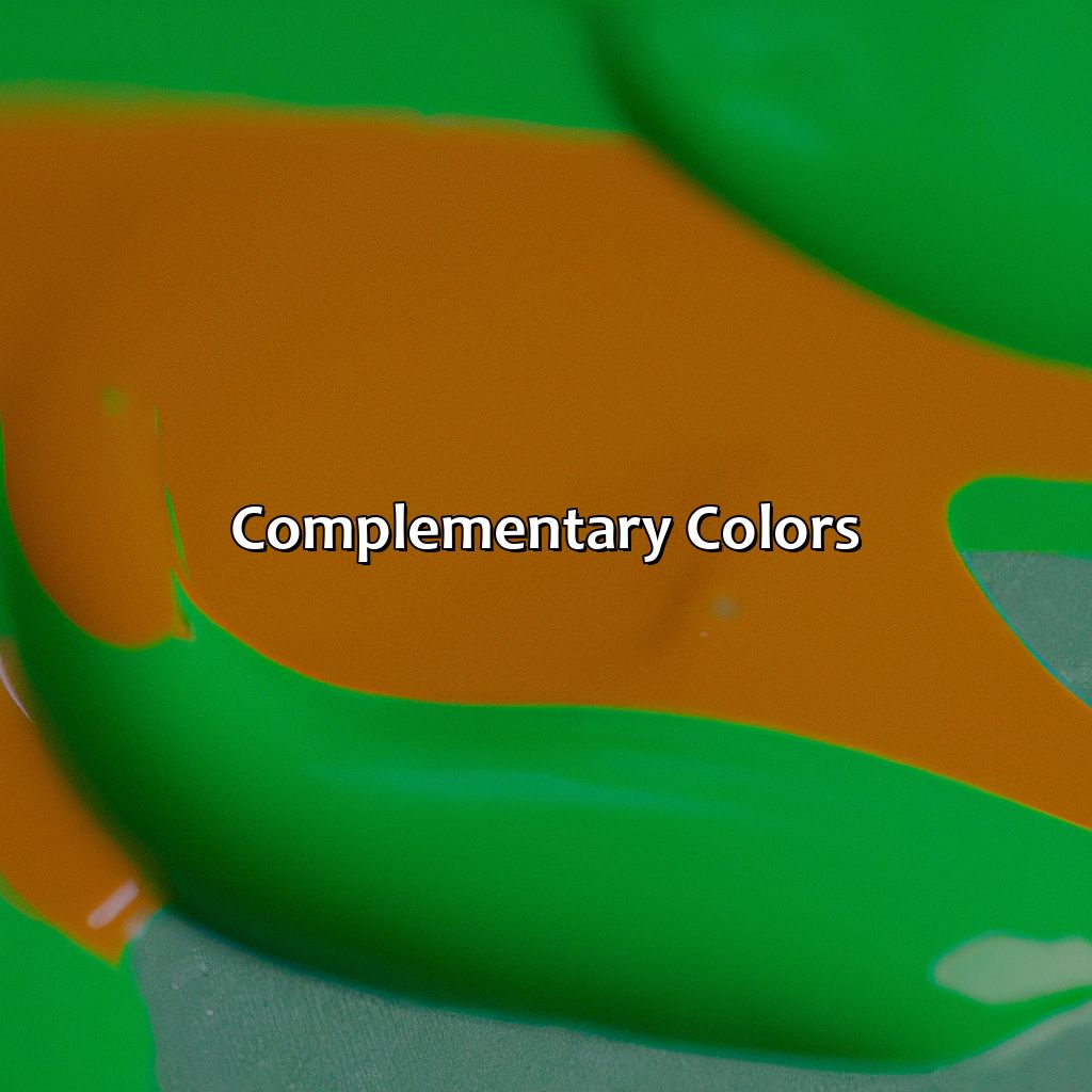
Photo Credits: colorscombo.com by Walter Jones
Delve into the section of “Complementary Colors” and focus on the article “Orange and Green Make What Color”. To understand the impact of complementary colors, two sub-sections are introduced. The first is about various uses of orange and green as complementary colors. The second investigates the significance of these colors, such as their meaning, symbolism, perception, and contrast. It also looks at the psychological and branding implications.
Uses of Orange and Green as Complementary Colors
Orange and Green’s color combination creates a complementary harmony which adds an interesting touch to designs, art, psychology, and branding.
- Complementary Color Combinations: Orange and Green complement each other due to their placement on the opposite sides of the color wheel. They create a contrasting effect that is pleasing to the eye.
- Color Harmony: The blend of orange and green can create an energetic and lively ambiance. The colors confer vibrancy particularly in designs related to joyful occasions like weddings.
- Color Scheme: Orange and green can be incorporated into a variety of themes such as style, nature-themed design, and Moroccan-inspired design for products.
- Significance in Psychology and Branding: The combination has been found useful in promoting brands related to food products or for healthcare products that are associated with liveliness.
Unique details about these colors include their ability to induce happiness by inspiring enthusiasm while creating a more cheerful mood. These colors are also widely used in interior designs particularly on couches or artwork.
Fun Fact – According to colorpsychology.org, the color orange represents joy, warmth, sunsets, power, excitement as well as half-time oranges during sports games!
Unlock the psychology of color and harness the power of orange and green in branding and design.
Significance in Psychology and Branding
Color Psychology and Branding Play a Significant Role
Color has been scientifically proven to affect human emotions, actions, and behaviors. The correct use of color can have a profound impact in branding, advertising, marketing and design. This makes it essential to understand color psychology, meaning, symbolism and contrast when utilizing orange and green in branding.
In branding psychology, orange and green are used effectively to create meaning and differentiate brands. However, Orange is associated with warmth, cheerfulness, creativity, enthusiasm whereas Green symbolizes relaxation, growth and nature. The Color Contrast play an important role as well.
Brand Perception can be influenced by the color temperature as well as the hue saturation of Orange or Green. Finally, A color blindness test is required before designing brand logos using these colors.
Unique details that require focused attention include proper selection for specific regions where certain colors are perceived differently than others based on cultural background or physical location.
A true story shows how strikingly On demand ride-hailing firm Lyft’s unique orange theme attracts customers with its simple yet appealing design strategy. While competitor Uber’s current logo seems dull since it replaced an iconic black letter logo to an image that looks like a backward letter C in dull shades of blues.
Mixing orange and green may seem like a color catastrophe, but in design and art, these complementary colors create a perfect harmonious palette.
Orange and Green in Design and Art
Photo Credits: colorscombo.com by Roger Nelson
Discover how orange and green can be used in design and art! Finding a vibrant color palette isn’t easy, but orange and green make for an eye-catching combo. In this article, we’ll explore three topics:
- Decor
- Fashion and beauty
- Food and nature
Get the latest ideas and inspiration with these colors!
Orange and Green Decor
From walls to furnishings, orange and green decor is gaining popularity for its bold and eye-catching color combination. The orange and green color scheme is unique, refreshing, and versatile enough for both modern and traditional spaces. Incorporate various shades of green and orange-green or orange-yellow into a neutral space for a lively touch. Add some warmth by pairing earthly mid-tone oranges with mossy greens or burnt sienna shades with army greens.
Green and Orange are two hues that complement each other like magic. This fascinating combination adds artistic character to interiors while infusing energy, comfort, and harmony all at once. Whether it’s an abstract painting or designer pillow cover, this duo can make a memorable statement without subjecting your eyesight to uncomfortable novelty items.
Orange-green and green-orange combinations can also be seen in nature, artworks, fashion textiles, toys, and packaging designs. These non-overbearing colors have proven themselves timeless as they effortlessly add life to indoor scenes along with bringing positive psychological aspects- optimism, creativity.
Did you know: the combo of orange-green was initially patronized by ancient Egyptians who used it for their hieroglyphs as well? Today though used differently the same colors pop up in different areas of application. If orange and green make you feel alive, why not wear them?
Orange and Green in Fashion and Beauty
The shades of orange and green are popular in fashion and beauty. These colors signify vibrancy, energy and freshness. Orange hue is a dynamic color that demands attention, while green hue represents nature and earthiness. Orange tone has a certain cheerful quality to it, whereas green tone symbolizes growth and balance. Both orange pigment and green pigment add depth and dimension to fabrics, cosmetics or accessories. Fashionistas love experimenting with orange and green dye combinations to create unique color blends for their outfits or hairstyles.
Orange and green clothing is perfect for summer season apparel, as these colors complement each other beautifully. For instance, an orange blouse coupled with a light green skirt makes a great summer office attire. At the same time, an outfit consisting of a vibrant green dress paired with an orange scarf is perfect for attending outdoor events or gatherings.
Similarly, when it comes to makeup routines, the combination of orange and green can work wonders. An eye-shadow palette comprising these shades can transform your look from plain to edgy in minutes. A hint of orange on the eyelid’s crease followed by a light shade of shimmering green enhances one’s natural glow.
A true story worth mentioning would be – The famous designer Karl Lagerfeld used to channel his love for oranges through his fashion runway collections displaying clothes soaked in rich tangerine hues. He often paired these with accessories in contrasting shades of mint-green or olive-green.
Overall, an infusion of both colors within the realm of fashion & beauty creates remarkable results that are eye-catching yet balanced at the same time! From juicy oranges to leafy greens, nature never fails to serve up a perfect pairing of complementary colors.
Orange and Green in Food and Nature
Orange and Green in Nature and Food are prominent colors that add vibrancy to our surroundings. Without these two, we might feel something is lacking in the beauty of nature. Let’s explore more about how these colors impact our food choices and stimulate our senses.
In a table format, we can see the prevalence of orange and green colors in different food items:
| Food Item | Orange Content | Green Content |
|---|---|---|
| Carrots | High | Low |
| Pumpkins | High | Low |
| Oranges | Highest | 0 |
| Mangoes | High | 0 |
| Spinach | 0 | high |
| Broccoli | 0 | High |
Apart from food items, we can also see the dominance of orange and green hues in flowers such as marigolds, zinnias, dahlias, lotuses, tulips and many more.
Orange and Green backgrounds or gradients create a lively appearance on digital screens or posters. The color intensity of orange and green combination adds to its charm. When the color saturation is high with low lightness, it creates a bold impact. In contrast, when the color saturation is low with high lightness value, it has calming effects.
To bring out the best of these colors in nature or design, one could balance their intensity keeping both complementary hues at different levels. Another suggestion would be to choose appropriate shades that match each other well – for instance: a darker shade of olive with a lighter shade of peach will complement each other beautifully.
Five Facts About the Color Orange and Green:
- ✅ Orange and green are complementary colors on the color wheel. (Source: Sensational Color)
- ✅ Orange and green create a vibrant and refreshing combination commonly seen in nature. (Source: Better Homes and Gardens)
- ✅ Orange and green are often used together in sports team logos and uniforms. (Source: The Spruce Crafts)
- ✅ The combination of orange and green is said to evoke a sense of balance and energy. (Source: Color Meanings)
- ✅ Using different shades of orange and green can create a variety of moods and feelings, from warm and cozy to cool and refreshing. (Source: The Nest)
FAQs about Orange And Green Make What Color
What color do you get when you mix orange and green?
When you mix orange and green together, you get a shade of brown. The exact shade of brown can vary depending on the amounts of each color used.
Can you mix any shade of orange or green to get the same result?
No, the shade of brown you get when you mix orange and green will vary depending on the specific shade of each color and the amounts used.
What are some examples of the colors orange and green that can be used to create this brown shade?
Examples of orange shades include apricot, peach, tangerine, and coral. Examples of green shades include mint, olive, lime, and forest green.
What is the process for mixing orange and green together to create a brown shade?
The process for mixing orange and green involves slowly adding small amounts of each color to a palette and blending them together until the desired shade of brown is achieved.
Are there any tips for mixing orange and green together?
One tip is to start with a small amounts of each color and gradually add more until the desired shade is achieved. Additionally, testing the color mixture on a scrap piece of paper before applying it to the final project can help ensure the desired shade is achieved.
What are some common uses of the color brown created by mixing orange and green together?
The shade of brown created by mixing orange and green can be used in a variety of art and design projects, such as painting, graphic design, and fashion. It can also be used as a neutral color in home decor and fashion accessories.
