Key Takeaway:
- Orange is a versatile color that can be combined with a variety of other colors in fashion, home decor, and marketing.
- When paired with complementary colors like blue or green, orange creates a bold and energetic look.
- Analogous colors like yellow or red can also pair well with orange, creating a harmonious and cohesive feel.
- Neutral colors like white, black, gray, and beige are also great choices for a more subdued look when combined with orange.
- When using orange in branding and marketing, it can convey energy, warmth, and optimism, making it a great choice for companies looking to stand out.
- When incorporating orange into your wardrobe or decor, it’s important to balance it with other colors and not go overboard. Use it as an accent color or pair it with neutral tones for a more timeless look.
Understanding the Color Orange
Photo Credits: colorscombo.com by Stephen Lee
To grasp the concept of orange, you must delve into its meaning and psychology. These explore the emotions and feelings connected to this color. Color theory and the mixture of complimentary colors provide insight on how to team orange with other hues to make a creative aesthetic.
The Meaning and Psychology of the Color Orange
Orange Color Psychology: The vivid color orange is often associated with enthusiasm, creativity, and fascination. As per color psychology, it stimulates the senses and evokes feelings of warmth, excitement, and happiness. It can also signify affordability and youthfulness, which is why advertisers frequently use this color in marketing campaigns.
The Psychological Significance of Orange: Apart from being a cheerful hue, orange can incite a sense of enthusiasm and encouragement to take action. It resonates with extroverted people who enjoy socializing and interacting with others. However, it may lead to frustration or impatience amongst those who are not fond of the loud ambiance.
Unique Details: Orange can take on diverse meanings depending on its shade or context of usage. For instance, bright shades like neon orange may symbolize danger or urgency in emergency signage like traffic cones warning you to slow down. Burnt orange tones create sophistication in fashion design as well as interior décor when accompanied by black or brown hues.
Suggestions for incorporating Orange: When wearing orange clothing or accessories, be mindful that it pairs well with neutral colors such as blue, gray or white along with metallics such as gold or silver as they invite sparkle without clashing patterns unnecessarily. When used appropriately in branding materials–with other complementary colors–orange arouses interest while sending playful vibes that evoke positive emotions among customers. In home decor settings, including an orange throw pillow on beige couches gives an inviting and bright impression without overwhelming other more muted colors dominating the living room palette.
Complement your life with complementary color combinations, starting with orange and blue.
Color Combinations and Color Theory
Color Harmony and Color Theory play a vital role in achieving balance and beauty in any design. The selection of color combinations can make or break the visual impact of the overall design.
To understand how color combinations work, we need to explore its concepts based on three major categories: Complementary, Analogous, and Neutral Colors.
| Complementary Colors | Analogous Colors | Neutral Colors |
| Colors placed opposite to each other on the color wheel Eg: Red-Green, Blue-Orange, Purple-Yellow |
Colors next to each other on the color wheel Eg: Red-Orange-Yellow, Blue-Green-Yellow |
Black, Grey, White, Cream and Beige if used creatively can bring out outstanding results. |
Complementary colors are used to create high contrast visuals while analogous colors add warmth and depth to the design. On the other hand, Neutral colors act as grounding elements which help in balancing out bright or bold colors.
The correct choice of color combinations impacts the effectiveness and success of any branding or marketing effort. Understanding how different colors complement each other is critical in deciding which combination works well for your brand.
Incorporating complementary colors like blue with orange or red with green makes the design visually compelling. It evokes a feeling of excitement, enthusiasm and adds dimensionality to the composition.
To achieve successful use of color combinations one needs to understand their effect psychologically. For example, red sends a signal for passion while green has been related with peace and tranquility. Combining these tell a different story altogether, creating a unique blend and context in your design.
Create a unique brand aesthetic with the right choice of color combination. The fear of missing out on the perfect color combination for a design can lead to disastrous consequences when it comes to branding. One should be aware that investing in this area is worth it and gives unique selling propositions for your brand.
Why settle for just one color when orange has so many potential partners in crime?
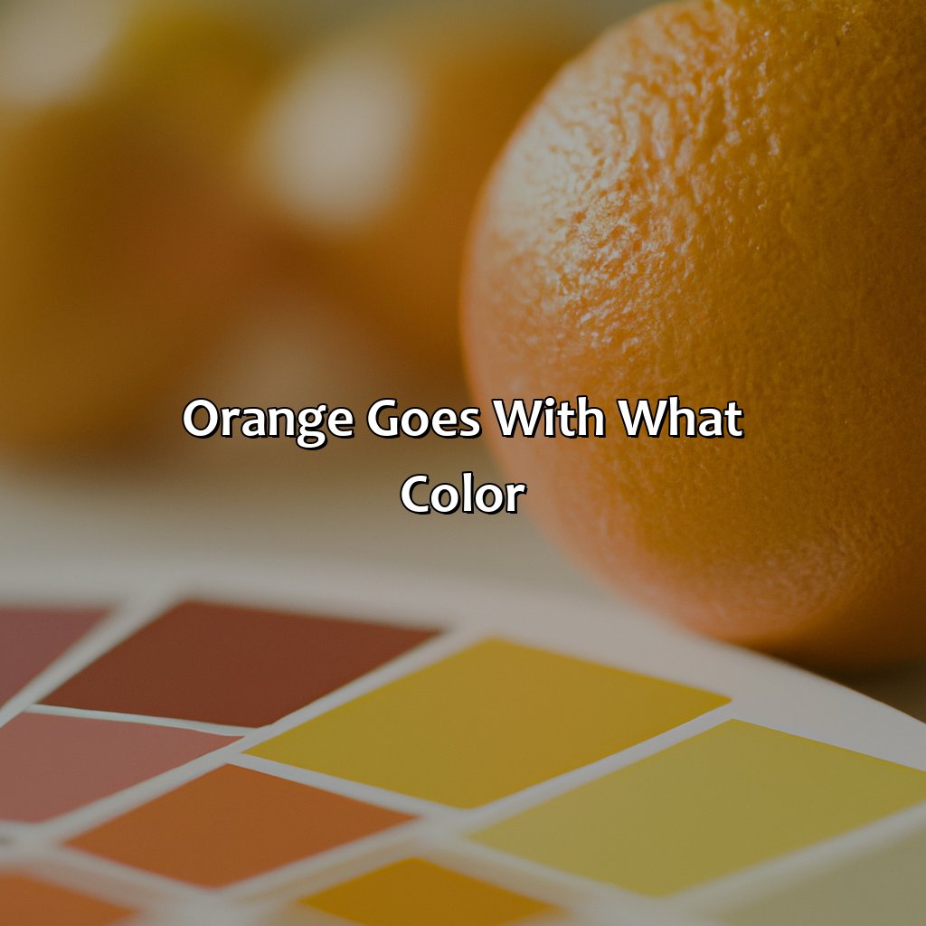
Orange Goes with Which Colors
Photo Credits: colorscombo.com by Albert Walker
What colors to pair with orange? Check out “Orange Goes with Which Colors”.
In this section, you’ll find:
- Complementary Colors for a special mix of colors.
- Click on “Analogous Colors” for shades that go together.
- Or try “Neutral Colors” for a balanced palette.
Each sub-section has its own unique color scheme to help you mix and match orange with ease.
Complementary Colors
Complimentary hues are colors that harmonize with each other and highlight each other’s contrasting qualities. They create a striking visual impact when paired together. When it comes to color combinations, complementary colors are typically opposite each other on the color wheel. The combination of orange and blue, orange and green, or orange and purple all make for daring yet balanced pairings. Additionally, analogous colors like red-orange and yellow-orange bring out different shades of color saturation in the chosen hue offering a unique blend.
A range of neutral shades like beige, gray, navy blue, or black is also perfect for toning down bright orange clothing or interior decor without detracting from its cheerful energy. Enhance your wardrobe or space by trying complementary and analogous schemes with warm autumnal tones involving different textures and depth.
Pro Tip: Use complementary color combinations in moderation rather than overwhelming with multiple clashing contrast hues which can get garish and distract from one another’s beauty.
Analogous colors are like a group of friends who all get along, blending together seamlessly in any outfit or design.
Analogous Colors
Colors that are neighboring each other on the color wheel are known as analogous colors. These colors share a similar hue and can create a harmonious look when used together in design or fashion.
Here is a table of some popular analogous color combinations:
| Analogous Colors | Example |
|---|---|
| Red, Orange, Yellow | Sunrise |
| Blue, Green, Yellow-Green | Forest |
| Purple, Blue-Violet, Blue | Twilight |
| Yellow, Green-Yellow, Green | Citrus Fruit |
Analogous color schemes offer a balanced and harmonious look while still allowing for variation in shade and intensity. They are often used in nature-like or organic designs.
It’s important to note that analogous colors can often cause a lack of contrast which may result in less visibility and legibility. It is best to pair them with contrasting shades or add textural elements to increase their visual appeal.
When incorporating analogous colors into branding or marketing materials, it’s best to stick to only one or two dominant hues so as not to overwhelm the viewer. According to an article by Canva.com titled “Color Meanings: What Does Your Brand Colors Say About You?”, using analogous tones creates an overall feeling of balance and calmness which can be ideal for brands who want to convey tranquility and serenity.
You can never go wrong with a touch of neutral, it’s the perfect balance to the vibrant and bold personality of orange.
Neutral Colors
Neutral colors are hues that don’t draw too much attention to themselves and match well with other colors. They include black, white, gray, beige, cream, and brown. Neutral tones blend well with different color schemes and can be used as a base or backdrop in fashion and interior design. Using these colors also gives a sense of balance and sophistication to any setting. Neutral shades have no obvious undertones, so it’s important to choose the right shade to complement other colors in the palette.
When combining neutral colors with orange, one can never go wrong. The warm tone of orange contrasts beautifully against the subtle backdrop of neutral shades, thereby making it stand out more prominently than ever before. Whether it’s a taupe sofa beside an orange wall or a beige scarf paired with an orange dress- such combinations exude elegance, charm and whimsy all at once.
It’s imperative to note while picking neutral clothing or accessories that they do not overpower the vibrancy of orange. Keeping it minimalistic is the best approach. For instance – wearing beige trousers with an orange shirt will always look elegant but adding too many accessories or layers will take away from this vintage combo.
To achieve a stunning effect when incorporating neutral hues into branding efforts is essential so that Orange acts as the centerpiece without looking overly gaudy or strident. It’s advisable to use soft shades like ivory or dove gray for background layouts as they provide perfect contrast to the bright color tones of Orange rather than diverting attention from them.
Incorporating neutral elements definitely enhances the overall impact of any creative outlet where Orange features as a must-have tone!
Need a little spice in your life? Add some orange – it goes with everything!
Using Orange in Fashion and Home Decor
Photo Credits: colorscombo.com by Larry Sanchez
Incorporate orange into your look and home in style! There are two sections to help you do this: ‘Orange Clothing and Accessories’, and ‘Orange in Home Decor and Interior Design’.
The first section has tips on how to add a touch of orange to your clothing. The second section explores how to use orange decor to lighten up your space.
Orange Clothing and Accessories
Orange in Fashion and Accessories:
Orange clothing and accessories have gained popularity in recent years. This vibrant hue can be paired with a variety of colors to create bold or subtle looks, making it a versatile option for fashion-conscious individuals. Here are five ways you can incorporate orange into your wardrobe and accessorize:
- Pair an orange top with neutral-colored bottoms such as black, white, or denim for a casual yet stylish look.
- Add an orange scarf or hat to your outfit to liven up your ensemble.
- Accessorize with orange jewelry such as necklaces, bracelets, and earrings to make a bold statement.
- Wear an orange dress or jumpsuit for a chic, monochromatic look.
- Layer an orange blazer over a neutral outfit to add a pop of color to your professional attire.
Fashion is all about expressing oneself through one’s clothing choices. And what better way to do so than by incorporating the color that signifies creativity- orange!
To switch things up even more, try combining various shades of orange with different textures and fabrics too.
By creating unique combinations with accessories like shoes or bags that complement the outfit’s overall aesthetic, anyone can stand out in style.
So why not experiment and inject some much-needed warmth into one’s wardrobe?
The use of this vibrant hue is beyond just fashion though. It also has its place in marketing materials!
Add a pop of personality to your home with orange decor, because it’s not the furnishings making a statement, it’s the color!
Orange in Home Decor and Interior Design
Orange is a versatile color that can add warmth and energy to any space. Decorating with orange can be done in various ways, such as adding orange decor or using orange home accents. With the right combination of colors and accessories, you can create a welcoming and stylish living area.
In interior design, burnt sienna, pumpkin spice and honey-toned shades of orange are used extensively. To incorporate this color, paint one wall or furniture item orange to make it stand out as an accent piece. Pillows, curtains, rugs or throw blankets in earthy shades of this color add vibrancy without overwhelming the room. Orange pairs well with neutral hues like beige, off-white and gray for a calming touch.
Unique details like metallics or bold graphics pair nicely with soft oranges while darker ones complement light pink tones. Pairing an area rug lined with oranges on black adds depth to the sophisticated room setting.
To complete a comprehensive look, consider experimenting with other complementary colors; browns and greens evoke earthy vibes whereas yellows are summery.
When decorating with orange in home interiors it’s important not to overdo it but rather using it to add pops of color subtly throughout rooms creating harmony between decor elements. By incorporating these tips into your design processes you’ll soon have a stunning and chic look enhancing spaces beyond measure!
When it comes to branding and marketing, orange is like the trusty sidekick who always gets the job done with a pop of personality.
Orange in Branding and Marketing

Photo Credits: colorscombo.com by Eric Gonzalez
To get the most out of orange in branding and marketing, you need to understand the benefits and applications. This section focuses on the impact of orange in branding and marketing. You’ll discover how to incorporate it into your branding and observe examples of companies who have used it in their logos.
We’ll also examine the message and emotions orange conveys in branding, so you can use it effectively in your strategies.
Examples of Brands that Use Orange in Their Logo
Many brands have successfully used the orange color in their branding and logo design. The vibrancy and energy of the color make it a popular choice for companies wanting to convey excitement, creativity, and adventure.
Companies that Use Orange in Their Logo:
- Nike
- Fanta
- Gatorade
- T-Mobile
- Amazon
These brands have utilized different shades of orange to create unique and recognizable logos that stand out in the market. For example, Nike’s iconic “swoosh” logo is an abstract shape that incorporates the brand’s bold orange color. Similarly, T-Mobile has used bright orange as the primary color for its distinctive wordmark logo.
When it comes to branding, choosing the right colors is essential to convey the desired emotions and message effectively. Orange is often associated with enthusiasm, confidence, playfulness, warmth, and friendliness. It can also be used as an attention-grabbing accent color or for highlighting calls-to-action on websites or marketing materials.
As a pro tip: When using orange in branding or logos, consider pairing it with complementary colors like blue or using it as part of a multicolored palette to create a balanced look.
Orange may not be the new black, but it sure is the new attention-grabber in branding and marketing.
The Message and Emotions Orange Conveys in Branding
The warm and energetic color orange conveys emotional and psychological messages in branding and marketing. It strikes a balance between red’s passion and yellow’s optimism. Orange evokes warmth, excitement, creativity, playfulness, friendliness, affordability, confidence, and vibrancy in brands.
Orange is a versatile color that can create dynamic color combinations with other colors. The dark shades of blue and green offer a complimentary contrast to Orange in branding materials because it increases readability. Muted or pale shades of brown provide an earthy effect when combined with orange. Alternatively, adding gray tones to orange gives the impression of being muted or understated.
Brands that use orange in their logo include Amazon, Harley-Davidson, MasterCard, and Fanta. These companies seek association with the emotions induced by the color Orange as mentioned above while showcasing a brand personality that highlights innovation, reliability & youthfulness.
Pro Tip: Use orange for youthful brands or products targeting creative professionals who associate themselves with passion & enthusiasm.
Before using orange in your life, make sure you do the ‘orange you glad I didn’t’ checklist of dos and don’ts for wearing, decorating, and marketing with this vibrant color.
Tips for Using Orange in Your Life

Photo Credits: colorscombo.com by Douglas Anderson
Orange in your life? Here’s how! Check out these tips to look stylish and sophisticated. Do’s and don’ts of wearing orange. Add color to your home with orange accents. And learn how to use orange in your marketing campaigns. An eye-catching brand image awaits!
Dos and Don’ts of Wearing Orange
When it comes to wearing orange, one should be mindful of the color’s hues and tones. To make the most out of wearing orange, consider the following tips:
- Dos:
- Wear bold and vibrant shades of orange for an assertive and confident look.
- Pair orange with complementary colors like navy blue or neutral colors like beige to create a balanced outfit.
- Consider adding pops of orange with accessories like belts, bags, or scarves.
- Opt for lighter shades of orange in spring and summer and darker shades in fall and winter.
- Experiment with different textures like suede or leather to create depth and interest within your outfit.
- Don’ts:
- Avoid pairing too many bright colors with orange as it can make your outfit appear overly busy or garish.
- Try not to wear head-to-toe orange unless you want a statement piece like a jumpsuit or dress for a special occasion.
- Do not mix too many patterns when wearing an orange garment as this can appear overwhelming rather than stylish.
It is worth noting that knowing what shade of orange suits you best based on skin tone can elevate your style game while wearing orange.
One Pro Tip would be to experiment with different styles until you find the perfect balance for you while wearing the color. If you’re feeling bored with your home decor, why not add some zest with orange accents?
Adding Orange to Your Home Decor
Decorating with the color orange can add a warm and welcoming atmosphere to your home. Orange home accents can be used sparingly or as a bold statement piece to create a unique aesthetic. Incorporate orange in your home decor by adding throw pillows, curtains, artwork, or even a statement couch in shades of tangerine or burnt orange. Use neutral colors like white, beige or gray in combination with orange elements to balance the room’s overall look.
To create an inviting living space using orange hues, choose different shades of orange to create contrast and depth in your decor. Bold orange accents against softer pastel oranges can create a stunning effect. Using natural materials such as wood or rattan furniture will help balance the bright color and texture of the room.
When deciding on a color scheme for your home decor, remember to consider the purpose and feel of each room you are decorating because certain shades may have different effects on people. For example, bold oranges may be too stimulating for a bedroom while earthy tones could bring comfort and warmth – creating an inviting sleeping space.
By incorporating tips from expert interior designers, decorating with orange accents is no longer intimidating. Fearlessly add splashes of tangerine throughout your house creating an invigorating environment to reflect your individual style choices – ultimately creating an inviting home using Orange!
Get your marketing on point with a pop of orange – it’s the color of adventure, warmth, and vitality!
Incorporating Orange in Your Marketing Materials
When it comes to marketing, the color orange can be a powerful tool in catching attention and evoking emotions. It is important to use orange strategically, pairing it with complementary colors to create balance and an appealing aesthetic. Ensuring that the overall branding message is consistent with the chosen color scheme is key.
To incorporate orange into your marketing materials, consider using it in subtle ways, such as accents or backgrounds instead of overwhelming the design. Remember that different cultures may have varying associations and meanings attached to certain colors, so it’s important to research your target audience before committing to any specific color schemes.
Overall, incorporating orange into your marketing materials can help make them more visually stimulating and memorable. By using a professional eye for composition and cultural sensitivity, you can make this bold color work wonders for your brand identity.
Some Facts About Orange Goes With What Color:
- ✅ Orange is a vibrant color that goes well with blues and greens, creating a striking contrast. (Source: The Spruce)
- ✅ Orange also pairs well with warm colors like yellows and reds, creating a cohesive color scheme. (Source: House Beautiful)
- ✅ For a muted and sophisticated look, pair orange with neutral colors like blacks, grays, and whites. (Source: Elle Decor)
- ✅ Orange can be used as an accent color in a room to add pops of color and energy. (Source: HGTV)
- ✅ Different shades of orange can create different moods, from a warm and cozy feel to a bright and cheerful ambiance. (Source: Real Simple)
FAQs about Orange Goes With What Color
What colors go with orange?
Orange is a warm and vibrant color that pairs well with many other hues. Some of the best colors to pair with orange include blue, green, purple, brown, and yellow. Keep in mind that the shade of orange you choose can also impact which colors will work best.
Can orange and pink be paired together?
Yes, orange and pink can be paired together. While both colors are bright and bold, they can complement each other nicely when used in the right way. One way to make this color combination work is by using a soft, blush pink with a bright orange.
Is orange a versatile color for home decor?
Yes, orange is a versatile color for home decor. While it may seem like a bold choice, there are many ways to incorporate orange into your home without overwhelming the space. For example, you could try adding orange accents to a neutral room or using a muted shade of orange in a patterned rug or throw pillow.
What are some complementary colors for burnt orange?
Burnt orange is a warm and earthy shade that pairs well with a variety of colors. Some complementary colors for burnt orange include olive green, dark purple, navy blue, and muted shades of yellow and pink.
How can I decorate with orange and blue?
Orange and blue are complementary colors that can create a vibrant and energetic space when paired together. One way to decorate with orange and blue is by using a bold shade of orange on an accent wall and incorporating blue in the decor through accessories like throw pillows, rugs, and artwork.
Can I wear orange and red together?
Yes, orange and red can be worn together. However, it’s important to choose the right shades of each color to avoid creating a clashing look. For example, pairing a bright red with a bright orange could be overwhelming, but using a muted red with a darker shade of orange could create a more harmonious combination.
