Key Takeaway:
- Red and yellow make orange: When the primary colors red and yellow are mixed, they create the secondary color orange. Understanding color theory and the properties of different colors lays the foundation for creating a wide range of colors for art, design, fashion, branding, marketing, and more.
- Color mixing involves spectrum, hue, saturation, brightness, and chroma: The process of creating colors through mixing involves understanding various components, such as the color spectrum, which consists of the full range of colors visible to the human eye, including the primary colors. Hue, saturation, brightness, and chroma are other elements that come into play.
- Orange has a variety of shades and uses: Various shades of orange exist, from pastels to vibrant colors, which have different uses depending on the context. In art, design, and branding, orange is often used to evoke feelings of warmth, joy, creativity, and enthusiasm. Understanding symbolism and associations related to colors is also important in creating effective branding and marketing strategies.
Understanding Colors
Photo Credits: colorscombo.com by Daniel Moore
To really comprehend colors and how they function, you must understand the spectrum, hue, saturation, brightness, chroma, color wheel, warm colors, cool colors, and more. In this “Understanding Colors” section, we’ll go into greater detail to help you understand it better. We’ll also discuss sub-sections like;
- primary and secondary colors
- color theory with complementary colors
- color harmony, contrast, shade, tint, tone, color scheme
- analogous colors, monochromatic colors
- triadic colors, split complementary colors
- tetradic colors, and neutral colors.
What are primary colors?
Primary colors are fundamental colors that cannot be created by mixing other colors. Instead, they are used to create all other colors through color mixing. The three primary colors are red, yellow, and blue. They play a crucial role in the color theory and help in understanding complex color combinations.
By knowing about primary colors and their properties, it becomes easier to create different shades of every color by simply mixing them in specific proportions.
When it comes to color mixing, only the three primary hues can be used as base colors. These cannot be created from any combination of other tones or tints but instead rely on the innate properties of light absorption and reflection. By blending primary hues together, an entirely new hue can be made that has its own unique tone or tint. Hence, primary hues represent a core foundation for creating virtually any shade imaginable.
Incorporating knowledge about primary colors into artwork can often elevate overall aesthetic appeal due to the nuanced ways in which different shades interact with one another. Being able to properly blend these hues allows designers and artists to craft a cohesive work of art that incorporates a variety of palettes without sacrificing visual integrity.
Don’t miss out on the opportunity you have to achieve high levels of creativity by adding this essential element of artistic expression into your work–understanding how primary colors interact is integral to creating vibrant designs with texture and depth! Mixing colors is like friendship – sometimes two is better than one, creating beautiful secondary colors.
What are secondary colors?
The secondary colors are hues obtained by mixing two primary colors from the color wheel. When mixing two primary colors, a new hue is created, which is considered a secondary color. These secondary colors are green, purple, and orange. Mixing blue and yellow creates green; red and blue create purple; and red and yellow make orange. Color mixing is an essential concept in various industries like fashion, design, art, and photography.
Understanding how secondary colors are formed can influence the way we use them in art or design projects. Secondary colors can vary in their composition depending on the amount of each primary color used. For instance, different ratios of red to yellow can create different shades of orange.
It’s worth noting that secondary colors differ from tertiary colors in that tertiary mixes include three hues- one primary color plus a mixture of the other two primaries’ secondary hue.
Pro tip: Colors have different meanings in different cultures and settings. It’s essential to understand the context before selecting a color scheme for any project.
Color theory is like a recipe book for artists, with ingredients like complementary colors, color harmony, and contrast, and techniques like shading, tinting, and toning to create amazing color schemes.
What is color theory?
The study of the relationship between colors is called color theory. It includes various principles that explain how different colors interact with each other. Understanding these concepts can help in creating a visually appealing design. One of the important aspects of color theory is the concept of complementary colors, where two colors that are opposite to each other create a high level of contrast and enhance each other’s hue. Additionally, color harmony refers to combining colors in such a way that they complement each other.
Shade, tint, and tone are used to refer to variations of different hues. Shade is created by adding black to a hue, tint by adding white, and tone by adding grey. A color scheme is a selection of colors used deliberately for design purposes. Analogous colors are those which lie next to each other on the color wheel and share similar hues whereas monochromatic colors as the name suggests consists of one hue but different tints, shades or tones.
Triadic colors are any three equally spaced colors forming an equilateral triangle on the color wheel along with split complementary using three colours; one base colour and two colours adjacent to its complement’s hue. Tetradic colours include four-color combinations; two pairs of complementary colours forming a rectangle on the colour wheel while neutral colours are those which do not fall under any particular type but include earthy or subdued tones like beige or grey.
A true story that exemplifies how important it is to understand color theory can be seen when Coca-Cola decided to change its trademark red color in the 1980s. The new red was brighter and had more orange elements, leading customers wondering if there was a change in formula or flavoring. This caused confusion among consumers and ultimately led Coca-Cola to revert back to their original red shade- highlighting how significant small changes in shades can affect customer perception.
Combine red and yellow, and you’ve got a color that’s as fiery as a spicy mustard – orange.
Red and Yellow
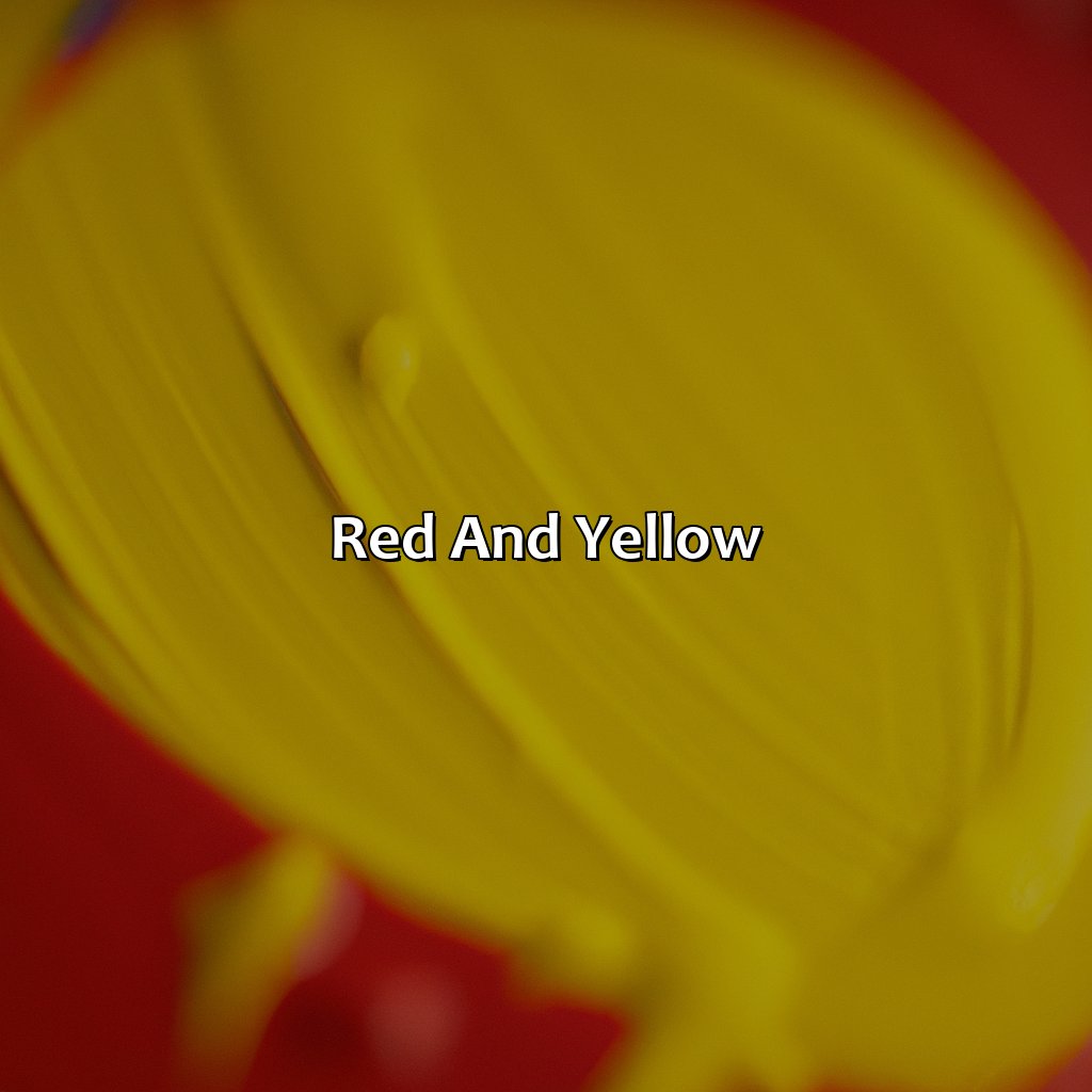
Photo Credits: colorscombo.com by Eugene Taylor
Explore the properties of red and yellow colors to understand how they make other colors. Learn about primary colors and color mixing. In this section titled “Red and Yellow,” discover its sub-sections.
- “Properties of Red Color” covers warm red, cool red, scarlet, rust, crimson, brick, and burgundy.
- “Properties of Yellow Color” talks about warm yellow, cool yellow, golden yellow, chartreuse, amber, marigold, ochre, saffron, tangerine, and vermillion.
- “Color Combinations with Red and Yellow” explains various combos like orange-red, burnt orange, peach, coral, fuchsia, raspberry, and terracotta.
Get a better understanding of these colors and mix them skillfully!
Properties of Red Color
Red color has distinctive features that distinguish it from other colors. It is a warm hue that represents passion and energy.
- Warm red tones such as scarlet, rust, and crimson have strong associations with love, excitement, and danger.
- Cool red tones such as cherry and raspberry are calmer and more soothing to the eye.
- Red has a high visibility factor and can attract attention towards anything it is used on.
- It is an intense color that evokes emotions such as aggression, passion, and anger in humans.
In addition to these characteristics, one must remember that different shades of red carry varying connotations. Red has been associated with kingship in ancient times when only royalty was permitted to wear it. It has also been associated with communism. During the industrial revolution era of coal production, leading business owners would often wear burgundy-colored suits made famous by the nickname “The Iron Lady,” referring to Margaret Thatcher.
There’s a story about how actress Audrey Hepburn showed up at the Oscars wearing a scarlet Givenchy dress in 1954. The elegant style of the dress paired with her wholesome beauty was portrayed as incandescent elegance in an era of extravagance.
Yellow comes in all shades, from warm to cool, golden to chartreuse, amber to marigold, ochre to saffron, tangerine to vermillion – it’s a bright and versatile color.
Properties of Yellow Color
Yellow is a vibrant color with unique properties that make it quite distinctive. Yellow can be categorized into different shades, including warm yellow, cool yellow, golden yellow, chartreuse, amber, marigold, ochre, saffron, tangerine, and vermillion. Its color carries the connotation of sunshine and happiness. It’s often used to evoke feelings of joy and optimism.
Yellow is considered a primary color in color theory. It has a high visual impact that draws attention to any object or text it’s used on. Warm yellows have more red pigments in them and are associated with heat and energy while cool yellows have more green pigments in them and are associated with tranquility.
In nature, you will find various bright yellow species from daffodils to sunflowers. Alongside its vibrancy is its ability to mix well with many colors on the spectrum like blue, black or white.
History notes that during Greek times back around 400BC-300BC “Lutes were made of yelow ivory” suggesting luxuriousness was conveyed by this color even centuries ago. In recent societies electricity companies use it to bring notice to their brand showing its energy association there too over time reflecting culture changes towards this mood-inducing hue also due to its effortless blend making abilities.
Mixing red and yellow is like playing with fire, resulting in a sizzling array of orange-red, burnt orange, peach, coral, fuchsia, raspberry, and terracotta.
Color Combinations with Red and Yellow
Combinations of Red and Yellow can produce an array of vibrant hues and shades. When mixed in different amounts, the colors can shift from warm orange-red tones to bright yellows or burnt oranges. This harmony is often used to create unique palettes that blend well together.
- Blending red and yellow creates a varied scale of shades such as peach, coral, and terracotta.
- Including more yellow in the mix creates brighter colors that resemble sunshine or golden honey.
- Adding more red results in deeper hues with a pinkish undertone such as fuchsia or raspberry.
- Darkening the mixture leads to rusty and blood-red colors
- In graphic design, red and yellow are frequently placed next to each other for a high-contrast effect in visual communication.
The combination of these two primary colors is essential knowledge for designers who want to express various emotions with their work effectively. To create the ideal balance between elegance and contrast in art pieces, one needs substantial expertise.
Once, a fashion designer admirer was playing around with combinations of Red and Yellow during her research when she realized how stunning the mixture looked on silk fabric with cherubs painted on them. It led her to incorporate this combination into her collection at Milan Fashion Week, giving her great recognition among fashion lovers worldwide.
Mixing red and yellow creates a spectrum of hues ranging from fiery to mellow, with varying degrees of saturation, brightness, and chroma to suit any color mixing needs.
Creating Orange
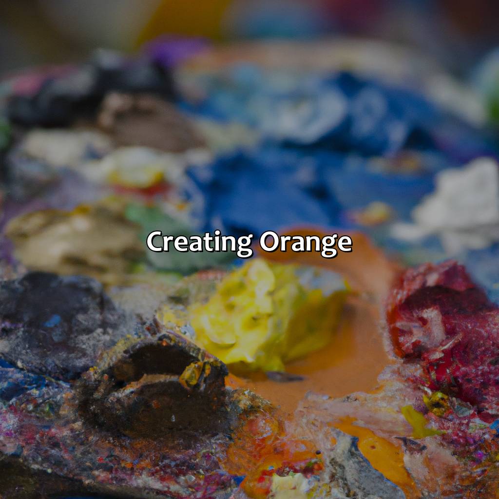
Photo Credits: colorscombo.com by Paul Thomas
Forming an orange color requires red and yellow. To understand color mixing, this section entitled “Creating Orange” has three subsections:
- “How Orange Color is Created”
- “Different Shades of Orange”
- “Uses of Orange Color”
Discover how this hue is formed with pigment and light sources. Investigate various shades of orange, from vibrant to earthy. Finally, figure out the importance of this color in art, design, fashion, branding, and symbolism in different cultures.
How Orange Color is Created
Combining red and yellow is a classic example of color mixing that results in the creation of orange. Orange can be created by mixing primary colors of pigment, namely, red and yellow in equal amounts. Similarly, when primary colors of light such as green and blue are mixed, it creates orange. The color theory suggests that the mixture of primary colors is essential to obtain secondary and tertiary colors.
Understanding how color mixing works with pigments and light sources gives an idea about how different shades can be created. By altering the concentration of each color in the mixture, various tones and hues of orange can be produced. The intensity varies depending on the amount of each color used. Thus, there exists a range from dark burnt orange to lighter shades.
Orange has many uses such as in advertising, marketing, branding industry logos; it has also been found to stimulate appetite and create excitement. Moreover, artists prefer this color for creating natural landscapes, sunsets or warm moods in their paintings.
It is true that historically orange was obtained using dry arsenic sulfide powder mixed with realgar mineral; however today’s standard procedures follow safety guidelines ensuring safe practices while creating different shades by combining colors through proper methods.
From pastel to earthy, vibrant to subdued, orange comes in all shades to suit every taste and personality.
Different Shades of Orange
Orange color can come in a wide range of shades, each with its unique properties and applications. These shades can be categorized as pastels, vibrant, earthy, subdued or muted colors. The various shades are achieved through the combination of different levels of red and yellow pigments.
Different hues of orange can evoke varied emotional responses in individuals based on their association with particular objects or personal experiences. For instance, muted orange is associated with fall and can be used to create a warm and inviting environment during cold months. Its subdued quality makes it ideal for use as an accent color without being too overwhelming.
In contrast, vibrant orange can add an element of excitement and enthusiasm to any design or artwork; perfect for those looking to make a bold statement. Pastel oranges offer a more delicate approach to using this color with subtler tones that work well in creating soothing visuals.
Overall, having knowledge of the different shades of orange opens up creative possibilities by allowing designers to choose just the right shade that will bring out the best effect for their designs.
Don’t miss out on great design choices because you have limited knowledge on what works best with Orange – learn more! From art to branding, orange is a color that has a strong presence and represents energy, warmth, and enthusiasm in various aspects of design and marketing.
Uses of Orange Color
Orange color is widely popular in art, design, fashion, branding, marketing and culture due to its unique properties and symbolic meanings. Its warm, energetic and playful nature makes it a great choice for promoting creativity and enthusiasm. Additionally, orange is often associated with positivity, happiness, excitement and adventure. This bright color is commonly used in branding and marketing to grab attention of the audience and create a sense of urgency or action. In art, orange can convey emotions like passion, vitality or intensity. Symbolically, orange represents creativity, confidence and cooperation which make it a great choice for team-building events or group projects.
Moreover, orange has both spiritual and cultural significance in many traditions around the world. For instance in Hinduism, saffron color which is similar to orange is considered holy and symbolizes purity and humility. Similarly in China, orange represents good luck while in Japan it signifies courage.
According to the Psychology of Color book by Eva Heller (2017), “Orange radiates warmth that can melt coldness“. It’s worth noting that while too much brightness can be overwhelming or irritating for some people but when used properly with other colors it can evoke emotions such as inspiration or optimism.
Understanding Colors
Photo Credits: colorscombo.com by Ronald White
To comprehend colors, you must know the foundations of primary and secondary colors, plus color theory. In this ‘Understanding Colors’ section, we’ll discuss the sub-sections:
- Primary and secondary colors
- Color theory comprising complementary colors, harmony, contrast, shade, tint, and tone
- Different color schemes like analogous, monochromatic, triadic, split complementary, tetradic, and neutral colors
- The spectrum, hue, saturation, brightness, and chroma, as well as the color wheel with warm and cool colors.
What are primary colors?
Primary colors are the purest colors that cannot be created by mixing other colors. They form the basis of color mixing, and from them, all other colors can be created. Mixing two primary colors in equal proportions forms a secondary color. This is a fundamental concept in color theory and is widely used in painting, printing, and digital design.
In color mixing, primary colors refer to red, yellow, and blue. These colors are significant as they provide the building blocks necessary for creating all the other colors. Mixing any two of these primaries produces secondary colors like orange (red + yellow), green (yellow + blue), and purple (blue + red). This process can continue indefinitely to create millions of shades.
The use of primary colors is crucial in various visual arts such as oil painting or watercolor work. The knowledge of which pigments are primary helps painters mix their paints effectively without introducing unwanted hues into their work.
Mixing primary colors is not limited to traditional art mediums alone but also has practical applications worldwide; it’s often necessary to know how to arrive at particular shades using only a limited range of pigments. Blending essential oils to create new fragrances or adjusting light-colored plastics using dyes are examples where the understanding of primary color mixing serves as an invaluable tool in everyday life.
Learning about primary colors’ roles in color theory, unchanging characteristics when mixed with others makes everyone truly appreciate expertly produced gradients consistently found throughout all forms of visual art known to man.
Mixing primary colors results in the creation of secondary colors, giving even more hues to choose.
What are secondary colors?
Secondary colors are the result of mixing two primary colors. Essentially, when any two primaries are mixed together in equal parts, a secondary color is created. This is the most basic concept underlining color mixing and plays a significant role in color theory. It’s important to note that there are three primary colors: red, blue and yellow, and three secondary colors – green (mixing yellow and blue), orange (mixing yellow and red) and purple (mixing blue and red). Knowing this fundamental fact can aid in creating various shades of colors for any design or artwork.
When we explore secondary colors further, it involves getting into advanced levels of understanding light wavelengths, hues and saturation levels based on color theory principles. These concepts form an integral part of art education as they empower artists to combine different hues to create unique works of art or give them insights about why certain color palettes might be more aesthetically pleasing than others.
Color mixing also impacts product design decisions for businesses or photographers whose life work revolves around capturing the perfect shot because knowing how specific colors interact or blend with each other can enhance visual engagement with clients or audience.
Pro Tip: Colors evoke specific emotions that can drive consumer purchasing behavior which is why it’s important to understand how secondary colors work together so they can be utilized effectively within marketing campaigns.
Color theory is like a game of mixing and matching, where complementary colors become best friends and monochromatic colors are the lone wolves.
What is color theory?
Color theory involves the understanding of how colors behave, interact, and relate to each other. Complementary colors, color harmony, contrast, shade, tint, tone are all essential components of this theory. It helps in creating an appealing color scheme that can create an emotional response from the viewer. Analogous colors have a similar hue while monochromatic colors use different shades of the same color. Triadic colors and split-complementary colors make use of three hues while tetradic colors use four hues. Neutral colors complement bright hues; it is important to understand their roles when working with a color scheme.
Pro Tip: A good way to start working with a new color is by adding small amounts at first and gradually increasing it until you achieve your desired result.
If you mix red and yellow, you get a color that’s as fiery as a hot-headed argument but still sweet as a banana split – orange!
Red and Yellow
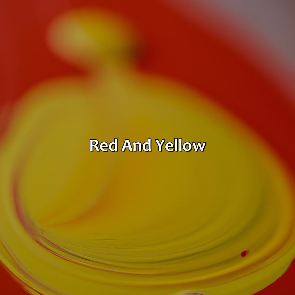
Photo Credits: colorscombo.com by Russell Flores
To grasp the color made by red and yellow, you must know the properties of each color and how they mix. In this “Red and Yellow” section with “Color Mixing” sub-sections, let’s dig into red’s warm and cool hues (e.g. scarlet, rust, crimson). Similarly, we’ll look into yellow’s shades (e.g. golden yellow, chartreuse, ochre). We’ll also explore the combinations of these two primary colors, such as orange-red, burnt orange, peach, coral, fuchsia, raspberry, and terracotta.
Properties of Red Color
Red Color Properties:
Warm or cool, scarlet to rust, red color has various properties that can change the entire mood of any design. Here are three key points about the unique qualities of red color:
- Red is an attention-grabbing color that evokes emotions such as passion, anger, and love.
- There is a range of shades in the red color family, including scarlet, rust, crimson, brick, and burgundy.
- The warmth or coolness of a red tone can also impact the overall feel of the color – warm tones tend to create excitement while cooler tones evoke calmness.
It’s important to note how different types of reds could be more suitable according to what kind of design/project you’re working on. For example, warmer tones tend to work well in restaurant branding for creating an exciting yet hearty atmosphere. In contrast, cooler tones may be better suited for designs related to healthcare or leisure products.
When using red in your design, it’s crucial to consider how it will function within context and communicate its intended message effectively. Depending on whether you want it to evoke certain emotions or have a particular meaning behind it – there are several considerations when working with this powerful color.
Yellow Color Properties:
Yellow comes in many flavors – from warm and cozy like a marigold, to zesty and vibrant like a tangerine, to rich and luxurious like amber.
Properties of Yellow Color
Yellow color has a vibrant and energetic personality that can evoke various emotions in a person. It is considered a primary color in color theory, and has unique properties that distinguish it from other shades.
Properties of Yellow Color:
- Warm yellow tones are associated with happiness, optimism, and energy.
- Cool yellow shades such as chartreuse can be tranquilizing and fresh.
- Golden yellow hues are often linked to richness, extravagance, and luxury.
- Amber colors evoke warmth and earthen qualities.
- Marigold is a specific shade of yellow that reflects joy and playfulness.
- Ochre is a muted shade of yellow that symbolizes robustness, endurance, and dependability.
Yellow also has many subtle variations such as saffron, tangerine, and vermillion that showcase the versatility of the color.
A true fact: According to a study by Rohrer et al., published in 2018 in Psychological Science, wearing warm colors like yellow increases people’s perceptions of your likability.
Mixing red and yellow unlocks a rainbow of possibilities, from fiery oranges and coral hues to peachy keen and raspberry whimsy.
Color Combinations with Red and Yellow
Red and Yellow are primary colors that can be combined to create various secondary colors. When combined, they create a range of shades from orange-red, burnt orange, peach, coral, fuchsia, raspberry to terracotta.
One of the color combinations created by red and yellow is the fiery shade of orange.
- Red and yellow combine in equal parts to create a bright orange hue.
- By adding more red than yellow or vice versa during the mixing process, different shades of orange can be achieved.
- Combining other colors with this mixture can result in unique and varied hues such as terracotta or peach.
It’s worth noting that when using this combination to produce other hues like green or violet, it’s important to start with an even blend of red and yellow before adding additional colors.
The history surrounding the use of this combination dates back centuries across various cultures like the ancient Greeks and Egyptians who used it in their art, design and decoration aesthetics. Today it continues to be widely used in branding campaigns for its energetic association with warmth and enthusiasm.
Mixing red and yellow creates the ultimate spectrum of happiness – bright and bold orange!
Creating Orange
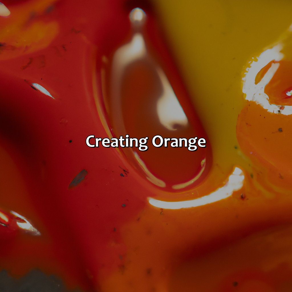
Photo Credits: colorscombo.com by Elijah Walker
Creating orange? It’s possible! Understand color mixing, saturation, brightness, chroma, and spectrum. Mixing pigment and light? That’s how you make orange with different shades, like pastel, vibrant, earthy, subdued, and muted. Orange matters in art, design, fashion, branding, marketing, and symbolism in culture. So get creative!
How Orange Color is Created
Orange color is created by mixing equal parts of red and yellow, resulting in a secondary color known as orange. This is due to the subtraction of light wavelengths, where red and yellow pigments combine to absorb all other colors except for orange, which reflects back to the observer.
Color mixing is an essential aspect of color theory that involves combining primary colors to create secondary and tertiary colors. Different shades of orange can be obtained by varying the ratio of red and yellow pigment or by adding white or black to adjust the brightness or darkness of the color.
Orange is widely used in branding and advertising due to its energetic and optimistic connotations. It is also associated with warmth, creativity, and enthusiasm.
A true fact according to a study published in the Journal of Visual Communication Research states that orange is a popular choice among high visibility apparel such as safety vests and jackets due to its high visibility under most lighting conditions.
Explore the rainbow of orange shades, from pastels to vibrants, earthy to subdued, and even the muted tones will make you shout ‘orange you glad I taught you this!‘”
Different Shades of Orange
Orange is a versatile color that can be found in various shades, each with its own unique properties. The color orange can be modified to create an array of different shades, ranging from pastel colors to vibrant colors, earthy colors, subdued colors and muted colors.
In exploring the different shades of orange, it’s important to note that these variations can be achieved by changing the amount of red or yellow used in mixing. Some popular shades of orange include:
- Peach Orange – which is soft and pale
- Tangerine – which is bright and bold
- Coral – which has pinkish hues mixed with the orange
- Burnt Orange – which is a dark and earthier shade of orange.
It’s fascinating how different industries have applied the use of orange across history. For instance, during the “Age of Exploration,” oranges were brought back from china with traders representing prosperity hence carrying a symbolical meaning for wealth. Today branding companies around the world utilize this exact tone in logo design as it exudes a sense of goodwill.
Therefore exploring the depth and application of various shades of orange provides us with insights on how to apply them in solving real-world applications such as branding and marketing. Orange is the perfect color for those who want their art, design, fashion, branding, or marketing to symbolize creativity, enthusiasm, and optimism.
Uses of Orange Color
Orange color is widely used in art, design, fashion, branding, and marketing. Its energetic nature makes it a popular choice in consumer packaging and logos. It is often linked with warmth, enthusiasm, excitement, and adventure. In the world of symbolism, orange represents creativity, fun, joy, optimism, and transformation. Its use varies across cultures where it may hold various meanings as per the beliefs or traditions followed by people.
The symbolism of the orange color has been integrated into art across different cultures. For instance, Dutch painters like Van Gogh incorporated orange to depict light on their subjects. Similarly, Pop Art maestro Andy Warhol created his famous Campbell’s Soup Can series using colors such as orange to add liveliness and appeal.
In branding and marketing sectors too, Orange has several applications for effective customer engagement and experience improvement. The logos of brands such as Harley-Davidson use orange to create a sense of adventure and symbolize their brand values.
Symbolism in culture finds expression through Orange as well where it is linked with auspicious events like sunset or religious practices like Gurpurab in Sikhism.
Orange’s application varies due to its dynamic essence that can add an element of energy or playfulness into remarkable contexts.
Color theory goes beyond the science of light and pigments and delves into visual perception, psychology, cultural associations, and symbolism.
Five Facts About Red and Yellow Making the Color Orange:
- ✅ When red and yellow are mixed in equal parts, they create the color orange. (Source: Smithsonian Magazine)
- ✅ The color orange is associated with energy, enthusiasm, warmth, and excitement. (Source: Color Psychology)
- ✅ The color orange is commonly used in branding, particularly for food and beverage companies, due to its ability to stimulate appetite and convey friendliness. (Source: Entrepreneur)
- ✅ In traditional color theory, orange is considered a “warm” color, as it is associated with fire and the sun. (Source: ThoughtCo)
- ✅ The use of orange in art and design dates back to ancient civilizations, where it was often used in pottery, textiles, and decorative arts. (Source: The Art Story)
FAQs about Redandyellow Makes What Color
What color does red and yellow make?
Red and yellow make the color orange when mixed together. It’s a secondary color that can be found on a color wheel between red and yellow.
Is there a specific ratio of red to yellow when making orange?
There’s no specific ratio, but typically equal parts of red and yellow are used to make orange. The shade of orange can vary depending on the amounts used.
Can other colors be mixed with red and yellow to create different colors?
Yes, mixing red and yellow with other colors can create a variety of shades and tones. For example, adding blue to red and yellow can create a brownish color.
Why do red and yellow make orange?
Red and yellow make orange because they are both primary colors. When they are mixed together, they create a secondary color on the color wheel.
What is the significance of the color orange?
The color orange is often associated with warmth, energy, and enthusiasm. It can also represent creativity and friendliness.
What are some examples of orange-colored objects?
Some examples of orange-colored objects include oranges, pumpkins, traffic cones, and sunsets. Orange is also commonly used in logos and branding for companies that want to convey a sense of excitement or playfulness.