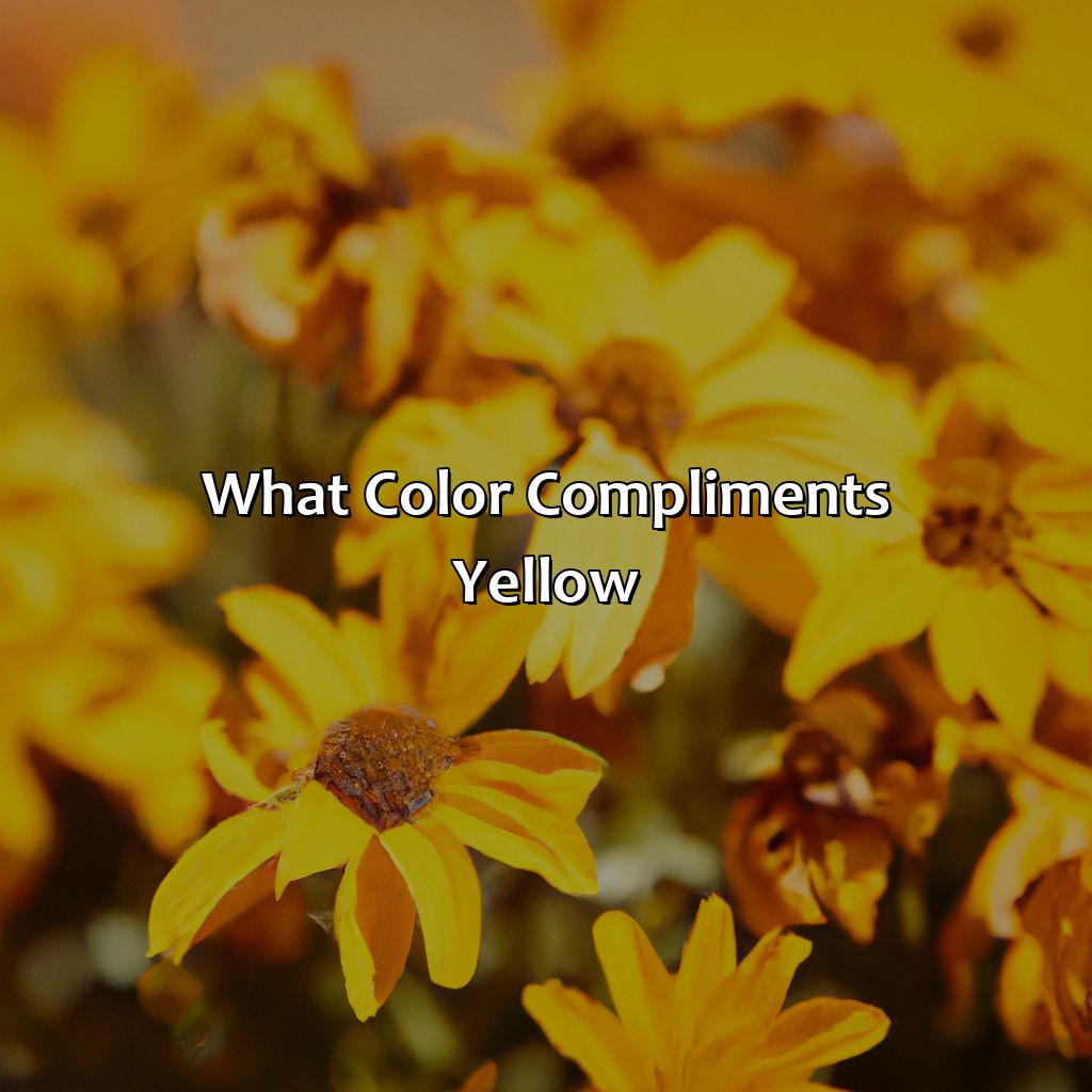
Key Takeaways:
- Understanding color compliments: In color theory, colors that are opposite each other on the color wheel are considered complementary, and they enhance each other when used together. Complementary colors for yellow are purple and violet, as these colors pair well with yellow and create a bold and striking color scheme.
- Warm colors that complement yellow: Warm colors like orange, red, and pink pair nicely with yellow. Orange is a popular choice for creating a warm and inviting color scheme, while red creates a bold and energetic look. Pink, when used in a split-complementary color scheme, adds a touch of femininity and sweetness to yellow.
- Cool colors that complement yellow: Cool colors like green, blue, and purple create a calming and relaxing effect when paired with yellow. Green is a fresh and natural choice that complements yellow nicely, while blue provides a relaxing and serene contrast. Purple, when used in a split-complementary color scheme, adds a sophisticated and regal touch to yellow.
- Neutral colors that complement yellow: Neutral colors like white, gray, and brown add balance and grounding to a yellow color scheme. White creates a clean and fresh look that pairs well with yellow, while gray provides a subtle and elegant contrast. Brown adds warmth and a natural feel to a yellow color scheme.
- Complementary color schemes: Using complementary colors in design creates a bold and eye-catching effect. Complementary colors for yellow are purple and violet, and they can be used to create a variety of color schemes, including monochromatic, analogous, and split-complementary schemes.
- Tips for using complementary colors successfully: When using complementary colors, it’s important to balance the colors and avoid overwhelming the design. Use one color as the dominant color and the other as an accent. Additionally, consider the mood and atmosphere you want to create with your color scheme.
- Examples of yellow complementary color palettes: Yellow can be used in a variety of settings, including fashion, home decor, and graphic design. For fashion, pairing yellow with navy blue or forest green creates a sophisticated look. In home decor, yellow can be paired with gray or brown for a warm and inviting feel. In graphic design, yellow can be used for branding, marketing, photography, and interior design, and pairs well with complementary colors like purple and violet.
Understanding Color Compliments
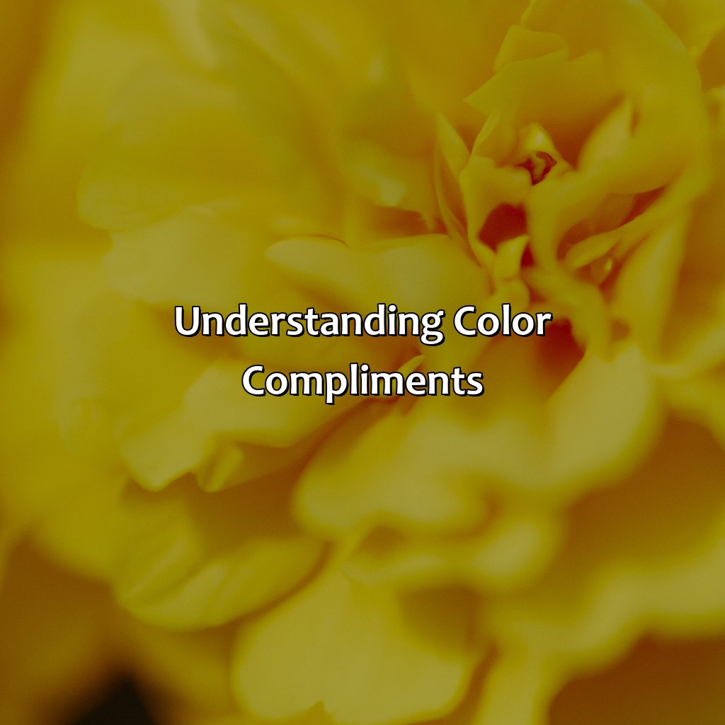
Photo Credits: colorscombo.com by Walter Campbell
The Science behind Selecting Complimentary Colors
Color theory and its various concepts are essential when it comes to designing and choosing the perfect color combination for any design or project. Understanding color compliments is crucial in this regard. Complimentary colors refer to colors that work well with each other and bring out the best in one another.
In selecting the perfect color compliment for yellow, it is important to understand the underlying science behind color combinations. The opposite of yellow on the color wheel is purple, and thus, purple is the complementary color of yellow. This means that when paired, they enhance each other’s vibrancy and create a beautiful contrast.
When it comes to color theory, it is crucial to remember that individual perceptions of color may vary and cultural differences could also play a role in the way colors are interpreted. However, the fundamentals of color compliments remain consistent.
It is important to note that the concept of color compliments has been a part of human history for centuries. Ancient cultures like the Egyptians, Greeks, and Chinese used natural pigments and dyes to create beautiful color harmonies in their artworks.
Overall, understanding color compliments is a fundamental aspect of selecting the perfect color combination. By incorporating the principles of color theory and the science behind color combinations, one can create visually stunning designs that leave a lasting impression.
Warm Colors that Complement Yellow
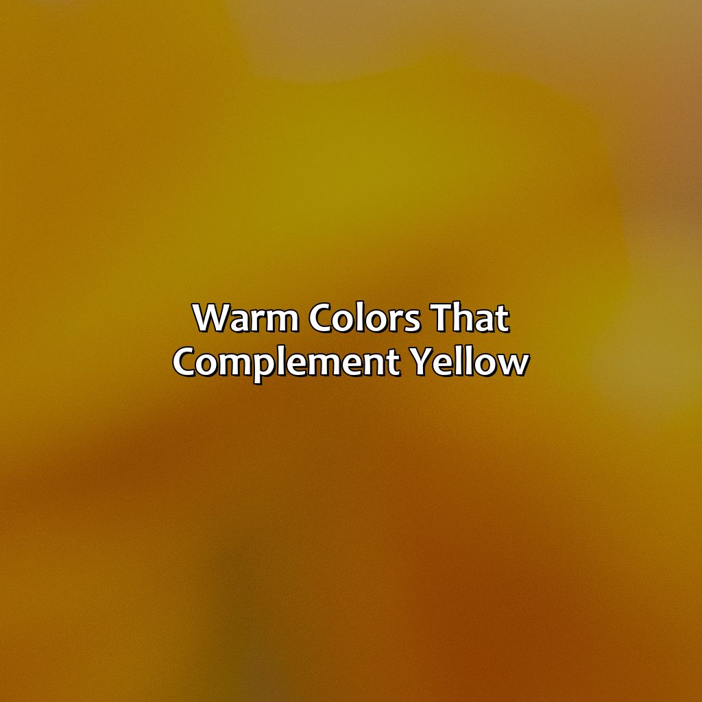
Photo Credits: colorscombo.com by James Wright
Create amazing color combos with yellow! Warm colors make great partners. Orange, red and pink are the best to enhance yellow. These warm colors can be put together to form all sorts of palettes. This article will take a look at each sub-section – orange, red and pink. See how warm colors combine with yellow for all kinds of colorful effects!
Orange
The color orange is part of warm color palettes that can beautifully complement yellow color combinations. Analogous color schemes, which include colors next to each other on the color wheel, also harmonize well with yellow. Combining orange with yellow creates a vibrant and energetic appearance because these colors are closely related in hue, making them complementary.
To create an attractive appearance when working with these colors together, use contrasting shades of orange such as burnt orange or tangerine. This adds depth and dimension to any design or outfit. Additionally, muted shades of orange like peach or coral blend perfectly with pale yellows for a soft and feminine look.
What’s unique about pairing yellow with orange is that it creates a warm feeling associated with energy and excitement without overwhelming. Moreover, designers can use this combination in various settings such as home décor, accessories, fashion, branding, and graphic design.
Don’t miss out on the charming possibilities that using the right orange hues can bring to your yellow-based designs. Try incorporating a range of orange shades into your next project to see what combinations you might discover.
Red is the spicy salsa to yellow’s mild guacamole in the world of color combinations.
Red
A powerful color that evokes intense emotions, Red is a warm shade incorporating red-orange and red-violet hues. When it comes to red color combinations, there are a lot of complementary options to choose from.
Red is a dominant hue that can be used in multiple ways. Complimentary warm color palettes like oranges or pinks can enhance the feel of any outfit or room decor. However, using bold combinations with yellow and neutrals such as white or black also creates an impactful look.
For unique details on red color combinations, consider adding subtle hints of blue or green for contrast and stability in graphic design projects. These complementary colors work well when working with broad palettes.
Create the perfect mood by balancing color schemes to manipulate emotions and atmosphere effectively. Red is energetic and passionate which can be balanced with cooler shades such as greens to add balance to an interior palette.
Don’t miss out on adding some excitement to your next design project by exploring the world of red’s complimentary colors! Who says pink and yellow can’t be friends? These color combos are giving us warm and fuzzy feelings.
Pink
To create an attractive warm color palette, pink can be paired with other warm colors like orange and red. This combination creates a bold and energetic look that’s perfect for fashion or home decor. When working with pink, it’s essential to balance its brightness by adding neutral tones like beige or gray. By doing so, you’ll maintain the intensity of the colors while keeping the overall design balanced.
Unique details regarding pink as a complementary color for yellow involve incorporating it into graphic design work. Designers use pink to express youthfulness, fun, hope, and love simultaneously. These connotations are essential when designing for specific audiences such as teenagers or young adults.
Pro Tip: To use pink successfully in your designs, begin by understanding how subtle changes in hue can affect its overall visual impact. Experiment with different shades of pink before deciding on the final palette as not all vision types will respond similarly to some hues of pink used along.
Green, blue, and purple walk into a room with yellow…and create a cool color party.
Cool Colors that Complement Yellow
Photo Credits: colorscombo.com by Vincent Rivera
To make beautiful color combos with yellow, you need to know which cool colors go best. In this section, ‘Cool Colors that Complement Yellow’, you’ll find how to craft stunning palettes using analogous, complementary and split-complementary schemes. Sub-sections are:
- Green
- Blue
- Purple
Green
A shade present in nature, the green color when combined with yellow creates striking combinations. Green is one of the cool colors that complement the warmth of yellow. Using green color combinations, cool color palettes, and analogous color schemes will enhance the beauty of any design or project.
Green is perfect for creating a natural and calm environment. It’s ideal for adding balance to a space and infusing it with a refreshing touch. The use of green color combinations can create harmony with other earth tones like brown, beige, or white and can be used to create unique effects.
To make use of this beautiful pairing, explore cool color palettes that involve shades of blue mixed with delicate shades of green like mint or seafoam. Green also pairs well with complementary colors like pink or red to create such analogous color schemes.
Historically, green symbolizes nature and regeneration in many cultures worldwide. Furthermore, specific shades refer to symbols representing agriculture in several areas. Today, modern designs have embraced various vibrant hues within similar tonal ranges and developed modern styles using graduated tones of greens.
Why be blue when you can have a blast with blue color combinations and cool complementary color schemes?
Blue
A blue-yellow palette offers endless possibilities to create unique color combinations. You can experiment with different shades of blue to achieve different effects. You can create a monochromatic scheme by using different shades of blue along with yellow as an accent color, or use analogous schemes that combine colors next to each other on the color wheel.
To create cool color palettes using blue and yellow, one can opt for light blues such as aqua or baby blue, which provide a refreshing, crisp look. Alternatively, darker blues like navy or royal blue provide depth and create bold statements when paired with yellow accents.
Historically, blue was not commonly used in art because it was difficult to make from natural pigments. However, during the Renaissance period, artists discovered how to produce brilliant hues of blue using ultramarine pigment imported from Afghanistan. From then on, the use of this exquisite shade grew tremendously in popularity among paintings.
In summary, Blue color combinations are essential components in cool-color palettes that complement yellow. Their complementarity creates striking contrasts while producing peaceful atmospheres when used together correctly within complementary color schemes.
Get ready for a regal vibe with these purple color combinations – perfect for creating cool color palettes and split-complementary color schemes.
Purple
Adding purple to yellow color combinations creates a beautiful harmony in cool color palettes. As an appropriate split-complementary color, purple pairs well with yellow-orange and yellow-green color schemes. This unique combination can bring a sense of sophistication and elegance to any design project.
Using muted shades of purple, like lavender or mauve, alongside vibrant yellows can add depth and interest to graphic design projects, fashion accessories, or home decor. Purple complements yellow well as it lends itself naturally as a background or accent to highlight the vibrancy of the yellow color.
Pro Tip: When using these two colors together, ensure that they are balanced in proportion because the stronger yellows may overpower lighter purples. If yellow is the sunshine, then white, gray, and brown are the clouds that bring balance to the color party.
Neutral Colors that Complement Yellow
Photo Credits: colorscombo.com by Christopher Jackson
Pairing yellow with the right neutrals can create stunning color combos. White, gray, and brown are the perfect neutrals to complement yellow.
We’ll explore the versatility of white for neutral color palettes and monochromatic schemes. Plus, the beauty of gray for neutral palettes, complementary schemes, and more. Lastly, warm brown for analogous color schemes to make yellow stand out.
White
The neutral color palette of white is a perfect complement for yellow as it adds a calming and sophisticated touch to the bright hue. Moreover, incorporating white color combinations in monochromatic color schemes with yellow can create striking contrasts while still maintaining an elegant feel. When using white in combination with yellow for clothing or home decor, opt for textures or patterns that add depth and interest to the overall look, such as textured fabrics or geometric prints.
It’s important to note that overusing white in a complementary color scheme could easily throw off the balance and make the space or outfit too stark. Therefore, combining other neutral tones like beige or gray can add warmth and help enhance the yellow- white pairing.
Source: https://www.thoughtco.com/what-colors-compliment-yellow-1070161
You don’t need a vibrant palette to make a statement, gray can be the perfect partner for bold pops of color.
Gray
The neutral color of gray can complement the warmth of yellow, making it stand out. Gray is diverse, with shades ranging from light to dark, giving it a wide range of compatibility options. Gray color combinations fit well in any setting and can be used to tone down bolder colors or create more minimalistic designs.
A combination of yellow and light gray creates a cheerful and clean look, while pairing yellow with charcoal gray creates a more sophisticated ambiance. The addition of beige or natural wood elements to the mix makes for a more organic feel. Gray can also be paired with brighter complementary colors like blue or green to create greater contrast.
Neutral color palettes use varying shades of gray along with other muted colors to create subtle yet elegant spaces. By using different intensities of the same color, including grays, these palettes create depth without overwhelming the senses.
Complementary color schemes are those that use opposing colors on the color wheel to enhance each other. When looking for complementary colors for yellow, consider cool tones like blue-gray or warmer tones like taupe-gray. These combinations emphasize the warmth and brightness of yellow while adding balance.
One true fact is that studies have shown that using complementary color schemes in marketing materials can help increase brand recognition and improve sales (Source: Shutterstock).
Why settle for boring neutral when you can embrace the cozy vibes of brown color combinations?
Brown
A popular neutral color palette, brown color combinations make an excellent complement to yellow. Brown hues like beige, taupe, and chocolate can tone down yellow’s vibrancy and add warmth to a space or outfit. Analogous color schemes with yellows and browns can create a cozy and natural atmosphere, perfect for fall or rustic designs.
Pro Tip: Keep in mind that the shade of brown used can affect the overall look and feel of the combination – lighter browns lean towards warmer tones while darker browns can appear more sophisticated.
Complementary colors are like a match made in heaven – they bring out the best in each other and create beautiful color schemes.
Complementary Color Schemes
Photo Credits: colorscombo.com by Roger Garcia
What are Complementary Colors? To understand how to use yellow in a complementary color scheme, explore this concept. It’s all about color theory and the definition of complementary colors.
Using Complementary Colors with Yellow? Create stunning combinations with yellow and learn about color palettes. Perfect for your artwork or design!
What are Complementary Colors?
Complementary colors are a fundamental concept in color theory. They consist of two colors that contrast each other and create a strong visual impact when used together. In essence, complementary colors are those found opposite each other on the color wheel. When used in design, they can evoke balance, contrast and harmony to a composition.
Complementary colors are integral to creating visual interest and depth within artworks. Using them effectively allows designers to emphasize areas of importance while balancing the overall composition. Their versatility has made complementary color schemes popular for centuries in fashion, interior design and graphic arts.
One unique aspect of complementary color combinations is that they possess a high level of contrast. Colors that appear opposite on the wheel are distinct from one another, making it easy for designers to use them for stand-out elements within their work.
Don’t miss out on these stunning effects when designing your projects! Incorporate complementary colors into your next artwork or design to evoke an impactful yet balanced response from your audience.
Yellow and its complementary colors make for a match made in heaven, like mac and cheese or tequila and regret.
Using Complementary Colors with Yellow
Complementary colors can enhance the overall impact of any design or visual element. When using complementary colors with yellow, there are some considerations to keep in mind that can help achieve the desired effect.
- Pair yellow with its warm color complements like orange, red or pink for a bold and vibrant look.
- Use cool color complements like green, blue or purple for a more calming and refreshing look.
- Neutral colors like white, gray or brown can be used as background tones to bring out the vibrancy of yellow.
- Create contrast by combining two complementary colors such as yellow and purple or yellow and blue-green.
- When using multiple complementary colors together, be sure to balance their intensity across all elements of the design.
- Consider using different shades and hues within each complementary color pairing for added complexity and depth.
While using these color combinations, it is important to keep in mind that personal taste will play a crucial role in determining how successful any particular palette will be. The variations in brightness, saturation, hue, tone etc. should be balanced to avoid generating an overpowering feel.
A suggestion would be to use subtle hues of green with shades of bright yellow that adds elegance yet contrasts perfectly well with one another. Another option could be combining black, white and grey with different shades of yellow for fabrics or wallpapers.
Master the art of color combinations with these expert tips on successfully using complementary color schemes.
Tips for Using Complementary Colors Successfully
Photo Credits: colorscombo.com by Bryan Rivera
For your next project, use the tips in this guide to balance complementary colors. Utilize complementary color palettes to make a well-rounded color scheme. Plus, apply color psychology to make a harmonious ambiance. Employ color to set the mood in any space and make an impact.
Balancing Complementary Colors
Achieving harmony between complementary colors can be challenging. Balancing color is crucial when using complementary color palettes in design or décor. A careful balance should be struck between bold and subtle colors to create an eye-catching display that doesn’t overwhelm the viewer.
To create a balanced look, it’s important to incorporate both hues evenly. Use one shade as the dominant color and accentuate the other through smaller details like accessories or accents.
Here is an example of how balancing complementary colors can work in design:
| Dominant Color | Accent Color |
|---|---|
| Navy Blue | Mustard Yellow |
| Forest Green | Blush Pink |
Incorporating both bold and subtle shades can make for a stunning visual display that grabs attention without being overwhelming.
Furthermore, it’s essential to consider the overall atmosphere you want to achieve with your color choice. Bold hues tend to have energizing effects while softer hues create a more relaxed ambiance. For instance, if you’re designing a children’s play area, bright colors might be more appropriate than calming pastels.
Balancing complementary colors is not always easy, and mistakes happen even among professionals. An interior designer once had to revamp their client’s office décor after discovering that one wall with blue was causing too much tension when paired with orange furniture on another wall. The designer rearranged the furniture and painted neutral light-gray walls to bring balance to the space, creating a relaxed atmosphere while still maintaining an energetic vibe suited for office settings.
Get ready to set the mood with the power of color psychology and creating atmosphere.
Using Color to Create Atmosphere
Color psychology plays a crucial role in creating the right ambiance for any space – be it home or work. The correct use of color can evoke emotions and help establish a particular mood. By using color to create atmosphere, you can ensure that you leave a lasting impression on anyone who enters your space.
Understanding color combinations and how they interact is key when it comes to creating the desired atmosphere with color. For instance, yellow being a warm color helps create a sense of happiness and warmth. Further, complementing the warm tone of yellow with cooler tones like blue or purple creates an ideal balance and serene environment.
Additionally, subtle changes in shading can have significant effects on the atmosphere too. Neutral colors like white or grey are perfect for adding depth while allowing other colors to take center stage.
Complementary color schemes are also effective for establishing an appropriate ambiance. Complementary colors lie opposite one another on the color wheel, such as blue and orange or purple and yellow. These combinations establish a striking contrast visually and help create an exciting atmosphere.
To leverage complementary colors successfully in creating an appropriate ambiance, ensure that you balance them correctly by altering their intensity as per requirement while ensuring they are not overpowering each other.
So whether you’re building your home space or designing your marketing materials, utilizing color psychology will help ensure maximum impact while sending the right message through creating an atmosphere that resonates with all stakeholders involved. Don’t miss out on crafting this powerful narrative with just the right blend of colors!
Get inspired to mix and match with these vibrant yellow complementary color palettes, perfect for fashion, home decor, and graphic design.
Examples of Yellow Complementary Color Palettes
Photo Credits: colorscombo.com by Logan Scott
Want to see yellow combos that work together? Check out these examples. To give you a full understanding, we’ve included fashion, home decor, and graphic design. Explore these sections to get ideas of yellow colors that can be used in different design areas. Think branding, marketing, photography, interior design, and yellow outfits!
Examples for Fashion
Fashion lovers know that color coordination is key to create stunning outfits. Mixing and matching colors requires an eye for detail and understanding of how different shades complement each other. Here are some examples of fashion color palettes that match yellow outfits.
A table below depicts six fashion color palettes, containing the name of the complementary color, a swatch sample, and a brief explanation about why it complements yellow.
| Complementary Color | Swatch Sample | Description |
|---|---|---|
| Purple | #6a0dad | Purple adds depth and sophistication to yellow. |
| Gray | #7e7979 | Gray adds a timeless and elegant feel to yellow. |
| Green | #008f39 | Green imbibes freshness and rejuvenation into the yellow outfit. |
| Blue | #054ffb | Adds a playful yet polished appearance to yellow. |
| Brown | #a57c1a | Warms up the outfit while retaining its richness. |
| Orange | #dc6c04 | Lends an energetic and radiant quality to the look. |
Fashion enthusiasts can experiment with these color combinations to create elegant and stylish looks. As it is well known among fashionistas, neutral colors also blend seamlessly with bold tones like yellow.
Mixing patterns like stripes or geometric shapes with other complementary colors can also create visually appealing results. Bold accessories such as handbags, belts, or jewelry can serve as accent pieces that enhance the overall look.
It is essential to note that choosing too many bright and bold colors reduces the effectivity of an ensemble. It is best to stick with two main shades in coordination while throwing in some accenting tones.
Historically, designers have matched yellows with contrasting hues like purples or blues. Most recently, designs have shown neutrals such as grays and white go exceptionally well with varying shades of yellows. These historical combinations signify how timeless these pairings can be over generations when done correctly.
Add a pop of sunshine to your home decor by matching yellow with complementary colors in these gorgeous color palettes.
Examples for Home Decor
When it comes to home decor color palettes, yellow is a popular choice for adding warmth and brightness to any space. Pairing yellow decor with matching colors can create a harmonious and inviting atmosphere in your home. For example, shades of blue can complement yellow and create a calming ambiance in a bedroom or living room. Additionally, neutral tones like white and brown can balance out the brightness of yellow and give a more grounded feel to a space.
Incorporating patterns with complementary colors, such as yellow and purple, can add interest to décor pieces like throw pillows or curtains. For a bold statement, consider using contrasting colors like black or green to accentuate a smaller area within the room.
It is important to keep in mind that different shades of yellow can also impact how other colors look when paired alongside them. Pastels work well with lighter shades of yellow while deeper hues pair best with stronger contrasting palettes.
According to HGTV Magazine, “yellow shines most when surrounded by complementary colors such as bright pink; pale blue looks fresh next to citrusy hues.” So be sure to experiment with various combinations until you find what works best for your home decor style and personal aesthetic preferences.
Examples for Graphic Design
Complementary Color Palettes for Graphic Design
When creating graphic design color palettes, it is crucial to use complementary colors effectively. The right balance can help enhance the design, improve branding and marketing efforts, and give your work a visually appealing edge. Here are some examples of how yellow in design can be enhanced by complementary colors across multiple industries.
- For branding: Pairing deep blue hues with bright yellow creates a striking contrast that can draw attention to your brand. This combination works particularly well for sports brands or logos that want a dynamic look.
- For marketing: Using warm gold and maroon tones helps create a luxurious feel that can add value and appeal to high-end products. This pairing works especially well in advertisements or packaging designs within the fashion or beauty industry.
- For photography: Adding purple and magenta hues next to yellow in photography helps create an eye-catching contrast while maintaining a cohesive feel. These hues work beautifully in candid outdoor shots, floral compositions, portraits taken under tungsten light conditions, or still lifes captured under soft daylight lighting.
- For interior design: Combining rustic browns with sunny yellows creates a warm inviting balance with classic charm for homes that are suited for modern-rustic styles like shabby chic themes.
Pro Tip: Don’t be afraid to experiment with different complementary combinations of yellows!
Five Facts About Colors That Compliment Yellow:
- ✅ Blue is a color that complements yellow, creating a vibrant and bold combination. (Source: Canva)
- ✅ Purple and yellow are complementary colors, making for a playful and energetic pairing. (Source: Color Meanings)
- ✅ Green pairs well with yellow, especially in nature-inspired designs. (Source: Creative Bloq)
- ✅ Red and yellow are complementary colors, creating a warm and lively contrast. (Source: The Spruce)
- ✅ Neutral colors such as gray, white, and black can also work well with yellow, allowing it to take center stage. (Source: HGTV)
FAQs about What Color Compliments Yellow
What color compliments yellow for clothing?
There are several colors that pair well with yellow, including black, gray, navy blue, and pastel shades of pink. Complementary colors, such as purple and green, can also be paired with yellow for a bold look.
What color compliments yellow in home decor?
For home decor, colors like gray, white, and beige work well with yellow. You can also try pairing yellow with shades of blue or green for a refreshing and calming effect.
What color compliments pale yellow?
Colors like light gray, mint green, and soft pink pair well with pale yellow. These colors create a subtle and elegant look when paired with pale yellow.
What color compliments mustard yellow?
Colors like navy blue, forest green, and rusty red work well with mustard yellow. You can also try pairing mustard yellow with earthy tones for a cozy and warm look.
What colors should I avoid pairing with yellow?
Avoid pairing yellow with colors like orange and bright red, as they can clash with the brightness of yellow. Also, avoid pairing yellow with too many bold colors at once, as it can be overwhelming.
Can I pair yellow with metallic colors?
Absolutely! Colors like gold and silver pair well with yellow and can add a touch of glamour and elegance to any outfit or decor.