Key Takeaway:
- Color symbolism plays a crucial role in how we interpret the world around us. It involves assigning symbolic meanings to different hues and has been used in art, literature, marketing, and other forms of expression.
- Colors are associated with both positive and negative connotations. Red is a powerful color that can signify love and passion, but also danger and anger. Black is associated with sophistication and elegance, but also negativity and darkness. White symbolizes purity and innocence, but can also represent emptiness and sterility. Yellow is a cheerful and optimistic color, but can also indicate cowardice or deceit. Green is often used to represent growth and renewal, but can also signify jealousy or envy.
- The psychology of color preference and perception is complex and involves a variety of factors such as cultural influences, personal associations, and color theory. Warm colors like red and yellow are associated with energy and enthusiasm, while cool colors like blue and green are associated with calmness and relaxation. Neutral colors like black and white can evoke a sense of sophistication and elegance.
Understanding Color Symbolism

Photo Credits: colorscombo.com by Joseph Harris
Understanding Color Symbolism: Exploring Symbolic Representations
Color symbolism is the use of color to represent certain ideas or qualities. It is an important aspect of communication across various cultures and traditions. Colors can convey emotions, experiences, values, and beliefs. By understanding color symbolism, we can comprehend the meaning behind the use of certain colors in different contexts.
Colors can affect perceptions, attitudes, and behaviors. They can evoke positive or negative feelings, express power, authority, or vulnerability. For instance, red is often associated with passion and energy, blue with calmness and trust, green with nature and growth, and black with mystery and sophistication. However, color symbolism can also vary across cultures and contexts. For instance, in Western cultures, white is often associated with purity and innocence, while in Eastern cultures, it symbolizes mourning or death.
It is crucial to consider the context and cultural background when interpreting color symbolism. One suggestion for better understanding would be to research the cultural significance of the colors in the context. Additionally, we should be mindful of our own biases and assumptions while interpreting colors, as they can influence our perceptions and interpretations.
Colors Associated with Positive and Negative Connotations
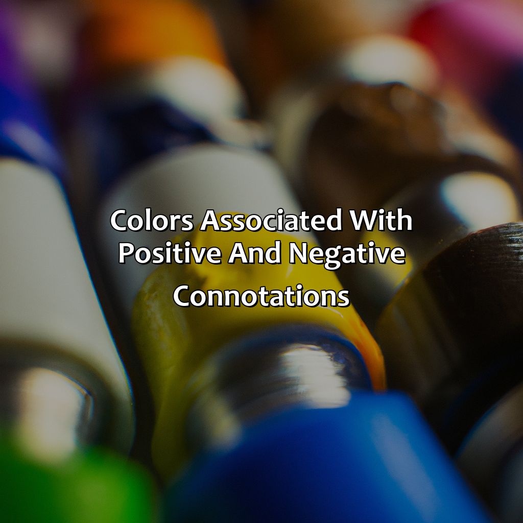
Photo Credits: colorscombo.com by Stephen Flores
To grasp positive and negative color associations, take a look at the “Colors Associated with Positive and Negative Connotations” section. It provides five sub-sections – Red, Black, White, Yellow, and Green. These showcase the positives and negatives of colors related to marketing, branding, fashion, advertising, art, and different cultures.
Red – Negative and Positive Associations
The color ‘Red‘ can portray both positive and negative connotations. Red is associated with passion, love, and excitement. However, it can also be linked to danger, aggression, and anger.
| Positive Associations | Negative Associations |
| Love | Danger |
| Passion | Aggression |
| Excitement | Anger |
Red is widely used in marketing and branding due to its ability to evoke strong emotions in individuals. When used appropriately, red can stimulate excitement and encourage action. However, overuse of red in advertising can lead to a sense of distrust or overwhelming sensation for customers.
Incorporating the color red into branding can help businesses represent their energy and passion towards their services/products. Therefore, understanding the psychological impact of using color symbolism in marketing and branding is essential for companies striving for long-lasting customer relationships.
Like the perfect little black dress, black in design conveys sophistication and elegance, but also mystery and mourning.
Black – Negative and Positive Associations
Black is an influential color that is both powerful and impactful. It has been associated with many positive and negative connotations throughout history. Here’s a closer look.
| Positive Associations | Negative Associations |
|---|---|
| Elegance | Fear/Death |
| Sophistication | Evil/Wickedness |
| Power | Doom/Despair |
| Mystery | Mourning/Grief |
Other unique details about black include how it can be seen as timeless and versatile in design, able to work well in contrasting color palettes or taking center stage on its own. Black is also known for its ability to convey emotions without being too overwhelming.
Color symbolism in design uses black strategically to create tension and drama while setting the tone for extreme emotions. Lack of color can psychologically enhance stress levels making it a perfect candidate for creating highlight effects when used with bright hues.
Don’t miss out on using this dynamic color to elevate your designs!
White may represent innocence and purity in some cultures, but in the fashion world, it’s just a magnet for stains.
White – Negative and Positive Associations
White has both positive and negative associations in color symbolism. It is often considered a symbol of purity and peace, associated with innocence and spirituality. On the other hand, white can represent emptiness and isolation, perceived as a lack of excitement or emotion.
| Positive Associations | Negative Associations |
|---|---|
| Purity | Emptiness |
| Innocence | Isolation |
| Spirituality | Lack of Excitement |
In fashion, white represents elegance and sophistication. It is commonly used to create a classic look, often paired with black or neutral tones. However, white clothing can also be seen as impractical due to its tendency to show dirt easily.
Unique details regarding color associations with white include its significance in different cultures. For example, in India, white is traditionally associated with death and mourning while in Eastern cultures it is linked to mourning and funerals.
Understanding the power of color symbolism in everyday life can help us make informed decisions regarding branding, marketing, interior design, art therapy, and healing practices. Incorporating colors appropriately based on their associations can evoke emotional responses from individuals.
Don’t miss out on using the right colors for your branding or home decor needs by overlooking the importance of color symbolism.
Why settle for a yellow belly when you can use the color to convey optimism and energy in advertising campaigns?
Yellow – Negative and Positive Associations
Yellow – Color Symbolism in Positive and Negative Connotations
Yellow is a color that often evokes feelings of positivity and happiness, as it is associated with sunshine and warmth. However, it can also have negative connotations depending on the context.
Below is a table outlining both the positive and negative associations of yellow:
| Positive Associations | Negative Associations |
|---|---|
| Warmth and Cheerfulness | Cowardice or Fear |
| Energy and Optimism | Deceit or Betrayal |
| Creativity and Playfulness | Warning or Alert |
| Hope and Confidence | Anxiety or Nervousness |
It’s essential to note that these associations are not universal but can vary based on cultural, personal, and environmental factors such as colors used in nature.
Color Psychology studies how people perceive color’s effects on emotions and behavior. In advertising, yellow is frequently used due to its association with warmth, energy, creativity, hope, cheerfulness. Contrarily, it can be over-stimulating when used excessively.
Lastly, research indicates that exposure to bright yellow colors can increase mental activity and emotions relative to slower pace of life in nature.
It’s important to understand different meanings behind colors while using them in various settings.
Green may symbolize envy or growth, depending on the culture and context, but in art, it’s just a color that you use to paint grass.
Green – Negative and Positive Associations
Green is a color with diverse connotations across various contexts and cultures. It holds both positive and negative associations, depending on its usage. Here’s a deep dive into the symbolic representation of green in different settings.
| Positive Associations | Negative Associations |
| Nature, growth, renewal, harmony, peace | Envy, greed, illness, toxicity |
Apart from the obvious positive associations that come hand-in-hand with references to nature and its lush greenery. The color Green also has significant therapeutic value in art. Many art therapists use green to evoke calmness which leads to openness amongst patients during sessions. Moreover, Different cultures associate meanings with the color green that are unique to them. In Islam it represents paradise whereas Hinduism describes it as life-giving and relaxing.
Pro-tip: Effectively using Green can be difficult when you want your brand or message to stand out against other brands in an industry like fashion where they’re already familiar used for sustainability & eco-friendly products. Why settle for just one favorite color when you can have a whole psychology behind it?
The Psychology of Color Preference and Perception
Photo Credits: colorscombo.com by Kevin Wilson
To learn about the “positive and negative” of color psychology, let’s look at the things that change how we view colors. We’ll think about cultural influences, and associations people have with colors like pastel, bright, muted, dark and light.
Factors Affecting Color Perception
The perception of color varies based on several underlying factors that affect its significance and symbolism. The influence of cultural, environmental and personal associations means that different people have varied interpretations of what each color represents. Color theory highlights that warm colors like red and yellow evoke excitement while cool colors like blue and green inspire calmness. Neutral colors have a soothing effect, often thought to signify elegance and sophistication. Such factors as lighting, texture, saturation, luminance impact upon how individuals perceive its qualities; overall contributing to the power behind its use.
Thus, the various factors influencing color perceptions demonstrate how diverse the implications can be when incorporated into various areas such as advertising and marketing or interior design where certain desired responses are needed or wanted.
For instance, in branding logos bold primary colors such as red tend to signify passion; Coca-Cola’s saturated logo is a classic example. Bright yellow amplifies visibility for brands who aim to grab attention, whilst softer pastel shades often provoke feelings of tranquility in consumer settings e.g healthcare environments.
Understanding these significant differences can help businesses develop strategic use of colors to both establish brand value and advance business goals through targeted visual marketing. The psychological impact of color suggests careful consideration should go into choosing colour schemes so that the overall result effectively meets desired effects from consumers.
Color psychology is truly fascinating once one begins to investigate further – there is always more beneath the surface!
Why see the world in black and white when you can explore the colorful cultural influences of color symbolism?
Cultural Influences in Color Symbolism
Color symbolism is heavily influenced by cultural factors across different societies and geographies, making it a critical aspect of human communication. Understanding color symbolism in different cultures can provide valuable insights into the significance and meanings attached to specific colors.
Considering the unique cultural perspectives on color symbolism, the following table provides examples of how some popular colors are viewed across different cultures.
| Color | Symbolic Association |
|---|---|
| Red | Good fortune in China, anger in Western cultures |
| White | Purity in Western cultures, mourning in parts of Asia |
| Black | Power and sophistication in Western cultures, mourning and negativity in some African countries |
| Yellow | Optimism and happiness in Western cultures, jealousy and greed in France |
Notably, cultural differences also affect the choice of preferred color palettes for products or services based on customer preferences. For example, bright hues evoke excitement and energy in China, while softer shades are favored in Japan because of their harmonious balance with natural elements like water.
Understanding color symbolism in different cultures can help businesses communicate their brand messaging effectively across international markets. It is important to consider these cultural variances when developing marketing materials or product designs to avoid any unintended offense or misinterpretation among diverse audiences.
To ensure effective communication with customers from various cultural backgrounds, businesses may consider localizing their marketing campaigns to align with the preferences of a particular culture. Another strategy could be conducting market research to comprehend local perceptions regarding color associations, which would guide the branding decisions.
Why choose just one favorite color when you can have a whole pastel rainbow of personal associations?
Personal Associations with Colors
Our personal associations with colors are highly subjective and can be influenced by cultural upbringing, personal experiences, and individual preferences. Colors can evoke emotions and memories, which contribute to our overall perception and attitude towards them. Some people may have positive associations with pastel colors, while others may prefer bright colors. Similarly, muted colors may be seen as calming or dull by different individuals. Dark colors can convey sophistication or negativity depending on the context and light colors can represent purity or simplicity.
It is essential to consider personal associations with colors in branding, marketing, and design strategies to ensure that the chosen color scheme resonates positively with the intended audience. Companies often conduct extensive research on color preferences before deciding on a brand’s color scheme. Moreover, understanding personal connections to colors can also inform therapeutic practices such as art therapy.
Pro Tip: When designing for a specific audience, take into consideration their unique personal associations with different colors to create a successful project.
Color is the visual wingman of advertising, branding, and design, making sure to attract and impress all the right audiences.
Applications of Color in Different Settings and Contexts
Photo Credits: colorscombo.com by Bradley Baker
To understand how color is used in different situations, like in advertising, branding, and design, the best approach is to look at sections dedicated to these topics. For example, color psychology in advertising and marketing, color schemes in interior design, color usage in logos, and color in art therapy and healing.
Color Psychology in Advertising and Marketing
Advertisers and marketers often utilize color psychology to understand how color affects a consumer’s behavior and purchasing decisions. Color symbolism in marketing plays an important role in establishing a brand’s identity and communicating its message. Through the use of colors, marketers can tap into consumers’ emotions, cultural associations and personal preferences to create effective advertisements.
Color psychology in advertising involves understanding the psychological impact certain colors have on viewers. For instance, red is associated with passion, excitement, and energy while blue connotes trustworthiness, professionalism and calmness. Therefore, businesses selling products or services that require trust may prefer to use blue as their primary color.
Incorporating color symbolism in marketing helps brands establish their desired identity by creating statements that further strengthen their values/positioning with the subconscious of their customers. Jungles clear rapport with ecological causes use green to signify peace which appeals to patrons who are environmentally conscious.
To effectively implement color psychology in advertising/marketing, brands must first understand their target audience’s demographic features as they tend to influence color preference considerably differently from a broad population.
Tips for using color psychology would include researching on your target audience’s demographics before deciding on color schemes that’ll work best with them. Another tip would be ensuring there is consistency across all your communication channels such as using uniformed color class across multiple graphic designs – print ads or social media campaigns- reinforcing messaging cues through consistent branding efforts directing patronage contact with ideas or ad campaign you’ve worked hard on developing.
Using color schemes in interior design can set the mood and reflect one’s identity, but let’s be real, we all just want our living room to look like it belongs on Pinterest.
Color Schemes in Interior Design and Home Décor
In interior design and home décor, color schemes have a profound impact on creating an atmosphere that reflects the identity of the occupants. The strategic use of color can enhance mood, influence perception and highlight unique characteristics of a space. Color scheme selections differ from one room to another based on its functional use, size, architectural elements, natural light sources and personal preferences.
Mood and color in interior design are highly interconnected as different hues create different sensations. For example, warm colors such as reds and oranges stimulate energy while cool colors like blues and greens evoke calmness. Neutral colors such as white or beige create a modern or elegant look depending on their application. Texture and pattern also affect how colors interact with one another in the overall scheme.
Color plays a significant role in shaping identity within spaces. Personalized color choices reveal individuality while universal shades bring unity to a shared space. Cultural influences also affect color choices such as Feng Shui principles or regional color palettes.
Interestingly, historical events have also influenced color trends in interior design over time. For instance, during WWII there was a lack of resources which led to designs with muted tones. Conversely, the 1960s celebrated vibrant saturated hues at the peak of its counterculture movement showcasing bold self-expression.
Overall, understanding how mood and color in interior design relate is essential for an optimal living environment that reflects identity. By selecting appropriate combinations of hue, saturation and value as well as texture and pattern highlights unique qualities for any given space.
Colors in branding and logos can convey a message within milliseconds, making sure you don’t judge a book by its cover is harder than it seems.
Color Usage in Branding and Logos
Color as a symbolic representation plays a vital role in branding. Color and marketing communication are interrelated, offering potential consumers an emotional connection to the brand. In this digital age, where visual content dominates advertising, the color palette of a brand becomes crucial to attract consumer attention.
The psychology of colors helps businesses design appropriate logos and choose relevant color schemes. Colors should be selected by analyzing their association with different emotions. Color and branding must complement each other such that it creates the desired impact on potential customers’ minds.
Color usage in branding and logo creation is more strategic than arbitrary. Primary colors like blue represent trust, intelligence & calmness making them ideal for brands like IBM & Dell. Brands aiming for environmental values tend to use green hues while luxury brands go for black or golden tones.
According to research by Emerald Insight, 90% of snap judgments made about products were based on color alone. This further shows how color can create perceptions and increase brand recall value effectively.
Feeling blue? Maybe a little color therapy can help.
Color in Art Therapy and Healing
Color therapy, also known as chromotherapy, has been used in healing practices for centuries. It involves utilizing the colors of the visible spectrum to promote physical, emotional and mental wellbeing. This practice is widely used in art therapy to induce an array of feelings and reactions in individuals.
The use of color symbolism in healing can be beneficial in understanding patient’s emotions and experiences. Different shades evoke unique personality traits, memories or associations that lead towards a successful art therapy treatment. Therapists use tools like color preference assessments to gauge what hues are more comfortable for their patients.
Color preferences vary from person to person based on culture, upbringing and personal experiences. Therefore, it is essential for therapists to learn about their clients’ distinctive tendencies concerning color choice and dealings with certain shades. They can then create tailored artworks using preferred hues showcasing expressions inherent to their clients.
One such instance where color therapy was immensely successful was during the treatment of military veterans experiencing post-traumatic stress disorder (PTSD). Patients displayed significant improvement when using warm colors like red and yellow to express intense feelings associated with trauma.
Overall, the use of color symbolism is widespread in various contexts using avenues like art therapy for complete recovery with minimum discomfort. Incorporating this technique helps create unique artwork that ensures complete participation and utmost benefit to those seeking help through art therapy.
Five Well-Known Facts About Colors and Their Positive/Negative Associations:
- ✅ In Western cultures, the color white is often associated with purity, innocence, and goodness (positive), while black is associated with negativity, evil, and darkness (negative). (Source: Verywell Mind)
- ✅ In Eastern cultures, the color red is associated with luck, prosperity, and happiness (positive), while white represents death and mourning (negative). (Source: CNN)
- ✅ Blue is often seen as a calming and peaceful color, with positive associations like loyalty, trustworthiness, and stability. However, it can also be associated with sadness and depression. (Source: Color Meanings)
- ✅ Yellow is associated with joy, happiness, and optimism, but can also represent cowardice and deceit. (Source: Empowered By Color)
- ✅ Green is strongly associated with nature, growth, and fertility, but can also represent envy or illness. (Source: Color Psychology)
FAQs about What Color Is Positive And Negative
What color is positive and negative?
Positive is typically represented by the color red, while negative is represented by the color black.
How did red and black become associated with positive and negative?
The association between red and positive and black and negative can be traced back to the earliest days of electronics. The convention was established by the electronics industry and has been widely adopted ever since.
Are there any other colors used to represent positive and negative?
While red and black are the most common colors used to represent positive and negative, other colors can be used as well. For example, white can represent positive and blue can represent negative in some contexts.
Is the convention of using red and black consistent across all industries?
No, the convention of using red and black to represent positive and negative is primarily used in the electronics and electrical industries. Other industries may use different colors or conventions.
What is the purpose of using colors to represent positive and negative?
The use of colors helps make it easy to identify positive and negative components in an electronic circuit or wiring. This can be especially helpful when troubleshooting or repairing equipment.
Can the convention of using red and black change in the future?
While it is unlikely that the convention of using red and black to represent positive and negative will change in the near future, the possibility exists as new technologies and industries emerge.