Key Takeaways:
- Warm colors like cream, beige, red, orange, yellow, and gold complement gray walls and create a cozy atmosphere.
- Cool colors like blue, teal, green, purple, silver, and metallics offer contrast and sophistication to gray walls.
- The color combinations that work well with gray walls include monochromatic, analogous, triadic, complementary, and split-complementary color schemes.
- When choosing colors for gray walls, consider the undertones of gray, use a color wheel for help, experiment with different shades of colors, pay attention to lighting, and coordinate colors for a cohesive look.
Colors That Complement Gray Walls
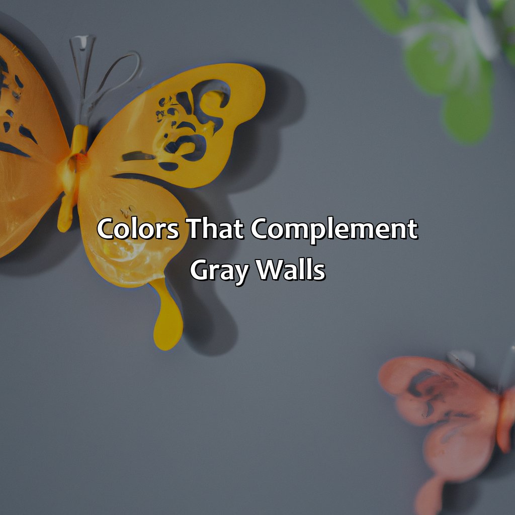
Photo Credits: colorscombo.com by Timothy Roberts
Gray walls need special attention when it comes to color schemes. Warm colors, cool colors, neutrals, and metallics all bring out the best in gray walls.
Let’s explore the warm colors: cream, beige, reds, oranges, yellows, and golds.
Cool colors are lovely too: blues, teals, greens, purples, silvers, and metallics. These contrasting colors create a beautiful effect!
Warm Colors
When pairing colors with gray walls, warm colors can create a cozy and inviting atmosphere. Cream and beige add a softness to the room, while red and orange offer a vibrant pop of color. Yellow and gold provide a cheerful medium that harmonizes well with gray.
In addition to these warm tones, there are other complimentary hues that can work well with gray walls. Blues and teals can add tranquility, while greens and purples provide an earthy or romantic contrast. Silver and metallics can also lend an elegant shine to the room.
To achieve the desired effect, it is necessary to choose a color combination that suits your specific style and taste. Consider trying monochromatic combinations for more subtlety or analogous combinations for low contrast harmonies. For bold looks, use complementary or triadic combinations. Split-complementary combinations offer both harmony and contrast.
Remember to experiment with shades of different colors as intensity levels can influence how complementary they appear together. Also, be aware of lighting when choosing colors as natural light may affect how those colors are perceived.
Despite having suggested tips on what works best for your home décor in terms of grey wall colour scheme, always remember that trends come and go but personal style is forever lasting. The most beautiful home decor is the one filled with items you truly love!
Who needs bright colors when you have the timeless elegance of cream and beige with your gray walls? #classycombo
Cream and Beige
Colors that are complementary to gray walls can give a room a sophisticated look. When it comes to coordinating colors for gray walls, Cream and Beige are warm neutral colors that perfectly complement gray walls. These colors are elegant and neutral, making them an ideal choice for any interior design scheme.
In addition to being visually appealing, the combination of cream and beige with gray walls has many other benefits. This color palette creates a calm and peaceful atmosphere while adding warmth to the space. Furthermore, this color duo opens up an entire spectrum of possibilities for accent pieces such as pillows, curtains, or artwork.
To achieve a cohesive look throughout the space when coordinating cream and beige with gray walls, use textured fabrics such as linen or wool which will create visual interest and depth in the room. Also add pops of metallic finishes in gold or brass on lamps or furniture accessories to elevate the overall look of the room.
So if you’re looking for ways to spruce up your living space with some coordinating colors for gray walls, then consider using creamy neutrals like beige and cream. By sticking with these tasteful choices you’ll quickly achieve a chic yet welcoming environment that feels just right!
Want your gray walls to pop? Add a fiery punch with red and orange accents.
Red and Orange
A great way to add a pop of color to your gray walls is by incorporating red and orange as accent colors. These warm tones create a vibrant contrast against the neutral gray backdrop, making the space feel lively and inviting. To avoid overpowering the room, consider using these hues in small doses such as throw pillows, art pieces or decorative accessories.
To enhance the overall aesthetic of the room, try pairing red and orange with neutral shades like cream, beige or silver. This will balance out the boldness of the colors while allowing them to stand out on their own. Additionally, you can experiment with different textures to create a layered effect that adds depth and dimension to the space.
Another way to use red and orange as accent colors is by combining them with other analogous colors like yellow or gold. This creates a harmonious look throughout the room that’s pleasing to the eye. However, keep in mind that overuse of analogous colors can result in a monotone scheme without enough contrast.
Fun fact: According to a study by University of Rochester researchers, people tend to associate red and orange with passion and energy which makes them ideal for spaces where socialization happens like living areas or dining rooms.
Add some sunshine and opulence to your gray walls with shades of yellow and gold.
Yellow and Gold
Yellow and gold shades that complement gray walls are warm, inviting and cheerful colors that brighten up space. Such tones create a cozy setting that offers a sense of comfort and warmth, making them a popular choice for living rooms, hallways or bedrooms.
| Yellow | Gold |
| Bright yellow | Pale gold |
| Lemon yellow | Deep golds |
| Mustard yellow | Metallic golds |
Incorporating yellow and gold to your interior design is easy as they are versatile colors that work harmoniously with other shades. You can combine either of these hues with an array of neutral and bold-colored accessories to enliven the room’s ambiance.
To strike a balance between refreshingly vibrant and calmingly muted aspects, you can set up a golden geometric chandelier matched with pastel yellow curtains. You may add pops of green plants to it for visual interest and liveliness.
One suggestion for incorporating these tones is opting for patterned rugs featuring these warm shades. Such carpets strategically scattered through the interiors lend texture without dominating the scene too much. Besides, patterned cushions or throws introduce casual comfort into compact corners of the room.
Add some cool blues and greens to complement gray walls, or go for a sleek metallic look for a modern touch.
Cool Colors
Cool colors are a great option when it comes to complementing gray walls. Blue and teal, green and purple, as well as silver and metallic hues, can perfectly match the coolness of gray and create a sophisticated look. Adding in these colors through decorative pieces like pillows, curtains or artwork can elevate the ambiance of any room.
To incorporate these colors effectively, consider choosing a monochromatic color scheme that features shades of blue throughout furniture and decor. Another option is to choose an analogous color scheme that features green or purple shades that sit next to each other on the color wheel. For those looking for bolder combinations, a triadic or complementary color scheme might be more suitable.
When selecting which shade of cool colors to use, consider the undertones present in your specific shade of gray. If they are cooler tones, stick with cooler options like blues and greens. Experimenting with different shades is also key in finding what works for your space.
Lighting should also be taken into consideration when choosing colors that complement gray walls. The natural light coming into the room can affect how colors appear in the space. Coordinate your color choices for a cohesive look throughout the room.
Pro Tip: Don’t be afraid to mix metallics with cool colors, this adds depth and texture while keeping with a cool color scheme. Add a splash of color to your gray walls with the dynamic duo of blue and teal, creating a refreshing and contrasting vibe.
Blue and Teal
Blue and teal are popular contrasting colors that go well with gray walls. These cool colors create a soothing and serene atmosphere in any interior space. The combination of blue and gray walls creates an elegant ambiance, while adding a pop of color with teal can bring energy to the room.
The use of different shades of blue and teal can create depth and dimension in the room. For instance, pairing navy blue with light gray creates a stylish contrast, while seafoam green or turquoise accentuates the calming effect of gray walls.
In addition, using blue and teal in decorative elements such as curtains, throw pillows, or artwork can add visual interest to an otherwise neutral color scheme. Combining these colors with metallic accents or textured fabrics can also add a touch of glamour to the room.
To create a cohesive look, consider other colors present in the room when choosing shades of blue and teal. For example, if there are warm tones in the flooring or furniture, opt for cooler shades of blues and teals that will complement rather than clash with those tones.
Don’t miss out on the opportunity to incorporate these stunning contrasting colors with your gray walls! Experiment with different shades and textures to achieve the desired outcome for your interior space.
Mixing it up with green and purple on gray walls creates an analogous dream come true.
Green and Purple
These shades can be added in the form of accent pillows, curtains, or even in furniture to add depth to the room’s decor.
| Green | Purple |
|---|---|
| Olive green | Mauve |
| Sage green | Lavender |
| Forest Green | Plum |
| Lime Green | Lilac |
Another unique way to incorporate green and purple with gray walls is by adding indoor plants that have these shades in their leaves. These plants not only add color but also purify the air.
Did you know that indoor plants were found to reduce stress levels? According to research conducted by NASA, certain houseplants, such as lavender and gerbera daisies, have been shown to decrease anxiety levels and improve overall well-being.
Gray walls make the perfect canvas for adding silver and metallic accents, adding texture and depth to your space.
Silver and Metallics
Pairing “Silver and Metallics” with gray walls can add a touch of sophistication and glamour to any room. A subtle addition of silver finishes or metallic accents can enhance the visual appeal of the interiors.
The table below demonstrates how silver and metallic colors work well with different shades of gray on walls:
| Shade of Gray | Silver & Metallic Color Options |
| Light Gray | Pewter, Chrome, Stainless Steel, Gold-toned metals |
| Mid-tone Gray | Brushed Nickel, Antique Brass, Copper, Bronze |
| Dark Gray | Gleaming Silver, Polished Brass & Bronze, Smoky Black Metal Tones |
Metallics like silver, gold or copper in decor pieces such as lamps or vases can create a bold contrast against light gray walls. Use textured fabrics like velvets or shaggy rugs to complete the look.
To make sure that silver metallics suit your space use natural lighting and consider grey undertones too. Experiment with different shades before deciding on the final color scheme.
Adding just a hint of metal to your decor can take it up and match the modern-day aesthetics. To create an understated yet polished look choose neutral colors for furniture paired with small accessories representing textured metallic motifs.
Gray walls are the perfect canvas for exploring color combinations – from monochromatic to triadic, let your walls play matchmaker.
Color Combinations That Work with Gray Walls
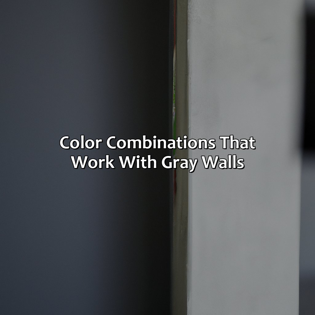
Photo Credits: colorscombo.com by Gabriel Harris
Finding perfect color combos for gray walls? Experiment! Try monochromatic looks, analogous or triadic colors. Or for high contrast, go for complementary colors. Here, we’ll show you how to:
- Mix and match monochromatic tones.
- Incorporate warm and cool undertones with analogous colors.
- Experiment with earthy and rich colors with triadic colors.
- Play around with contrast with complementary colors.
- Add an extra touch of elegance with split-complementary colors.
Monochromatic Color Scheme
Using a monochromatic color scheme with muted tones can be an elegant and sophisticated way to decorate a space with gray walls. This scheme involves using different shades and tones of the same color, in this case, gray. Adding subtle variations of the same color can create depth and interest in a room. However, it’s important to balance the muted tones with pops of brighter or bolder colors to prevent the room from becoming too dull or monotonous.
To achieve a monochromatic color scheme with gray walls, it’s essential to choose shades that complement each other well. For example, using light gray on the walls and darker shades for furniture and textiles can create contrast without overwhelming the senses. Additionally, adding accents of white or black can help break up the monotony while maintaining a cohesive look.
If you’re looking for inspiration, consider using shades of blue-gray or green-gray as accents in a room with gray walls. These colors not only complement each other but have a calming effect that can help create a relaxing atmosphere.
Moreover, monochromatic color schemes have been used by many successful interior designers such as Kelly Wearstler for her projects like San Francisco Proper Hotel.
A match made in color heaven: analogous color scheme is perfect for adding warmth or coolness to gray walls depending on their undertones.
Analogous Color Scheme
Analogous color scheme refers to using colors that are adjacent to each other on the color wheel. This type of color combination creates a harmonious and cohesive look that is pleasing to the eye.
To complement gray walls, using analogous colors with warm undertones can create a cozy and inviting feel. Colors such as taupe, tan, and olive green can work well. Similarly, cool undertones with gray walls can be complemented by blues, greens, and purples in an analogous palette.
To achieve a successful analogous color scheme, it is crucial to consider the intensity of the hues used. It is recommended to stick with muted or pastel shades as opposed to vibrant ones. One way to make an analogous color scheme more interesting is by incorporating different textures and patterns within the same color family.
When choosing colors for an analogous scheme, it is essential to have a good understanding of the undertones of both the gray walls and the colors being considered. Using a color wheel can be helpful in identifying which colors would work best together in an analogous arrangement. Experimenting with different shades of each hue can also help create depth and interest.
Ultimately, coordinating colors for a cohesive look with gray walls involves finding the right balance between warm and cool tones while still creating contrast within an analogous palette. By taking into account these factors and implementing them thoughtfully, one can successfully create an interior space that feels balanced and visually appealing.
Add some earthy or rich tones to your gray walls with a triadic color scheme that will make your space feel cozy and inviting.
Triadic Color Scheme
A Triadic Color Scheme involves using three colors that are evenly spaced from each other on the color wheel. It is an excellent way to add richness and vibrancy to gray walls. One approach is to use earthy colors with gray walls, like olive green and burnt orange or terracotta. Another is to opt for rich colors with gray walls, such as deep shades of blue and purple.
Below is a table showcasing some examples of a Triadic Color Scheme:
| Gray | Olive Green | Burnt Orange |
|---|---|---|
| Gray | Deep Purple | Mustard Yellow |
| Gray | Sapphire Blue | Dark Red |
Using a triadic color scheme can bring depth and interest to a space. When working with this approach, consider using shades in different saturations and values to create balance. Incorporate these tips while experimenting with the colors: assess the undertones of gray, pay attention to lighting, and coordinate colors for a cohesive look.
Incorporating a Triadic Color Scheme into your gray wall design can help create an unexpected yet stylish look. According to Elle Decor, “The best way to approach any design challenge is by experimenting fearlessly until you find something that delights you.” Add a pop of color to your gray walls with a complementary color scheme, whether you prefer high contrast or low contrast.
Complementary Color Scheme
A high contrast complementary color scheme can add an intense and vibrant touch to gray walls. This scheme uses colors that are opposite to gray on the color wheel, such as warm orange or cool blue-green, for a bold and striking effect. For a more subdued look, a low contrast complementary color scheme may be used, which involves choosing colors adjacent to gray on the color wheel like soft pink or light green.
The following table showcases some popular color combinations for both high and low contrast complementary color schemes:
| Complementary Color Scheme | High Contrast with Gray Walls | Low Contrast with Gray Walls |
|---|---|---|
| Orange & Blue | Pink & Green | Yellow & Brown |
| Red & Green | Lavender & Lime Green | Peach & Mint Green |
| Yellow & Purple | Olive Green & Rust | Taupe & Sage |
When using this scheme, keep in mind that the ratio of grey to other colors should be considered carefully. Using too much one color over gray walls may lead to overwhelming sensations. Instead, one suggestion is to follow a 60/30/10 rule where one dominant shade occupies 60% of the space (usually gray), followed by another complementary color at 30%, and finally accent decor coming into play at 10%.
Pro Tip: If you’re looking to give your home or office a cohesive look, using complementary colors alongside your gray walls helps create visual interest while having character and depth in every room.
Add some funk or elegance to your gray walls with the split-complementary color scheme – the perfect match for a bold or sophisticated look.
Split-Complementary Color Scheme
A split-complementary color scheme involves using one base color and two colors that are adjacent to its complement on the color wheel. For example, if gray is your base color, you can choose a shade of red-orange and a shade of yellow-green as complementary colors. This scheme allows for some funky colors with gray walls while still maintaining an elegant look.
| Base Color | Complementary Color 1 | Complementary Color 2 |
|---|---|---|
| Gray | Red-Orange | Yellow-Green |
This scheme provides a balance between warm and cool tones without being too overwhelming. By sticking to shades that are not too bright or saturated, you can maintain a sophisticated design.
Pro Tip: When choosing split-complementary colors for your gray walls, start with the base color and then experiment with various trios until you find the right combination for your space.
Choosing colors for gray walls? Consider undertones, experiment with shades, and coordinate for a cohesive look – your walls will be anything but dull.
Tips for Choosing Colors That Go with Gray Walls
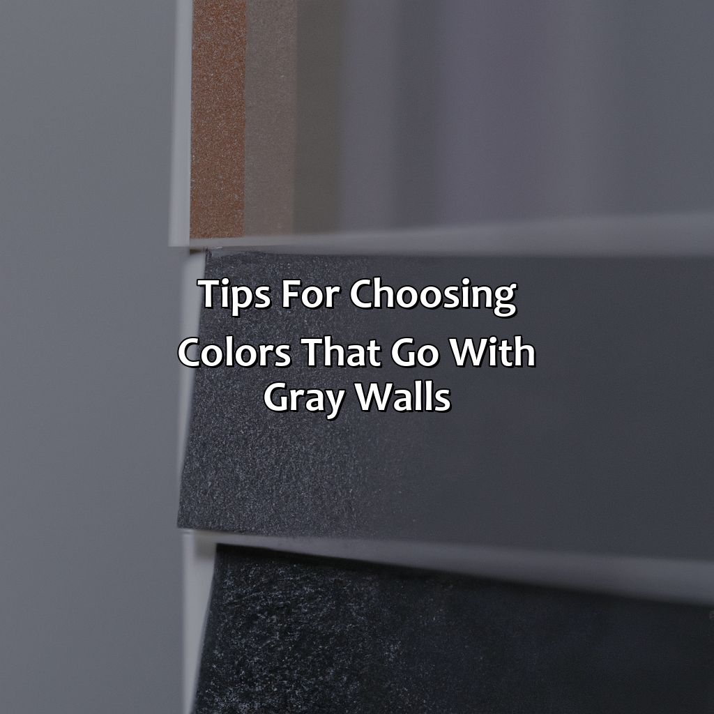
Photo Credits: colorscombo.com by Thomas Johnson
Choosing the ideal paint colors for your gray walls? Here’s the answer! Look at the undertone of the gray walls. Match it with warm or cool hues. Utilize a color wheel for help. Experiment with various shades. Pay attention to lighting too. Lastly, coordinate colors for a cohesive look and statement pieces. Voila!
Consider the Undertones of Gray
Gray walls come in different undertones, and it’s essential to consider these when choosing complementary colors for a cohesive look. Warm undertones with gray walls lean towards beige, cream, red, orange, yellow, and gold. Cool undertones with gray walls are made up of blue, teal, green, purple, and metallics such as silver.
To better understand which undertone your gray walls lean towards, you can use the following table as a guide:
| Undertone | Description | Complementary Colors |
|---|---|---|
| Beige | A warm grey that leans towards brown | Creams, beiges and muted shades |
| Blue | A cool grey with a blue cast | Blues in cool to neutral tones |
| Green | A warm grey that has yellow or green hues mixed in | Bright greens complement lighter greys while deeper greens work well with charcoal shades |
| Purple | A grey with pink or purple hues woven into its composition | Subtle purples that aren’t overpowering |
| Teal | This tone is suited best to deep grays that have a hint of blue-green within them | Deep blues like navy or cobalt. |
| Yellow/Golden Brown | It adds warmth to cooler grey shades | Mustard yellows gives depth and variation to soft greys |
When considering the colors to pair with gray walls based on their undertones, it’s advisable to experiment with different shades within those color ranges too.
Lastly, it’s worth noting that the addition of too much white paint can make a gray hue appear lighter than it should. So, try spinning the color wheel to find your perfect match for a flawless coordination with gray walls.
Use Color Wheel for Help
Color coordination is essential for a cohesive and visually appealing home décor. To achieve this, one can make use of the color wheel, which is an effective tool to choose colors that complement each other. With gray walls, it becomes more critical to use the color wheel as the right hues can either balance or overpower the gray walls.
The color wheel is a visual representation of colors arranged in a circular pattern that helps to choose colors based on their relationship with each other. With gray walls, one can experiment with various shades of complementary, analogous or triadic colors. One can also select monochromatic schemes by pairing different shades of grays with varying undertones.
Furthermore, the color theory suggests using bright hues like yellow, orange and red to add warmth and coziness to space while cooler tones like blue and green offer a modern and fresh look. Using metallic shades like silver or gold add glamor and depth to your interior décor.
When selecting coordinating colors for grey walls with the help of a color wheel, consider its undertones before choosing accent tones. Blue-gray walls go well with mauve or lavender accents while warm grays blend beautifully with beige or cream hues. Experimenting with bolder hues requires some attention towards lighting; natural lighting complements bright warm-toned hues whereas dim-lit spaces require neutral cool-toned accents to harmonize with gray walls.
In summary, utilizing a color wheel is an efficient means when choosing coordinating colors for gray walls. It ensures you pick complementary and contrasting colours based on the science behind their arrangement on the colour spectrum creating harmony in your home décor. Gray walls are like a blank canvas, so don’t be afraid to experiment with different shades of colors to find your perfect match.
Experiment with Different Shades of Colors
Using varying shades of colors can create a beautiful and visually stimulating look when paired with gray wall paint ideas. Matching colors for gray walls can be challenging but experimenting with different shades of colors can help you find the perfect combination.
Here is a 4-step guide to Experimenting with Different Shades of Colors for your gray walls:
- Start with a neutral shade – Begin by adding lighter or darker tones of neutral colors such as beige, white, or ivory. This will immediately add depth and contrast to the space.
- Bring in a pop of color – Choose a bold color that complements the undertones of your gray walls. For example, blue or green shades work well for cool-toned grays while warm-toned grays pair beautifully with shades of red or yellow.
- Play around with pastels – Soft pastel colors are an excellent way to soften the look of your space while still being visually appealing. Pastel pinks, blues, greens, and purples complement gray walls perfectly.
- Try monochromatic styling – Monochromatic color schemes involve using variations of the same color in a room to create an almost seamless transition from one hue to another. Try using multiple shades and tones of your chosen color to keep things interesting without being overwhelming.
It’s important to pay attention to lighting when experimenting with different shades of colors on your gray walls. Natural lighting can change how paint looks throughout the day so be sure to see how different lighting conditions affect your choices.
To wrap up, experimenting with different shades and tones is crucial when trying to find matching colors for gray walls that work best for you. By following these four steps and paying attention to lighting conditions, you’ll have designed a cohesive look that perfectly complements your stylish new space!
Lighting can either make or break your gray-walled dream, so choose wisely with both natural and artificial light to avoid becoming a dramatic horror movie set.
Pay Attention to Lighting
When coordinating colors for a cohesive look with gray walls, it is essential to pay attention to lighting. Both natural and artificial lighting can significantly impact how the color looks and feels in space. Direct lighting, such as sunlight or overhead lamps, intensifies the hue’s saturation, while indirect light, like lampshades or wall sconces, creates a soothing contrast.
Consider dim light settings where warm tones complete the gray walls well to create a cozy atmosphere. Explore brighter spaces with cool colors on lighter shades of gray walls that provide an energetic environment. Natural lighting brings out the undertone in gray. However, artificial lighting might affect it differently.
Subtle changes can make significant differences in indoor illumination and complementing with grey walls. Experiment with different placements of lights like adjust lamps’ shade or adding floor lamps increases dynamic textures and enhances ambiance with the right hue choice for your space.
Don’t miss out on creating an unforgettable atmosphere for everyone who enters your space by not paying attention to Lighting!
Coordinate Colors for a Cohesive Look
Coordinating colors with gray walls is essential to create a cohesive and harmonious look in your home’s decor. This requires a keen eye and strategic thinking to create the perfect combination of shades, hues, and tones.
- Choose statement pieces that complement gray walls.
- Use warm or cool accent colors to add depth and richness to space.
- Experiment with monochromatic, analogous, triadic, complementary, or split-complementary color schemes.
- Pay attention to lighting as it can make colors appear different than their natural state.
- Coordinate shades of similar tones and hues together for a cohesive look.
When coordinating colors for a cohesive look, it is essential to understand the nuances of gray’s undertones. To achieve this understanding, use color wheels as they provide an excellent visual representation of how different hues will mix with gray.
To take decorating with gray walls even further, consider incorporating statement pieces such as bold artwork or colorful furniture. This allows you to infuse personality into your decor and showcase your unique style while simultaneously maintaining harmony with the wall color.
An interesting fact about coordinating colors is that it has ancient roots in the practice of Feng Shui. In this philosophy, arranging objects by color plays an important role in harmonizing energy flow within a space. By choosing the right colors, you can promote positivity and calmness throughout your living environment.
Five Well-Known Facts About What Colors Go with Gray Walls:
- ✅ Yellow and gray go well together, creating a warm and cheerful ambience. (Source: The Spruce)
- ✅ Blue and gray are a classic combination that creates a calming and soothing atmosphere. (Source: House Beautiful)
- ✅ Pink and gray can create a sophisticated and elegant look, particularly when paired with metallic accents. (Source: Elle Decor)
- ✅ Green and gray work well together, especially when incorporating natural elements like wood and plants. (Source: HGTV)
- ✅ Purple and gray complement each other, creating a luxurious and elegant feel. (Source: Real Simple)
FAQs about What Colors Go With Gray Walls
What colors go with gray walls?
Gray walls are a popular choice in modern interiors. While they offer a calming and neutral backdrop, many people are unsure of which colors to pair with them. Here are six colors that go well with gray walls:
What color bedding goes with gray walls?
When it comes to bedding, complimentary colors to gray walls include soft shades of white, cream, pale pink, or dusty blue. These colors provide a relaxing contrast to the cool tone of gray.
What color curtains go with gray walls?
To add texture and warmth to a room with gray walls, consider pairing them with curtains in warm shades of beige, taupe, or cream. For a bolder look, deep jewel tones like emerald or sapphire can add elegance.
What color accent pieces go with gray walls?
To add pops of color to a room with gray walls, consider using accent pieces in bold colors like vibrant yellow, coral, or purple. Alternatively, softer shades of blush or mint green provide a more subtle contrast.
Can you mix patterns with gray walls?
Yes, patterns can be mixed with gray walls. The key to a successful mix of patterns is to ensure that there is a common color or texture that ties them together. For example, using throw pillows with a plaid pattern that incorporates various shades of gray can work well with a solid gray wall.
What color furniture goes with gray walls?
When it comes to furniture, gray walls offer a lot of flexibility. Neutral shades such as brown, beige, or cream can create a cozy atmosphere, while darker shades of black, navy, or forest green can provide a pop of contrast. If you’re looking for a more colorful option, furniture in shades of blush, terra cotta, or mustard yellow also create an eye-catching contrast to gray walls.