Key Takeaway:
- Color harmony refers to the pleasing arrangement of colors in a design or artwork, achieved through the use of color theory and design principles.
- Color theory involves understanding the color wheel, primary, secondary, and tertiary colors, and color schemes such as complementary, analogous, triadic, split complementary, and monochromatic.
- The importance of color harmony lies in its impact on emotions, moods, branding and marketing, visual appeal and aesthetics, and overall design composition. Achieving color harmony requires consideration of context and purpose, balance and contrast, and the use of color tools and resources.
- Examples of color harmony can be found in art and design, brand examples, and in nature and the environment, through the use of color mix, color composition, and color inspiration.
- Color harmony is important in various settings, including warm, cool, and achromatic colors, as well as bold, muted, pastel, metallic, neon, matte, glossy, vintage, retro, modern, industrial, and earthy colors. Balancing warm neutrals, cool neutrals, and soft or vibrant hues, as well as exploring color-blocking and various color combination ideas, can help achieve harmonious designs.
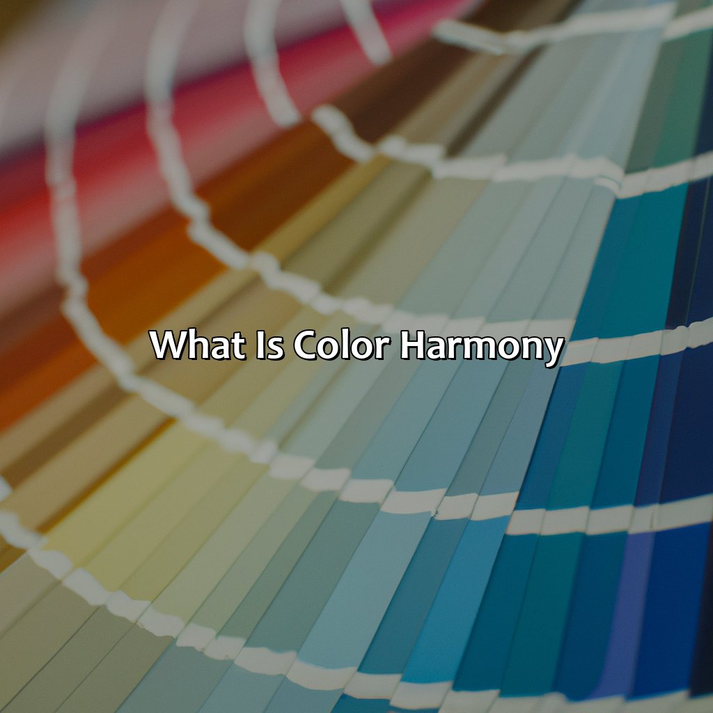
Definition of Color Harmony
Photo Credits: colorscombo.com by Andrew Allen
Color harmony refers to the arrangement and combination of colors in a way that is aesthetically pleasing to the eye. It involves choosing colors that complement each other and create a sense of balance and unity in a design or composition. The concept of color harmony is fundamental in fields like art, design, and fashion, where the right color combinations can make or break a piece. By using color theory and different color schemes, designers can create harmonious color palettes that evoke certain emotions and convey specific messages to their audience.
One example of a popular color harmony is the complementary color scheme, which involves pairing colors that are opposite each other on the color wheel, such as red and green or blue and orange. This creates a bold and dynamic contrast that can be visually striking. Another popular color harmony is the analogous color scheme, which involves using colors that are next to each other on the color wheel, such as green, yellow-green, and yellow. This creates a more subtle and cohesive color palette that is pleasing to the eye.
In addition to color theory and color schemes, other factors like lighting, texture, and context can also affect the perception of color harmony. For example, the same color palette can look different in natural light versus artificial light, or on different materials like matte versus glossy surfaces.
A well-known example of color harmony in action is the iconic Coca-Cola logo, which uses a red and white color scheme to create a sense of energy, excitement, and nostalgia. This simple yet effective color palette has become synonymous with the brand and is instantly recognizable worldwide.
Color Theory
What is Color Harmony? To understand it, explore The Color Wheel. It focuses on hue, saturation, and value. Consider Primary, Secondary, and Tertiary Colors too. They are about the relationships between colors. Color Schemes show different combinations, such as complementary, analogous, triadic, split-complementary, and monochromatic.
The Color Wheel
The arrangement of colors in a circular chart is essential to understand how color relationships work – the Color Wheel. It helps identify primary, secondary, and tertiary hues, define complementary and analogous colors, and create an overall balance within a design.
In the table below, you can see the three categories of color based on their properties – Hue, Saturation, and Value. Hue refers to the actual color; Saturation is about its purity or intensity; Value is about its lightness or darkness.
| Category | Hue | Saturation | Value |
| Primary Colors | Red, Yellow, Blue | 100% | 50% |
| Secondary Colors | Orange, Green, Purple/Violet | 100% | 50% |
| Tertiary Colors (Intermediate) | |||
|---|---|---|---|
| Yellow-Orange, Red-Orange, Red-Violet/Purple, Blue-Violet/Purple, Blue-Green, Yellow-Green | Combination of two primary/secondary colors in equal parts as shown on the diagram. | Hue varies depending on the combination being used |
|
The Color Wheel offers a variety of color schemes, from monochromatic to complementary hues. Additionally, we can use it to balance contrasts by considering variations in saturation and value.
When combining colors for design purposes, it is crucial to understand how color harmony works and selecting colors that fit the context and function of your project.
To create a balanced design, consider the psychology of colors carefully and test various combinations before finalizing. For example, choosing complementary colors on opposite sides of the Color Wheel may create a visually appealing but too vibrant result when used together at high intensity. Instead, soften one or both with more neutral shades.
In summary, The Color Wheel is an essential tool for understanding color relationships in design. By carefully selecting hues based on their properties and considering context and purpose when choosing color schemes, designers can create harmonious designs that appeal to target audiences while achieving their intended goals.
Why settle for simple primary colors when you can mix and match to create vibrant secondary and tertiary shades?
Primary, Secondary, and Tertiary Colors
Primary colors are the building blocks of all other colors, including secondary and tertiary colors. Secondary colors are formed by combining two primary colors, while tertiary colors are created by mixing a primary and a secondary color. In terms of hue, primary colors are red, blue, and yellow; secondary colors include green, purple, and orange; and tertiary colors can vary based on the specific primary-secondary combination used.
| Primary Colors | Secondary Colors | Tertiary Colors |
|---|---|---|
| Red | Green | Blue-Green |
| Blue | Purple | Red-Purple |
| Yellow | Orange | Yellow-Orange |
It is important to note that these color classifications may differ slightly depending on the specific color theory being used. For example, some color theories may consider magenta, cyan, and yellow to be the primary colors instead of red, blue, and yellow.
Understanding the differences between primary, secondary, and tertiary colors is crucial for achieving color harmony in design or art. By using complementary or analogous color schemes that utilize these different types of colors appropriately, designers can create visually appealing works. One unique aspect of tertiary colors is their ability to bridge between complementary pairs of primary and secondary hues when creating tonal harmonies.
I once witnessed an artist meticulously blending shades of primary and secondary hues using paint on canvas to create a breathtakingly harmonious piece that showcased exceptional control over balance and contrast in both hue intensity and saturation levels.
Why settle for one color when you can have a whole scheme? Explore the world of complementary, analogous, triadic, split complementary, and monochromatic colors.
Color Schemes
Referring to the coordinated choices of colors in an artwork, design or branding, color schemes are essential in achieving balance and harmony. These schemes could either be complementary colors that lie opposite to each other on the color wheel; analogous colors, which are adjacent and harmonious to one another; triadic colors, set at equal intervals apart from each other; split complementary colors that are chosen adjacent to the original complement; or monochromatic schemes that utilize varying shades and tints of a single color. Choosing a fitting scheme enhances the aesthetic appeal of designs, thus boosting its impact on viewers.
In creating a design or artwork with color schemes in mind, choosing appropriate sets involves thinking about various factors such as contrast, prominence, and overall appeal among others. For instance, while complementary colors give off high contrast and vibrancy effect throughout a design project, analogous colors grasp much subtlety while encouraging unity. In addition, color theory knowledge for choosing well-matched schemes based on context and purpose is crucial. There is no doubt that color palettes communicate beyond just adornment aspects.
True history reveals designers like Wassily Kandinsky from Bauhaus school who revolutionized art with his unique choice of striking complementary color pairings. He developed an inner understanding of how people associate different emotions with diverse hues and values. This later led him to research alternative chromatic harmonies outside what was known till then as artistic harmony.
Color harmony isn’t just about looking pretty; it’s about creating a visual language that speaks to our emotions and perceptions.
Importance of Color Harmony
Grasp the worth of color harmony in design? Know the effects on human feelings and the sense of beauty. Reach color harmony triumphantly? Consider principles of contrast, balance, and temperature, color impression, and composition.
This part examines the importance of color harmony in the psychology of branding, marketing, and inspiring color trying-out. Sub-sections investigate the emotional and mood effect of color harmony, branding and marketing, the visual allure and aesthetics of color variation and psychology.
Effect on Emotions and Moods
Color harmony has a significant impact on emotions and moods, affecting the way individuals react to their surroundings. The colors used in a particular setting can evoke different emotions and moods that can influence an individual’s behavior.
Colors such as red and yellow are associated with excitement and happiness, while blue and green promote calmness and relaxation. Bright hues tend to stimulate the senses, leading to heightened emotions, while neutral tones create a subdued atmosphere.
To achieve an appropriate color harmony that fosters the desired emotional response, it is essential to understand color theory. This entails identifying primary, secondary, and tertiary colors alongside their various combinations in color schemes.
Furthermore, each context demands its corresponding combination. Different sizes of objects or spaces dictate that certain colors will give off specific feelings or moods compared to others.
Therefore, when designing or choosing colors for any setting or brand representation, consideration of purpose is crucial. The balance and contrast of colors could also affect whether the design emits positive or negative emotional responses.
One suggestion widely adopted at ensuring effective utilization of appropriate color harmony is using color tools resources such as Adobe Color Wheel. Understanding your target audience enables you to choose fitting chromatic palates that suit your brand’s voice properly.
Lastly, it is worth noting that knowingly selecting fittingly paired hues leads to superior designs suitable for affecting the desired behavior reaction positively towards creativity in branding designs.
In summary, attaining adequate color harmony allows for correlation between emotion/mood triggers specific designs/outward settings’ responses-which defines personal reflexes.
Your brand’s color scheme can make or break consumer perception, so choose wisely and stay ahead of the ever-changing color trends.
Branding and Marketing
Color is a central player in branding and marketing. The color psychology of branding involves the use of colors that represent the brand’s values and message. Marketers use color trends and color symbolism to evoke emotions, inspire consumers, and create a unique identity for their brand.
Color harmony plays an integral role in creating a successful brand image as it allows marketers to present a consistent visual language across all communication channels. Selecting complementary colors that work together can increase memorability and impact on customers’ minds.
To stand out in a crowded marketplace, brands need to experiment with color schemes that resonate with their target audience. This experimentation calls for creativity and inspiration while also taking into account consumer preferences.
Pro tip: When selecting colors for your brand, keep consistency across all platforms in mind for maximum impact.
Adding the right color variation and tone can make an aesthetically pleasing design that appeals to the psychology of branding.
Visual Appeal and Aesthetics
The use of color in design has a significant impact on the visual appeal and aesthetics of a given piece. By using color harmony effectively, designers can create an attractive and visually cohesive design. Color variation is critical; too much or too little can negatively affect the aesthetic quality. The tone and intensity of color used will also impact the overall impression of the artwork, whether it’s calming or striking. Understanding color psychology when branding is important to match the color scheme with its intended audience.
To achieve optimal visual appeal and aesthetics, designers should aim towards having balanced colors that complement each other. The placement of colors should be intentional, leaving negative space to balance out colors and not overwhelm the viewer’s eyesight. Designers must ensure that they’re not using too many loud colors together as they might look gaudy resulting in undesired visual representation.
Pro Tip: Using tools like Adobe Color CC can help find matching shades for a cohesive feeling throughout designs for branding purposes.
Balancing color with context and purpose, achieving color harmony is like hitting the sweet spot on a color palette pinball machine.
Achieving Color Harmony
Achieving color harmony requires context, purpose, balance, contrast, and resources. Here’s what we’ll explore in “Achieving Color Harmony with Context, Purpose, Balance, Contrast, and Color Tools”:
- Considering Context & Purpose
- Balance & Contrast
- Using Color Tools & Resources
Consideration of Context and Purpose
Consideration of the context and purpose is crucial when achieving color harmony. The contextual factors are inclusive of the environment, light, culture, and audience. The selection of colors must align with the purpose of the design in question, e.g., conveying a specific message or evoking certain emotions. The intended use of the design is also essential in selecting appropriate hues, saturation levels, and combinations.
It is important to note that what may be considered harmonious in one context may not necessarily be suitable for another. Therefore, designers must understand their target audience and environment before choosing a color palette. A deep understanding of context and purpose provides insights into which colors or color schemes will work best.
Pro Tip: When considering context and purpose for your color harmony decision-making process, always put yourself in your audience’s shoes by asking what they would expect or how they would feel in different contexts.
Balance and contrast are like yin and yang in color harmony, creating a visual dance that keeps the eye engaged.
Balance and Contrast
Achieving a balance between the various colors used is critical in creating visual harmony. Contrast, on the other hand, helps distinguish and draw attention to specific elements within a design or artwork. By juxtaposing color opposites, such as light and dark or warm and cool hues, contrast adds depth and interest to a composition. A well-balanced color scheme with proper contrast can create a visually stunning effect that draws the viewer’s eye.
One method to achieve an ideal balance and contrast is by using complementary colors and analogous color combinations. Complementary colors are opposites on the color wheel and create strong visual contrast when paired together. Analogous colors, located next to each other on the color wheel, are harmonious when used in conjunction. Proper use of balance and contrast ensures that artwork or designs have a compelling visual effect.
Pro Tip: Use neutral tones such as black, white, or gray as they provide excellent support for bolder, brighter hues while maintaining overall harmony throughout the composition.
Find your perfect color match with these essential color tools, from palettes and selection guides to color blindness tests and professional-grade color grading software.
Use of Color Tools and Resources
Use of Color Tools and Resources:
Color selection is not just about randomly picking colors that seem appealing. It requires careful consideration of what colors work well together and in what settings. This is where color tools and resources come into play.
- Color Palette: This tool is used to develop a set of color combinations that are aesthetically pleasing for a specific design or project.
- Color Grading: Used in photography and film, color grading involves adjusting the color palette to match the mood or feel of the story being told.
- Color Blindness Test: This resource helps designers identify whether their chosen colors can be seen by individuals with different forms of color blindness.
It is important to note that different contexts require different considerations when it comes to color selection and implementation. The use of color tools helps ensure that these considerations are met with precision.
Pro Tip: By investing time in learning how to use various color tools, designers can streamline their workflows and save themselves from potential headaches down the road due to incorrect selection or poor implementation.
Get inspired by these color harmony examples, from the art world to branding, and even Mother Nature herself.
Examples of Color Harmony
We’ve added samples to explore color harmony more deeply. Art and design examples show the importance of color composition in creating attractive visuals. Brand examples show how color psychology works in branding. Nature/environment examples demonstrate how colors can be inspiring and how they blend in nature, giving us many color combination ideas.
Art and Design Examples
Artistic and Design Illustrations
Various art and design compositions can showcase the use of a harmonious blend of colors that evokes creativity and emotions. Examples of unique color mix in art include Van Gogh’s “Starry Night” showcasing the dominance of blue along with gradients of other cool hues, Pablo Picasso’s “Girl with Mandolin” that features bold fall-oriented tones. Another notable use of color composition is Mark Rothko’s “Orange and Yellow” that incorporates just two colors yet offering impressive visual appeal.
| Artistic Composition/ | Colors Used |
| “Girl with Mandolin” | Bold Fall-Oriented Tones |
| “Starry Night” | Dominance of Blue Along with Gradients of Other Cool Colors |
| “Orange and Yellow” | Combination of Orange & Yellow Hues |
Apart from this, graphic designers generally utilize specific color schemes to suit the purpose or theme. For instance, a spa website may have a blue-green palette to offer a sense of calmness and relaxation, while e-commerce sites would opt for bright colors to grab customer attention.
The Influence of Colors on Graphic Design is an important aspect that cannot be overlooked. Designers have observed that combinations like vivid blues mixed with warm reds can also induce positive energy levels in audiences.
Notably, modern technology and computer tools help graphic designers develop unique approaches towards using colors today. However, it is important to note that usage should not overshadow the message or context.
From Coca-Cola’s iconic red to Tiffany & Co.’s robin’s egg blue, brand colors speak volumes about their missions and personalities.
Brand Examples
Color Psychology in Branding
Brands use color to create a personality that resonates with their target audience. Color has the ability to influence consumer behavior and can become an integral part of a brand’s identity.
- The first example is Coca-Cola, which uses red as its primary color. This choice reflects the brand’s energy, passion, and excitement.
- The second example is McDonald’s, which uses yellow and red to evoke feelings of joy, happiness, and playfulness. This combination also triggers hunger in consumers, making it perfect for food branding.
- The third example is Tiffany & Co., which has made turquoise its signature color to represent luxury and sophistication.
It is essential for brands to select colors carefully based on the psychology behind each hue. Understanding consumer psychology can help create meaningful brands that connect with their customers emotionally.
The role of color in branding goes beyond aesthetics; it communicates a brand’s message on a subconscious level that influences purchase decisions. Therefore, businesses should prioritize selecting colors that align with their core values while keeping their target audience in mind.
Don’t miss out on the opportunity to make your brand more memorable by selecting colors that enhance your brand’s personality!
Mother Nature has been nailing color harmony since way before Pantone was even a thing.
Nature and Environment Examples
The world around us offers an abundance of color inspiration, especially in nature and the environment. The colors found in these natural spaces can create impactful color harmonies, which is important for many designs and visual displays.
To better understand the use of color harmony in nature and the environment, we can take a closer look at various examples.
| Type | Examples |
|---|---|
| Landscapes | sunsets, mountain ranges, forests |
| Animals | birds, insects, fish |
| Flowers and plants | gardens, fields, tropical settings |
These examples showcase how colors in nature lend themselves to creating beautiful combinations that can be used for design inspiration and beyond. It’s worth noting that each example has unique details – a sunset with warm oranges and reds may evoke a different feeling than a cool-toned mountain range with shades of blue and green. In addition to the colors themselves, the saturation levels and distribution also play a role in creating effective harmonies.
Interestingly enough, humans have long utilized natural color inspiration from their surroundings to create meaningful designs. Many ancient societies used dyes made from plants or other natural sources to incorporate these colors into clothing or tapestries. Today, we continue to find inspiration in nature when it comes to color choices and artistic endeavors.
Five Facts About Color Harmony:
- ✅ Color harmony refers to the pleasing arrangement of colors in a design or artwork. (Source: Canva)
- ✅ There are several methods of achieving color harmony, including complementary, analogous, and monochromatic schemes. (Source: Smashing Magazine)
- ✅ The use of color psychology can also enhance color harmony by creating a desired mood or emotion. (Source: Verywell Mind)
- ✅ Achieving color harmony involves considering factors such as hue, saturation, and brightness. (Source: Creative Bloq)
- ✅ Color harmony is important in various fields such as graphic design, interior design, and fashion. (Source: The Spruce)
FAQs about What Is Color Harmony
What is color harmony?
Color harmony refers to the process of selecting and combining colors in a way that is visually appealing. It involves understanding the color wheel, color relationships, and color psychology to create a pleasing and balanced color palette.
Why is color harmony important?
Color harmony is important because it can affect how people perceive your brand, product, or design. By using colors that complement and enhance each other, you can create a more professional and cohesive look that is more likely to attract and retain customers or viewers.
What are the different types of color harmony?
There are several types of color harmony, including monochromatic, analogous, complementary, triadic, and tetradic. Monochromatic harmony uses different shades and tints of the same color, while analogous harmony combines colors that are next to each other on the color wheel. Complementary harmony pairs colors that are opposite each other on the color wheel, while triadic harmony uses three colors that are equally spaced apart. Tetradic harmony uses four colors that are arranged in two complementary pairs.
How can I create color harmony in my design?
You can create color harmony in your design by starting with a base color and then selecting complementary or analogous colors to pair with it. You can also use color scheme generators or consult a color wheel to find colors that work well together. It’s important to consider the context and purpose of your design when selecting colors to ensure that the final result is both visually pleasing and effective.
What is the difference between color harmony and color contrast?
Color harmony and color contrast are two different concepts in design. Color harmony refers to the combination of colors that work well together, while color contrast refers to the difference between colors. While color harmony aims to create a cohesive and balanced design, color contrast can draw attention to certain elements or create a hierarchy within a design.
How do cultural differences affect color harmony?
Cultural differences can affect color harmony because different cultures may have different associations and emotions tied to certain colors. For example, in Western cultures, white is often associated with purity and innocence, while in some Asian cultures it is associated with mourning and death. It’s important to consider the cultural context of your design when selecting colors to ensure that your message is communicated effectively and respectfully.