Key Takeaways:
- Color theory is the study and application of how color is perceived and used in art, and encompasses principles such as color harmony, contrast, and perception.
- The color wheel is a tool used in color theory that organizes colors into primary, secondary, and tertiary hues, offering a visual representation of color relationships and mixtures.
- Understanding color temperature and psychology can aid artists in creating mood and emotion in their work, and color mixing techniques can be used to create unique and dynamic color schemes.
Understanding Color Theory
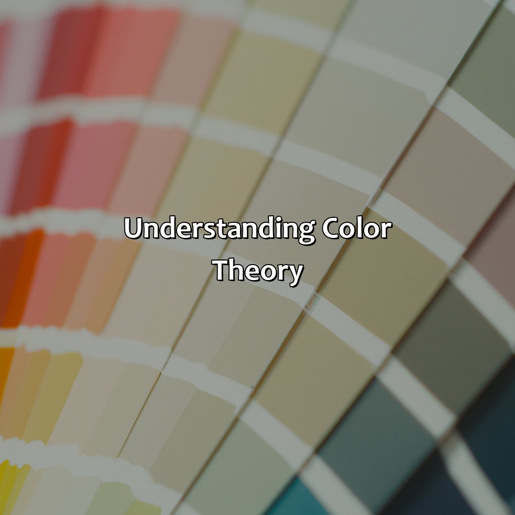
Photo Credits: colorscombo.com by Ethan Ramirez
To comprehend color theory in art, it’s essential to comprehend its definition and why applying its principles matters. Knowing the basics of color theory in visual art is important. Additionally, learning its principles and how to utilize them in design and fashion is beneficial.
This art tutorial emphasizes the importance of color theory in art history for beginners.
Definition of Color Theory
Understanding the basics of color theory is crucial in visual art. Color theory principles are essentially a set of rules that inform artists’ choices regarding color schemes, color mixing, and the harmony between different colors. By understanding these principles, artists can create dynamic and captivating artwork that communicates their intended message effectively.
Color theory involves the study of how colors interact with one another on both a physical and perceptual level. It comprises several essential concepts such as the color wheel, color temperature, harmonies, psychology, contrast, and mixing techniques that help artists achieve their artistic goals. By gaining proficiency in these areas, artists can use color more confidently and strategically to express specific emotions and ideas.
Additionally, many successful artists have relied on these theories over time to create engaging artwork that resonates with audiences worldwide. As an example, Vincent van Gogh employed powerful contrasts of complementary colors in his iconic Starry Night painting to evoke intense emotions within viewers.
According to sources at The Art Academy, “learning about color theory basics is fundamental for anyone looking to create compelling works of art.” This statement emphasizes the importance placed on mastering fundamental aspects of creative expression like understanding the relationships between different colors present in a given piece of artwork. Consequently, artists must acquaint themselves with these principles to create works that captivate their target audience readily.
Color theory in art is the backbone of creating impactful and meaningful pieces that evoke emotions and tell stories.
Importance of Color Theory in Art
Understanding the significance of color theory in art is essential for creating impactful and striking artworks. Color theory provides a foundation for artists to understand how colors work, how they interact with each other, and how to create balance and harmony within their composition.
Incorporating color theory in design, fashion, and art history helps beginners grasp the basics of color principles and gain insights into more complex concepts. As one dives deeper into color theory, they can customize their creative decisions while developing their artistic style.
Color harmony and contrast are two critical elements for giving artworks an emotive impact. By carefully selecting colors that complement or contrast each other, artists can influence the viewer’s emotions or evoke specific responses.
To effectively leverage the power of color theory in art, it is important to be mindful of its various applications. For instance, an artist might consider a warmer palette to create a bright image or cooler tones to elicit a sense of calmness.
Overall, incorporating color theory into your creative process will help you harness its immense power to create eye-catching artworks. So whether you are someone just starting on art tutorials or vying for greater professional expertise in this field – make sure to keep this critical element at the forefront of your artistic pursuits!
Unleash your inner artist by understanding the complexities of the color wheel and its hues, primary colors, secondary colors, and tertiary colors.
Color Wheel
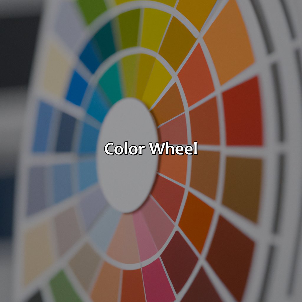
Photo Credits: colorscombo.com by Gary Smith
To utilize the color wheel in art, you must know the basics. The wheel has three colors: primary, secondary, and tertiary. We will explore two types of the wheel. RYB and RGB. We will also go over the fundamentals of color theory and the difference between additive and subtractive color mixing.
Understanding the Color Wheel
The Color Wheel is a vital aspect to understand the basics of color theory principles. It encompasses several parts, including primary, secondary and tertiary colors, RGB and RYB color wheels, among others.
| Type of Color Wheel | Description |
|---|---|
| Primary Color | Red-Yellow-Blue Wheel Used for mixing Colors. |
| Secondary Color | Orange-Green-Violet Made by Combining Two Primary Colors. |
| Tertiary Color | Yellow-Green, Red-violet, Blue-Green and so on… Three Primary Colors. |
Understanding the Color Wheel helps to comprehend how different hues are related. Additionally, it provides a foundation for creative color choices like analogous or complementary colors schemes.
A harmonious piece of artwork utilizes the principles of the Color Theory basics to create an emotional response in viewers without overwhelming them.
Fun Fact: Artist Johannes Itten created the first modern art school’s foundational course in color theory at Germany’s Bauhaus school in 1916.
RYB or RGB, mixing colors has never been more fun – until you learn about additive and subtractive color mixing.
Types of Color Wheel
The color wheel comes in two major types, RYB and RGB. The RYB color wheel is used primarily for traditional art forms, whereas the RGB color wheel is utilized in digital arts. The arrangement of colors on each wheel differs, with the RYB wheel having primary colors of red, yellow, and blue while secondary colors are green, orange and purple. On the other hand, the RGB color wheel utilizes red, green, and blue as their primary colors with secondary colors of cyan, magenta and yellow.
| Type | Primary Colors | Secondary Colors |
|---|---|---|
| RYB Color Wheel | Red, Yellow & Blue | Green, Orange & Purple |
| RGB Color Wheel | Red, Green & Blue | Cyan (Green+Blue), Magenta (Red+Blue) & Yellow (Green+Red) |
Additionally, tertiary colors exist in both types where they are created by mixing a primary with a neighboring secondary hue on the wheel. For example, tertiary hues on an RYB color wheel are yellow-green or blue-green while on an RGB color circle can be orange-red or blue-green. Understanding these various types of color wheels is vital for artists to create accurate hues.
Pro Tip: Proper understanding of color mixing helps artists to achieve various effects both through additive and subtractive methods when creating artwork.
Color harmony is the art of finding the perfect balance between complementary, analogous, and triadic colors for a visually stunning masterpiece.
Color Harmony
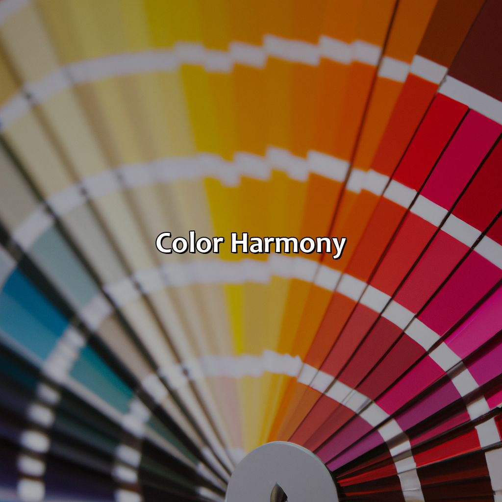
Photo Credits: colorscombo.com by Dylan Martin
Understand the basics of color theory for achieving color harmony in your artwork. This includes complementary colors, analogous color schemes, and triadic color schemes. This section will guide you on how to use these color schemes. Learn about types of color harmony. Create moods with color symbolism and psychology. See examples of color harmony in art to perfect your color compositions.
Types of Color Harmony
Understanding the types of color harmony is crucial in creating captivating and emotive artworks. Different color schemes create different moods and feelings.
Consider the following table that showcases the three types of color harmony:
| Type of Color Harmony | Colors Included |
|---|---|
| Analogous | Colors that are adjacent to each other on the color wheel |
| Complementary | Colors that are opposite each other on the color wheel |
| Triadic | Three colors equally spaced apart on the color wheel |
Analogous color palettes give a sense of harmony and flow as they consist of colors situated next to each other on the color wheel. On the other hand, complementary schemes offer high contrast and vibrancy through pairing opposing colors. Triadic combinations showcase an all-around balance by using three colors evenly distributed within 120 degrees on the wheel.
It’s essential to select the right type of harmony for your artwork as it helps to determine how your audience perceives your piece.
According to Verywell Mind, specific hues can stimulate particular body responses, such as red generating excitement or fear and blue promoting calmness or intelligence.
Creating artworks involves utilizing various harmonious color schemes and patterns. Understanding these concepts helps artists use their creativity effectively while achieving maximum emotional impact.
A true fact from The Spruce Crafts states that Vincent van Gogh’s ‘Starry Night over Rhone’ uses an analogous scheme by including shades of blue-green, blue, and purple to convey a serene mood.
Color harmony can evoke powerful emotions and symbolism, making it a crucial tool for artists to create the perfect mood in their work.
Creating Mood with Color Harmony
Color Harmony can evoke various emotional responses from the viewer, making it an essential aspect of art. By combining color schemes, artists can create different moods and convey ideas to their audience. Understanding how different colors interact with each other is key to achieving this. The harmony can be achieved through the use of color schemes, including analogous, complementary, or triadic schemes. Each scheme creates a unique mood; analogous harmonies offer soothing effects; complementary ones provide stark contrasts and vibrant emotions while triadic offers an energetic combination of all three primary colors.
Incorporating color psychology and symbolism into these harmony schemes adds another layer of meaning to the artwork. For instance, red symbolizes love but also passion and anger; blue represents calmness but can signify sadness as well. Therefore, artists can utilize these colors to illustrate certain emotions or themes in their works.
Fun fact: Different cultures perceive colors differently based on their traditions and values (source: The Guardian). It is imperative to consider this when dealing with paintings that may appeal differently in different parts of the world.
Color theory in art is like a harmonious symphony where the right notes create beautiful compositions that evoke emotions.
Color Harmony in Art Examples
Here is a table showing the Types of Color Harmony along with their Description and Examples:
| Type of Color Harmony | Description | Example |
|---|---|---|
| Analogous | Colors that are next to each other on the color wheel and create a smooth transition from one color to another. | Claude Monet’s Water Lilies |
| Complementary | Colors opposite to each other on the color wheel that provide energy, contrast, and harmony. | Vincent van Gogh’s Starry Night |
| Triadic | Three colors equally spaced apart on the color wheel that create tension, vibrancy, and balance. | Wassily Kandinsky’s Composition VIII |
It is essential to note that some artists may choose to deviate from traditional types of color harmonies as they experiment with creating an unconventional effect within their artwork.
To elevate your art pieces through color composition, consider studying various types of artworks and identifying the colors used for harmony. Experimenting with analogous colors can produce a relaxing atmosphere without sacrificing balance while incorporating complementary colors creates intense energy in an artwork.
Additionally, exploring color temperature can help to make your artwork sizzle with warm colors and cool contrasts.
Color Temperature
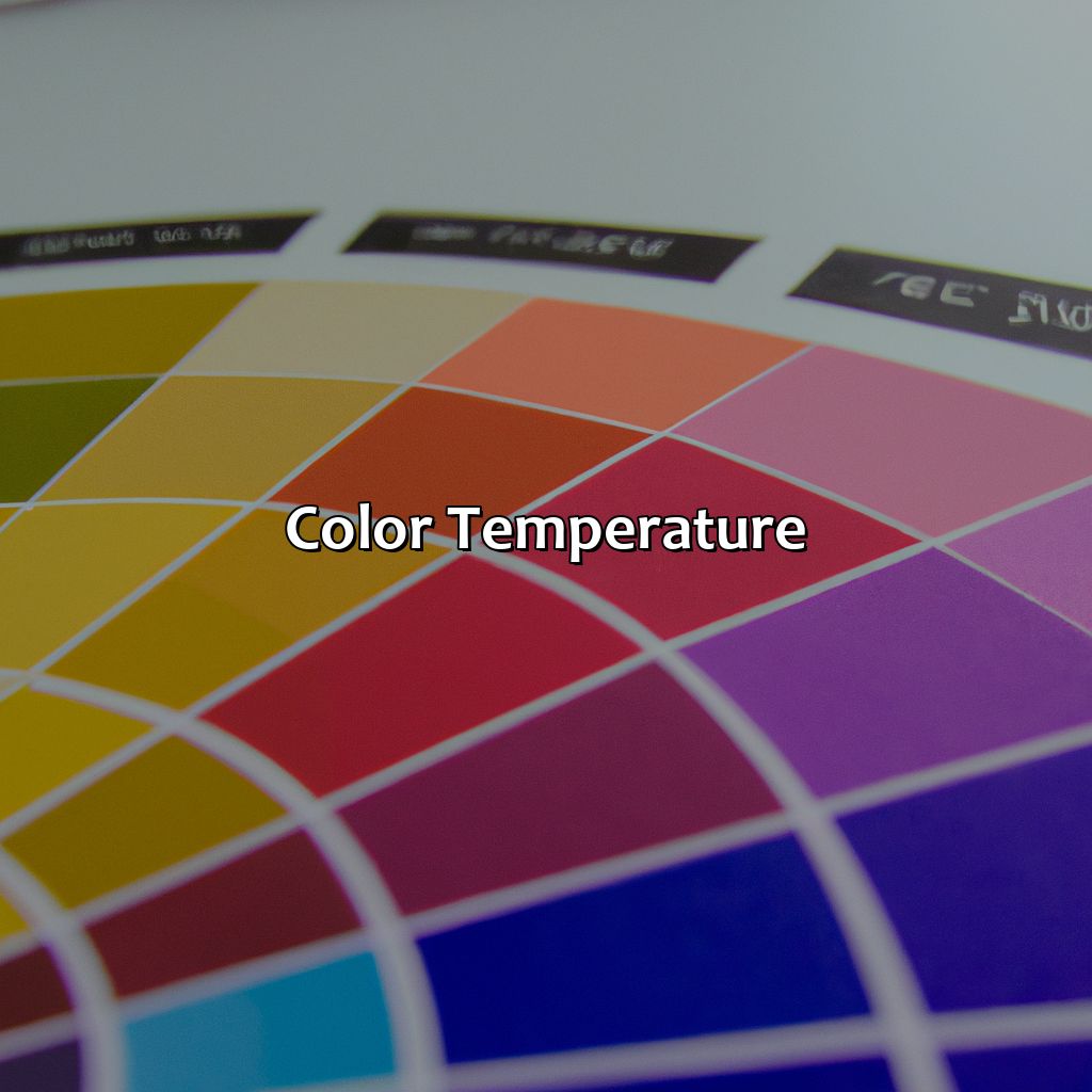
Photo Credits: colorscombo.com by Robert Sanchez
Understand the effect of color temperature on your artwork. Explore the “Color Temperature” section of the article, “What is Color Theory in Art”. It has sub-sections such as “Warm Colors vs Cool Colors” to gain deeper knowledge of color contrast. Also, check out “Effects of Color Temperature on Art“. This will help you to understand how color theory affects viewers and manipulates their psychology.
Warm Colors vs Cool Colors
Warm and Cool Colors: An Overview
Colors are divided into categories, one such being the warm colors and cool colors. Warm colors consist of reds, oranges, yellows, pinks, while cool colors are greens, blues, purples. These color schemes have a significant impact on the artworks they are used in.
- Warm colors tend to stand out and appear more prominent than their cooler counterparts.
- Cool colors are known to be calming and relaxing but create an impression of being farther away.
- Warm colors bring warmth and energy; they make objects appear closer and stimulate people’s emotions.
- Cool colors evoke feelings of calmness and serenity but seem to recede from the viewer due to their calming nature.
Color temperature is fundamental in building the ambiance for any artwork. A painting featuring sunsets or autumn would use warm hues like reds, oranges, and browns to enhance the setting’s coziness. In contrast, cool shades like blue or green would suit oceanic scenes or settings that depict serenity.
Incorporating color contrast into your work dramatically impacts how elements interact within artwork. Colors opposite each other on the wheel create contrast – warm against cool. Balancing warm and cool tones help bring harmony between these contrasting shades by neutralizing them with complimentary shades closest on the wheel.
Overall applying proper color theories is crucial for any artist as it sets ambiance, communicates emotion effectively to viewers while letting artists convey their message effortlessly if done right. Failing to apply it adequately can render an ineffective outcome compared to what could be achieved with proper implementation.
It’s essential not just for the artist but for art enthusiasts to understand color temperature differences efficiently that we can appreciate those paintings even more effectively compared to others; thus missing out on fantastic art pieces.
Color temperature can evoke emotions and set the tone for artwork, showcasing the power of color theory effects and the psychology behind it.
Effects of Color Temperature on Art
Color temperature is an essential aspect of color theory effects as it affects the atmosphere and emotion conveyed by a piece of art. Warm colors, such as reds, oranges, and yellows, evoke feelings of energy and enthusiasm. On the other hand, cool colors like blues, greens, and purples create a calming effect on the viewer and promote tranquility.
The choice of warm or cool colors in art depends on the psychological impression the artist intends to convey. For example, artists may use warm colors to highlight passion and excitement in their work while preferring cooler tones to showcase tranquility and serenity.
To make optimal use of color temperature in art, artists should consider factors such as texture, form and shape in addition to psychology of color theory. Using warm shades with rough textures would lead to stimulating art that reflects vibrancy whereas combining cool hues with smooth finishes leads to serene art striking peaceful notes.
Pro Tip: A combination of both warm and cool temperatures could make for great color contrast within artwork leading viewers’ focus on elements placed with more intention.
Explore the emotional and symbolic power of color through color psychology, and learn to wield its influence in your art.
Color Psychology
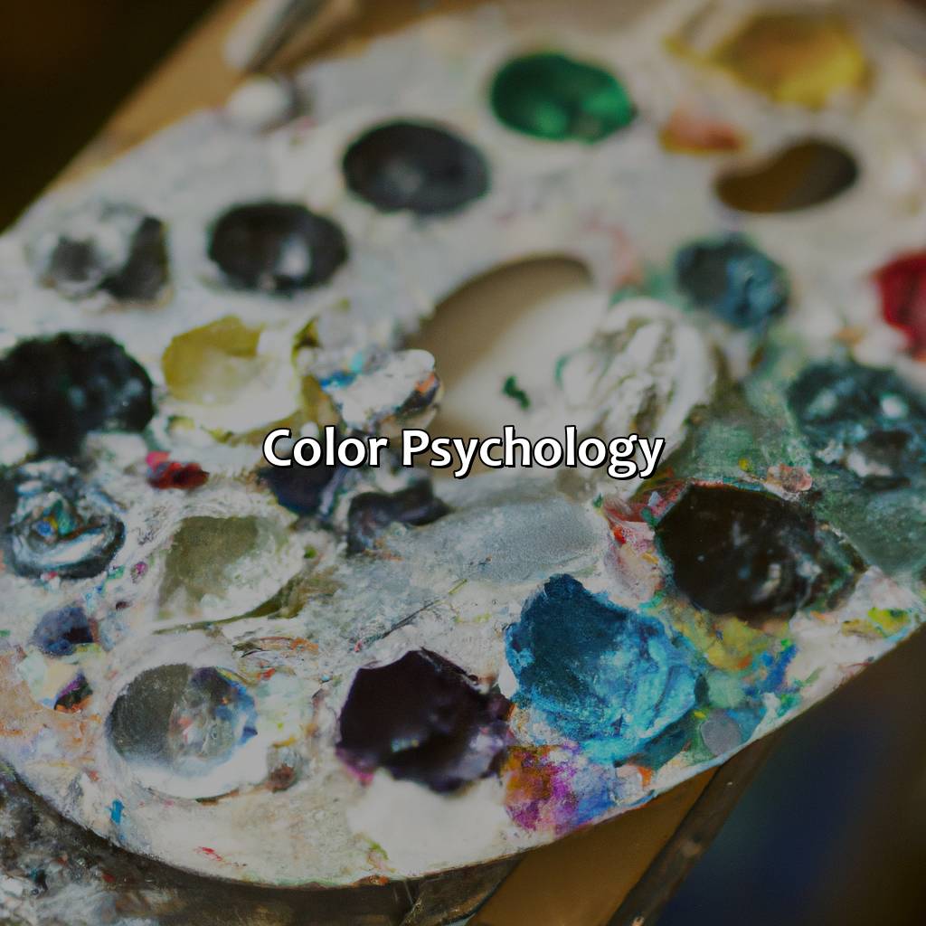
Photo Credits: colorscombo.com by Juan Rivera
Gain insight into color psychology! We’ll discover how colors affect our emotions, associations and perceptions. Different colors relate to different emotions. Artists, marketers, designers, fashion stylists and branders use color psychology to stir up specific emotions. Find out how color psychology plays a big role in art therapy, psychology of color theory, research and classroom learning!
Emotions and Associations of Colors
Colors have distinct emotions and associations attached to them, making color theory an integral part of various industries like art, marketing, branding, design, and fashion. Understanding the psychology behind colors can help artists create more emotionally impactful works of art.
- Warm Colors: These colors include reds, oranges, yellows and are associated with energy, warmth, and excitement.
- Cool Colors: These include blues, greens, purples and are linked with calmness, relaxation and spirituality.
- Neutral Colors: White is associated with purity and cleanliness while black signifies sophistication and elegance.
- Bright Colors: Bright shades like pink or neon evoke youthful energy.
Moreover, color psychology extends beyond individual hues. The combinations of certain colors can stimulate specific emotions like happiness or sadness. For instance, bright pastels in blue-green scales can induce a sense of tranquility because it mimics natural watercolor elements.
Color psychology is widely incorporated in marketing design as brands use different hues to create a desired response from consumers. Red is often associated with urgency (for sales), green represents health (for organic produce) whereas yellow signifies both cautionary markers (traffic signals) as well as happy fun times (picnic joy). Fashion designers choose color palettes based on fleeting trends along with classic pieces that fit their brand identity.
Lastly, ancient history shows that some cultures used particular dyes to distinguish power status: the affluent wore purple due to being costly dye options and the working class dressed in pale fabrics (due to cheaper options). With time, however; color fads infiltrated social systems across the globe leading to versatile interpretations in modern times.
Unlock the power of emotions with color theory in art and elevate your art therapy game to a whole new level.
Using Color Psychology in Art
Understanding the Psychology behind Color Theory and Its Applications in Art
Color theory has significant relevance in understanding the human psychology of color perception, which is an essential component of creating impactful works of art. Research indicates that the colors we see can evoke specific emotions and associations. Artists can apply this knowledge to engage their viewer’s subconscious and create profound emotional connections. The psychology behind color theory is a fascinating subject, specifically when it comes to using it for art therapy.
By integrating concepts like complimentary colors or color harmony into their artworks, artists can create specific moods or emotional responses from their audience. Using a deep understanding of the psychology associated with certain colors, artists can generate viewer responses that are visually pleasing, enjoyable, or even therapeutic. This integration also proves beneficial for classroom instruction as artists improve their abilities by learning about the ways that different colors interact.
Though there have been many studies on the effects of color on human perception and behavior, little is known about its function within artwork. A unique property associated with artwork may generate somewhat distinct responses to emotions elicited by specific colors than standalone contexts.
Add some spice to your art with color contrast – the perfect ingredient for a well-balanced color scheme.
Color Contrast
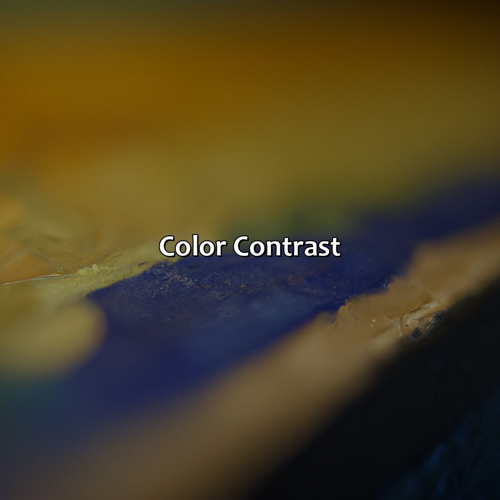
Photo Credits: colorscombo.com by Larry Sanchez
Mastering color contrast in art requires exploring our article, titled “What is Color Theory in Art”. Here, you’ll understand color theory principles, color perception, chroma, and saturation. For further understanding, check out “Understanding Color Contrast”. Then, “Creating Contrast with Color in Art” will teach you how to use color contrast effectively, even if you are colorblind or lack color theory knowledge.
Understanding Color Contrast
Color plays a significant role in art, and to create an impactful piece of artwork, you need to understand the principles of color theory. One essential component of color theory is understanding color contrast. Color contrast refers to the differences between colors in terms of hue, chroma, and saturation. It is crucial for artists to understand how different types of contrasts can impact their work.
Artists use various techniques to create contrast with colors in their works, such as contrasting warm colors against cool colors or using complementary colors. By creating contrast with different hues, chromas, and saturations, artists can draw attention to specific areas of their artwork or evoke certain emotions within the viewer.
Understanding the concept of color contrast is essential to achieve a harmonious balance in your artwork. It can help artists avoid using too many clashing colors that might create visual chaos instead of a unified piece.
Studies show that color perception varies among cultures and individuals and has an impact on our psychological response. Therefore, when using color contrast in artistic works, it’s important to keep in mind the viewers’ cultural backgrounds and psychological responses to different colors.
According to research conducted by psychologists Andrew Elliot and Markus Maier, “Even though people tend to view some colors more favorably than others…there isn’t much evidence that certain hues make everyone feel one way while other shades have a universally different effect.” Understanding this varying perception is critical for artists hoping to evoke specific emotions through their use of color contrast.
Adding a pop of color contrast can bring balance to any artwork, even for those who are colorblind.
Creating Contrast with Color in Art
Creating a striking color contrast is a fundamental element of the successful implementation of color theory in art. Contrast can be created by using complementary colors, warm and cool colors, or light and dark hues. Artists use contrast to create visual interest, make specific elements stand out, and evoke emotion.
An effective way to create color contrast in art is by balancing the intensity of bright or bold colors against muted or neutral ones. Finding the right balance ensures that neither element dominates over the other and results in an overall pleasing aesthetic.
Another way to enhance color contrast is by considering how colors are viewed by those with color blindness. Incorporating colors with high contrast for individuals who cannot differentiate between certain hues ensures that everyone can appreciate the artwork’s intended effect.
Overall, creating powerful color contrasts involves finding creative approaches to balance various forms of contrasting hues while considering their effects on different people. By taking these aspects into consideration, artists can achieve captivating and emotive artworks through the use of color theory.
Mixing colors isn’t just for preschoolers – it’s a crucial tool for artists looking to create dynamic and captivating artworks.
Color Mixing
Photo Credits: colorscombo.com by Jose Miller
Master color mixing in art! Dive into color schemes and color theory examples. This section focuses on understanding: additive and subtractive color mixing. Use color mixing techniques in various art forms. Examples include: painting, graphic design, interior design, and business.
Understanding Color Mixing
To achieve the desired color, artists use the technique of color mixing. By combining colors, they can create a wide range of new hues that add depth and variety to their work. Understanding Color Mixing is essential for mixing accurate colors and creating more complex effects.
The following table outlines the various principles of color mixing:
| Principles | Description |
| Additive Color Mixing | A combination of colored light that produces a result that is lighter than the combined parts. |
| Subtractive Color Mixing | The process of filtering light; removing specific wavelengths until the desired hue is achieved. |
| Luminosity | Different shades and luminosities will affect how mixed colors turn out. |
Understanding Color Mixing Principles not only helps in the technical aspect but also opens up a whole new realm of creative possibilities. The resulting mixes can lead to new textures, tones, and tints by utilizing different blending techniques such as layering or glazing.
Pro tip: Use high-quality pigments to produce better quality artworks with more nuanced, vibrant colors.Mixing colors can be complicated, but understanding the difference between additive and subtractive color mixing can help artists create the perfect hue.
Additive and Subtractive Color Mixing
It is important to understand the difference between additive and subtractive color mixing when working with different mediums such as digital or printing. Additive color mixing involves combining light emitted from colored sources while subtractive color mixing involves pigments that absorb some colors of light.
The following table shows the difference between additive color mixing and subtractive color mixing:
| Type | Additive Color Mixing | Subtractive Color Mixing |
|---|---|---|
| Definition | Red + Green = Yellow, Green + Blue = Cyan, Blue + Red = Magenta | Primary Pigments are mixed to create Secondary Pigments |
| Colors used | RGB (Red, Green, Blue) | CMYK (Cyan, Magenta, Yellow, Key) |
| Example | Computer/Camera screens use additive color mixing to create images | Printing Industry uses subtractive color mixing |
One should have a clear understanding of both types of color mixing to avoid any mistakes while creating artwork. Don’t miss out on incorporating this fundamental theory into your work for a better outcome. Mixing colors is like creating your own personal magic potion for any art medium, business branding, or interior design project.
Using Color Mixing Techniques in Art
Color mixing techniques are essential in creating captivating and evocative works of art. These techniques blend colors to create new hues, shades, and tones that can influence the overall message of an artwork. Understanding color theory in painting, graphic design, interior design, and even business requires knowledge of additive and subtractive color mixing.
- Layering paint or ink colors to produce new shades
- Mixing pigments with water or oil-based mediums to create unique tones
- Using a color palette to harmonize different hues
- Combining complementary colors for contrast in an artwork
- Employing gradient effects to simulate depth and volume
Color mixing techniques are not only limited to traditional mediums like paints but also extend to digital design software. Tools like Adobe Photoshop or Illustrator allow designers to mix RGB (additive) colors or CMYK (subtractive) colors on the screen, achieving desired outcomes.
Pro Tip: When using watercolors for your paintings, it is important always to add the lighter colors first because once darker colors are added on top of them, it will be challenging to remove them.
Color theory is the ultimate tool for artists to mix, match, and showcase emotions in their works of art – this guide ensures you hit all the right hues.
Importance of Color Theory for Artists
Color theory is paramount to digital art as it is the bedrock of creating powerful and emotive artworks.
Mastering the color wheel, understanding color harmony, temperature, and psychology allow artists to manipulate hues to elicit certain emotions or responses from viewers. Equally important is comprehending color mixing, creating contrast with colors, and knowing how to use them in different mediums.
This knowledge helps create artworks that can make people feel a certain way or convey a particular message effectively. Color theory for digital art is not only essential for aesthetics but assists in storytelling and communication through artistic works.
Understanding color theory and its effect on emotions is crucial for creating captivating visuals in any form of art.
Applying Color Theory in Art to Create Powerful and Emotive Artworks .
The Color Theory application in art has immense importance as it can create powerful and emotive artworks. Effective color usage in art depends on understanding color theory aesthetics, which includes the color wheel, color harmony, temperature, contrast, and mixing. Mastering the monochromatic and analogous color schemes or a split complementary and tetradic color scheme can enhance your artwork’s visual impact. Additionally, several tools like color palette generators can assist artists in choosing the perfect colors for their compositions. It is widely used not only in paintings but also in video, lighting, textiles and social media marketing.
Interestingly enough, studies have shown that businesses can influence customer purchasing behavior by incorporating specific colors into their product design. According to research by AppInstitute’s Social Media Marketing Trends 2021 Report, Facebook Ads with blue CTAs received 2.5 times more clicks than those with green CTAs. This showcases the power behind understanding the psychology of how certain colors affect human emotions and experiences.
5 Facts About Color Theory in Art:
- ✅ Color theory is the study of how colors relate to each other in art and design. (Source: Creative Bloq)
- ✅ There are three primary colors: red, blue, and yellow. (Source: ThoughtCo)
- ✅ The color wheel organizes hues in a logical and harmonious way. (Source: My Modern Met)
- ✅ Different color combinations can evoke different emotions and moods in a piece of artwork or design. (Source: Canva)
- ✅ Understanding color theory can greatly enhance an artist or designer’s work. (Source: Adobe)
FAQs about What Is Color Theory In Art
What is color theory in art?
Color theory in art is a set of principles used to create harmonious and aesthetically pleasing color combinations in visual art. It involves understanding the relationships between colors, their properties, and how they interact with each other.
Why is color theory important in art?
Color theory is important in art because it provides artists with a framework for creating balanced and visually appealing works. By understanding color relationships, artists can manipulate their compositions to elicit emotional responses from viewers and communicate their intended messages effectively.
What are the fundamental principles of color theory in art?
The fundamental principles of color theory in art include color harmony, color contrast, color temperature, and color value. These principles help guide artists in selecting and combining colors to create a cohesive and aesthetically pleasing composition.
How did color theory develop in art?
Color theory in art developed over centuries, with contributions from various artists and scientists. The ancient Greeks were the first to classify colors into primary, secondary, and tertiary hues, while Johannes Itten and Josef Albers developed modern color theory during the Bauhaus movement in the early 20th century.
What is the difference between additive and subtractive color theory?
Additive color theory involves creating colors by combining light sources, as in computer monitors and projectors. Subtractive color theory involves creating colors by removing wavelengths of light, as in traditional printing and painting methods. The two theories use different models for defining color relationships.
How can I apply color theory in my own artwork?
You can apply color theory in your own artwork by experimenting with different color combinations and studying the principles of color harmony, contrast, temperature, and value. It’s also helpful to understand the emotional evocation of different colors and how they can impact the mood or message of your artwork.