Key Takeaway:
- Complementary colors are colors that are opposite each other on the color wheel and create a strong contrast when paired together, making them popular in art and design for creating balance and harmony. Understanding complementary colors is a fundamental part of color theory and can be used to enhance any kind of visual communication.
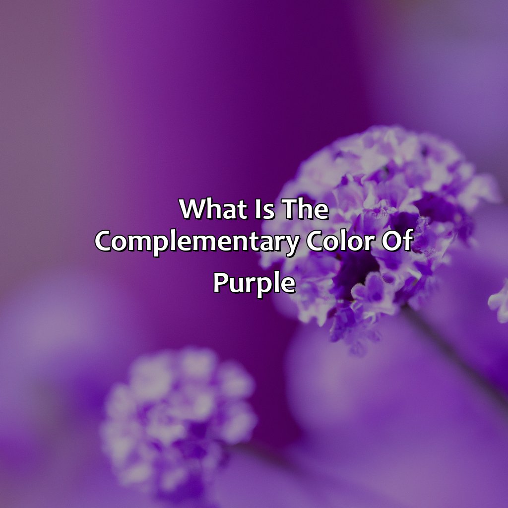
- The complementary color of purple is yellow. This pairing of warm and cool colors creates a bold and dynamic contrast that is often used in interior design and fashion design. Understanding complementary colors can help you create a variety of color combinations for your own projects.
- There are several ways to determine the complementary color of purple, including using the color wheel, split complementary color schemes, double complementary color schemes, and color triangles. By experimenting with different color combinations, you can find complementary shades that suit your aesthetic preferences and enhance the overall look of your project.
The concept of complementary colors
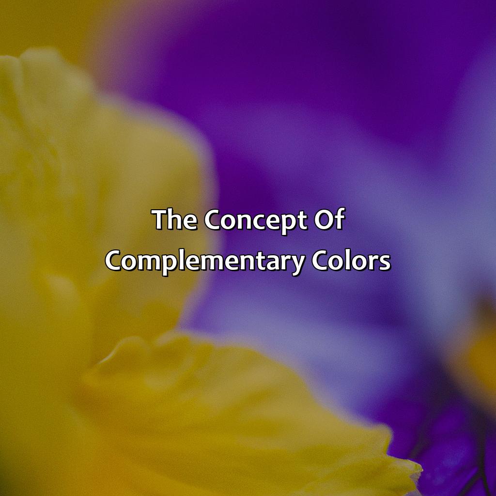
Photo Credits: colorscombo.com by Peter Thomas
Complementary colors refer to certain color combinations that work well together in art and design. They are typically found opposite each other on a color wheel. The concept of complementary colors is an essential aspect of color theory and is often applied to create stunning color pairings that create balance and harmony. By using contrasting colors, artists and designers can create a visual interest that catches the eye and makes a design more aesthetically pleasing.
Understanding complementary color relationships can significantly enhance the color combinations used in a design. By pairing complementary colors, a designer can create a dynamic color harmony that is both eye-catching and aesthetically pleasing. Additionally, the use of complementary colors can elevate the visual interest of a design, making it more engaging for the viewer.
When considering complementary colors, it is important to also take into account the saturation and brightness of the colors selected. Pairing a bright, highly saturated color with another color of the same intensity can create a jarring visual effect. Therefore, it may be better to pair a highly saturated color with a neutral or desaturated complementary color to create the desired contrasting effect.
In art and design, the pairing of complementary colors can significantly impact the overall aesthetic of a piece. Whether using bold, contrasting colors or more subtle hues, a deep understanding of complementary color theory can lead to visually stunning and aesthetically pleasing works.
The complementary color of purple
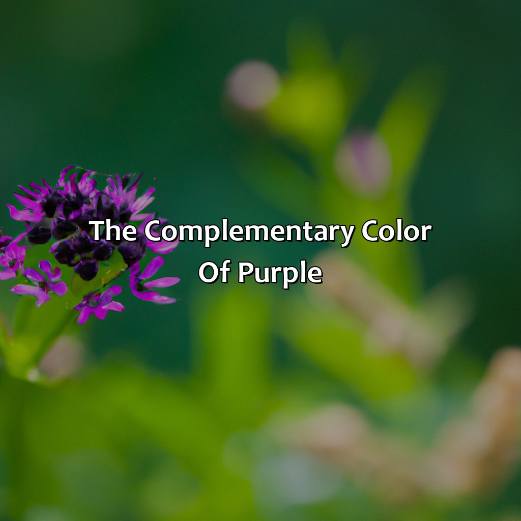
Photo Credits: colorscombo.com by Peter Thomas
Dive into the section of understanding purple’s complementary colors. To comprehend this, you need to get a grasp of hue, saturation, chromatic variations, perception, and visual communication. Moreover, learn about complementary colors in color theory. This is majorly important while creating a color scheme. Color psychology and its relation to warm and cool colors, as well as color vision deficiency, are also key details.
Definition of purple as a color
Purple is a color that is created by mixing blue and red hues. It is considered to be a secondary color because it is made by combining two primary colors. Purple can vary in saturation and lightness, which affects its perception.
In terms of visual communication, purple is often associated with royalty, luxury, and creativity. It has a calming effect on people and can also stimulate the imagination.
Understanding the definition of purple as a color is important when discussing complementary colors. Complementary colors are those that are opposite each other on the color wheel. They create an appealing contrast when used together and enhance the brightness of one another.
To find the complementary color of purple, one can use the color wheel or combine colors to create different shades. The most popular complementary pairs with purple include yellow, green, and orange.
It’s important to note that complementary colors play an essential role in design as they help create balanced compositions and evoke specific emotions in viewers. Brands often use complementary colors in their branding, marketing, and advertising campaigns to leave a lasting impression on consumers.
Some suggestions for using complementary colors with purple include creating contrasting backgrounds or patterns, highlighting specific elements within a design, or using them as accent colors in typography or imagery. Overall, understanding how to use complementary colors effectively can take any design project from simple to stunning.
Understanding complementary colors is like having a secret weapon in your design arsenal, especially when taking into account warm and cool colors, color psychology, and even color vision deficiency.
Explanation of complementary colors
Complementary colors are hues that when combined, create an ideal color contrast. While warm colors such as red, yellow and orange share relations with one another, cool colors such as green, blue and purple also do. When these two opposite color ranges come together to create a perfect harmony, it’s called the complementary effect. These pairs of hues have a deep-rooted relationship applicable in many fields like fashion designing, interior decoration and branding. Color vision deficiency can also affect how people perceive complementary colors in their environment. Understanding the psychology behind color combinations is essential for engaging and effective designs.
Discovering the complementary color of purple is like finding the missing puzzle piece of your color combinations.
How to find the complementary color of purple
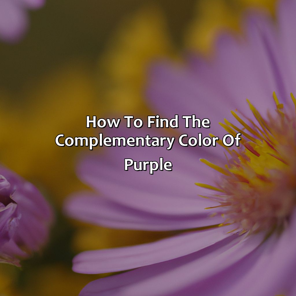
Photo Credits: colorscombo.com by Joshua Hill
To find the complementary color of purple, we must understand the basics of the color wheel. We’ll divide this into two parts: using the color wheel to determine complementary colors and combining colors to create complementary shades.
We need to know the principles of color contrast, spectrum, and mixing. That way, we can identify color combos that create perfect contrasts and look great.
We’ll look into color perception, the RGB, CMYK, and HEX codes, plus split complementary, double complementary, and color triangle theories.
Using the color wheel to determine complementary colors
The significance of the color wheel in determining complementary colors is undeniable. The color wheel is a visual representation of the color spectrum, which includes all visible light and colors perceived by the human eye. By using the color wheel, designers and artists can determine which colors complement each other based on their position on the wheel.
| Color on Wheel | Complementary Color |
|---|---|
| Purple | Yellow/Green |
To find the complementary color of purple, one can start by locating it on the color wheel. The complementary color is located directly opposite purple, which makes yellow or green its complement. These pairings are considered to have high levels of contrast and create striking visual effects when used together in design.
A designer needs to understand that creating contrast is not always about using completely opposing colors but choosing shades that work well together based on hue, saturation, and temperature differences. For instance, instead of using pure yellow with purple, one may opt for a golden yellow or mustard shade to achieve a more harmonious yet distinctive outcome.
Call-to-Action: A thorough understanding of complementary colors is essential in design! Ignoring this knowledge could lead to unappealing designs. Avoid disappointing outcomes; consider exploring various complementary pairing options today!
Mixing colors is like playing matchmaker for hues, finding the perfect complementary couple for maximum aesthetic appeal.
Combining colors to create complementary shades
Combining colors to achieve complementary contrast is a crucial aspect of color analysis. It involves detecting the right color combinations that appeal aesthetically and evoke the desired emotional response. To achieve a perfect blend, several factors come into play, including color choices, cultural beliefs about color association, and lighting conditions.
- Choosing the right tones of colors is essential in achieving the desired effect.
- Understanding which hues create harmony is necessary in determining the most suitable compliments.
- Mixing warm and cool shades or shades of differing intensity can produce pleasing combinations.
- The strategic placement of complementary colors in design has different outcomes, such as creating a focal point or an overall harmonious feel.
Color blending for aesthetic appeal is an art that requires creativity and knowledge of principles. The utilization of contrasting pairs offers depth to designs. Properly executed complementary color combinations leave a positive impression on viewers’ minds.
To enhance your designs’ effectiveness, it’s essential to understand how to combine colors correctly. Implementing this knowledge into branding and marketing materials can significantly alter public perception towards a brand or product.
Remember that color mixing isn’t all about aesthetics; it’s also an effective tool for communication. Choosing colors aptly through color analysis increases efficacy in relaying messages subtly.
Unleash your creativity today by playing with complementary shades! Lack of innovation may lead to missed opportunities for creating beautiful pieces with lasting impressions! Get ready to add some color to your life with these complementary pairings of purple that are sure to make your design pop, whether you prefer analogous, monochromatic, triadic, or tetradic colors, or the warmth of orange and yellow or the coolness of green and blue.
Examples of complementary color pairings with purple
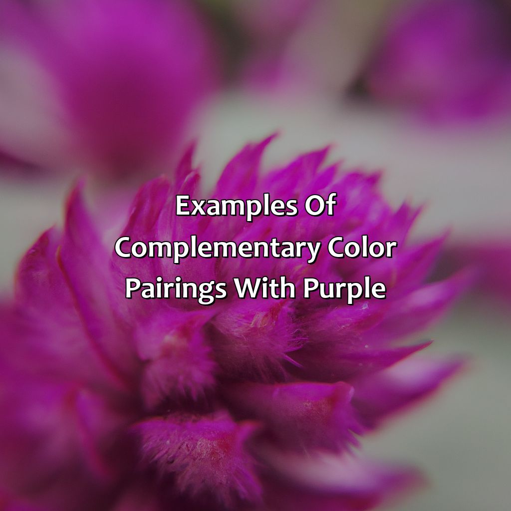
Photo Credits: colorscombo.com by Philip Martinez
Check out purple’s complementary colors! Analogous, monochromatic, triadic and tetradic color schemes make unique, harmonious combinations. For example, purple and yellow are great for interior and fashion design. Digital design and branding?Purple and green. Want to know the latest trends and techniques? Purple and orange!
Purple and yellow
When it comes to color associations, purple is often associated with royalty, luxury and creativity, while yellow is associated with sunshine, joy and optimism. Their combination creates a dynamic visual aesthetic that can be used to evoke a sense of energy and excitement.
When creating color combinations with purple and yellow, it’s important to consider the tone or shade of each color. A deep shade of purple pairs well with a bright yellow, while a pale lavender goes better with muted shades of yellow.
In interior design, purple and yellow can be incorporated into patterns for wallpapers or upholstery fabrics. Similarly, fashion designers can use this complementary pairing in clothing or accessory designs.
To incorporate this color combination effectively, either color should be used sparingly while the other dominates the design space – too much of both colors may result in overwhelming and jarring visual appeal.
As for alternative pairings, shades of blue or pink work well as accent colors to complement this duo. By understanding these concepts, one can master effective color combinations to create visually appealing designs in any industry from branding to advertising.
Pairing purple and green is like creating a digital garden in your color printing and web design, making your branding and advertising bloom with complementary shades.
Purple and green
Combining shades of purple with green creates a beautiful complementary color pairing that is often used in design and branding. The contrasting hues balance each other out, with purple representing royalty, creativity and luxury while green represents nature, growth, and health. This combination is commonly seen in color printing, digital color, web design, branding and advertising.
To create the complementary shade of green for your purple hue, you can use the color wheel or mix various shades together. Applying these principles to design can create impactful results that catch the eye of consumers.
Interestingly, this color pairing is not only beautiful but also has roots in various cultures around the world. In Irish folklore for example, wearing a combination of purple and green signified rebellion against English rule during the 19th century. (Source: The Psychology of Color in Marketing and Branding by Gregory Ciotti)
Get ready for a citrusy explosion: exploring the complementary colors of purple and orange.
Purple and orange
Purple and Orange in Complementary Colors
Purple is an exquisite color that is created when red and blue are mixed. It is known to symbolize creativity, nobility, and luxury. The complementary color of purple is orange. These colors are opposites on the traditional color wheel.
When purple and orange are placed beside each other, they create a pleasing visual effect, making them popular choices in design. This pairing is popularly found in interior design, fashion, and graphic designing industries.
Orange being lively and vibrant while purple being a calm but bold shade make for an excellent complementary color match. Some designers use gradients to transition between these two shades.
While most preferred usage would be in apparel or graphics industries, this blend of colors can also be brought into household items like curtains, wall arts or pieces of furniture such as pillows/cushions.
This combination has been used throughout history by famous painters; Van Gogh’s ‘Starry Night’ uses these colors as contrasting elements.
Moreover, with the advancements made in multiple-color grading software available today, designers have several tools available at their disposal for exploring unique combinations of color trends alongside multiples variations etc that can elevate their designs to new heights!
Color your design world with the magic of complementary colors!
Applications of complementary colors in design

Photo Credits: colorscombo.com by Randy Moore
To grasp the importance of complementary colors in design, we need more than just the answer to ‘what is the complementary color of purple?’ Let’s explore the many applications of complementary colors in design. These include color symbolism, harmony theory, inspiration, color wheel chart, gradient, and conversion. We will also discover why complementary colors are so meaningful in design, how they are used in branding, marketing, and advertising, and the current color trends and variations.
Importance of complementary colors in design
The utilization of complementary colors is crucial in art and design to achieve harmony and balance that appeals to the aesthetics of the viewer. Complementary colors, when used strategically, can enhance visual communication and effectively deliver a message. The combination of purple with its complementing color creates a powerful contrast that engages the viewer.
Combining complementary colors helps create a visual hierarchy that guides the viewer’s eye, strengthens the composition, and adds depth to designs. Using complementary colors also triggers color psychology, where viewers subconsciously associate those colors with specific meanings. For instance, purple evokes luxury, royalty, and creativity when paired with yellow or green.
To use complementary colors appropriately, it’s necessary to have proper knowledge about their opposing nature. Marketers could use this law to attract particular target groups – for example using purple for high-end products like perfumes as it makes people feel like they are in an exclusive club – adding value. However, not every designer has intuitive knowledge about which combinations work best hence trial and error is often the only methodological solution.
One way designers can mitigate risks is by considering analogous palettes – ensuring designs maintain unity while serving their purpose. Applying these concepts effectively demands expertise and insight into current trends, but ultimately creating an engaging product that is emotionally stimulating will lead to more sales as clients find morality in things they feel good by association with. Color trends may come and go, but the power of complementary colors in branding and advertising is here to stay.
Use of complementary colors in branding, marketing, and advertising
The use of complementary colors in branding, marketing and advertising is significant for creating cohesive visual experiences. The combination of colors that opposing each other on the color wheel create contrast, draw attention and evoke emotions. Marketers are choosing color combinations according to recent color trends and variations to convey their brand messages more effectively.
Color combinations play a vital role in building a brand’s identity, raising recognition and generating positive consumer perceptions. From logos to packaging design, the right color associations can communicate product qualities, including reliability and innovation. Additionally, the use of complementary colors attracts viewers’ attention while communicating strong messaging.
Today’s brands rely on color psychology studies to pick the perfect hues for their identities based on age demographics, psychographics and current trends. Color variations influence buyers’ moods differently depending upon socio-cultural backgrounds. Different target groups understand meanings behind certain colors differently as well; thus, careful consideration should be put into assessing how various audiences interpret specific color schemes.
According to Forbes sources reveal, “Coca-Cola’s choice to combine red and white helped raise revenue by over 30 percent within just two years.” This proves the significant impact that complementary colors choices may have in developing brand identities that lead to success.
Five Facts About the Complementary Color of Purple:
- ✅ The complementary color of purple is yellow. (Source: LifeHacker)
- ✅ Purple and yellow are often used together in art and design to create a striking contrast. (Source: ColorMatters)
- ✅ Complementary colors are located opposite each other on the color wheel. (Source: Color Wheel Artist)
- ✅ Mixing purple and yellow together creates a neutral gray or brown color. (Source: Sensational Color)
- ✅ Purple and yellow are both warm colors, making them a good pair for creating a cozy atmosphere. (Source: The Spruce)
FAQs about What Is The Complementary Color Of Purple
What is the complementary color of purple?
The complementary color of purple is yellow. This means that when purple and yellow are placed next to each other, they make each other appear brighter and more vibrant.
Why is yellow the complementary color of purple?
Yellow is the complementary color of purple because they are located opposite each other on the color wheel. Complementary colors tend to produce a high contrast when placed next to each other.
Can I use any shade of yellow as the complementary color of purple?
Yes, any shade of yellow can be used as the complementary color of purple. However, brighter shades of yellow tend to produce a higher contrast compared to muted or darker shades.
What if I use a different complementary color for purple?
Using a different complementary color for purple can result in a different color scheme and effect. However, if you want to create a high contrast effect, it is best to stick with the color wheel and use yellow as the complementary color.
What color scheme can I create with purple and yellow?
Purple and yellow are considered to be complementary colors. They can be used to create a vibrant and bold color scheme, perfect for creating a lively and energetic atmosphere.
Can I use complementary colors for other purposes other than decor?
Yes, complementary colors can be used for a wide range of purposes, such as branding, graphic design, marketing, and more. Understanding complementary colors can help you create a more pleasing and cohesive color scheme for your projects.