Key Takeaway:
- The origin of magenta color can be traced back to the 1850s, when chemist François-Emmanuel Verguin discovered fuchsine, a synthetic dye that produced a purplish-red color. This color was later renamed magenta in honor of the Battle of Magenta, a prominent battle in the Second Italian War of Independence.
- Magenta color exhibits unique properties, such as its position on the color spectrum between red and blue, its ability to create various shades by adjusting the color models, and its importance in color printing due to its presence in the CMYK color model.
- Magenta color has various uses in different industries and fields, such as in printing for creating accurate color reproduction and in art and design for its striking and vibrant appearance. Its variants, such as neon magenta and dark magenta, are also popular in fashion and consumer products.
- To mix magenta color, it is advisable to use the primary colors of red and blue, which can create various shades by adjusting the color models. Achieving different shades of magenta depends on the amount and proportion of red and blue used in the mixture.
- Magenta color has an important role in various industries and daily life, such as in color printing, fashion, and product design. Its unique position on the color spectrum and ability to create various shades make it a valuable addition to any color palette.
The origin of magenta color
Photo Credits: colorscombo.com by George Hill
Magenta color has a fascinating origin. It is not present in the visible spectrum of light and is created when blue and red light waves intersect at the same point. Due to this unique phenomenon, magenta color is a non-spectral color. The concept of non-spectral colors was introduced by Thomas Young in the early 19th century. This distinctive color has been used in many applications, such as printing, dyeing, and even in the creation of art. Magenta color origin presents an interesting story of how science and art blend together to create something remarkable.
The creation of magenta color is linked with the intersection of red and blue light waves. This color is perceived by our brain even though it is not present in the visible spectrum of light. Magenta color, also known as fuchsia, has a rich and vibrant tone that makes it a popular choice for designers and artists. The color is named after the magenta dye, which was created in 1859 by French chemist Francois-Emmanuel Verguin. It was named after the Battle of Magenta, which took place in Italy in the same year.
The color magenta has been used in various fields, including fashion, art, and interior design. It is a popular choice for branding as it symbolizes creativity, passion, and innovation. Magenta color origin has been a topic of interest for scientists and artists alike, and it continues to be a subject of research even today.
Interestingly, magenta is also present in some natural pigments, such as beetroot. Pigments like anthocyanin give flowers such as roses, carnations, and violets their vibrant magenta color. The science behind these natural pigments is still being studied, and it has immense potential in various fields of science and technology.
It is a known fact that the human eye can distinguish approximately 10 million different colors, and magenta color origin adds one more unique shade to this extensive range. The history and science behind this mesmerizing color have always fascinated scientists, artists, and color enthusiasts.
Properties of magenta color
Photo Credits: colorscombo.com by Roy Clark
RGB stands for red, green, and blue. This color model is for electronic displays. CMYK is cyan, magenta, yellow, and key (black). It’s used for printing. Let’s delve into the special qualities of magenta in these models. To understand magenta, you need to know about RGB and CMYK.
The RGB color model
The RGB model is widely used in digital media such as web design and photography because it allows for accurate color reproduction on screens. The model works based on the idea that our eyes perceive light at different wavelengths for different colors. By combining red, green, and blue lights, we can create a wide array of colors that mimic what our eyes see.
Unique details about the RGB model include its ability to produce a wider range of colors than other models based on additive color mixing. Additionally, it is commonly used in video production and animation due to its precision in color reproduction.
Pro Tip: When working with RGB color values, it’s important to keep in mind the difference between pixel-based and vector-based graphics. Pixel-based graphics may appear distorted when upscaled since individual pixels cannot be divided further into smaller components. Vector-based images however maintain their quality since they are created using mathematical equations rather than pixels.
Printing in CMYK: making sure your magenta makes the cut.
The CMYK color model
| C | M | Y | K |
| Cyan pigment concentration ratio | Magenta pigment concentration ratio | Yellow pigment concentration ratio | Key (black) pigment concentration ratio for gray balance |
| 0-100% | 0-100% | 0-100%0-100% |
Unique details about the CMYK color model include its ability to produce a large variety of colors with just four primary pigments. These four colors have high ink demand and can create some overlap and thus difficulty in producing accurate shades.
Once upon a time, a company hired a designer who was unaware of the differences between RGB and CMYK color spaces. They designed online content using RGB color values that looked vibrant on-screen but when printed was heavily faded because it was not converted into the CMYK color model beforehand – causing print delays, cost overruns and unhappy clients.
Magenta is the color that makes printing both colorful and expensive.
Uses of magenta color
Photo Credits: colorscombo.com by Donald Garcia
Check out the uses of magenta in printing, design, and art! It can create stunning visuals. Learn how to use it in your next project. In printing, it has a unique role. As does in design and art too. See how magenta color can make your project stand out!
In printing
The use of magenta color in printing is paramount since it is one of the four ink colors (cyan, magenta, yellow, and black) used in the CMYK method. In this process, magenta color is paired with cyan while black and yellow are also added to create a broad spectrum of visible hues. The importance of magenta extends beyond that because it produces images with vivid colors and high contrast levels while reproducing millions of colors accurately.
Magenta color printing plays an essential role in graphic arts professions since it affects production quality significantly. It is mainly used in high-end printing projects such as advertising materials like brochures, billboards, and banners where image quality must be especially crisp. Magenta’s significance can also be observed in photography prints where hues often appear distorted if proper adjustments are not made between the various ink pigments during printing.
A unique characteristic of magenta color printing can be found regarding its impact on flesh tones. Professionals recognize that when selecting colors to print human figures or faces, a slightly more substantial amount of magenta ink is required than other pigments. This approach ensures that skin tones are printed accurately without making faces look overly pale.
To make the most out of magenta color printing, there are specific suggestions for optimizing your work:
- Use high-quality papers designed for heavy coverage applications as that will allow the ink to saturate the page better.
- Monitor your ink cartridges regularly since running low on any color could negatively affect print quality and waste paper stock.
- Finally, invest in printers equipped with caliber machine heads because they aid in ensuring consistent ink delivery at every nozzle.
In summary, mastering the intricacies surrounding magenta color usage creates results that satisfy even perfectionists’ demands across various applications. From achieving accurate coloring to detailed imagery outputting – it’s all about selecting the best equipment available for optimizing print jobs involving magenta coloring methods effectively.
Magenta color adds a touch of boldness and drama to any creative work, whether it’s a painting, graphic design project, or even a fashion statement.
In design and art
Magenta color design and art are heavily intertwined, with magenta’s bold and vibrant hue making it a popular choice for a variety of projects. In design, magenta can be used to create attention-grabbing logos, branding materials and website elements that stand out against more muted colors. For artists, magenta’s intensity makes it a great addition to mixed media pieces or as an accent color in paintings.
In art, magenta color can be used to achieve various effects; from creating a focal point in the piece to drawing contrast between different parts of the creation. Consequently, many abstract artists use this captivating shade creatively. It also plays a vital role when it comes to graphic designing. Changing the magnitude of its luminance produces a plethora of shades that elevates even the simplest graphics.
Moreover, Magenta’s strong characteristic is especially crucial for advertisers and marketers who want their message to grab people’s attention effectively. This hue tends to capture people’s interest quickly, which is why its application should not be overlooked in web design.
Don’t miss out on the opportunity to incorporate stunning shades of magenta into your next art or design project!
Magenta color has more variations than a chameleon on a technicolor acid trip.
Variants of magenta color
Photo Credits: colorscombo.com by Aaron Green
Understand the difference between standard magenta and its variants. This helps you make a preference for a particular variant, based on your needs. Let’s look at two popular variants:
- Neon Magenta – It possesses bright and vibrant shades which result in a luminous display.
- Dark Magenta – It showcases deeper and richer shades which creates a more subdued and sophisticated look.
They both possess distinct features.
Neon magenta
A highly saturated shade of pinkish-purple, neon magenta is a popular color in the fashion and entertainment industries. Its bright and vibrant quality makes it stand out in crowds, which is why many clothing brands use it for their collections. This color is noticeable from a distance, grabbing attention due to its intensity and boldness.
Neon magenta is not only used in fashion but also in graphic designing where such shades are popular among young audiences. It adds an energetic punch to websites and social media pages. It’s considered a trendy color that has been embraced by various pop music stars as well.
Fun fact: The fluorescent dye Rhodamine B retains its bright fuchsia hue even under UV light, making it perfect for synthetic fabrics like polyester often used in making neon-colored clothing.
Why settle for just magenta when you can have its edgier cousin, dark magenta, for all your moodier and more daring color needs?
Dark magenta
The deep variation of the magenta color is known as dark magenta. It is created by adding black pigment to the pure magenta color, resulting in a richer and darker hue. Dark magenta falls on the purplish side of the spectrum, with a more subdued appearance than other bright variants of magenta.
Dark magenta is often utilized in fashion design for creating elegant and sophisticated clothing items. It enhances the beauty of prints, patterns, and embellishments that are produced on fabrics. It also appears in many cosmetic products such as lipsticks, eye shadows, and nail polishes due to its unique and alluring shade.
Industries extensively leverage dark magenta’s appeal to attract more customers. For instance, companies use it for branding purposes as it represents luxury, creativity & seamlessness.
Pro Tip: Dark Magenta can be paired up with lighter shades such as pale pink or light beige for an elegant look in interiors & fashion wear. Mixing magenta color is like playing mad scientist – add a touch of cyan, a hint of yellow, and voila! A new shade of magenta is born.
Mixing magenta color
Photo Credits: colorscombo.com by Mason Smith
Achieving magenta perfection? Piece of cake! Just mix in some other primary colors. We’ll show you how! In this section, you’ll learn the art of creating stunning magenta tones.
Sub-sections cover mixing magenta with other primary colors and achieving different magenta shades. Let’s get started!
Mixing with other primary colors
When mixing magenta with other primary colors, a unique spectrum of colors can be achieved. Here is a table showcasing the outcome of mixing magenta with blue and yellow:
| Magenta | Blue | Yellow | Resulting Color |
|---|---|---|---|
| 100% | 0% | 100% | Reddish-Pink |
| 50% | 50% | 0% | Purple |
| 100% | 50% | 0% | Deep Pink |
| 0% | 100% | 100% | Cyan |
Interestingly, when mixed in equal parts, magenta and yellow create a vibrant shade of orange-red. In contrast, mixing magenta and blue produces shades of deep purple and pink.
Apart from these combinations, exploring other ratios could lead to different shades of colors entirely. It’s essential to consider the intended outcome when mixing colors to achieve the desired temperature, brightness, and shade.
To experiment effectively with mixing magenta with other primary colors, start with small quantities, gradually adding more color if necessary. Keep track of color combinations in case you need to create the same shade at a later time.
By understanding how magenta interacts with primary colors in deeply personal ways, it opens up unexplored color possibilities for diverse applications where the right hue can make all the difference.
Mixing magenta with other colors is like a box of chocolates, you never know what shade you’re gonna get.
Achieving different shades of magenta
Achieving a spectrum of magenta hues requires the precise combination of other colors. By mixing different amounts of blue and red with magenta, one can obtain various shades of this color. The amount of these primary colors added alters the intensity and depth of the resulting hues.
| Shade name | Primary colors used | Intensity |
|---|---|---|
| Light magenta | More red, less blue | Low intensity |
| Bright magenta | Equal amount of blue and red | High intensity |
| Baby magenta | More blue, less red |
One can create unique variations by adjusting the ratio between the primary colors used in an experiment, darkening or lightening each shade. With a deep knowledge of color theory, designers and artists often innovate by creating new interpretations that stem from experimentation with color combinations.
Pro Tip: It’s essential to use proper equipment and follow color-mixing rules to achieve consistent colors across media formats accurately.
Some Facts About Magenta Color:
- ✅ Magenta is a shade of pink-purple color that is named after the dye made from the root of the madder plant. (Source: Color Matters)
- ✅ It is a subtractive primary color, which means that it is used in printing to create other colors by mixing with other primary colors like yellow and cyan. (Source: Britannica)
- ✅ Magenta is often associated with creativity, imagination, and emotional balance. (Source: Bourn Creative)
- ✅ The color magenta is widely used in the fashion industry, especially in women’s clothing and accessories. (Source: Vogue)
- ✅ Magenta is also used in the branding of various companies, including T-Mobile and Intel. (Source: 99designs)
FAQs about What Is Magenta Color
What is Magenta color?
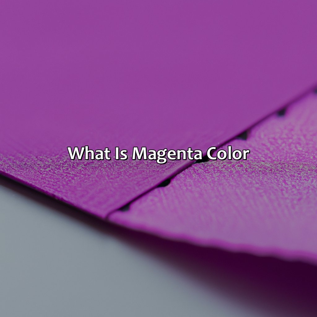
Magenta is a bright, purplish-red color that is often described as a mix of red and blue hues.
What are the primary colors of light that create magenta?
Magenta is not one of the primary colors of light, which are red, green, and blue. Instead, magenta is created by mixing equal parts of red and blue light.
What are some common uses for magenta color?
Magenta is a popular color for use in printing, particularly for creating bright and vibrant designs. It is also commonly used in fashion and interior design.
What emotions are often associated with the color magenta?
Magenta is often associated with passion, energy, and creativity. It is also sometimes linked to love, romance, and feminine energy.
What variations of magenta are there?
There are many variations of magenta, with different shades and levels of saturation. Some common variations include fuchsia, hot pink, and rose.
How does the color magenta affect our mood?
Magenta is often thought to inspire creativity and imagination, and can also be energizing and uplifting. However, too much magenta can be overwhelming, so it is important to balance its use with other colors.
