Key Takeaway:
- Perception of color is a complex process influenced by various factors including cultural and personal preferences, aesthetics, and color theory. Certain hues, such as desaturated and putrid colors, are generally considered less attractive than others.
- The Pantone 448 C is widely regarded as the ugliest color due to its association with unappealing and unsightly objects, such as cigarette packs. This highlights the role of context and association in color perception.
- While there may be some objective qualities to ugliness in color, beauty is ultimately subjective and influenced by individual experiences and perceptions. Certain color palettes may be considered ugly or unpleasant, but this may vary depending on the individual and context.
Factors affecting the perception of color
Photo Credits: colorscombo.com by Gregory White
Factors Affecting Perception of Color
Color perception is affected by various factors that are crucial in determining how individuals perceive, interpret and understand colors. These factors include aesthetics, color theory and synesthesia. Understanding these factors is essential in determining perceived preferences for colors, including unpleasant hues.
Below is a table that highlights some of the key factors affecting perception of color:
| Factor | Description |
|---|---|
| Illumination | The level and direction of lighting affects how colors are perceived. |
| Surrounding Colors | The colors surrounding a hue can greatly affect how it is perceived. |
| Contrast | The difference in luminance or color between an object and its surroundings affects how it’s perceived. |
| Culture | Color preferences vary across cultures, making it important to consider cultural differences in color perception. |
It’s important to note that these factors interact with one another, producing various color perceptions that can vary from person to person.
Understanding the unique details surrounding color perception can greatly assist in determining preferences for unpleasant hues. Suggestions to consider include employing complimentary shades, reducing the use of fluorescent colors, blending contrasting colors, and avoiding overuse of dark hues. Utilizing these suggestions can help in reducing the appearance of unpleasant hues and can improve overall visual appeal.
Cultural and personal preferences in color perception
Photo Credits: colorscombo.com by Brandon Jones
Color perception varies greatly, depending on cultural and personal preferences. Different cultures have unique color associations and symbolism. Personal taste also plays a significant role in color preference. The way people perceive and interpret color is influenced by their upbringing, experiences, and social environment. Understanding cultural differences in color perception can help in designing visually appealing products and advertising. It is essential to consider the cultural cues and symbolism associated with different colors to avoid offending or alienating a particular audience.
Color preferences can shift from generation to generation or even within a particular region. For example, in Western culture, the color black is associated with mourning and sadness. However, in some regions of Africa, black is a symbol of power and authority. Similarly, the color white symbolizes purity and cleanliness in Western culture, while in China, it is associated with mourning and death. Color preferences are also influenced by personal experiences. People often associate colors with significant events or emotions in their lives, which can shape their future color choices.
An interesting fact is that “Drab Dark Brown” was declared the “world’s ugliest color” in 2012 by the Australian government. The color was chosen to discourage smoking by making cigarette packaging less attractive. However, it’s important to note that the perception of beauty or ugliness in color is subjective and can vary greatly between individuals.
Pantone 448 C: The ugliest color
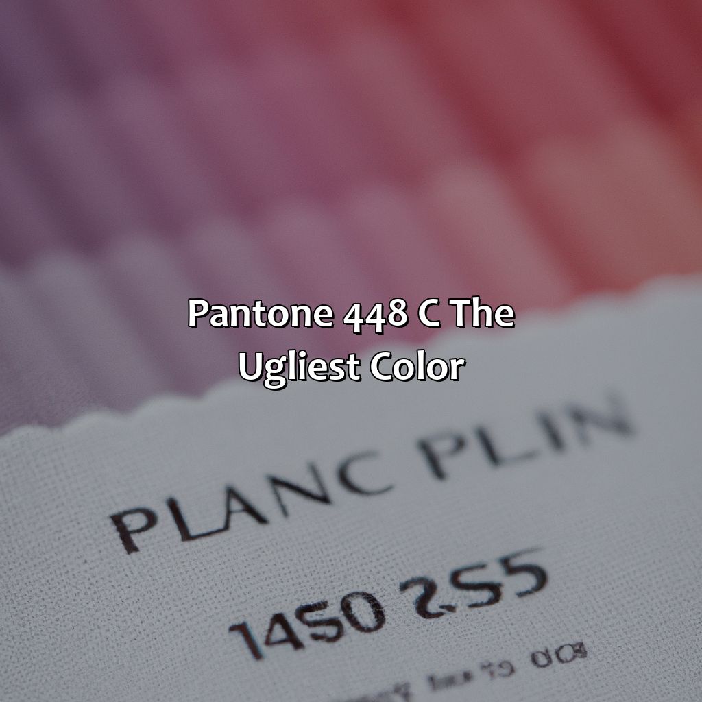
Photo Credits: colorscombo.com by Sean Scott
This article shines a spotlight on the negative implications of disliked colors, desaturated hues, and putrid tints. It dives into Pantone 448 C, which has been labeled as the ugliest of them all. How this color was chosen and how it is being utilized in anti-smoking campaigns will be looked into more closely.
How Pantone 448 C was chosen as the ugliest color
Pantone 448 C was determined as the ugliest color through extensive research conducted by GfK, a marketing research company. The study involved over a thousand participants who rated various colors based on their appeal. Pantone 448 C received the highest rating for being the least attractive color due to its dull and murky appearance, which elicited negative emotions in people. This quality makes it particularly unsuitable for product design, branding, and color associations.
The process of choosing Pantone 448 C as the ugliest color used both objective and subjective measures to determine aesthetic preferences. The objective criteria included psycho-physiological responses to colors such as eye strain, heart rate variability, and pupil dilation. The subjective measures relied heavily on personal perceptions of beauty and cultural associations with particular colors.
Further studies have shown that Pantone 448 C has an association with dirty or unappetizing items like tar or burnt food items. Hence it is frequently used in anti-smoking campaigns to discourage smokers from consuming tobacco products.
Interestingly, other colors such as beige and brown tones also have similar associations with unpleasantness due to their boring shades. Neon and bright colors too are associated with cheap or low-quality products leading to negative brand value perceptions. Such understanding calls for careful consideration when making choices related to color in product design or branding efforts.
Looks like Pantone 448 C not only ruins your smoking experience but your visual experience as well.
The use of Pantone 448 C in anti-smoking campaigns
Pantone 448 C, considered the ugliest color in the world, is being used in multiple anti-smoking campaigns due to its unappealing and unsightly visual perception. The use of this color aims to discourage consumers from smoking and prevent them from perceiving tobacco products as attractive. The power of visual perception on consumer behavior has led many organizations to incorporate Pantone 448 C in their campaigns.
This strategy has been successful worldwide due to the unfavorable reaction people have towards this specific shade of brownish-green. By making it visible on cigarette packages and advertisements, smokers are more likely to associate it with negative messaging surrounding health consequences and waste.
Furthermore, research conducted by Market Watch found that the use of unappealing colors like Pantone 448 C helps companies decrease product consumption by up to 35%. This highlights how color perception can significantly influence customer behavior across different industries.
Pro Tip: Incorporating visually unpleasant colors into advertising campaigns can be an effective way to promote a message or product by appealing to emotions associated with negativity rather than positivity.
Move over Pantone 448 C, these colors are vying for the title of ‘ugliest’ and they’re not taking no for an answer.
Other colors that are deemed ugly
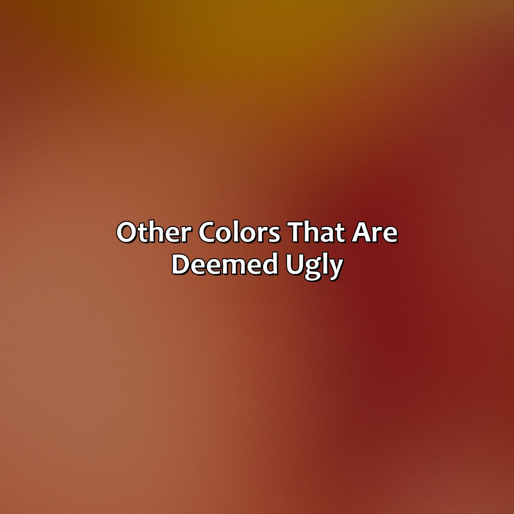
Photo Credits: colorscombo.com by Daniel Johnson
Explore unpopular colors. Brown and beige tones are usually thought of as dull and plain. Neon and bright colors are usually seen as ugly, too. They’re seen as tacky and irritating. Let’s go deeper into these unpopular hues.
Brown and beige tones
Colors in the range of brown and beige tones have been deemed as bland, boring, unsophisticated, or even kitschy and tasteless. The reason for this could be that these colors are often associated with earthy or natural elements and may lack the vibrancy and excitement of brighter colors. It is a common perception that these tones do not evoke any emotion or passion, thus making them unappealing in design.
Furthermore, when it comes to branding and packaging, brown and beige hues can give off a cheap or outdated look. This may explain why many brands opt for bolder colors to attract customers.
Interestingly, despite being considered unattractive by some people, brown is actually an essential color in fashion. A well-chosen shade of brown can add warmth, depth, and sophistication to an outfit.
Overall, while brown and beige tones may not be everyone’s cup of tea, they still have their place in design and fashion. It all depends on how they are used and paired with other colors to create a unique aesthetic.
Prepare your sunglasses and stomach, because we’re about to dive into the world of neon and bright colors – where gaudy, garish, and visually disturbing reign supreme.
Neon and bright colors
Bright and garish colors have always been a topic of conversation. Many even find them nauseating or visually disturbing. These gaudy tones tend to be associated with louder design elements and are often deemed as tacky or revolting. While it’s reported that such bright colors grab attention easily, they’re not necessarily favored when it comes to sophisticated or elegant designs.
Designing with such loud hues require significant consideration on their application, pairing, and context in which they are being used. However, pushing boundaries can also lead to unexpected results where the use of bright colors adds vibrancy to the finished product. So, while there is no fixed rule on the use of garish shades, one must balance their usage appropriately.
Interestingly, a few decades ago neon colors were highly popular in fashion and commercial printing. Their use soon showed its kitschy side leading people to regard them as overly showy and distasteful. On the other hand, brighter pastels are trending on social media at present.
It’s fascinating how preferences for color continue to shift over time, thus making it impossible to truly define a universally unattractive shade without considering personal preference and cultural nuances. As much as we may want to label certain colors as objectively ugly, the truth is that beauty is a subjective and contextual experience – even when it comes to dark, dreary palettes.
Can color be objectively ugly?
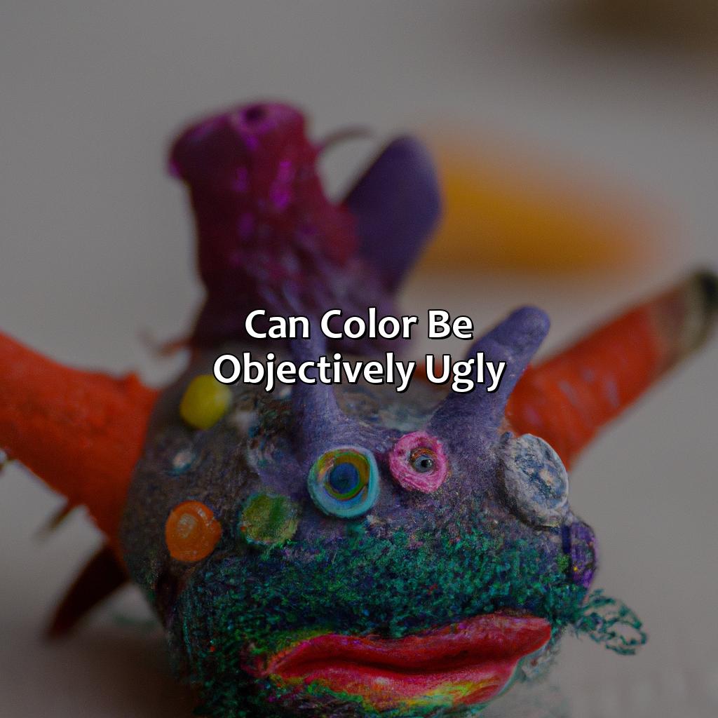
Photo Credits: colorscombo.com by Austin Anderson
Color can be perceived both subjectively and objectively, but the concept of “ugliness” remains subjective. However, various studies have shown that certain colors, such as shades of brown and olive green, are often perceived as unpleasant by a majority of people. The role of context also plays a crucial role in the perception of color, as a color that may seem unappealing in one scenario could be perceived as beautiful in another. Additionally, the use of dark colors and ugly color palettes can be intentional in design, as they can convey certain emotions or themes. Notably, a study by the Australian government revealed that a particular shade of brown, specifically Pantone 448 C, was deemed the “ugliest” color and was used on cigarette packaging to discourage smoking.
Some Facts About the Ugliest Color:
- ✅ The ugliest color is Pantone 448 C, also known as “Opaque Couché.” (Source: The Guardian)
- ✅ Opaque Couché was selected in 2016 as the official color for tobacco products in Australia. (Source: The Sydney Morning Herald)
- ✅ Studies have shown that Opaque Couché is associated with negative emotions like filth and death. (Source: The Guardian)
- ✅ Despite its reputation, Opaque Couché has been used in high-fashion brands such as Balenciaga and Givenchy. (Source: Business Insider)
- ✅ The color’s unpopularity has led to its use in campaigns against smoking and other harmful habits. (Source: The New York Times)
FAQs about What Is The Ugliest Color
What is the ugliest color?
The ugliest color, according to a 2012 survey conducted by Australian researchers, is a greenish-brown shade named “pantone 448 C.”
Why was pantone 448 C named the ugliest color?
Pantone 448 C was named the ugliest color because it was perceived as dirty, lifeless, and drab. The study was conducted to help discourage people from smoking by making cigarette packaging less appealing.
Are there any other colors that are considered ugly?
Beauty is subjective, and what one person considers ugly may be appealing to someone else. However, colors that are often associated with negative emotions like decay, illness, and death, such as brown, gray, and black, are commonly perceived as unattractive.
Can ugly colors still be used in design?
Ugly colors can still be used in design, but they should be used carefully and strategically. For example, if the goal is to create a feeling of unease or discomfort, an ugly color may be appropriate. However, if the goal is to create a positive and uplifting mood, it would be best to avoid using ugly colors.
Is it possible for colors to change their perceived ugliness over time?
Yes, the perceived ugliness of a color can change over time. For example, a color that was once associated with illness and death, like black, may now be considered fashionable and chic. Trends and cultural shifts can impact the way people perceive colors.
Can someone have a phobia of ugly colors?
While there is no official phobia of ugly colors, some people may experience strong negative emotions when exposed to certain colors that they find unattractive. This is not uncommon, as colors can have a powerful impact on our emotions and mental state.