Key Takeaway:
- Neutrals such as beige, cream, and taupe complement plum purple and can create a harmonious color scheme in interior design and home decor, according to color psychology.
- Jewel tones such as emerald, sapphire, and ruby can create a bold and sophisticated look when paired with plum purple, and add depth and richness to a color palette.
- Warm colors such as mustard, coral, and orange create a balanced and cohesive color pairing with plum purple, and can add a pop of color to a space when used as accent hues.
Key Takeaway:
- Cooler tones such as mint, teal, and dusty blue can create a striking contrast with plum purple, and bring a refreshing and calming effect to a color scheme.
- Bright colors such as yellow, lime green, and fuchsia can add a statement piece and energy to a space when paired with plum purple, and create a dynamic and playful color combination.
- Deep colors such as navy, burgundy, and black can create a dramatic and elegant look when paired with plum purple, and bring a strong and sophisticated color pop to a space.
Key Takeaway:
- Monochromatic color schemes that use different shades of plum can create a soothing and cohesive look, and add depth and richness to a space.
- Analogous color schemes that use colors close to plum on the color wheel, such as lavender, lilac, mauve, eggplant, and magenta, create a harmonious and balanced color combination that can be used in different design styles.
- Complementary color schemes that use colors opposite plum on the color wheel, such as yellow-green or lime, can create a vibrant and eye-catching look, and add energy and contrast to a space.
Colors that Complement Plum
Photo Credits: colorscombo.com by James Lee
We’ve made a selection of colors to go with your plum purple. For a smooth color palette, neutrals like beige, cream, and taupe are great. To bring in some vibrancy, jewel tones like emerald, sapphire, and ruby are ideal. For warm tones, mustard, coral, and orange will bring balance.
Neutrals: Beige, Cream, and Taupe
Neutrals like Beige, Cream, and Taupe form a classic color scheme for any outfit or decor. They not only complement Plum but also create an elegant and sophisticated look. These colors work particularly well in formal settings and can add depth to casual outfits as well.
– Beige: The warm, earthy tone of beige provides a complementary balance for the richness of plum color. This neutral shade is versatile and pairs well with most other colors.
– Cream: Like beige, cream has similar properties as a neutral color that creates a timeless look when paired with plum. It adds more brightness, making it perfect for spring or summer wardrobes.
– Taupe: Taupe is another useful neutral that creates a subtle contrast against the deep shade of plum. This rich yet subdued hue is soft enough to not overpower other colors in your outfit.
Pairing plum with these neutrals ensures stunning color coordination that conveys elegance and sophistication.
Neutrals like Beige, Cream, and Taupe are versatile options for any fashion statement or home decor where they can create an atmosphere of warmth and comfort without compromising the intentionality behind it.
Not just appearance-wise but beige, cream, taupe hues have shown to work wonders on people’s mood by providing them with calming effects. According to 2021 research done by Cambridge University’s Center for Brain Repair – shades of earthy colors including taupe have been found to create relaxing and meditative states in the brain.
Plum and these jewel tones: a harmony fit for royalty.
Jewel Tones: Emerald, Sapphire, and Ruby
Colors that evoke a luxurious and elegant feel, jewel tones like emerald, sapphire, and ruby are the perfect complement to plum. Combining these colors adds an air of sophistication and brightness to any outfit or interior. The color harmony created by these deep hues can create the perfect balance between boldness and subtleness.
Pairing plum with jewel tones like emerald, sapphire, and ruby can bring out both the warmth of plum’s red undertones as well as its cool blue tones. This combination adds depth to any design scheme and is perfect for creating a statement look without going overboard.
To achieve the best results when pairing jewel-toned colors with plum, it is essential to choose accessories that showcase each color equally. A scarf or handbag in saturated emerald green paired with a plum-colored dress can add an unexpected pop of color while maintaining balance in the overall ensemble.
Pro Tip: For extra oomph, try pairing more than one jewel tone with your favorite shade of plum!
Add some warmth to your plum palette with mustard, coral, and orange – it’s all about finding the right color balance.
Warm Colors: Mustard, Coral, and Orange
Colors that emit warmth, such as mustard, coral, and orange, are perfect complements to the richness of plum. Achieving color balance, it’s essential to use these warm colors in a ratio of 70% towards neutral colors and 30% towards bold ones. These combinations can add depth and dimension when used creatively in outfits or interiors.
Incorporating warm colors alongside plum invokes feelings of comfort and relaxation. Whether it’s an accent wall painted in bright orange or mustard fabrics on a plush headboard, this variation creates an inviting atmosphere. The mixing of these seemingly contrasting hues pops up richly against the deep purple tones.
Unique variations such as rust or peach present a great way to elevate your styling game while still retaining warmth in your outfit or interior decor activities. Using different shades and textures is crucial when introducing these colors into your design plans. As they may come off too bright or flashy if not added with finesse.
History has showcased that using warm colors provides energy in spaces designed for relaxation and rejuvenation. Incorporating mustard, coral, and orange into interiors often results in significantly higher productivity levels across boardrooms, creative studios, and home offices meant for stressful tasks by offering pure inspiration for physicality even from the corner piece accents shining from the coffee tables.
Plum purple may be regal, but it also loves a good fight with its contrasting cool and bright color foes.
Colors that Contrast with Plum
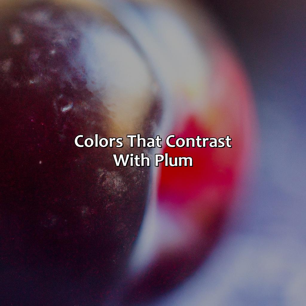
Photo Credits: colorscombo.com by Austin Martinez
To make your space eye-catching, use color theory to find colors that contrast with plum purple. Experiment with cool tones like mint, teal and dusty blue. Or, you can use bright colors like yellow, lime green and fuchsia. Deep colors like navy, burgundy and black can also add a pop of color.
Cooler Tones: Mint, Teal, and Dusty Blue
Mint, Teal, and Dusty Blue fall under the category of cool colors that create a refreshing aesthetic when paired with plum. These shades offer a calming effect and balance the deeper tones of plum.
Their mild hues work well to tone down the vibrancy of the plum color and create a unique contrast. The soft blue undertones in navy blue can also add depth to the overall outfit when paired with plum.
When selecting cooler tones to complement plum, it is recommended to focus on achieving color balance. By choosing shades that have similar undertones, you can create harmony within your wardrobe and elevate an ensemble from good to great. Additionally, accessorizing with silver pieces or opting for metallic accents can add shine and glamour to your overall look.
For some inspiration, picture yourself in an outfit consisting of an elegant and sophisticated deep plum dress with a dusty blue cardigan layered on top or slim fit suits made in complementary colors. Find ways to experiment with these different shades until you find what works best for you – fashion is all about finding your individual style!
Add a pop of color to your outfit with a statement piece in bright colors like yellow, lime green, or fuchsia.
Bright Colors: Yellow, Lime Green, and Fuchsia
Using vibrant and bold bright colors can add a pop of contrast to the deep tones of plum. Yellow, lime green, and fuchsia are fantastic options that create an energetic statement when combined with plum.
- Yellow: Bright shades of yellow work well with dark shades of purple. Bold sunshine yellow adds a sunny pop while soft pastel yellows bring subtlety.
- Lime Green: This fresh and zesty shade pairs fantastically with deep purples for a stunning look. A light and airy shade of lime green maintains the summer vibe in colder months too.
- Fuchsia: A brilliant pink hue that complements the depth of rich plums excellently. It brings a sense of glamour and sophistication to any outfit.
By adding any combination of yellow, lime green, or fuchsia to your outfit, you’ll create a statement piece that stands out in any setting.
When incorporating these bright colors into your wardrobe with plum purple accessories like handbags or shoes, opt for softer versions of each shade to ensure they don’t clash but work together effortlessly. Bringing these bright hues in through prints or patterns is another way to level up an outfit without things getting too hectic.
It’s worth noting that while all these colors complement plum perfectly, they also differ significantly from one another in terms of weightiness and tone. It makes trying out new combinations something worth experimenting with! However, balancing multiple high-intensity accents can be tricky. Practice pairing pieces together before committing to wearing them outdoors.
Pair plum with deep colors like navy, burgundy, and black for a color pop that’s anything but basic.
Deep Colors: Navy, Burgundy, and Black
Pairing plum with deep colors such as navy, burgundy, and black can create a stunning color pop. These colors contrast well with the richness of plum, adding depth and drama to any ensemble. A combination of navy and plum creates a sophisticated look, while pairing burgundy with plum gives off a vintage vibe. Black complements plum beautifully and is an effortless way to create a chic and timeless look.
Using darker shades alongside plum adds dimension to an outfit and creates a sense of balance. Rich burgundy tones can be used in subtle accents or as statement pieces for an eye-catching effect. Navy pairs well with cool-toned plums and serves as an elegant neutral that grounds the overall look. Black adds sleekness to any outfit while giving soft plums a bold edge.
When pairing plum with deeper colors, it’s important to keep in mind the occasion and context of the outfit. For formal events, opting for black or navy combinations may be more appropriate, while casual settings lend themselves well to mixing in rich burgundy tones.
Throughout history, dark hues have been associated with luxury and sophistication. The use of these deep colors evokes feelings of mystery and elegance that continue to resonate in fashion today. When paired with plum, these colors provide endless possibilities for creating unique, standout looks that are sure to turn heads.
Pairing plum with different color schemes is like creating a work of art – it’s all about finding the perfect balance of purple hues, lavender, lilac, mauve, eggplant, magenta, and more to create a stunning and cohesive color palette.
Pairing Plum with Different Color Schemes
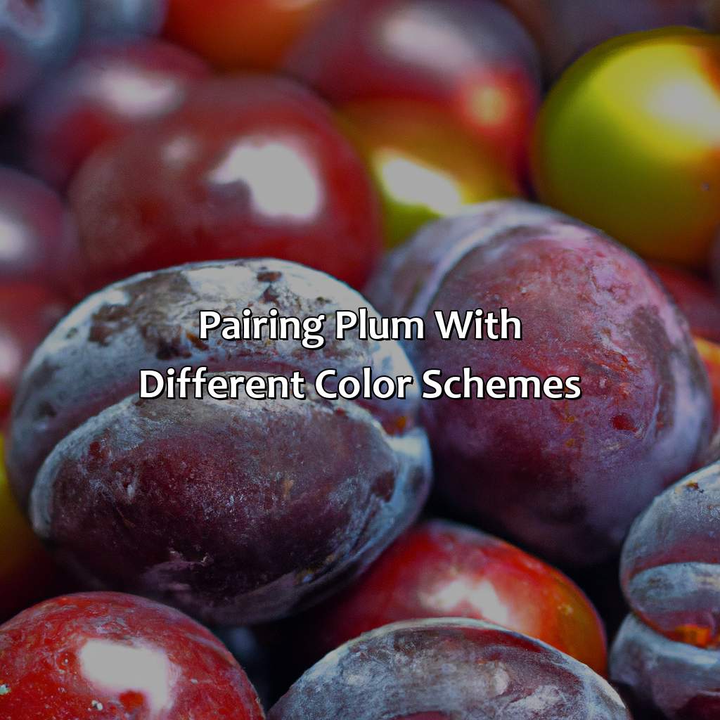
Photo Credits: colorscombo.com by Gerald Harris
Let’s explore plum purple color pairings! This article is for those who want to mix and match colors like a pro. We’ll investigate different color palettes and how to experiment with them. Sub-sections include:
- Monochromatic shades of plum for subtlety
- Analogous colors close to plum on the color wheel (like lavender, lilac, mauve, eggplant, and magenta) for a harmonious feel
- Complementary colors opposite plum on the color wheel for a bold statement.
Monochromatic: Different Shades of Plum
To create a monochromatic color scheme with plum, embrace the versatility of this deep shade by incorporating varying shades of plum in your color palette. Instead of introducing a new hue, play with the saturation and brightness levels within the same hue to add depth and interest to your look. Using different shades of plum can create a cohesive and harmonious effect, creating a tonal elegance that is both modern and sophisticated.
For a unique approach to monochromatic dressing, try mixing textures and fabrics in varying shades of plum. Use creamy chiffon fabrics for lighter tones, and rich velvet or wool for deeper hues. This combination will achieve visual interest with visually dynamic layers that look effortless.
Avoid using too many patterns when creating your monochromatic outfit as they may distract from the understated elegance that comes along with it. Try incorporating bold accessories like boots or statement jewelry in complementing colors such as gold to uplift your outfit.
Incorporating different shades of plum is also ideal for creating dramatic makeup looks where you can layer berry-toned lipsticks on top of smokey eyes for an ultra-glamorous look. The monochromatic style is all about keeping things minimalistic yet impactful so keep a keen eye on balance while experimenting with various shades.
Overall, creating different shades from the same family hue encourages creativity, especially when it’s done in monochromatic style. It’s perfect for dressing up or down as well bringing just enough visual appeal enough without overwhelming fussiness.
Pairing plum with its colour wheel neighbours is like having a party with the purple hues – lavender, lilac, mauve, eggplant, and magenta – everyone’s getting along just fine!
Analogous: Colors Close to Plum on the Color Wheel
Colors that are analogous to plum on the color wheel are hues that are adjacent to it. These colors share a similar undertone which makes them blend harmoniously with the primary color.
Shades such as lavender, lilac, mauve, eggplant, and magenta can complement plum exceptionally well.
To create a seamless look using analogous shades with plum, consider incorporating lavender and lilac accents in your outfit or home decor. On the other hand, if you want to take a bolder approach, try pairing plum with eggplant or magenta for an eye-catching look.
Below is the table of analogous colors close to Plum on the color wheel:
| Primary Color | Analogous Colors |
|---|---|
| Plum | Lavender, Lilac, Mauve |
When choosing garments or accessories in analogous shades with plum, consider opting for complementary textures and materials like velvet or silk to enhance their unique properties.
Don’t miss out on elevating your style game by experimenting with these analogous purple hues; rather than going for safe options. Incorporate them tastefully into your wardrobe and home decor items and let them add an element of elegance and sophistication.
Pairing unexpected complementary colors with plum is like an arranged marriage – it may seem weird at first, but it could end up being a beautiful match.
Complementary: Colors Opposite Plum on the Color Wheel
Colors that perfectly complement plum are the ones opposite to it on the color wheel. These color pairings create a beautiful balance and harmony. In short, plum is matched with its complementary colors for an optimal effect.
| Complementary Color | Examples |
|---|---|
| Yellow | Lemon |
| Lime Green | Chartreuse |
| Fuchsia | Magenta |
It’s interesting to note that complementary colors create strong contrasting effects when used together, making them perfect for accentuating each other.
In contrast to monochromatic or analogous color schemes, complementary colors are best used sparingly. However, when they’re used in full force, using complementary colors can make a stylish statement.
Complementary color pairings have been used for centuries by artists and designers as a rule of thumb when working with different hues and tones. As a result, this technique has become an essential part of color theory and design philosophy today.
Pairing colors with plum is like conducting a colorful science experiment – mix, match, and observe the unexpected results!
Tips and Tricks for Pairing Colors with Plum
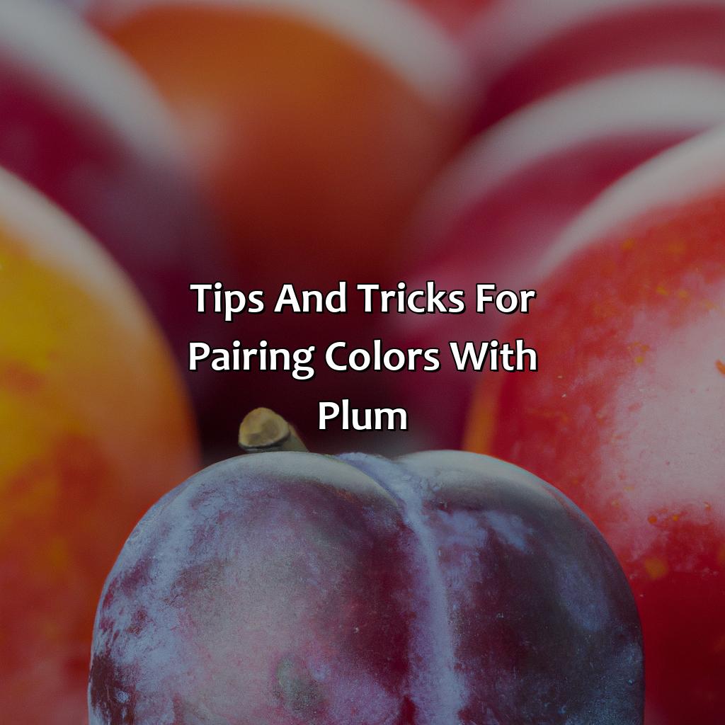
Photo Credits: colorscombo.com by Daniel Miller
Gaining skill with combining colors and plum needs knowledge of color impact, understanding, and symbolism. To reach balance and contrast, try experimenting with various hues of plum. A neutral color as a base can also assist with this balance. Accessories can add a burst of color to your clothing or decor. When selecting colors, rely on your instinct, as color psychology can have a major effect on our view of a space or outfit.
Experiment with Different Shades of Plum
A color experiment can be conducted by playing with different shades of plum. Plum is a versatile shade that comes in several shades such as wine, eggplant, and orchid. Different colors can be mixed and matched to produce unique styles and looks. Color perception plays a crucial role in determining which shades complement each other best. To create an appealing look, using analogous or complementary colors is recommended.
To make the most out of the color experiment, start by choosing different shades of plum that work well together. For instance, combining a dark shade of plum with a lighter one can result in a chic look that highlights the depth and contrast between light and dark hues. Additionally, adding other jewel tones such as emerald or sapphire can also provide balance and visual interest.
Furthermore, when trying out new colors with plum, it is essential to use a discerning eye to ensure that the resulting style still aligns with your personal taste and preferences. Starting small with accessories like bags or shoes can help you gauge which color combinations work best for you.
Overall, experimenting with different shades of plum is an excellent way to incorporate this rich tone into your fashion choices while discovering which colors work well together based on your individuality. Mixing various hues takes time but ultimately produces uniquely beautiful results if done carefully through continuous practice.
Neutral colors are like Switzerland, always there to provide balance and contrast in the colorful world of fashion.
Use a Neutral Color as a Base
A neutral color is an excellent base for a plum palette as it will create a color balance. Use colors like beige, cream, or taupe as they provide a soft and subtle background while allowing the plum tones to stand out. This combination is beneficial in creating a relaxed and elegant ambiance without overpowering the space.
To achieve the perfect balance of colors with plum, use neutral hues for larger furniture pieces, such as sofas and curtains. Bold shades of purple can then be added to accent pillows or artwork to add contrast and interest. Neutral tones also give you versatility in terms of decorating because they complement other accent colors well.
Using a base of neutrals allows plum to become the primary focus of the room, which gives designers creative freedom over how to incorporate other colors into their design ideas. It works well when you want to avoid overloading your decor with too many different hues while maintaining color contrast.
It is essential to note that choosing neutral shades does not mean designing boring interiors – on the contrary; playing with complementary designs will elevate your style game. You can add depth by introducing layers with furnishings and textures such as cozy throws or plush rugs.
According to Better Homes & Gardens Magazine, “Neutral hues are typically soft and calming rather than bold or dramatic.” Therefore mixing neutrals with bold hues like burgundy & magenta allow you to strike that perfect balance between calmness and energy inside your living space.
Accessories are the perfect way to add a pop of color without committing to a full-blown plum obsession.
Start Small with Accessories
Accessories are a great way to start incorporating colors that complement plum or contrast with it. These small touches can add a pop of color to an outfit without overwhelming the overall look.
- Start with jewelry in the desired color. A simple necklace or pair of earrings can bring attention to the accessory and brighten up an outfit.
- Add a scarf to your outfit in a contrasting or complementary color scheme. This can also be a functional accessory for cooler weather.
- Experiment with different colored shoes or handbags to change up the look of an outfit.
- Incorporate hair accessories such as headbands, scrunchies, or hair clips in contrasting colors. This is also a great option for those who prefer more subtle pops of color.
- Fashionable belts or statement hats are also great tools for adding a pop of color without going overboard.
- Sunglasses are another easy way to incorporate color without being too obvious about it. Look for fun and bright frames that complement your skin tone and personal style.
Using accessories is an easy and non-committal way to experiment with different color schemes while adding interest to your outfits. Don’t be afraid to try something new and mix things up.
Finally, by implementing these suggestions while starting small with accessories, you’ll quickly learn which colors complement or contrast well with plum purple while finding ways that work well for you. Accessories are versatile enough so that you can step out of your comfort zone and branch into new fashion territory! Your intuition knows best when it comes to pairing plum with different color schemes, but don’t let color psychology influence your fashion choices too much.
Trust Your Intuition
Trusting one’s intuition is a crucial aspect of creating color schemes that complement plum. Color influence, symbolism, and psychology are significant elements in the choices we make with regard to our daily lives, including the colors we wear. When pairing colors with plum, it’s important to allow your instinct and creativity to take charge. By trusting your innate judgment and unique perspective on colors’ blends, you can come up with innovative color schemes that best match your personality and style. So go ahead and try different combinations of shades that resonate with your intuition while keeping in mind color psychology principles such as mood enhancement or contrast creation.
In addition, color influence plays a critical role in people’s feelings, emotions, and perceptions. While some people might associate certain colors with positive feelings like happiness or calmness, others may have opposite associations. Thus it’s essential to trust your instincts when making color choices because they embody individualism as well as cultural upbringing.
It’s also important to keep in mind the symbolism behind each chosen shade when selecting complementary hues for plum clothing items or accessories. For instance, green symbolizes nature and healing while red represents passion. Hence determining which symbol resonates more with you will help you make informed decisions when choosing additional hues to pair up with plum.
Five Facts About What Colors Go With Plum Purple:
- ✅ Plum purple goes well with neutrals like white, beige, and gray. (Source: The Spruce)
- ✅ Plum purple also pairs nicely with shades of pink, such as blush and rose. (Source: Decorating By Donna)
- ✅ For a bold look, try pairing plum purple with shades of green. (Source: Decoist)
- ✅ Metallic shades like gold and silver complement plum purple nicely. (Source: House Beautiful)
- ✅ To create a warm and cozy space, pair plum purple with earthy tones like brown and rust. (Source: Ideal Home)
FAQs about What Colors Go With Plum Purple
Q: What colors go with plum purple?
A: Plum purple is a versatile color that can be paired with a range of complementary and contrasting hues, including gold, black, white, green, pink, and navy blue.
Q: Can I pair plum purple with earth tones?
A: Yes, earthy colors like brown, beige, and olive green can look great with plum purple. These muted tones add warmth and depth to the color palette.
Q: Will metallics work with plum purple?
A: Yes, metallics like silver and gold can add a touch of glamour to plum purple. Just make sure to balance the shine with neutral or matte colors.
Q: Can I wear plum purple with pastels?
A: Yes, pastels like light pink, lavender, and baby blue can soften the intensity of plum purple. This combination can be perfect for spring or summer events.
Q: What about bold colors?
A: Plum purple can be paired with bold hues like orange, fuchsia, or electric blue for a stunning color-blocking effect. This works particularly well with accessories or statement pieces.
Q: How can I use color psychology to style plum purple?
A: Plum purple is associated with creativity, luxury, and mystery. Consider pairing it with colors that convey other emotions, such as yellow for joy, green for calmness, or red for passion. This will give your outfit or décor a more complex and meaningful look.